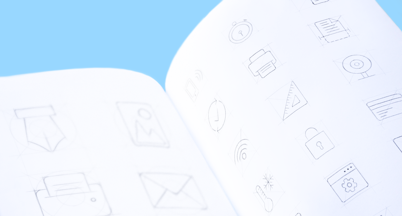
Iconography Guidelines & Style Guides
Iconography is a unified visual language that can be understood by people from different locations and cultures. Icons are widely used for navigation in social places such as airports, train stations, production halls, museums, etc. They let people overcome a language barrier and navigate comfortably in conditions when the time is very limited (e.g. in an airport). The same principles apply to iconography systems for digital products. The right usage of icons helps to make in-product navigation more accessible and increase business metrics (CTR, number of successful onboarding sessions, etc.). Consistency, readability, and scalability are the core parameters of any design system. Consistency influences a general trustworthiness of a product, readability increases the speed of interactions, and scalability lets your product to grow effectively.


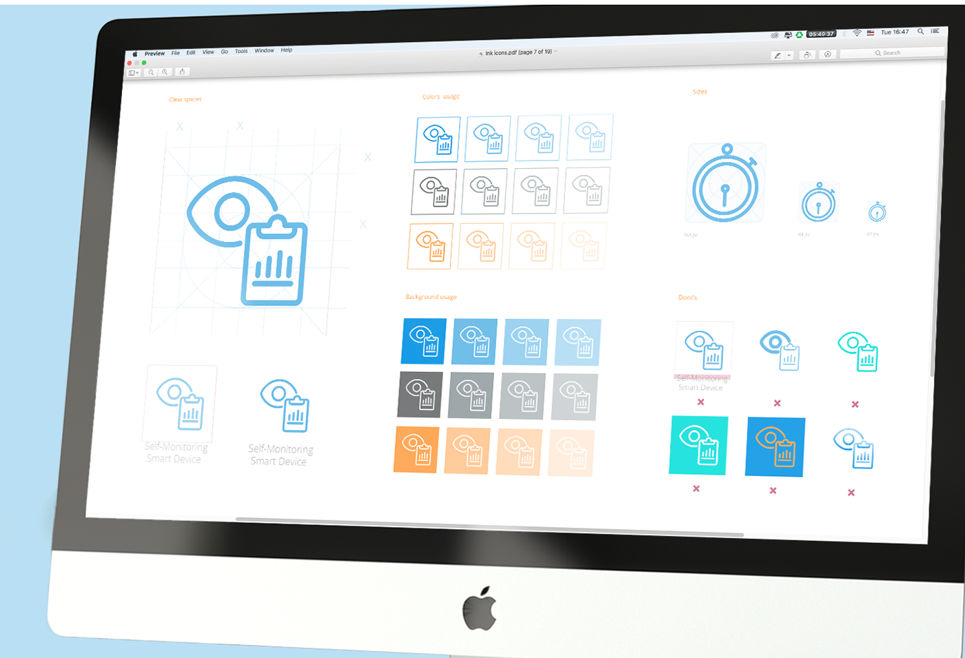
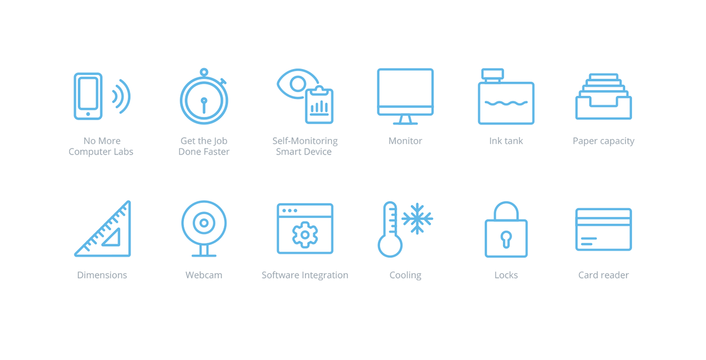
Ink SmartStation
Ink SmartStation is a tech startup with a goal to make student's life better. They created a smart printing kiosk with a seamless experience where students can print anything with the touch of a button. We designed the first generation of the iconography system for Ink.me website and in-kiosk interface. The primary goal was to design pictograms that could be easily recognized by people with different cultural and technical background (the print kiosks set up in campuses).


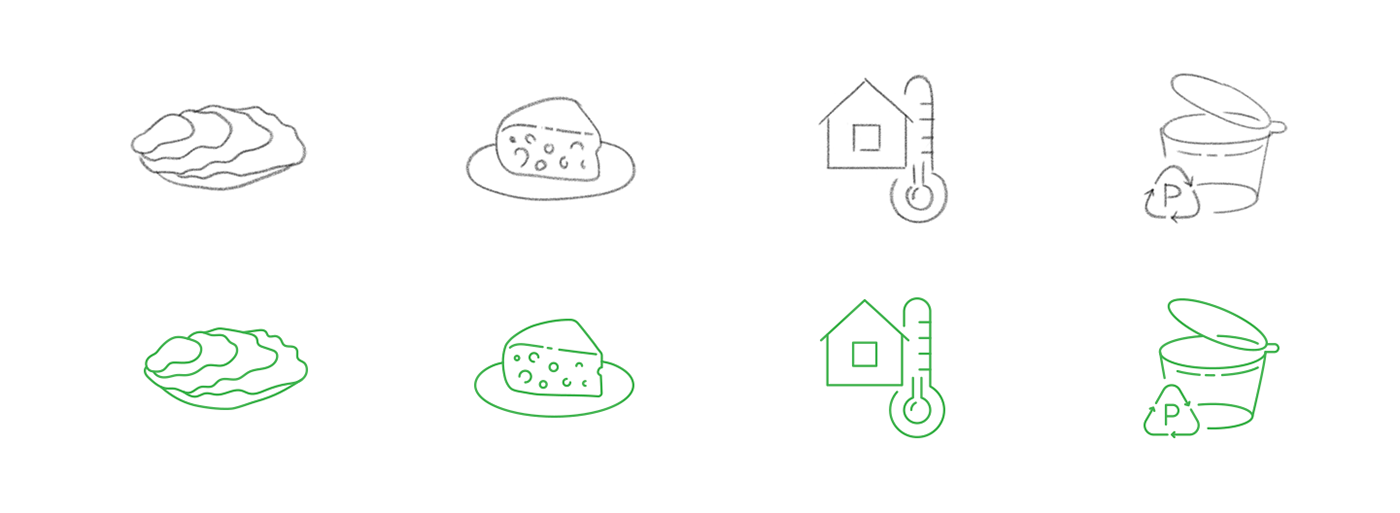
Nelio
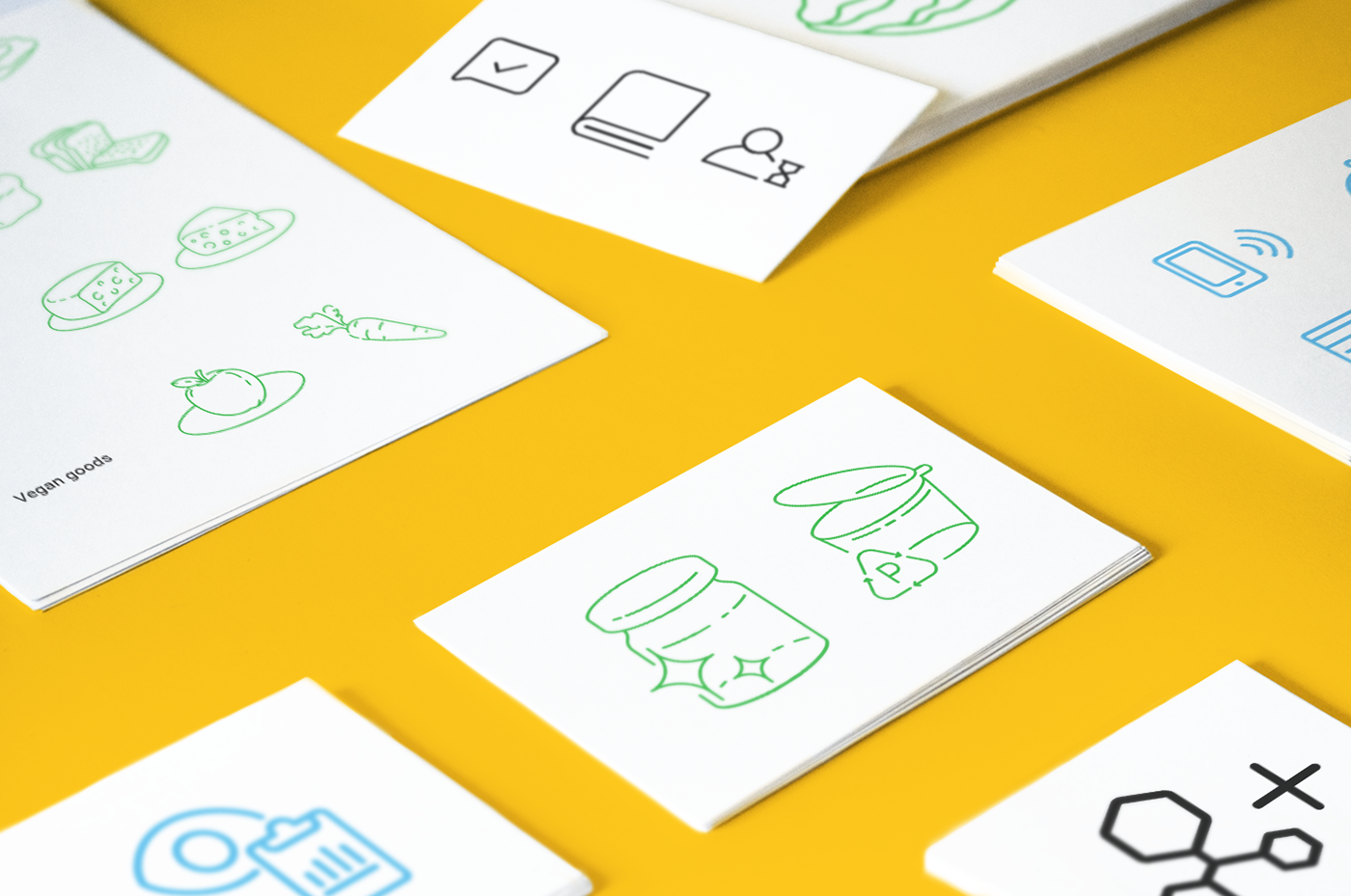
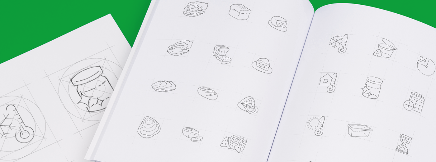
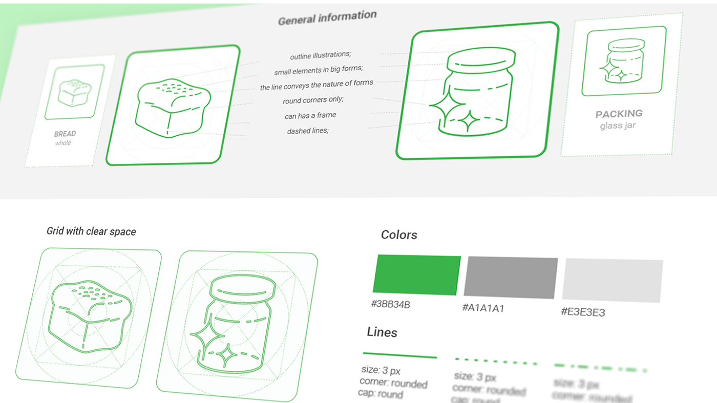
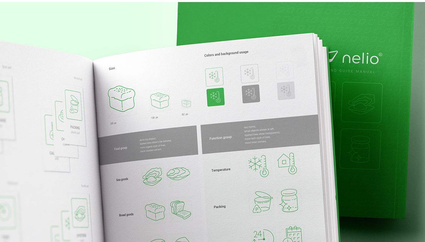
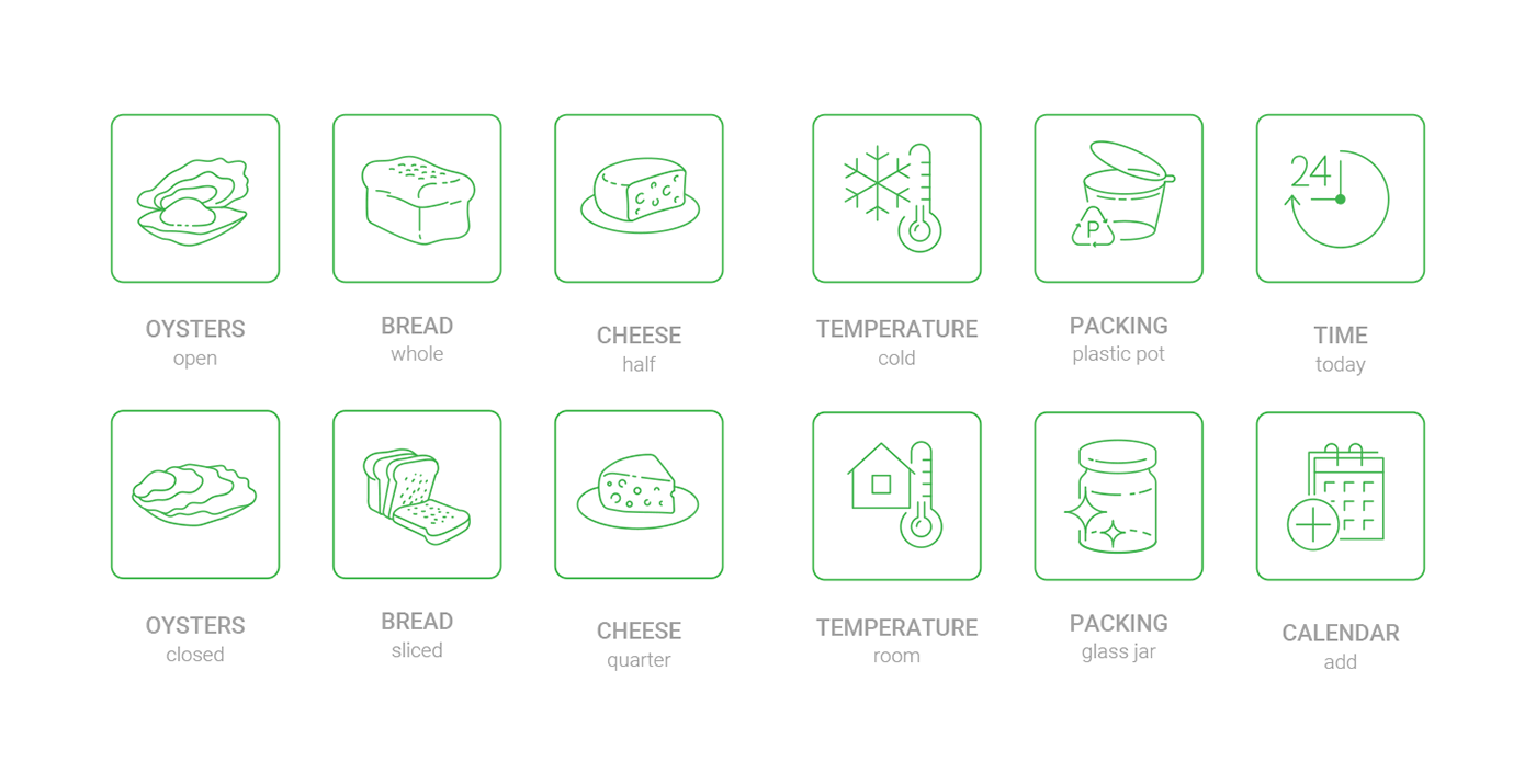
Nelio is a Lion-based food delivery startup with a primary focus on local stores. As a part of a full-stack design service (UX/UI app design, visual identity, illustrations, etc.), we built an icon set used in the iOS and Android applications. We chose an outline semi-illustrative style to make it possible to illustrate visually complex food such as different types of cheese, bread, etc.


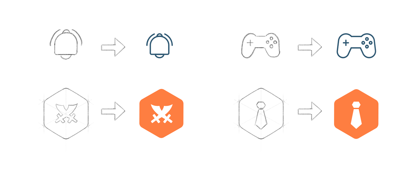
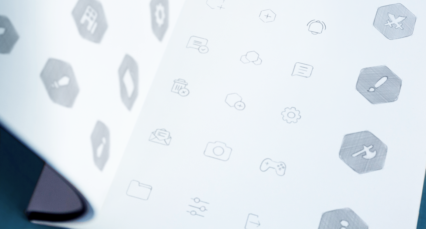
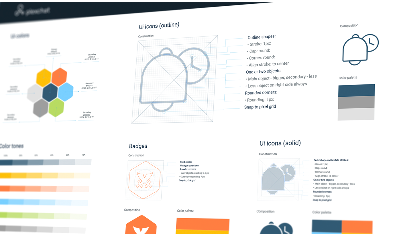
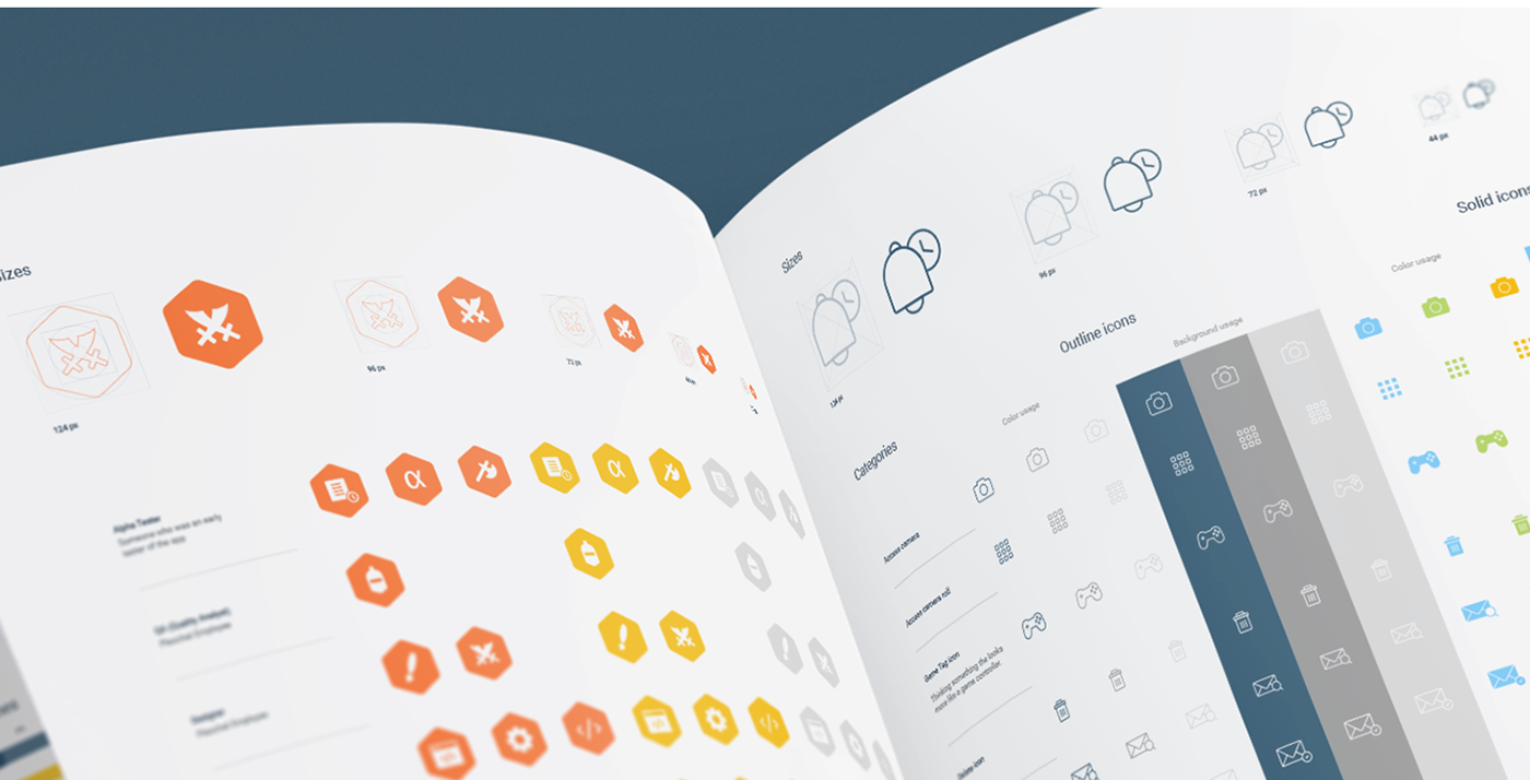
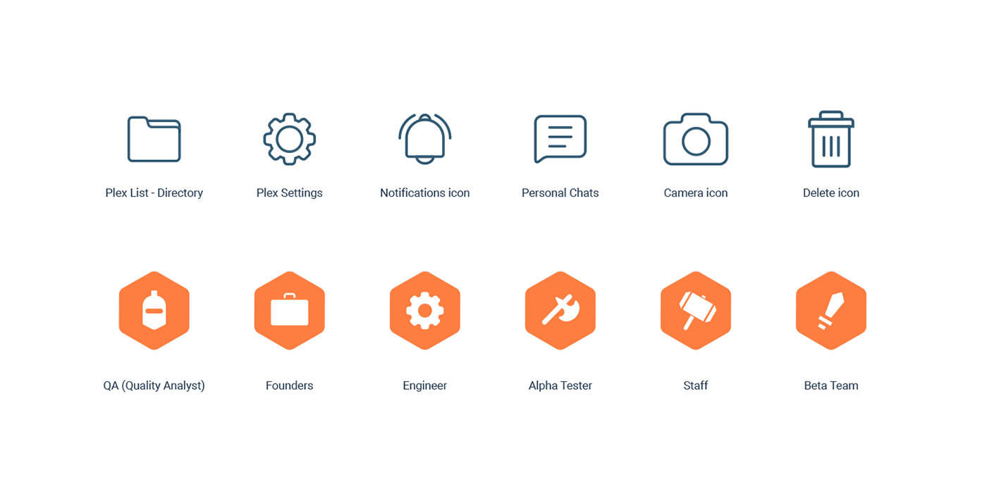
Plexchat
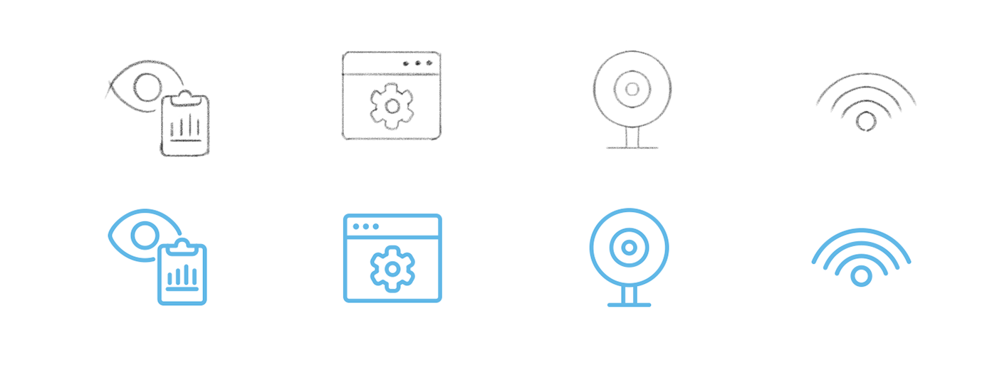
Plexchat is a chat application for gamers. Mobile-first digital startup contacted us to design visual identity assets: logo sign, wordmark, brand patterns, illustrations, pictograms, and some product UI work. The interesting part of the iconography project was using references from games. As a result, we had an icon set where well-known metaphors such as 'gear' or 'trash can' lived together with icons like a sword, shield, helmet, etc.


Thanks for Watching!