
DEPARTMENT FOR EDUCATION
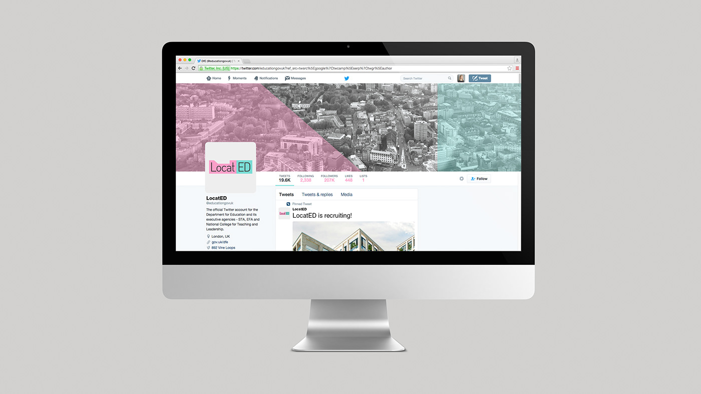
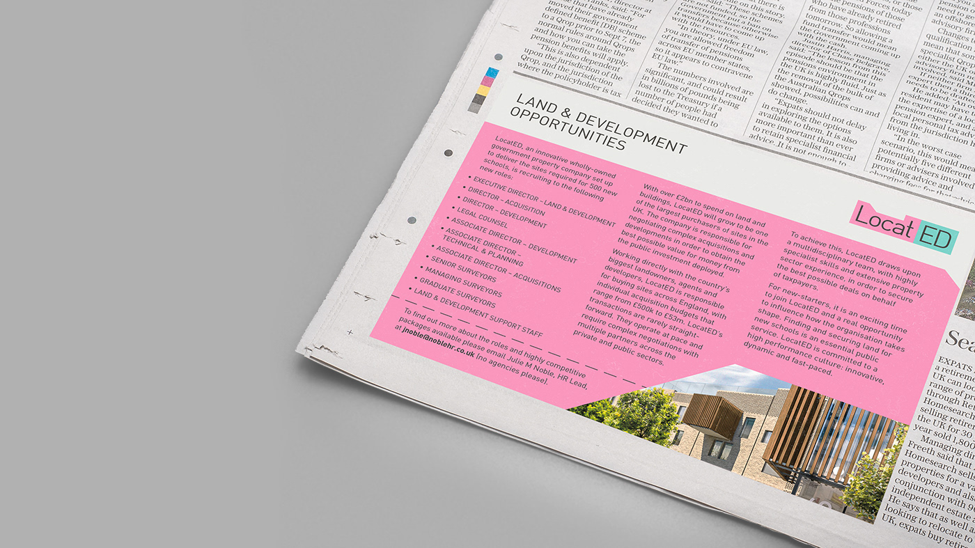
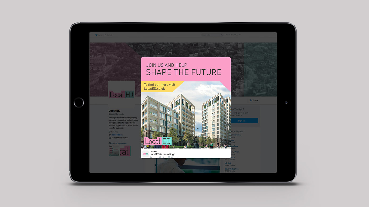
LocatED branding
LocatED is a new publicly-owned property company, working to buy and develop sites to use as schools. DfE didn’t want the brand to look like a civil service entity, so we had a lot of freedom to be creative.
The logo is inspired by land development and floor plans. The two colour shapes emphasise the dual meaning of LocatED, as well as suggesting dual-purpose spaces, something the project is keen to make use of.The colours steer away from harsher tones associated with governmentor the construction industry.
The diagonal line in the logo becomes part of the brand’s visual language.It is used consistently across applications to create asymmetrical shapesused to hold images and information. The LocatED dashed line addsstructure and detail to designs, and reminds us of the project’s dynamism.