
Mindful Case Study
RESEARCH + DISCOVERY | DEFINE | IDEATION + STRATEGY | PROTOTYPE | TEST | ITERATE
ROLE: Lead UX+UI Designer (RESEARCH, INTERACTION DESIGN, VISUAL DESIGN)
CLIENT: MINDFUL
TIMELINE: 80 hours over 4 weeks
TIMELINE: 80 hours over 4 weeks
THE CHALLENGE
Help people find ways to manage their anxiety through a mobile app that can be used in tandem with a wearable sensor.
THE OUTCOME
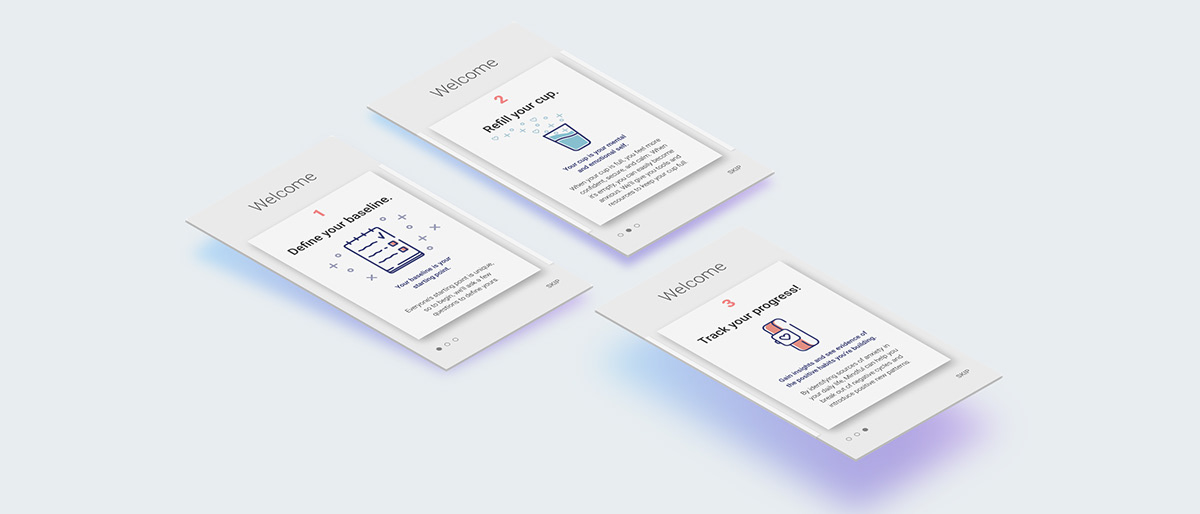
A simple, friendly app design that helps users find approaches based on their preferences while monitoring and tracking their progress.BACKGROUND
Anxiety disorders are the most common mental illness in the U.S., affecting 40 million adults-- 18.1 percent of the population. They're highly treatable, yet only 36.9 percent of those suffering receive treatment. Mindful is a new mobile Android app that aims to help users manage and reduce their anxiety. Mindful’s greatest value to the market comes via wearable technology that allows users to track their behaviors, moods, physical factors, and other signs that could contribute to anxiety and that correlate with intense feelings of stress or worry. The design of the wearable device is intentionally minimal, with no screen (it can communicate alerts via vibration). It's designed as a piece of smart jewelry that can be worn as a pendant, bracelet, or clipped to clothing.

RESEARCH + DISCOVERY
Tools used: MARKET TREND analysis, competitive analysis, PROVISIONAL PERSONAS, CONTEXTUAL INQUIRY
Market & Industry Research
To begin this project, I spent a few hours getting up to speed on anxiety-related apps and trends within the mental health space. I also researched wearable devices and apps with wearable sensor integration. I learned that there are 10,000+ mental health apps on the market. The mental health space is incredibly competitive! The apps cover a broad variety of approaches and specializations. To help identify the market segment that most directly aligns with Mindful’s positioning, I conducted a competitive analysis. This gave me the opportunity to look for ways Mindful might differentiate itself and provide unique value to users.

Provisional Personas
I then created three provisional personas based on Mindful’s target market and information I’d gathered during my initial deep dive into secondary sources. This helped me identify people who might be ideal interview subjects and consider how I might want to frame some of my interview questions and planning.
Subject Matter Expert
I wanted to get a professional healthcare provider’s perspective on anxiety treatment, so I sought out a licensed mental health counselor to interview by phone. As an experienced counselor, both in person and via online video chat, she shared some valuable insights:
1) The general flow of therapy for anxiety is to: identify, track, and find tools to help manage.
2) Everyone has their own baseline, so it’s important to start with an initial rating so progress can be measured in relation to it.
2) Everyone has their own baseline, so it’s important to start with an initial rating so progress can be measured in relation to it.
3) Tracking in relation to a baseline also helps get buy-in from patients, because they’re primed to look for change.
4) In therapy, she works with clients to proactively recognize physical signs of anxiety like increased heart rate, clenched jaw or fists, etc.
5) From a therapist’s perspective, the option for clients to share information with their therapist can expose them to liability, so she would only want to use an app that she reviewed with the patient.
User Interviews
I created an interview script and interviewed 7 people over 2 days (3 in person, 4 via video chat). Participants were women ranging in age from early 20’s to 60+ years old. All said they’d experienced anxiety, and several had tried using an app or wearable device to monitor their health or help with anxiety.


"[When I'm anxious] I feel like I'm in this hole of sadness and worry." “[When meditating] I like hearing someone tell me 'breathe now' or 'close your eyes' to make sure I'm doing it right." “There are some meditation apps out there that are so serious, like you have to be an expert or something” “I don’t want the process of trying to find meditations to add to my anxiety!”
KEY FINDINGS
Regardless of age, all participants seemed to describe many of their experiences, causes, and methods of dealing with anxiety in similar ways. While participants had a variety of coping techniques, meditating and talking to someone were most often cited. Participants overall expressed some ambivalence towards wearables. Some but not all participants had tried apps to help with meditation or relaxation.

Synthesis + Defining
Tools used: empathy map, primary persona, POV + HMW STATEMENTS, BRAINSTORMING
Uncovering Insights + Identifying Needs
Following the interviews, I created an empathy map to synthesize the information gathered.
I looked for patterns, themes, similarities, and contrasts. Doing so helped me uncover insights from my observations and move towards identifying implicit user needs.

Primary User Persona
Drawing from the insights and needs identified via my empathy map, I established a primary user persona: Ellen Fisher. Ellen is able to manage her anxiety fairly well most of the time, but there are times when she feels exceptionally anxious, worried or stressed. She’s tried some meditation apps before but finds some of them a bit overwhelming. She’d like a simple, straightforward way to find some helpful tools and coping techniques when she feels anxiety setting in.

Defining the Design Problem
Taking the insights and needs from my empathy map and persona, I translated them into POV ("Point of View") statements and then HMW ("How Might We") questions. Reframing the insights and needs I identified in my research allowed me to turn them into clearer invitations and challenges for design.

How might we help Ellen find an approach to anxiety management that best suits her?
Brainstorming + Ideation
With my POV statements and HMW questions planted in front of me, I used the Crazy 8's brainstorming technique to generate ideas and consider as many possible solutions I could within the allotted time frame.
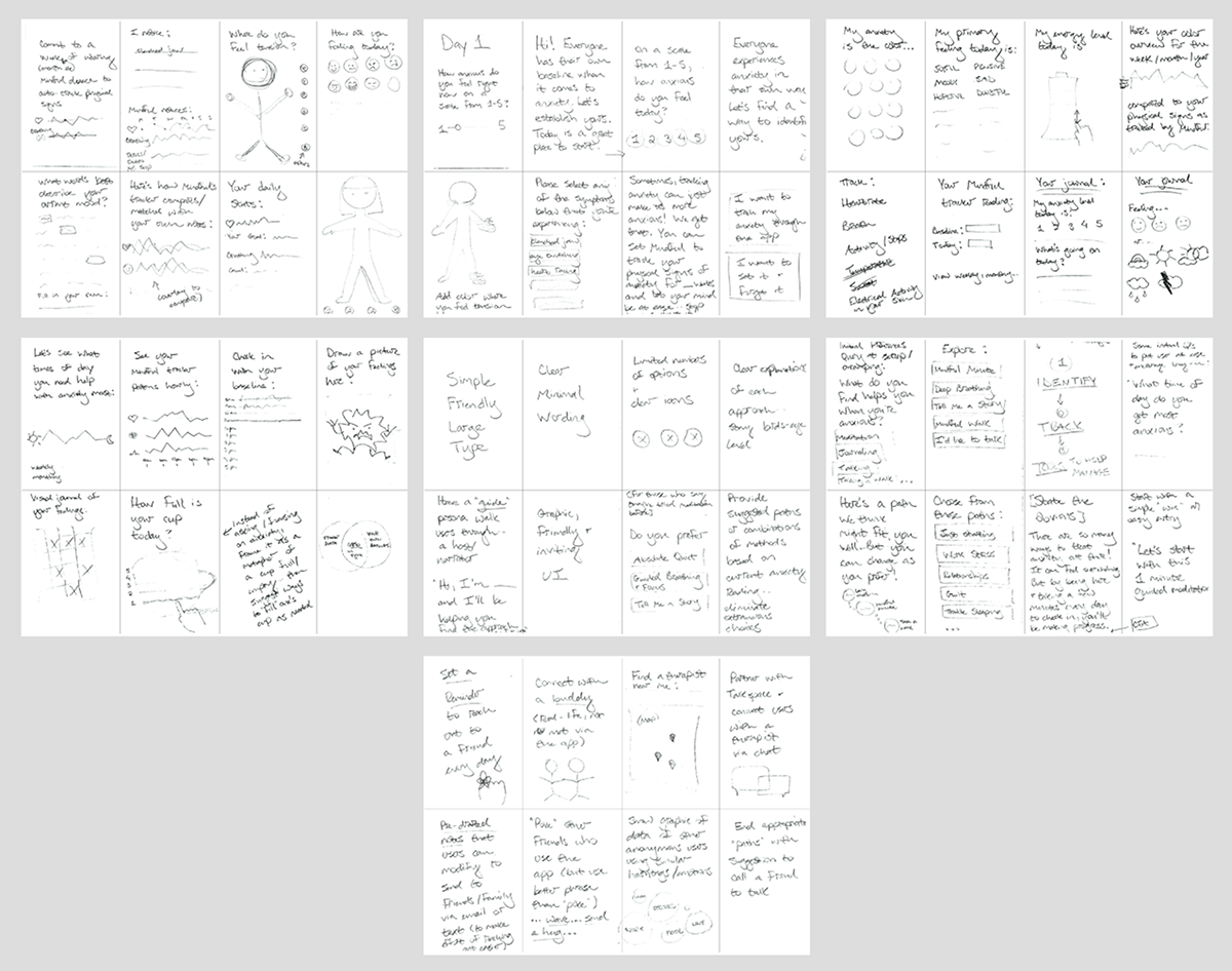
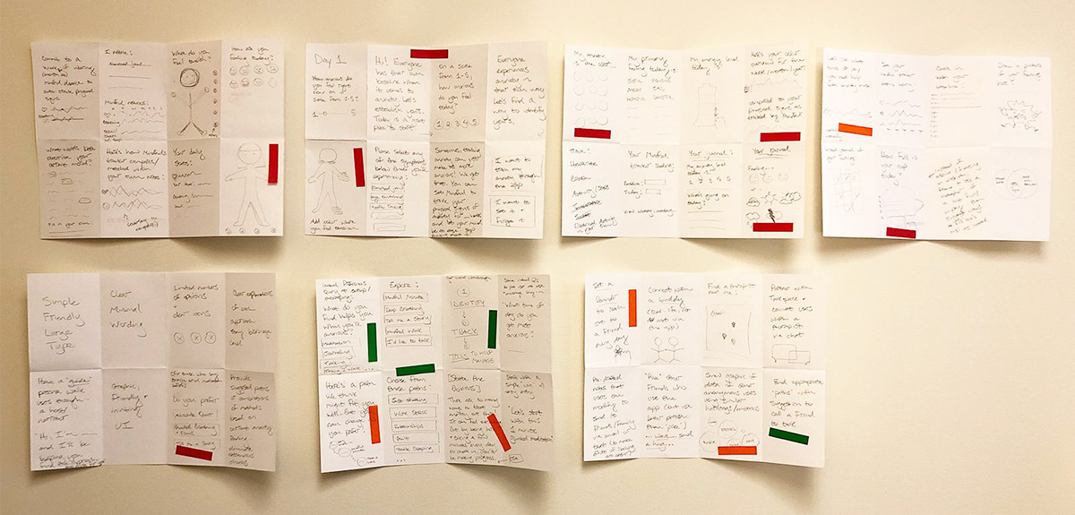
I then posted my sketches up on a wall to review together. Lacking dot stickers, I used flags to mark ideas on my brainstorming sketches and notes that I thought were most promising.
Project Strategy
Tools used: PROJECT GOALS MAPPING, PRODUCT ROADMAP, SITE MAPPING
Project Goals
I had a lot of ideas from my brainstorming and ideation— now, it was time to make some decisions on which ones to pursue. To help focus my project objectives and priorities, I identified where individual business, user, and technical goals overlapped. The resulting shared goals gave me a way of assessing which ideas would be best suited for the needs of both Mindful and its users.

Product Roadmap
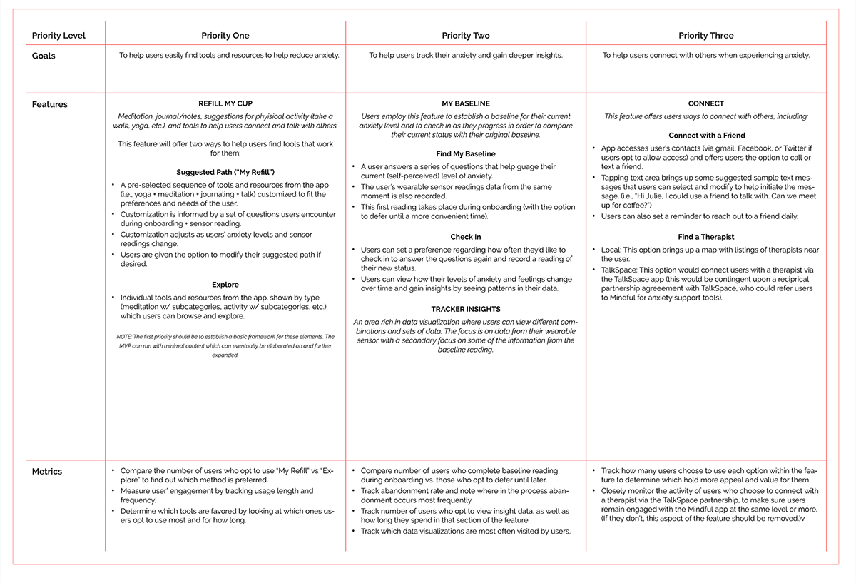
With my shared goals in mind, I went back to review the ideas I’d generated during brainstorming. I decided to cut up my Crazy 8's into "cards" and shuffle and sort them to figure out how they might turn into cohesive features, and how various elements might be grouped within the app. Doing this helped me as I worked towards defining features in my product roadmap.

In the resulting product roadmap, features are presented in order of priority, along with proposed metrics to assess the impact and effectiveness of the features.
App Map
Informed by the features and priorities outlined in my product roadmap, I created an app map showing the content architecture proposed for Mindful.


INTERACTION DESIGN
Tools used: User flow map, TASK FLOW MAP, sketching, wireframing in sketch, prototyping in invision
Finding the Flow
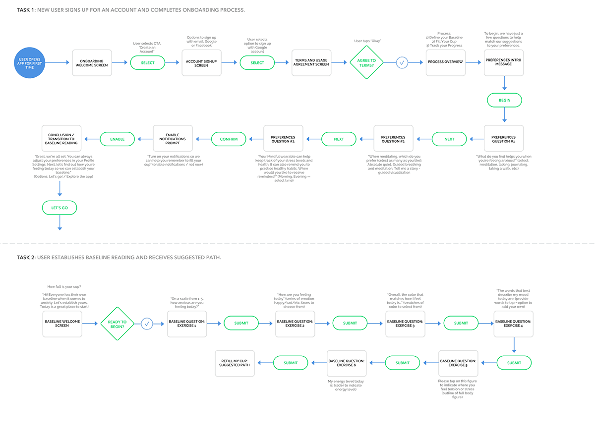
Referencing the app map, I created a user flow map, working through 3 possible ways a user might interact with Mindful. I sketched the flows first in pencil and paper, then rendered them in Sketch.

While the user flows showed an overview of the complete journey from a user’s entry to their eventual exit, I also wanted to focus on some specific tasks within these flows and carefully consider their details. To do so, I created 2 individual task flows, breaking out specific tasks from the first user flow and creating more detailed, individual screens. For example, in the user flow a group of screens called “initial preferences questions” is shown. In my task flow I break out this grouping and show the progression and content planned for each screen. Doing this helped me make sure I’d included all necessary key frames I’d need as I created wireframes for my prototype.
UI Requirements
Referencing the screens I’d mapped out in my user task flows, I considered high level and detailed requirements that the app and each page would need and outlined them in a UI Requirements document. This served as an outline and punchlist of sorts for me as I designed the key screens for the user flows. You can view the UI requirements list here >.
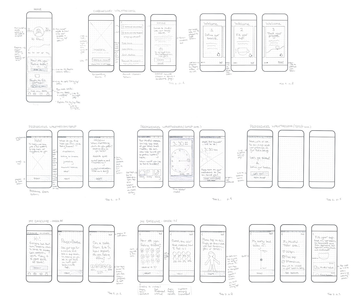
Wireframing
Again referencing the task flows, I sketched screen designs for each keyframe and included annotations. I referenced various Material Design UI Kits and Google’s guidelines as I considered how to pull from them while also adapting as needed to fit my content. Thinking through the layout, interactions and flows of these screens at this stage helped save time once I moved into creating mid-fidelity wireframes.
Prototyping
I then brought my wireframes into InVision and built a mid-fidelity prototype to share with users. Testing the app’s design at this stage, before any visual design had been added, allowed me to get feedback from test subjects that was focused around the concept, organization, flow, and interactions of the app.


Usability Testing
Tools used: testing plan and script, invision prototype, AFFINITY MAP
I developed a usability testing plan and defined my test objective and goals. I created a script with 3 scenarios with tasks for test participants to attempt to complete. You can see the full plan here >. The test focused on 3 tasks:
1) Navigate through the onboarding to set up an account and user preferences.
2) Complete the baseline assessment.
3) Navigate to the home screen and then back to the “Fill Your Cup” recommendations page.
TAKEAWAYS
One participant made more errors than the others. I found it especially valuable to see how he interacted with the app: quickly skimming and tapping through pages-- he seemed rushed and stressed. This emphasized to me the importance of making sure visual hierarchy and cues are employed to minimize user errors and frustration, especially since this individual may represent a state users could likely be in when interacting with the app.However overall, the general consensus was that Mindful was simple, straightforward, and easy to understand. Participants felt that it fit within a genre of apps familiar to them, and they were able to navigate and understand hierarchy of the app overall.
“I’m really interested in the idea of a wearable that could track my breathing— that’s a ‘thing’ for me when I start feeling anxious. I’m kind of over tracking my steps, but tracking my breathing is something I’d be interested in.”
...
“I like it [the ‘Fill Your Cup’ concept]... I guess I’d like to see it described a little bit more somewhere.”
Insights + Recommendations
To synthesize my findings, I created an affinity map. I took the observations and results from my user testing sessions and created sticky notes for each observation and data point, color-coded by user. I then sorted them as successes, problems, or observations. From there, I translated that content into insights and finally made a list of prioritized recommendations for the next iteration, outlining actionable next steps.


A few relatively quick and easy fixes emerged as recommendations for the baseline questions section. Since they involved minimal investment of resources while resolving some points of user frustration, I prioritized them. Beyond those fixes, some broader mandates emerged. It became clear that adding icons and graphics where possible would offer users a way to visually differentiate content and get a quick read not completely dependent upon text. Also, the concept and identity of the “Fill Your Cup” feature needed more development and explanation to users. Finally, emphasizing Mindful’s ability to track breathing rates in connection with anxiety via the wearable sensor would help differentiate this unique feature of the app, helping it stand out in a competitive market.
UI DESIGN + ITERATION
Tools used: moodboard, styletile, high-fidelity wireframes + invision prototype, Ui kit
Visual Direction
Moving into developing the branding visual design for Mindful, I began by creating a word map to define some brand attributes. I gathered references for inspiration from various sources and made Pinterest board for the project, and then edited down some of my selections to create a moodboard and very preliminary palette direction.

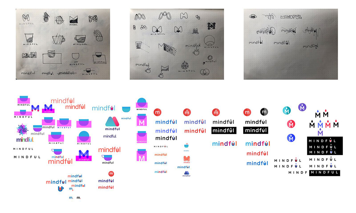
I sketched logo ideas in pen before moving to screen, then worked through some (rough!) ideas before finally settling on a final direction for the logo.
I then worked on the style tile, trying out colors and approaches in my wireframes to see how they might work in context. I chose a vibrant tone of purple to convey a sense of optimism and clarity, while using softer tints of purple and complementary colors to keep the design feeling light.

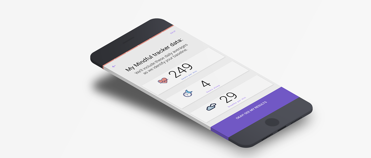
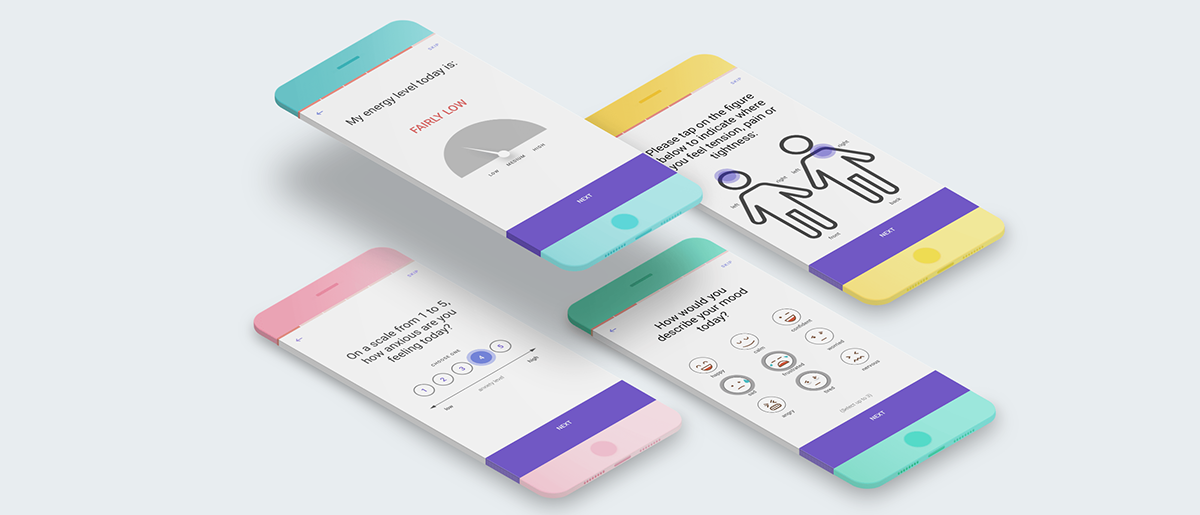
Going back to my mid-fidelity wireframes, I applied the colors, styles and icon illustrations outlined in my style tile to create a higher fidelity version while also making recommended changes as outlined in my affinity map. I integrated distinct graphic icons throughout the app to provide strong visual cues and opportunities to understand content without needing to closely read text. I also revised content related to the Fill Your Cup feature to help explain and develop the concept further. And on the page of recommended actions, I changed the top recommendation to a breathing exercise to better integrate and emphasize Mindful’s ability to offer help with breathing in connection to anxiety.
High-Fidelity Prototype
I brought these wireframes into InVision once again, to create a prototype that offers another opportunity for user testing before going further with the site design and implementation.
click within the prototype above to explore and interact with it.
UI Kit
Finally, I created a UI kit to serve as a reference and resource guide for anyone working on the site. The UI kit provides a place to document styles and elements used across the site, so that they remain consistent.

PROJECT Takeaways
The field of anxiety management is vast, and I certainly feel as though I just scratched the surface with this project. However, by diving in and testing my concepts at an early stage like this, I was able to get a sense early on of what resonated with users and which directions might help the product stand out in a crowded marketplace.
Next Steps
With more time, I’d like to further develop the emphasis on Mindful’s ability to offer content-rich, meaningful suggestions and resources based primarily on breath monitoring and management. My user testing revealed that at least a portion of users find this aspect of the product particularly valuable and interesting. Developing those aspects of the app further would provide focus and help create a more defined point of distinction for the app.