


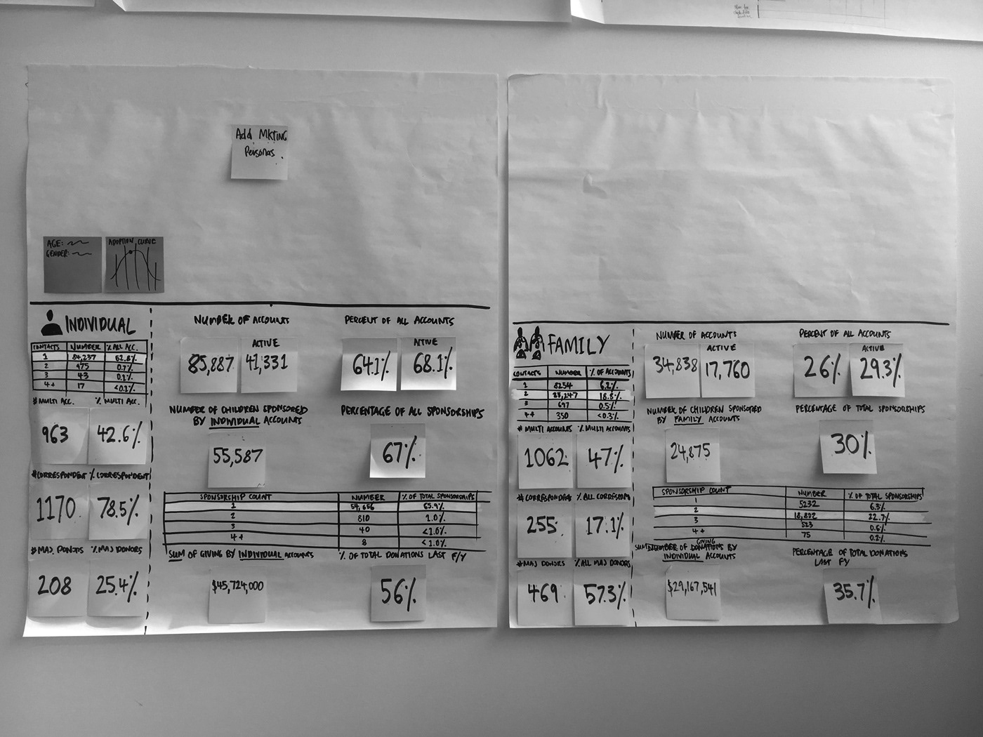
Our two main personas for the project—individuals and families. Largely data based and definitely not very pretty. There’s a post-it at the top reminding me to add a photo of our corresponding marketing persona…I never did get around to it. Such is life on a fast moving project though.

Epics, user stories, lots of ideas and a grubby thunderbolt display. Much to the dismay of my fellow designers, I have a bad habit of putting my mitts all over the screen during design reviews. Sorry guys.

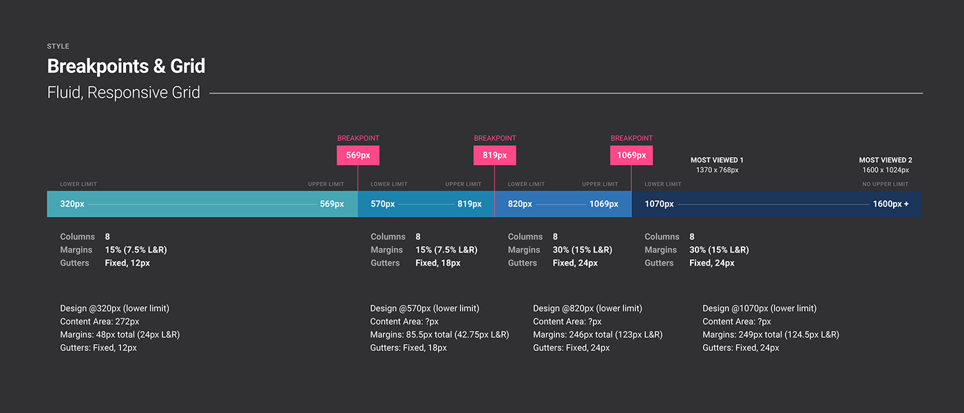
We landed on 4 breakpoints for the build—these were based largely off considerations around paragraph length readability. This allowed us to optimise for breakpoints for content instead of specific device resolution.
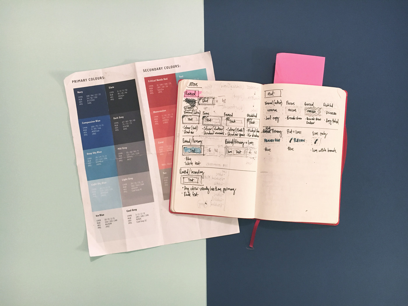
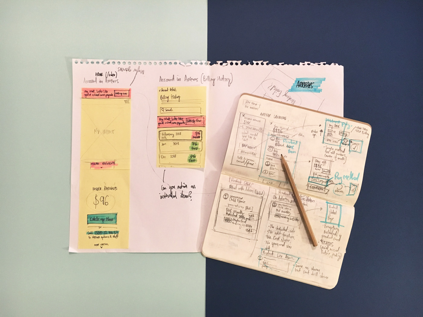
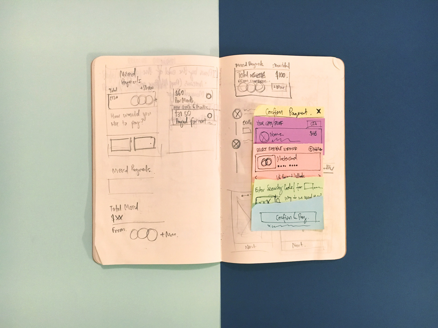
A battered hardcopy of Compassion's colour palette. The sketchbook shows early sketches/thoughts on various button components.

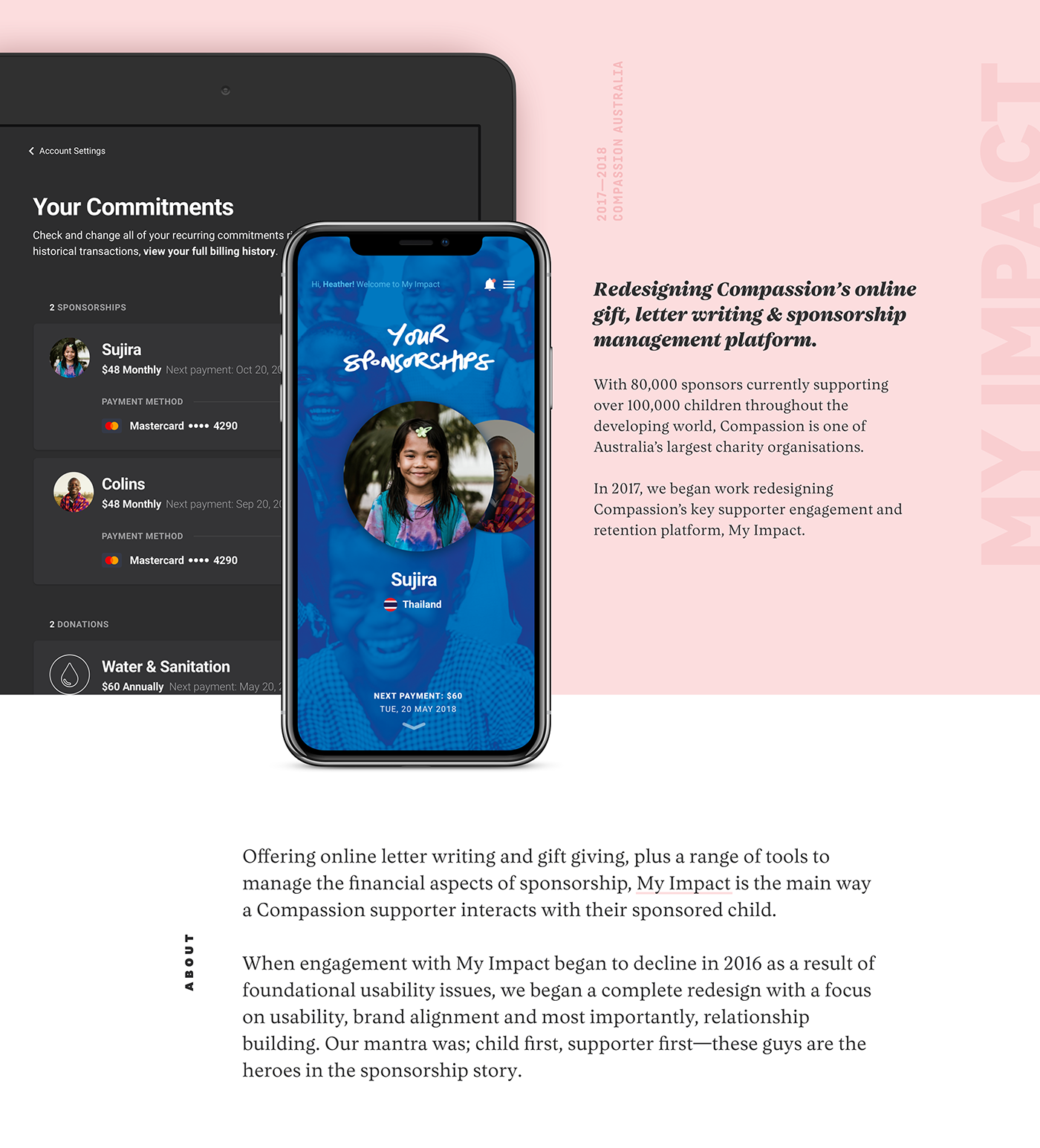
'Your Commitments' content scaling down and adapting to different breakpoints.

The postal and billing address components represented at different breakpoints. Conditions on display state and data handling are shown to the left. Yahbwoi Ave in Medowie isn’t a real address FYI.