

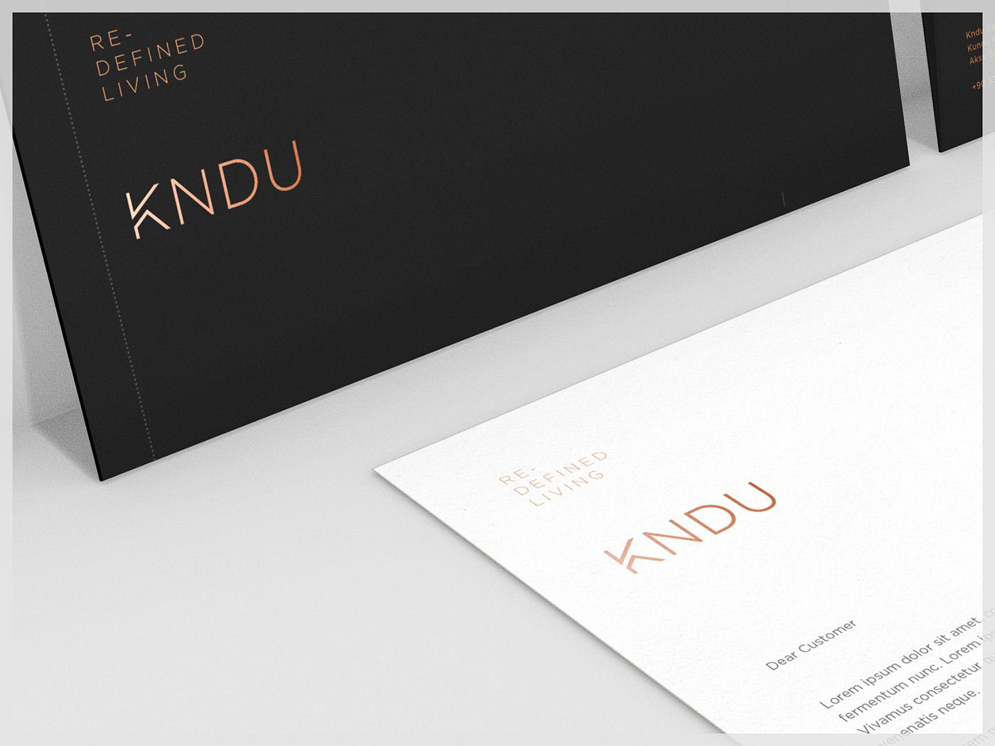
Redefining Communication
For the Innovative Sustainable Luxury
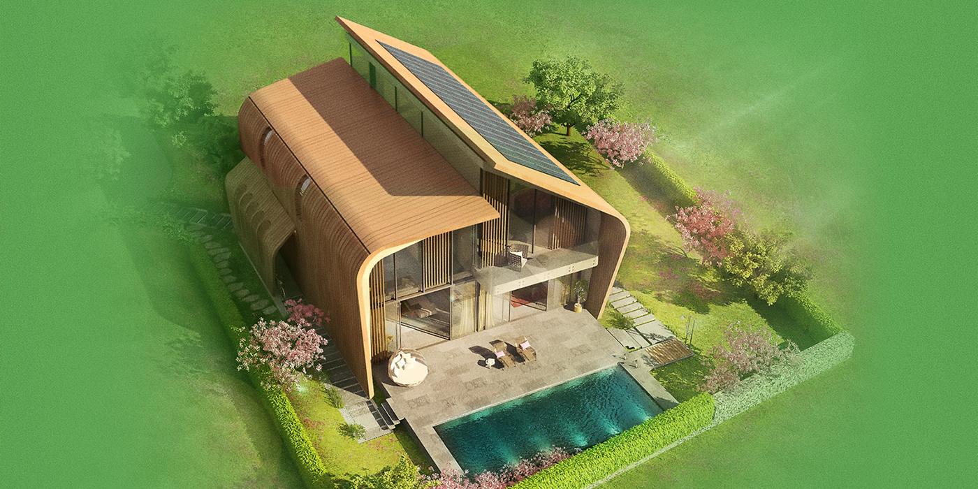
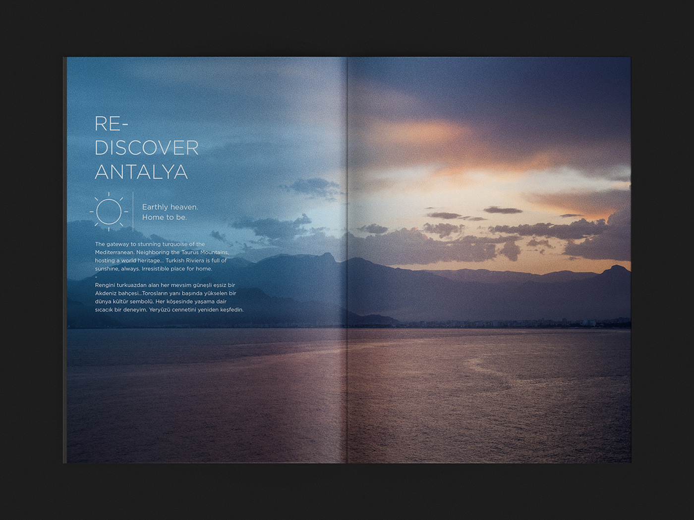
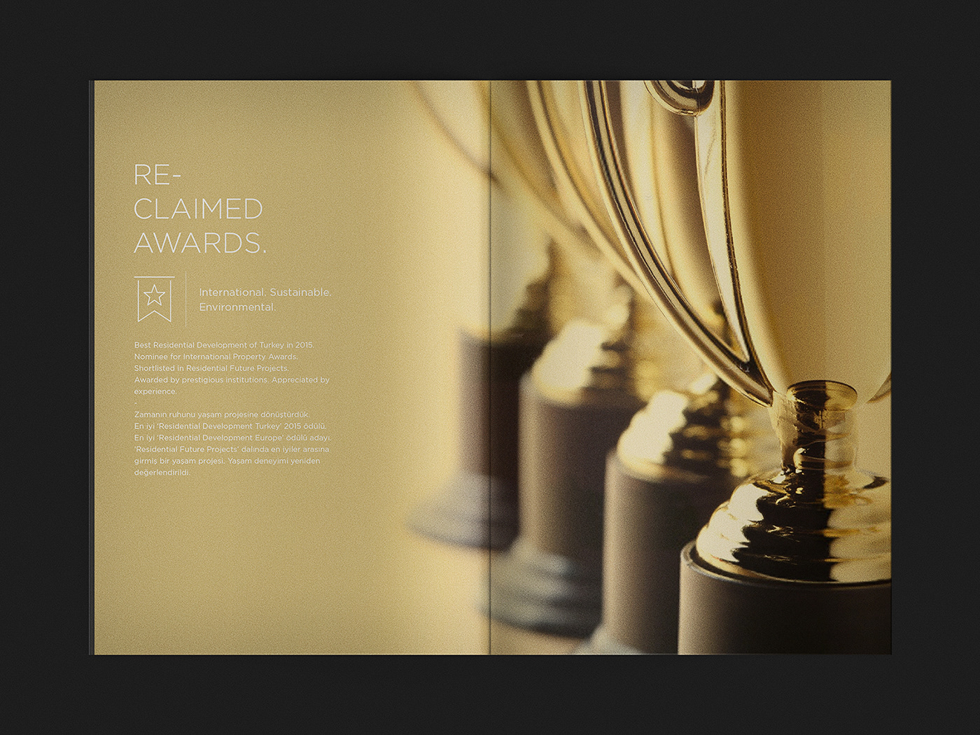
Kndu is an award winning project, designed by GAD for AHK Development, Construction Fitout FF&E Solutions. An impressive residential development located in Antalya, Southern Coast of Turkey. Including four large, twenty two medium, and twelve small residential units with distinct parking area, the residences are linked to the public transport by unique underground connections.
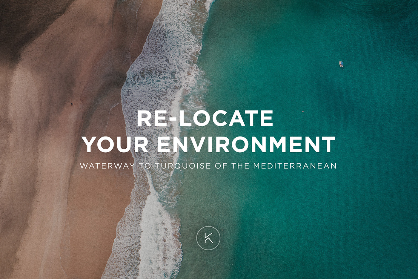
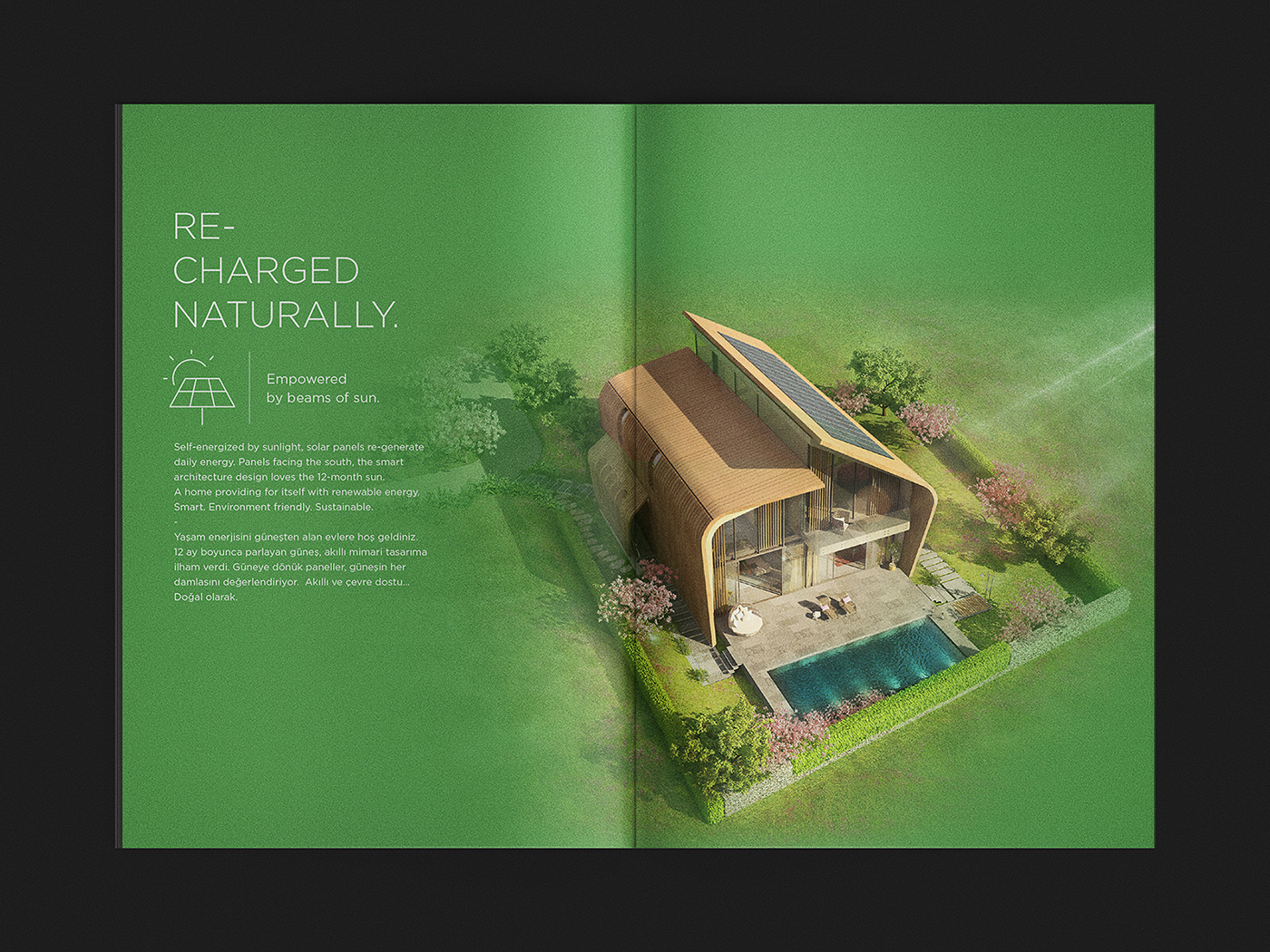
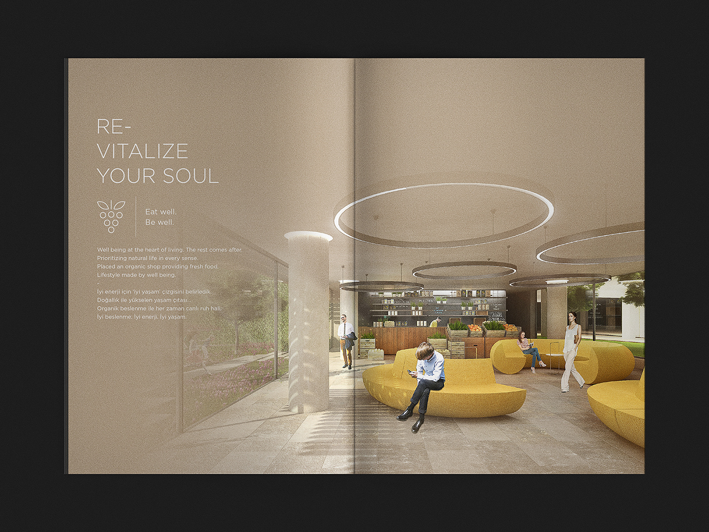
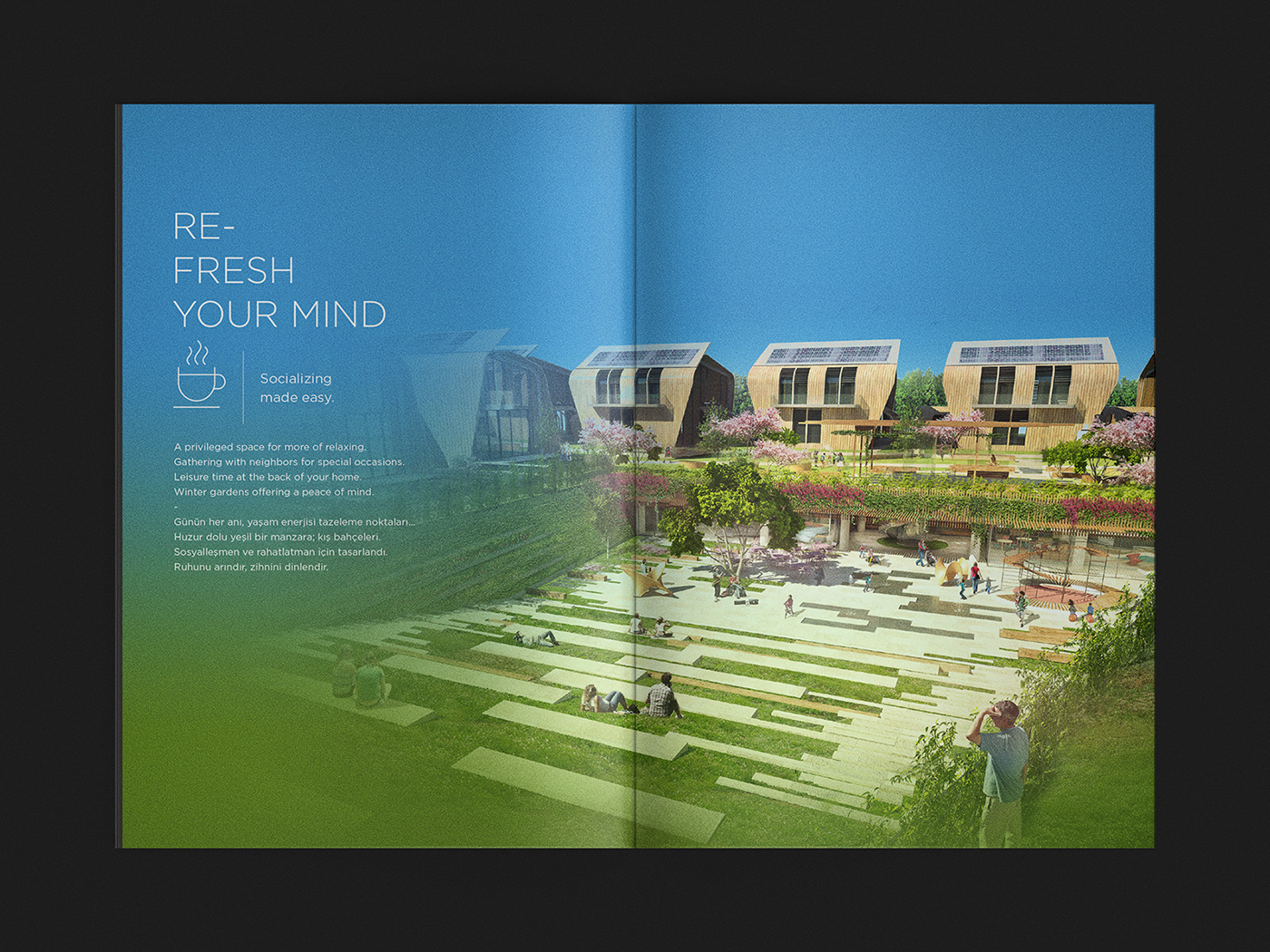
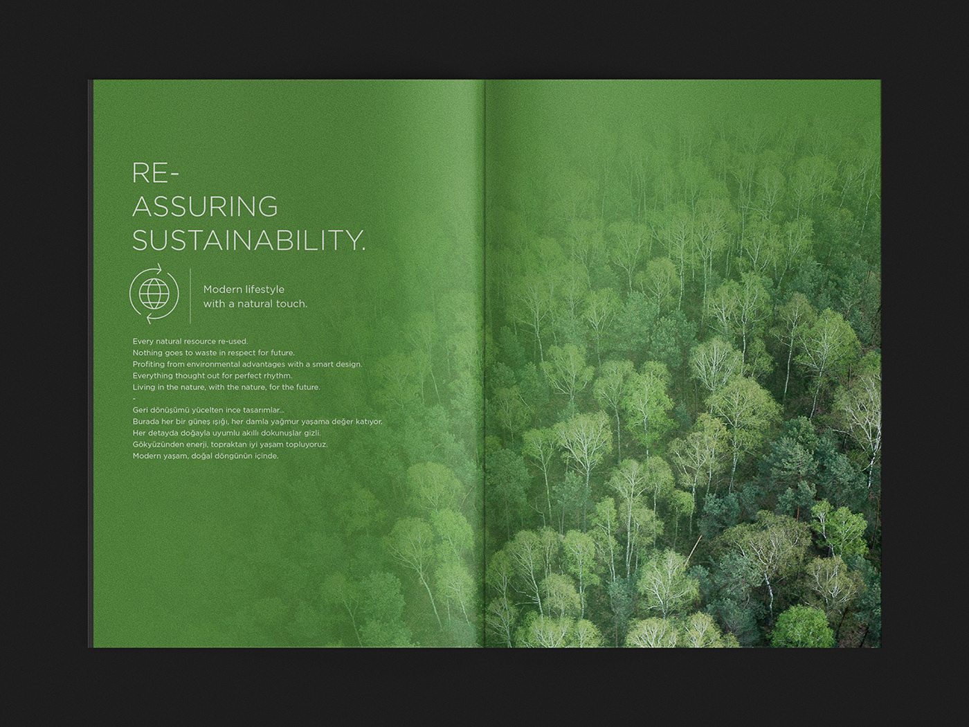
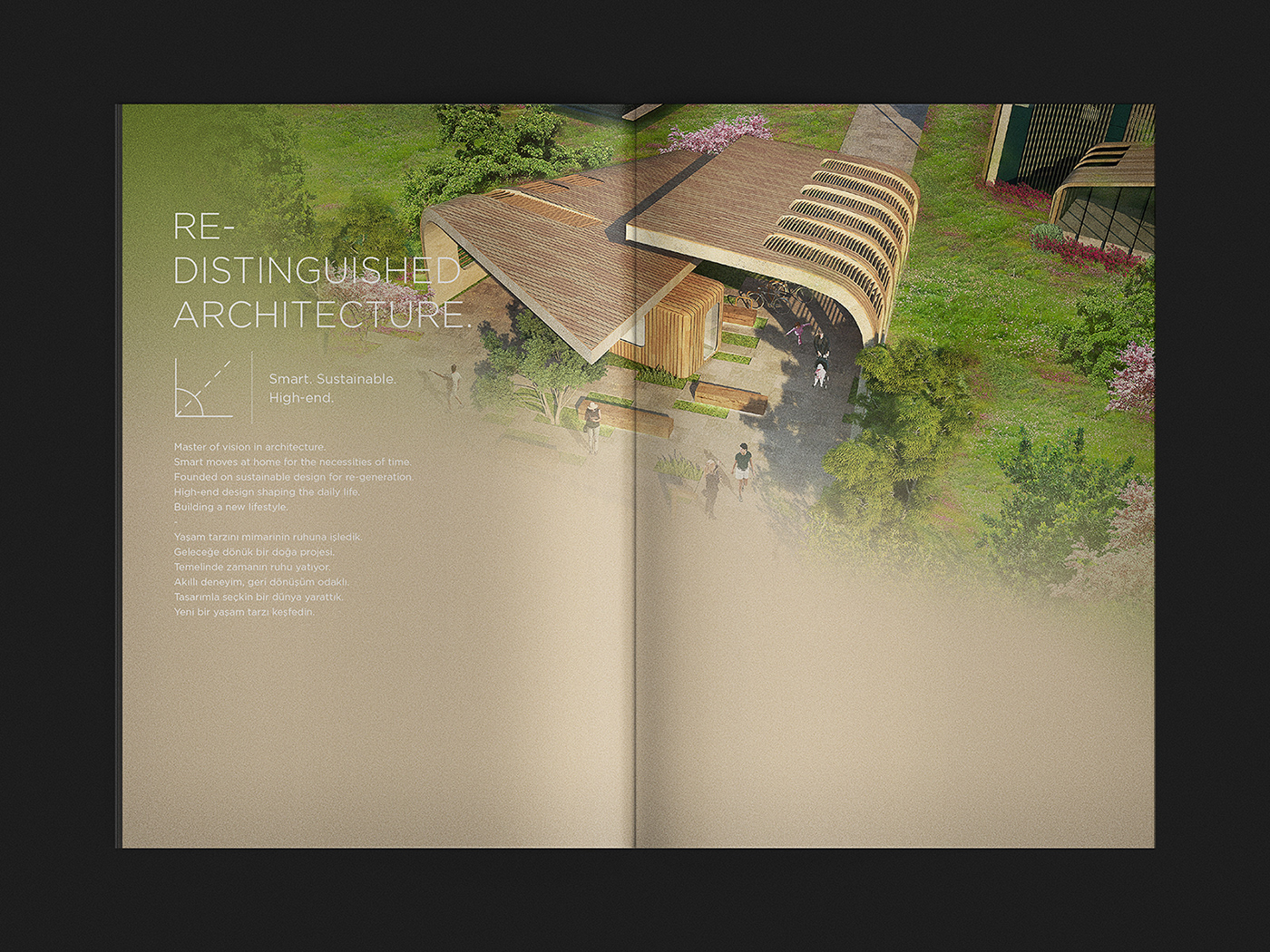
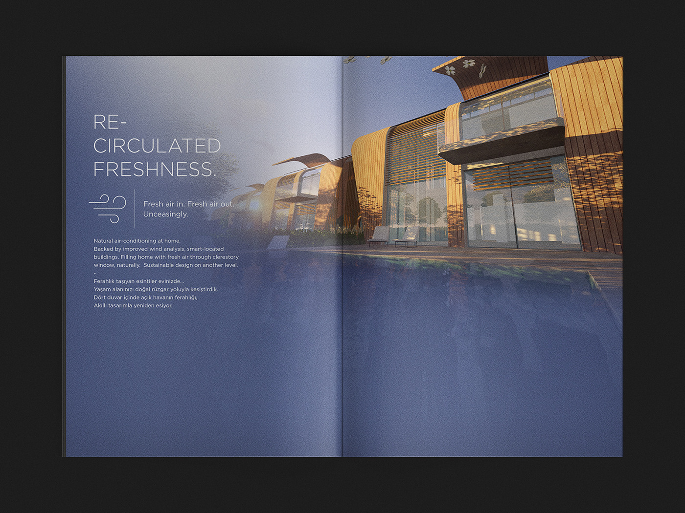
As required by BREEAM Certification, the project lays its foundation on sustainable design principles; sourcing exclusively local materials, producing lowest waste and pollution. The residential area hosts an immense communal green space, uniquely designed for circulation and recreation of fresh air. Moreover, the north-south orientation maximizes the use of sunlight as each dwelling produces its own energy with photo-voltaic panels.
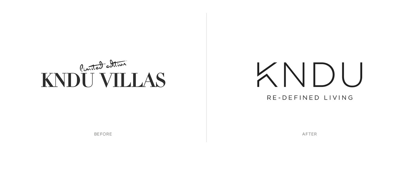
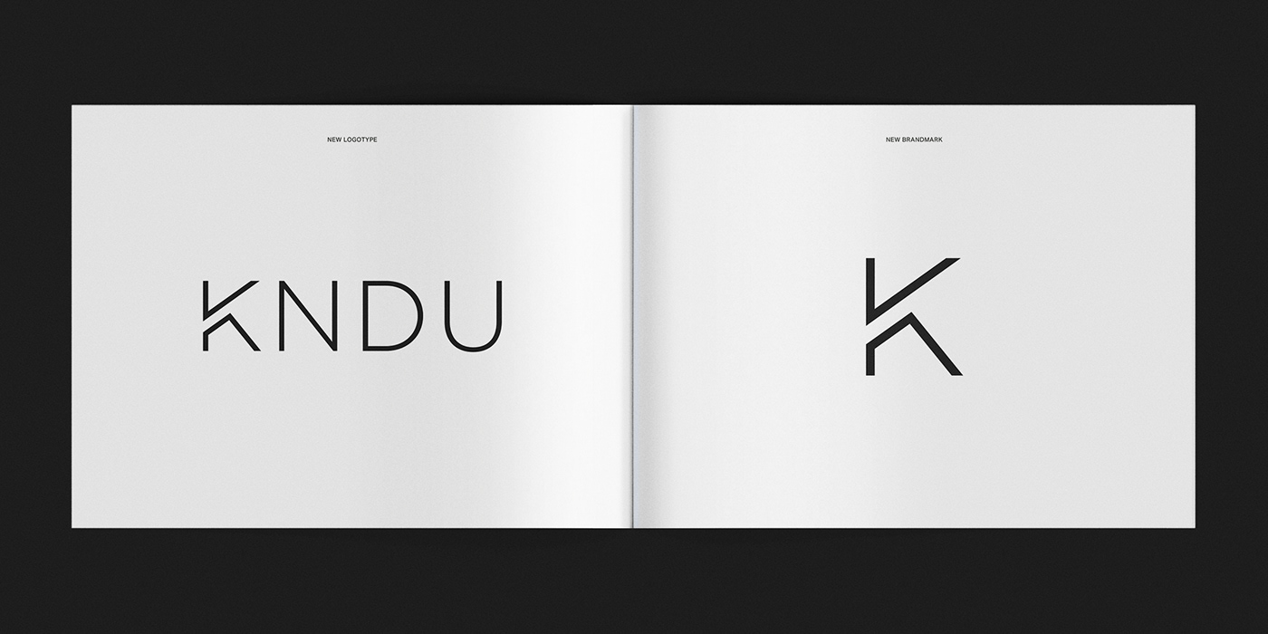
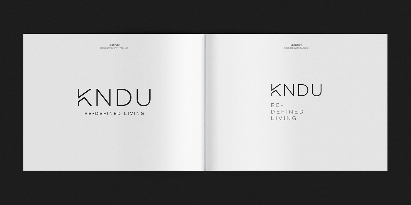
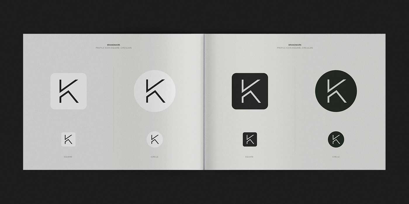
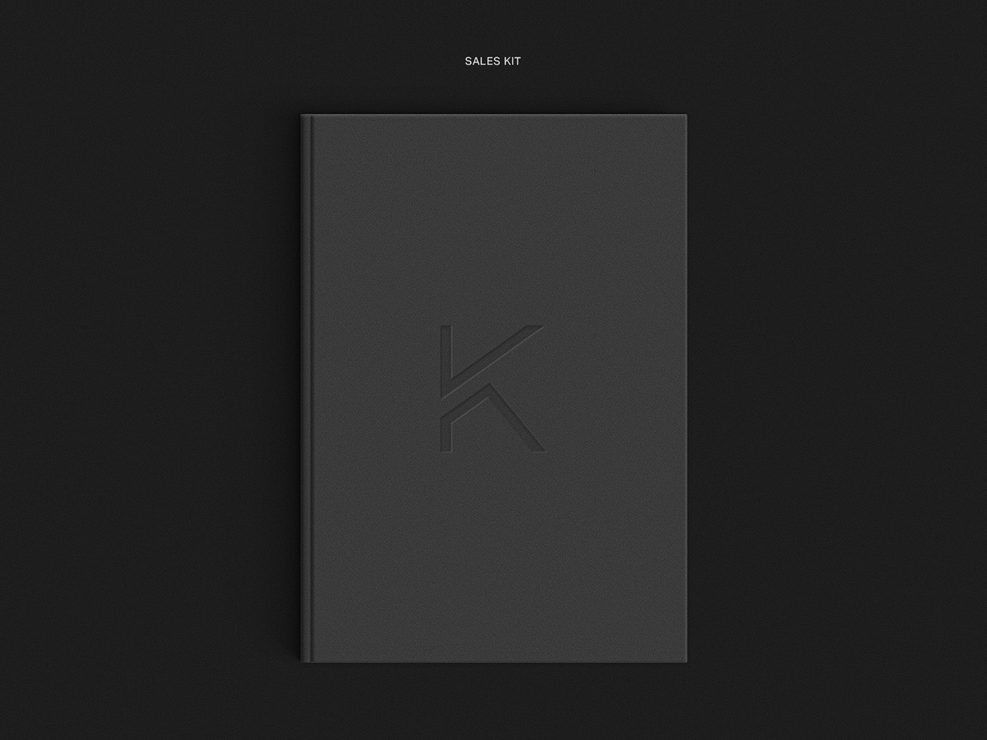
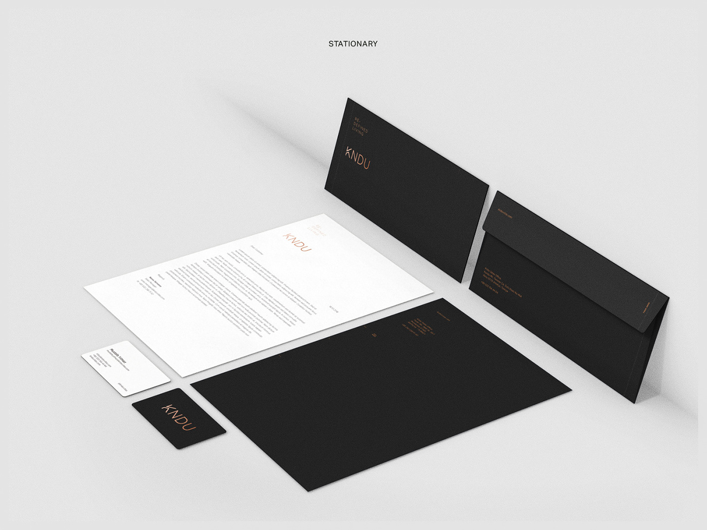
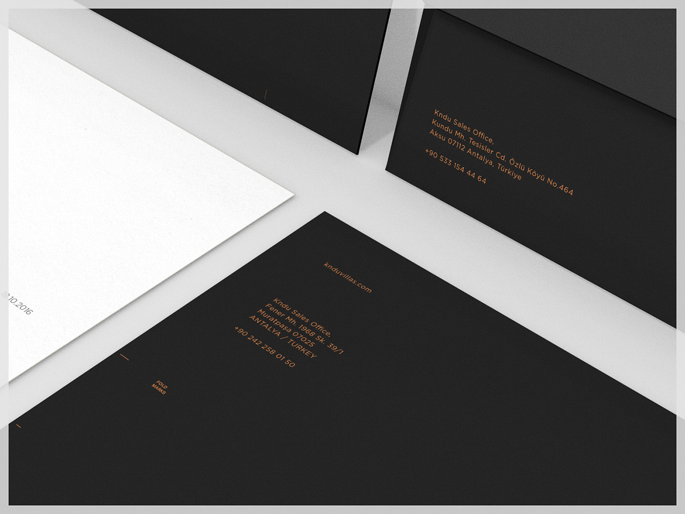
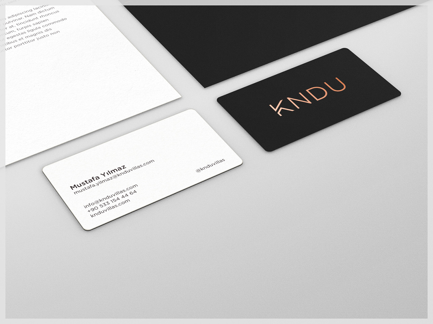
This project is an example of a simple sales kit brief turning into a holistic update of the project, empowering the marketing & sales muscles. We redefined the project, created a new logotype, developed the new icon system and wrote the integrated communication strategy based on "Redefining Living".
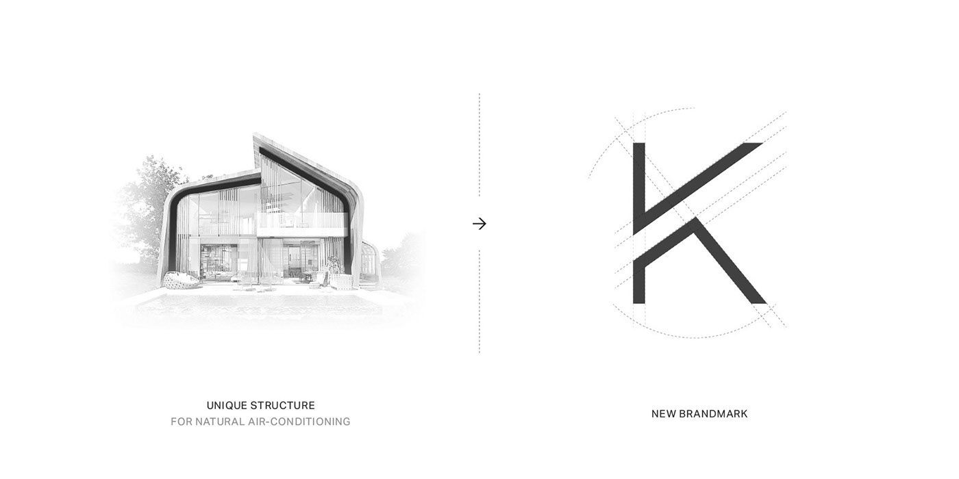
We wanted to create a modern and simple touch and as Jonathan Ive Said, "To be truly simple, you have to go really deep. For example, to have no screws on something, you can end up having a product that is so convoluted and so complex. The better way is to go deeper with the simplicity, to understand everything about it and how it’s manufactured. You have to deeply understand the essence of a product in order to be able to get rid of the parts that are not essential.”


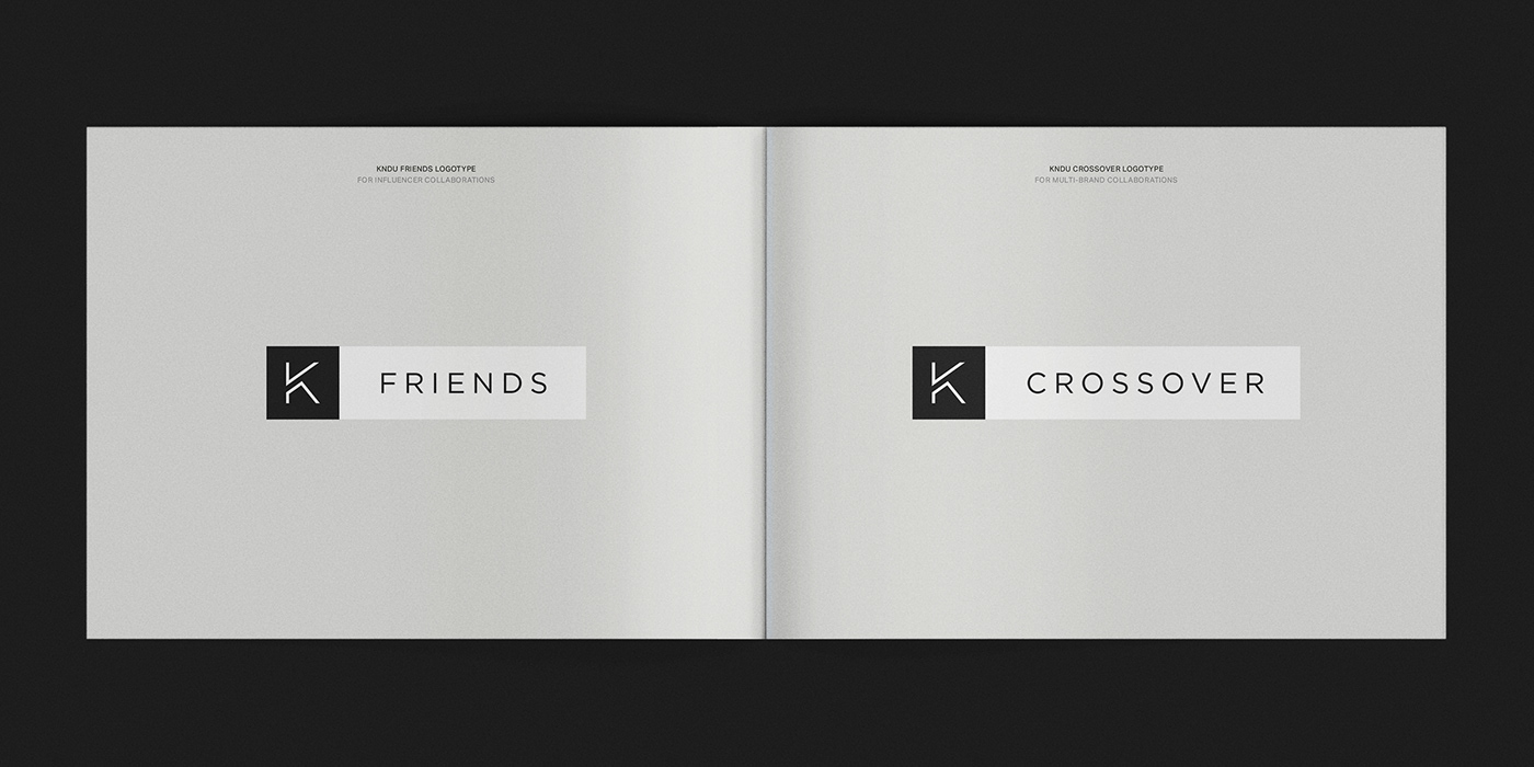
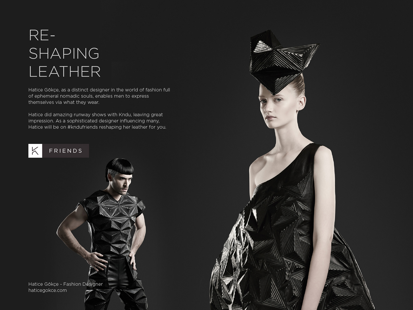
Kndu Friends & Kndu Crossover
Kndu Friends & Kndu Crossover is a collaborative project between influencers, brands and Kndu. The project is solely about building a culture through collaboration, creativity and exclusivity. The ultimate stories created by influencers and brands perfectly fit in the DNA of Kndu which reflects innovation, sustainability and smart future. This approach endorses brand culture and values.


Simple, Clear, Visual, Functional
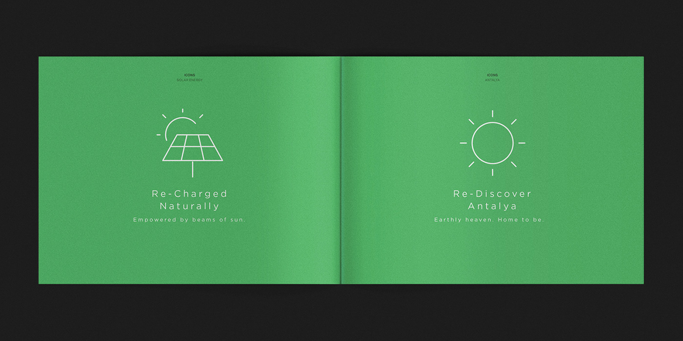
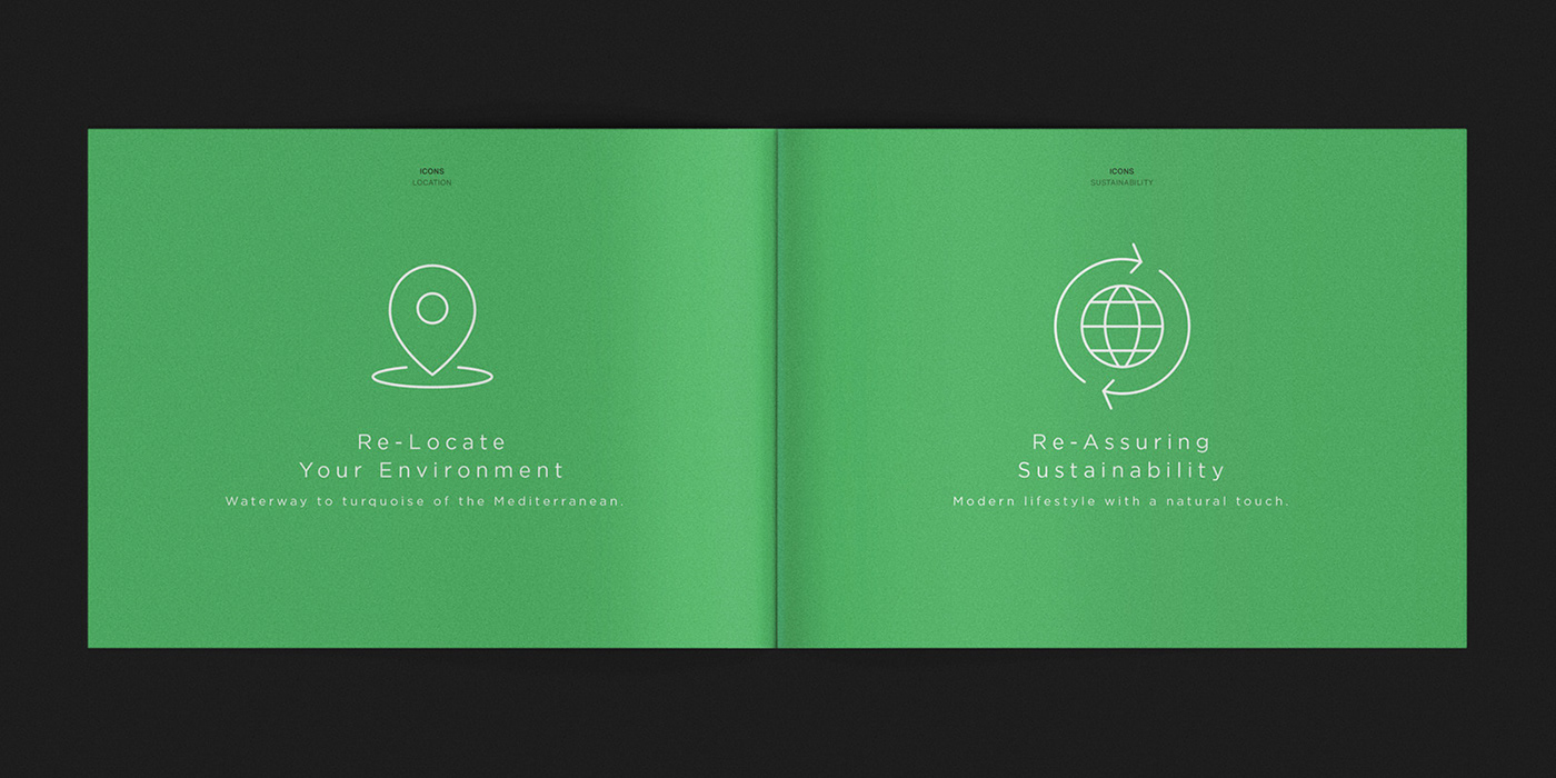
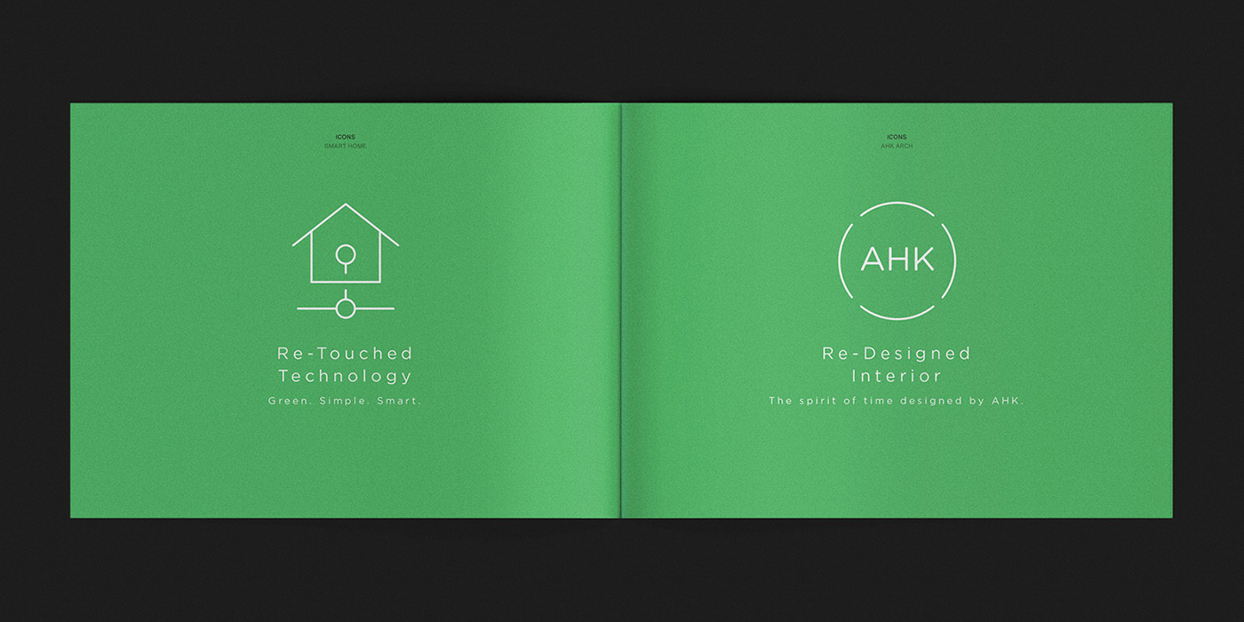
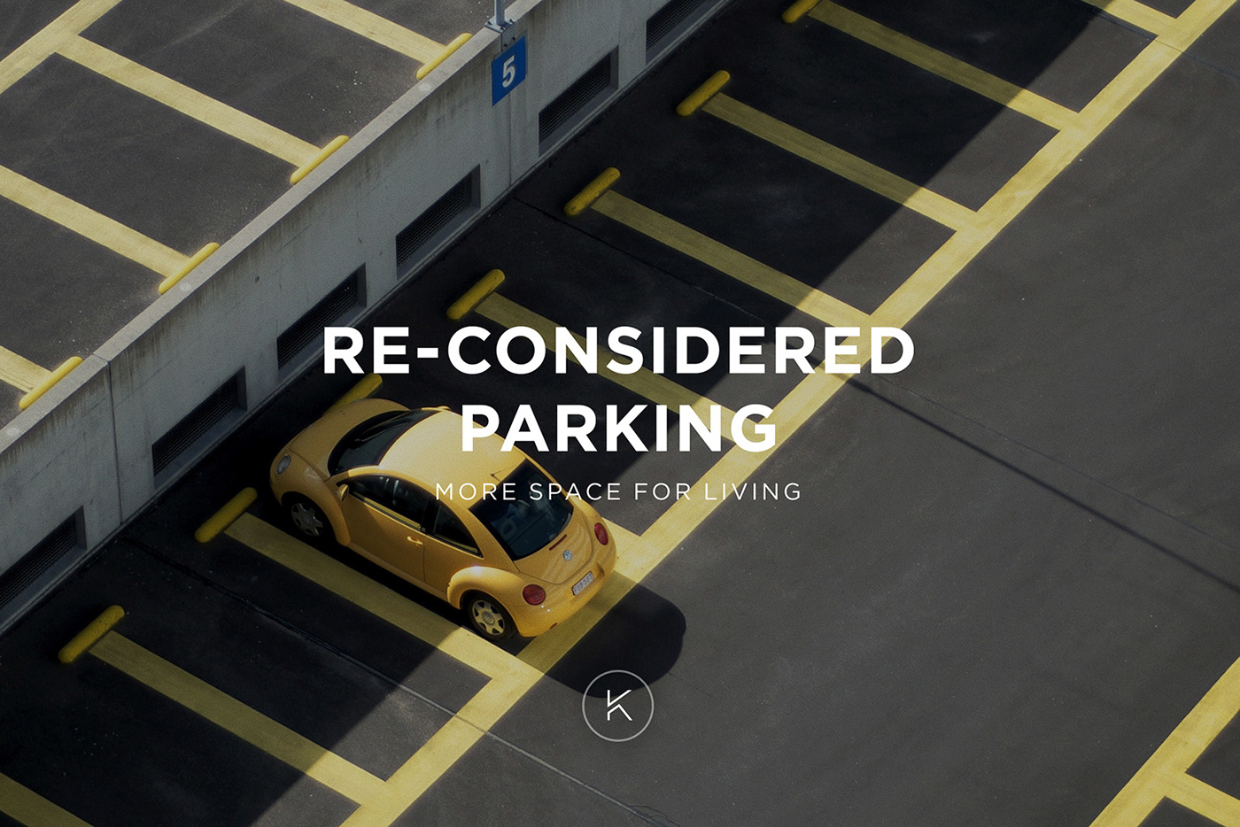
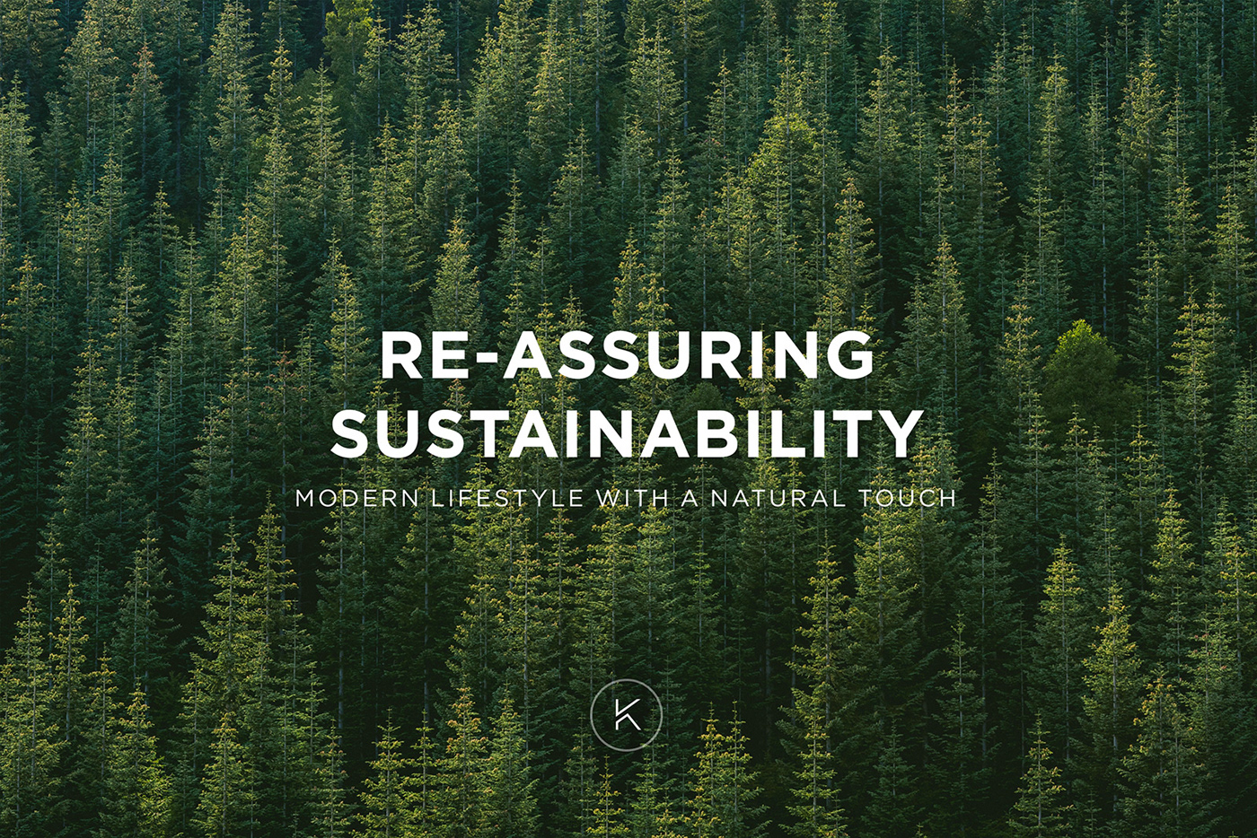
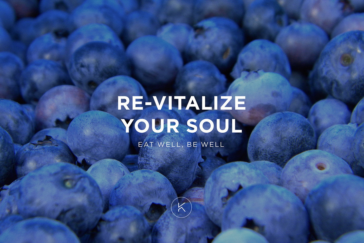
The style of the new line based icon system reflects the modern language of smart world. Each icon has an additional tagline and each tagline is created based on "Re-defining Living" motto of Kndu Villas.
The line strength of the new icons can be adjusted for a better readability in different sizes. Small icons have a wider outline than large ones. The line strength also follows the weight of the corporate typeface. So icon and tagline act as a connected element.
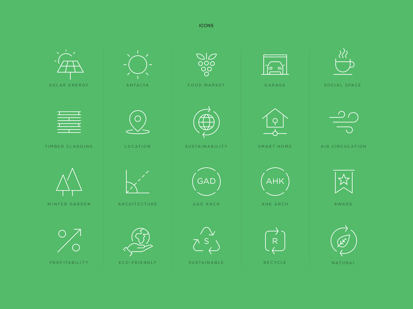
Each Feature is Represented by a Tagline
“Redefining Living” is a set of high-end features. These features were designed into a set of icons and represented by a tagline. Each feature is symbolized by a proper icon. Taglines and copies were written in Turkish and English for the ease of audience.


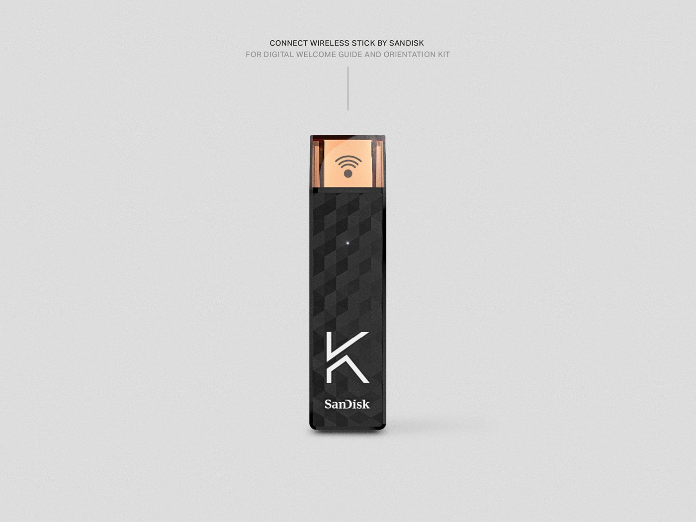
A Warm Welcome With the Copper Touch
Welcoming is an essential part of every home culture. So we greeted the new residents of Kndu with a set of welcome gift. The copper touch in gift selection highlighted elegancy. The household items reflected the unique desig and the feeling of technology. Perfect match for the future KNDU community.


© 2017-2018 Mehmet Gözetlik Residence Photography: Ali Bekman
-
Legal Disclaimer: Some imagery is used for Brand proposal only. Copyright of featured background images and photographs are the intellectual property of their respective owners.


