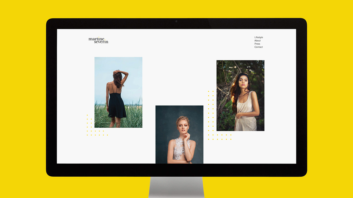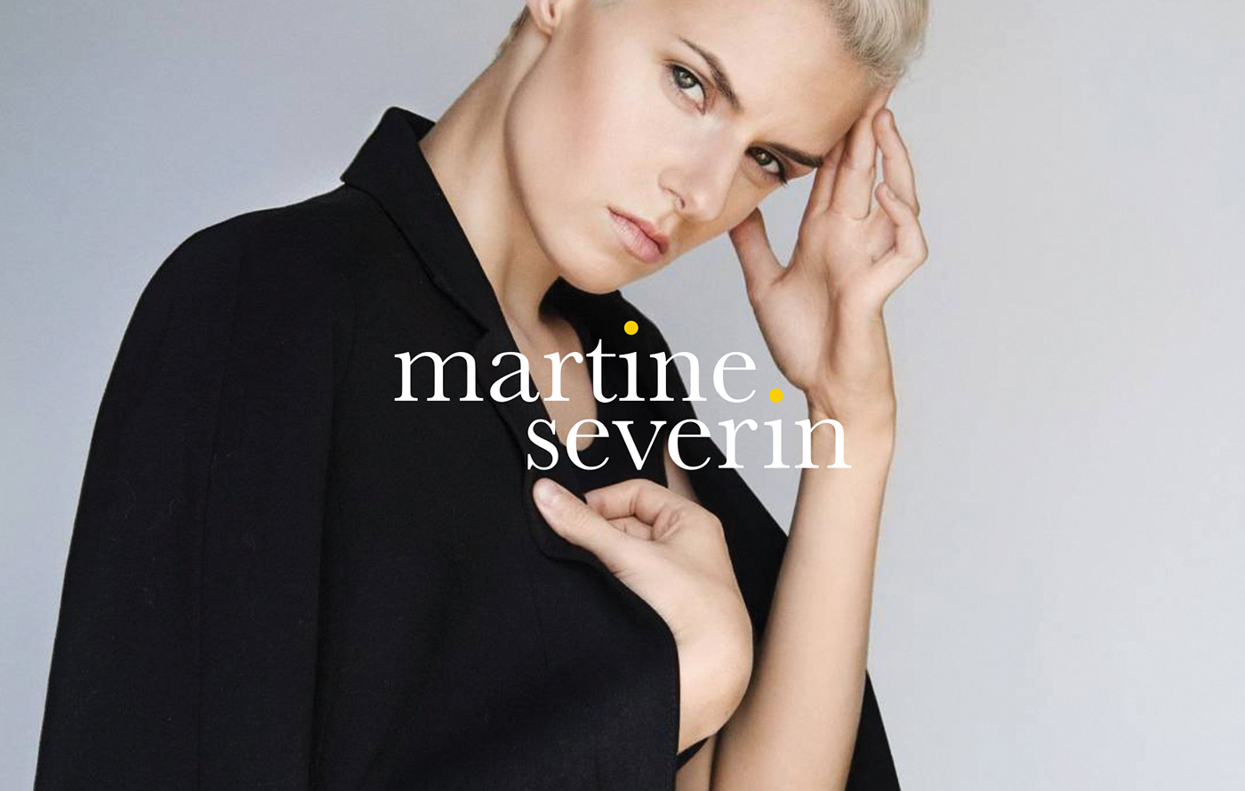

Martine's elegant imagery reflects the diversity that exists in our world. She brings curiosity and a sense of playful freshness to her work. We used these two experience attributes as a guide for the logotype and brand expression.


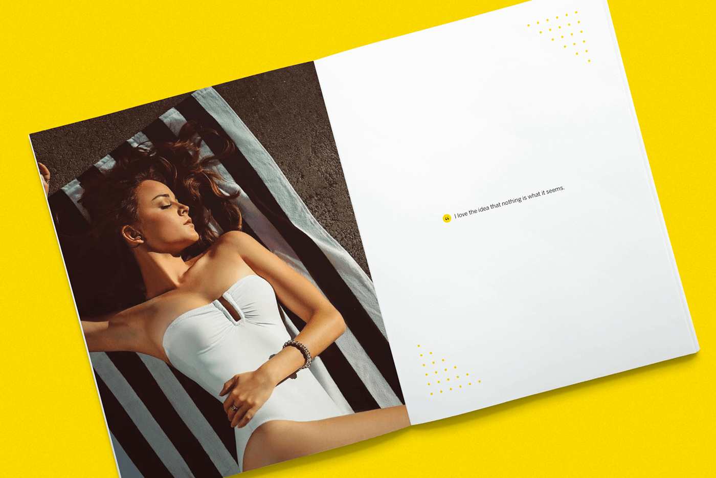
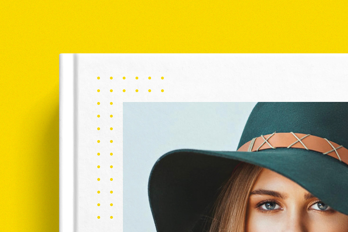
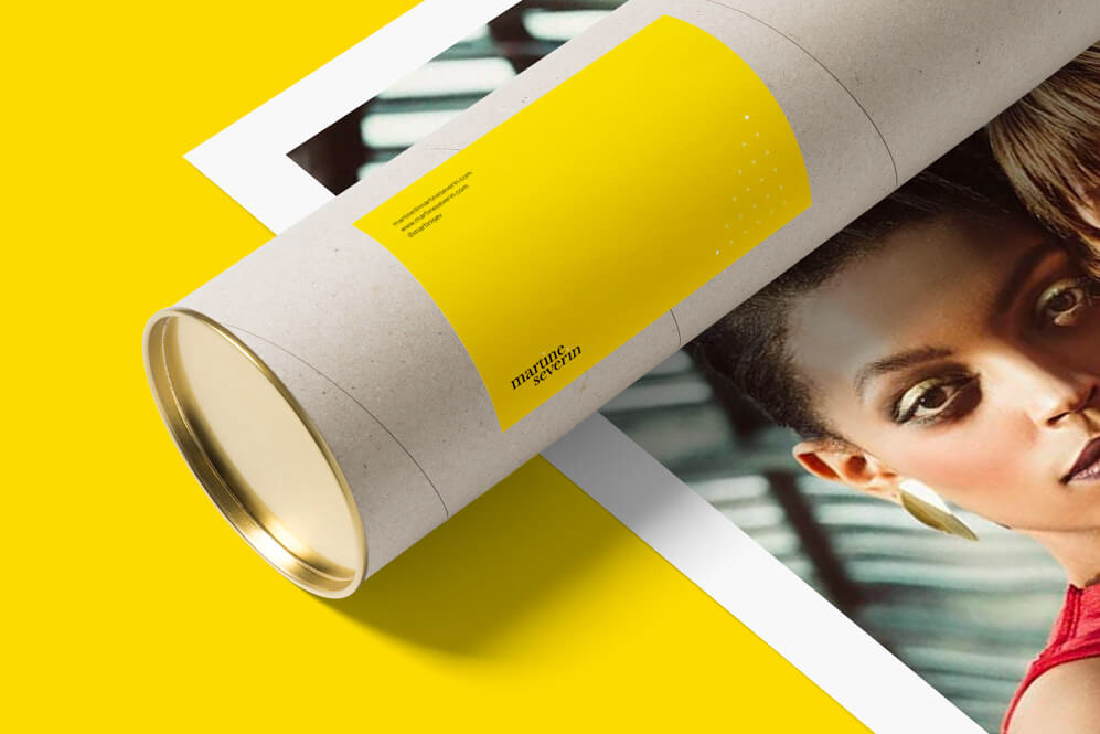
After researching her closest competitors, it was clear the identity needed to take a somewhat bolder approach to differentiate her, without reducing impact from work itself. We explored numerous logotype options, and always a bright, bold color palette to convey this playfulness. Settling on an almost Canary yellow, we paired our colors with a simple and subtle pattern echoing the dot patterns oftentimes found in camera viewfinders. This was extended into the tittle of the 'i' in the logotype. Across applications, the expression behaves as a flexible pattern that frames Martine's work.