

A-LEVEL GRAPHIC COMMUNICATION PROJECT
The project was based on a fabricated Gig/festival that was going to be taking place at a nightclub called The Limit which was a real club in the 1970s in the UK, Sheffield. Due to the 1970s early 80s settings I created my project based on the idea that The Limit was allowed to let the Sex Pistols play along with an array of bands from the punk era and onwards.
The following is a collection of digital work done for the project mainly in the form of posters, due to the time setting any online branding or advertising wouldn't of happened. I wanted to stay true to the time period and the form of branding, advertising and look that The Limit would have.


Posters done in Adobe Illustrator CC 2018
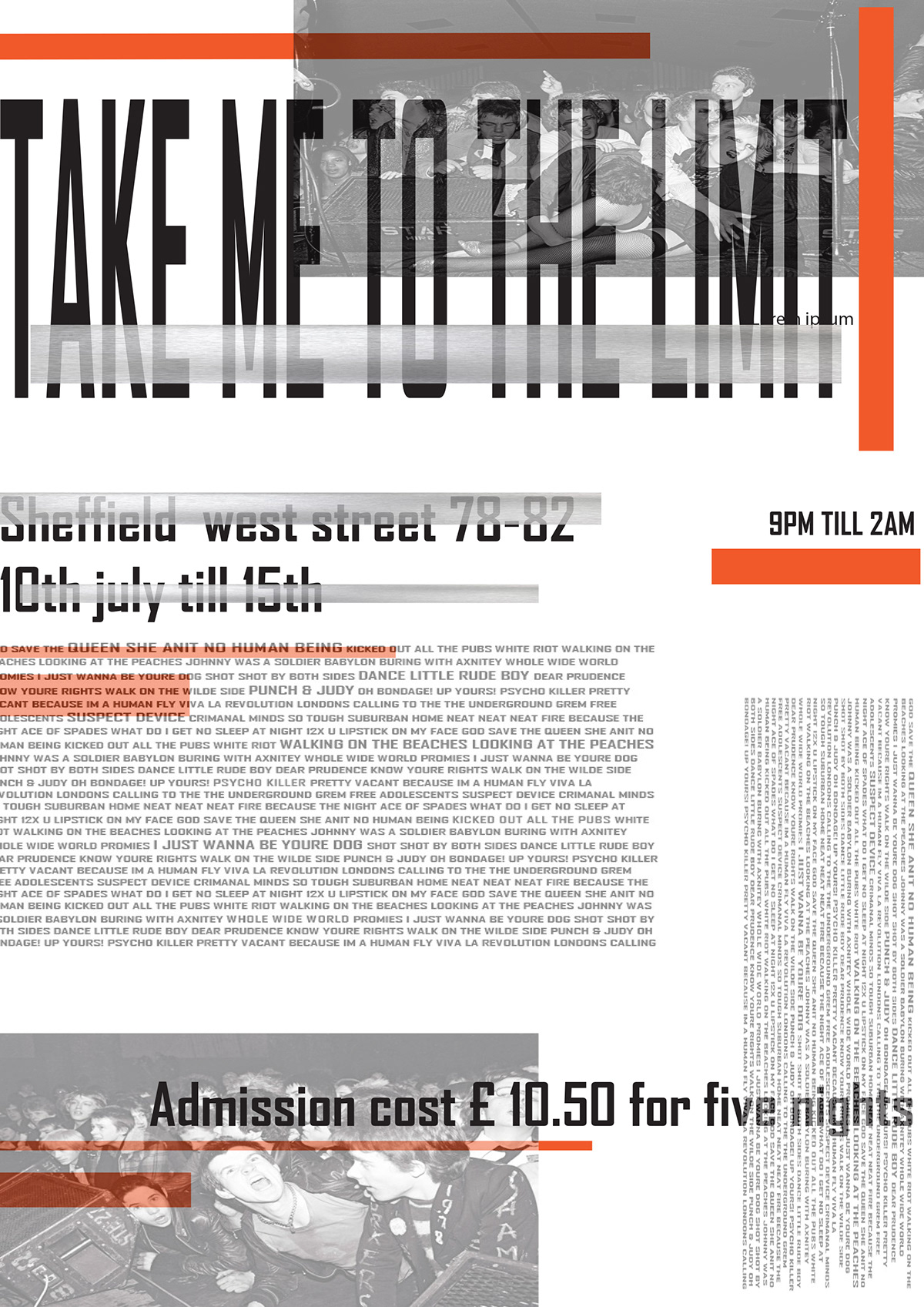
Promotional posters for the gig, simplistic design and centred around typography and layout. Heavily influenced by the works of Wolfgang Weingart especially the curve and sizing of type with the word ANARCHY and era of new wave typography.
4x6 inch print outs have been added to the items that could be added to the A04 aspect of the exam also just another way to add to the idea of how intimate and small something like this event would of been where zines, collectables and hand crafted memorabilia was created in small batches to have as a token from the event, a keepsake not mass produced but each one slighly different.

Combining the curve type with the harsh angled type with very controlled spacing allowed for a more interesting design and layout, also the sharp contrast of the orange with the type angled with the straight orange line add to the overall appearance of the gig.
The curve was a staple that flows throughout the project, using type as what the graphics would be centered around not just an add on to inform but inbedded into the overall design of the posters.


Experimenting with having photographs as the background to some of the graphics and how that would counter to the more controlled simplistic nature of the white background posters.

This particular poster was influenced and referencing a poster by Armin Hofmann that he did for the Basel Theater for Giselle in 1959 which had the text going verticaly. Adding the vertical text changed the poster and gave it more of an edge aesthetically.
Posters done in Adobe Illustrator CC 2018
Was a mixture of combining the white washed out backdrop to the posters with the opacity changes of the photography, also working with the type in a different way in terms of layout and the lack of curve in the design. Also still influenced by my references taking in the layout which was influenced by the Emigre Magazine and also the likes of Wolfgang Weingart and the New wave era of graphic design and typograhy which yes became more established in the 1980s but i felt works with the 1970s setting and overall aesthetics of the branding.


This GIF of the match is to do more so with the theme of my AO4 product which will be a classic matchbox on a larger scale to have as a promotional keep sake from the gig that will hold a cassete tape, illustration print outs, matchsticks, safety pins to create a real essance of the era im trying to replicate in this project.


The illustrations are to be included as a promotional offer as one off prints either as a collection of 4x6 inch print outs to be included in the AO4 section of the project as items to be placed inside the built product again relating back to the idea of not being mass produced each slightly different and on a samll scale adding to the project.
Darwing done in Adobe illustrator CC 2018

Done using Adobe Photoshop CC 2018
Ideas surrounding the devlopment of using the illustartions as prints on shirts/sweatshirts that would be available merchendise at The LIMIT during the Gig.


