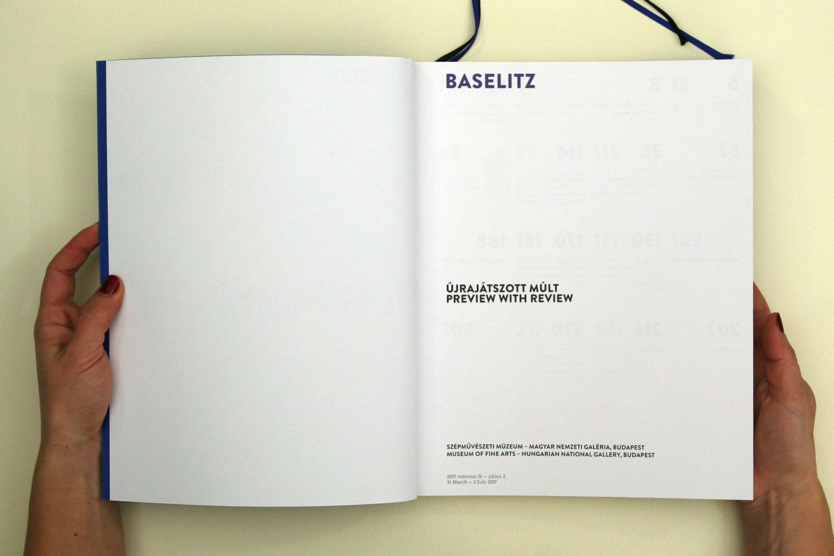
BASELITZ
Preview with Review
Exhibition Catalogue design for Museum of Fine Arts Budapest
The book is the catalogue of the exhibit dedicated to the oeuvre of Georg Baselitz as the third station of the Classical Contemporary German series staged by the Budapest Museum of Fine Arts.
All of Georg Baselitz’s work is organised around abstract time: he processes and transforms the past, his own memories, motives from the German landscape and his German roots. This distinctive method of handling time preordained that the works should not be presented in chronological order but along major turning points and subjects exposed. This is what the title of both the exhibition and the catalogue allude to: Preview with Review.
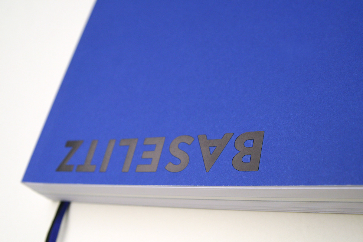
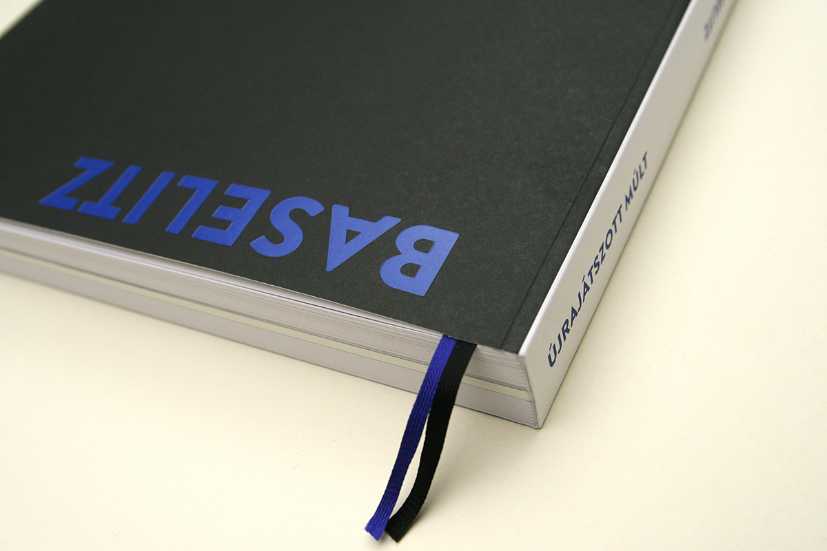
We wanted the cover to minimally reflect what has become the Baselitz trademark: upside down depiction. For this reason, the BASELITZ name appears upside down on both the front and the back cover, with hot foil stamping. When first picking up the catalogue, the reader automatically starts from the back since this is where they see the writing with the “right side up”. Only once they open it, do viewers realise that they need to turn the whole book around and the upside down symbolism comes to light.
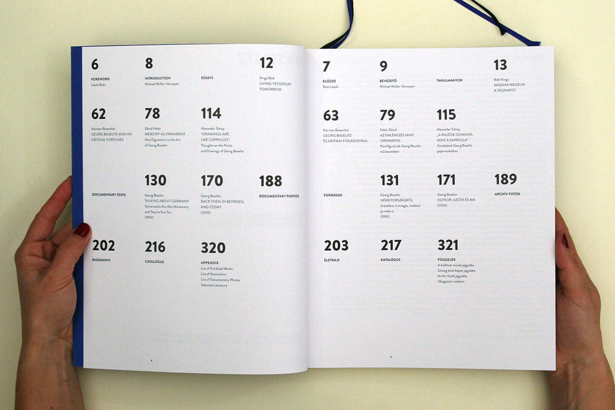
Besides the studies written in connection with the exhibition, the presentation of the works displayed and an archive photo section, the bilingual (English, Hungarian) catalogue contains the artist’s credo in the form of a personal statement. This division in terms of the content influenced the structure of the catalogue as a whole. A marked separation between the visuals of the various units is discernible. We used a parallel but asymmetric mirror to portray the bilingual text on the page-pairs with the English text on the left and the Hungarian on the right. A page-pair with the same colour as the cover opens each unit.
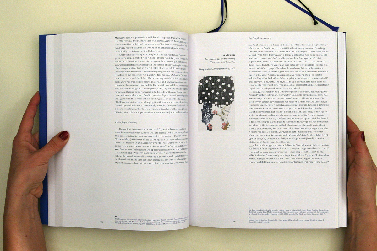
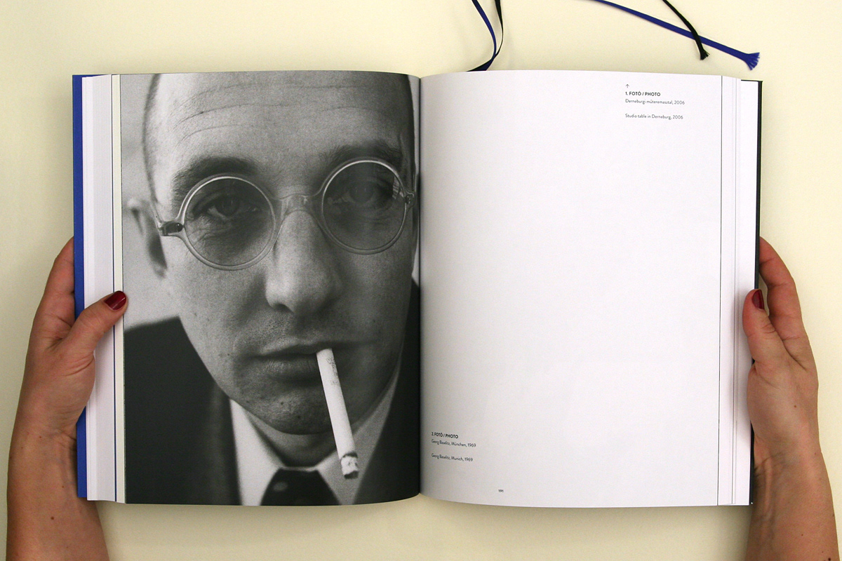
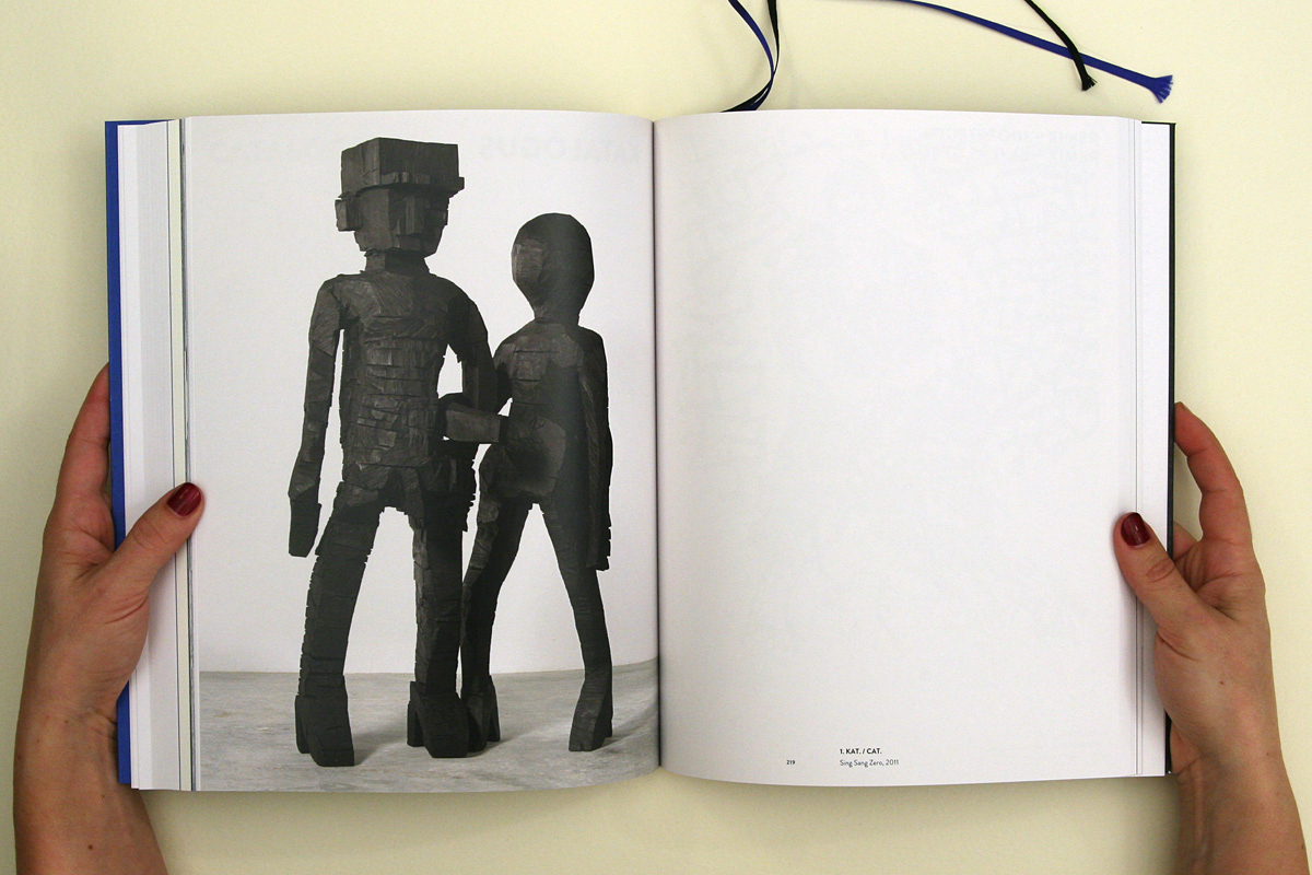
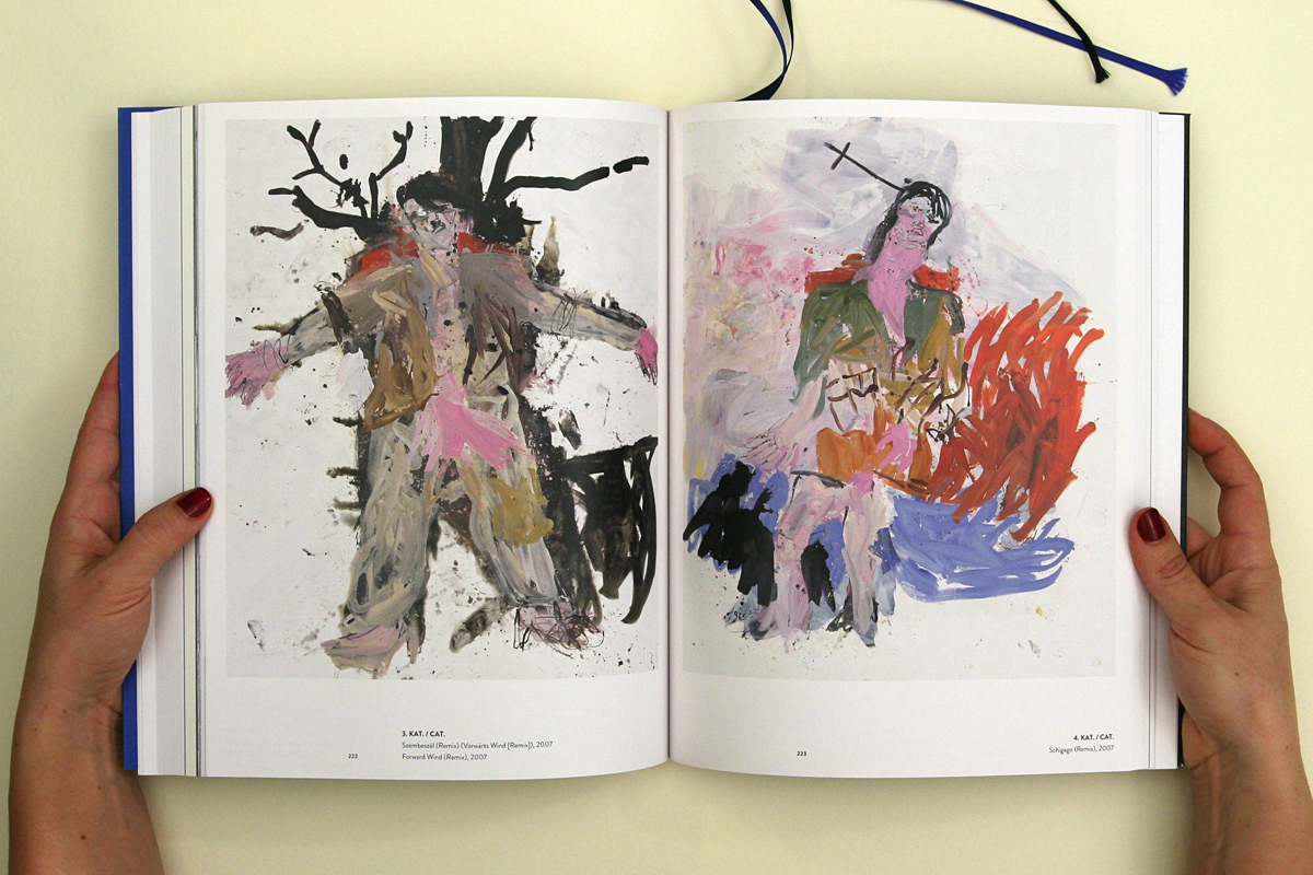
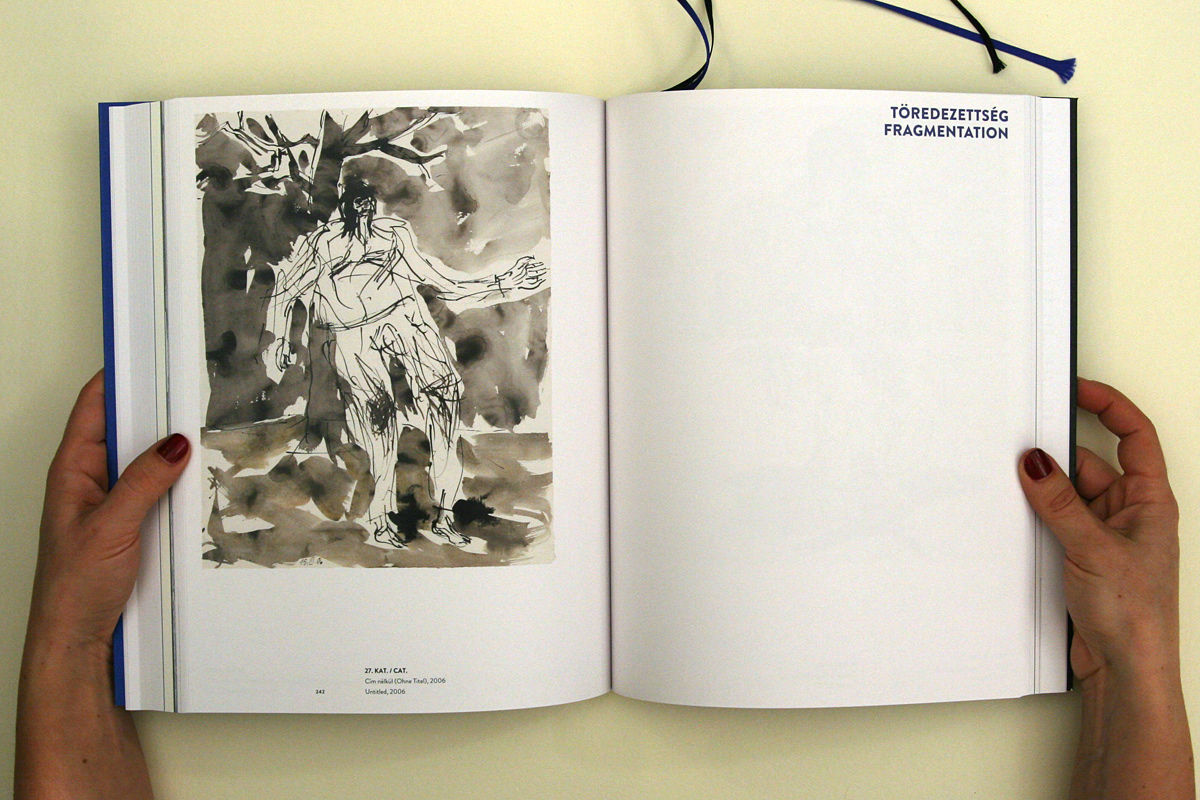
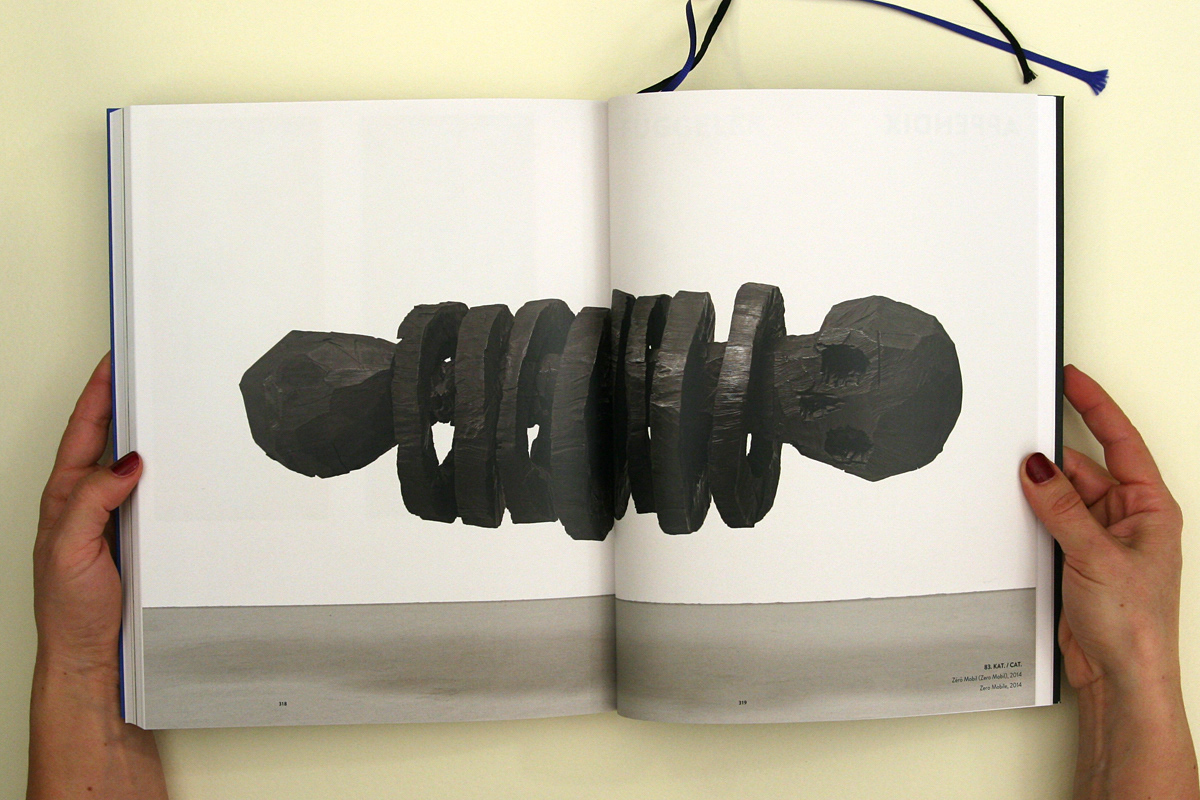
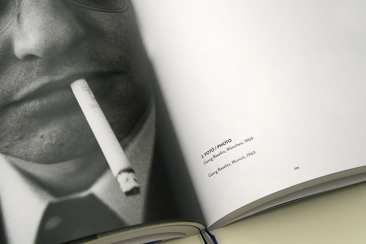
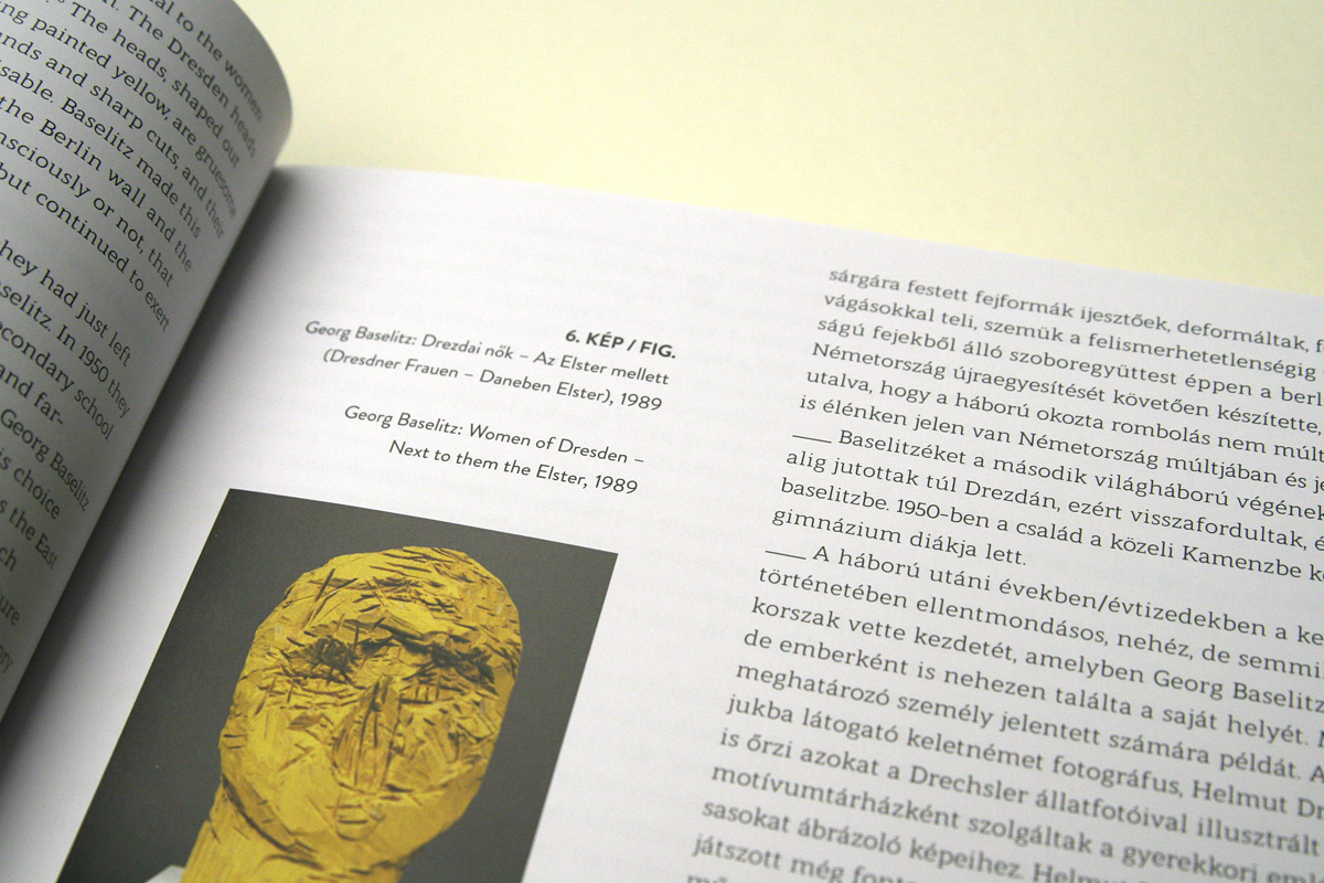
The first unit is the 3 studies, where the reader is aided by picture inserts, captions and footnotes. The picture inserts are not directly related to the text so we managed to avoid repeating the images next to the two language versions. This flexibility allowed room for a typographical game to place the images on the page-pair in a diversified manner. The second unit comprises Baselitz’s own texts. We wanted to make this the turning point of the catalogue: as if this were the point where the artist and the art take over so we separated this part by using different paper and larger font coloured in blue. This is followed by a shorter but lively documentary photo selection. The spontaneous snaps bring the artist, Baselitz closer to the reader. The last part is a unit presenting 80 works. We kept the order and structure displayed in the showcase which is very characteristic of the exhibition because the works do not portray the oeuvre in chronological order but along major turning points and issues. Typefaces used: Brandon Grotesque, Modum.
Curator: Kinga Bódi
Graphic design: Bieder Anikó, Gelsei Balázs
Photos: Gelsei Balázs