


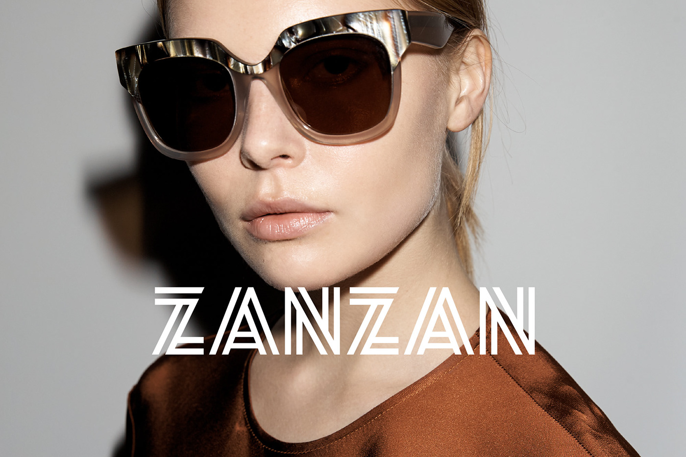
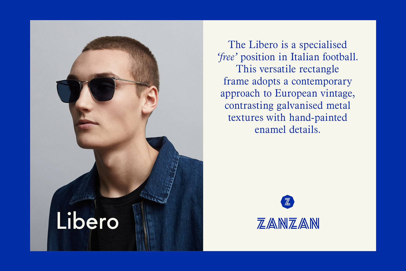

Inspired by classic Italian coastal motifs, our rebrand of ZANZAN relaunches this iconic eyewear brand as they extend their product range to include optical & mens collections in 2018.
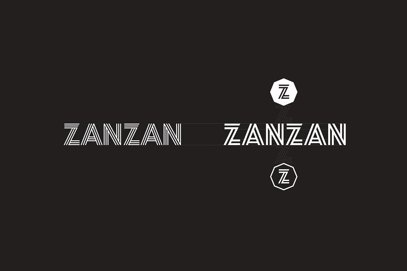
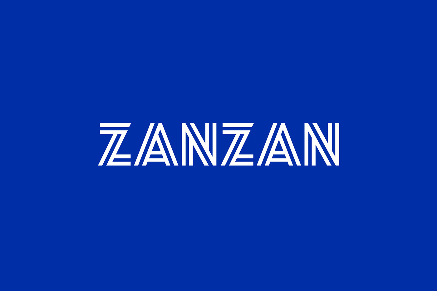
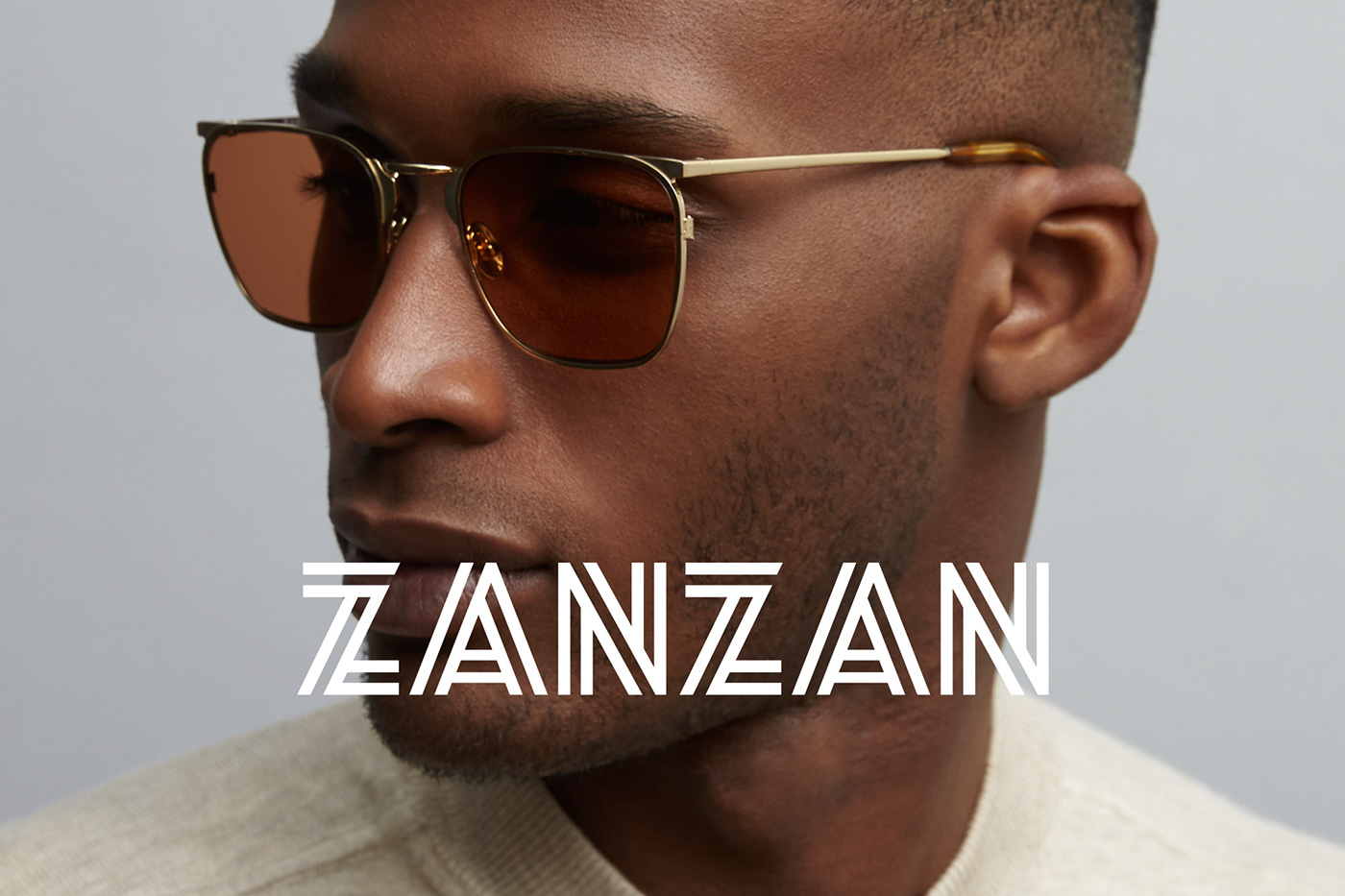
The dynamic ZANZAN striped logotype is at the heart of the identity system. Elements of the original mark needed to be retained for continuity and the new logotype had to appeal to a wider audience of men & women. Production issues associated with the previous mark, were ironed out with the rebrand.
We introduced a series of graphic marks inspired by iconic parasol silhouettes that delineate ZANZAN optical & sun collections through a simple graphic system that operates above (sun) and below (optical) the logotype.
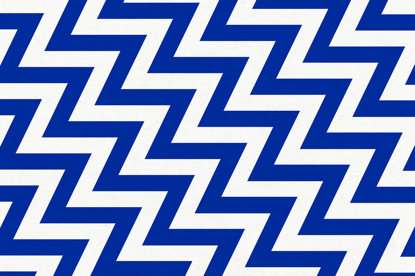
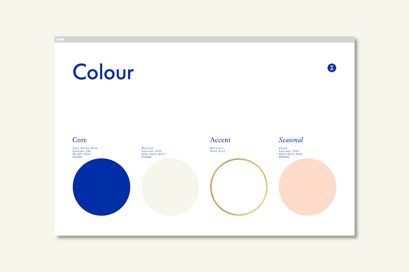
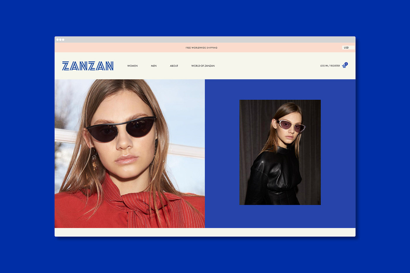
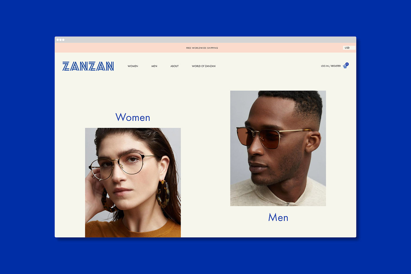
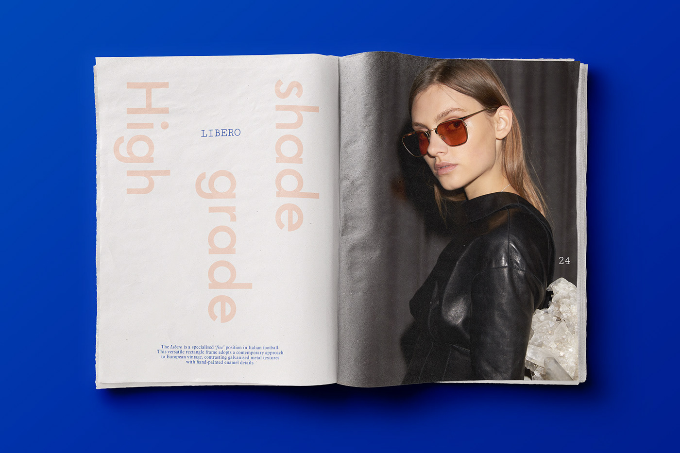
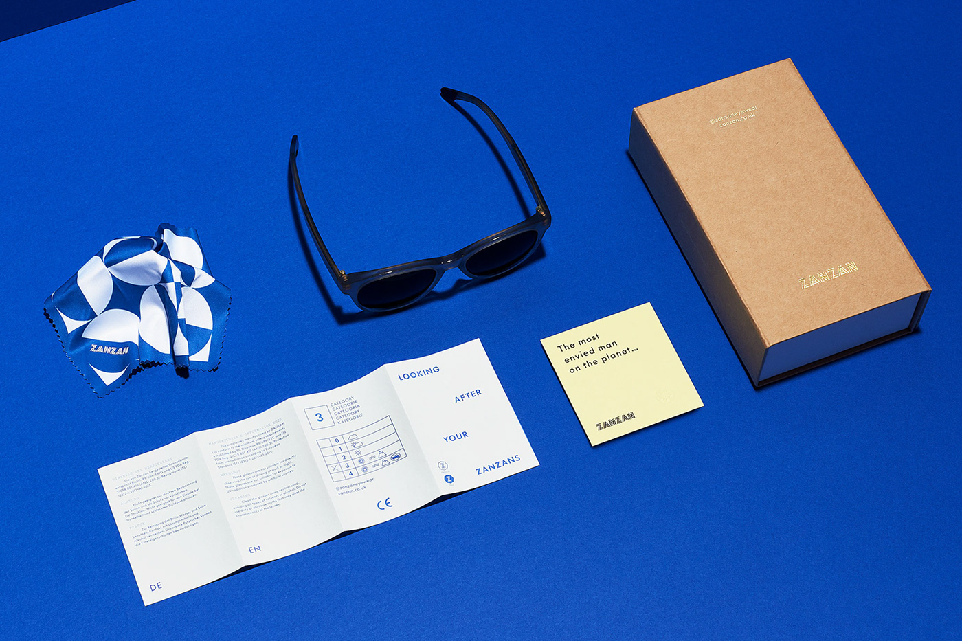
A vibrant core colour family with seasonal shifts operates alongside pattern and a versatile approach to typography — this ensures playful elements are easily retained throughout the identity application. While we didn’t design Zanzan’s online store, our identity elements, approach to typography and colour palette ensure it’s consistent with the overall ZANZAN experience.
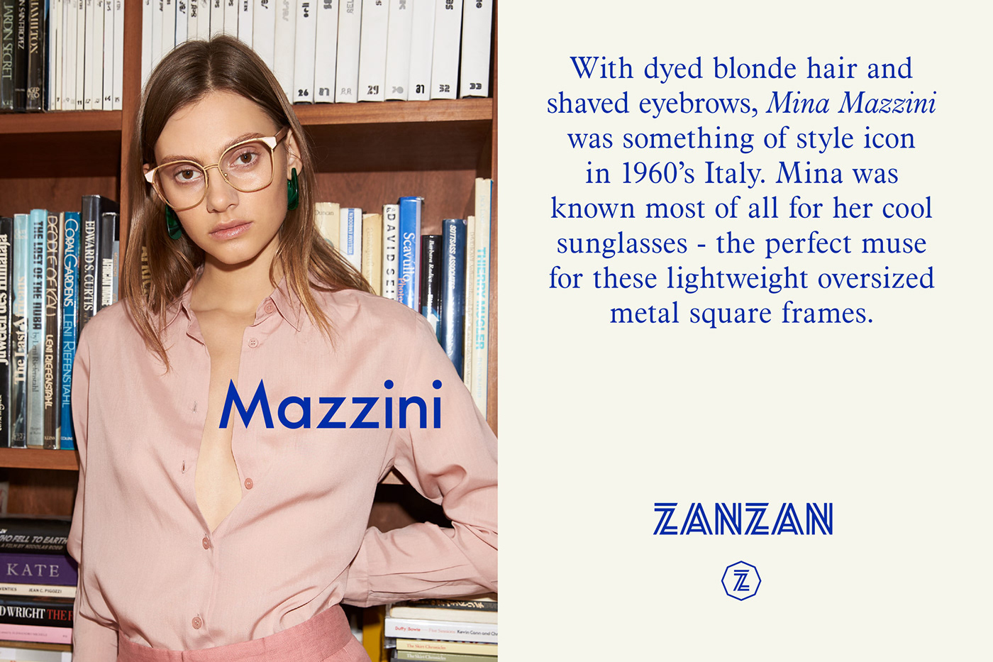
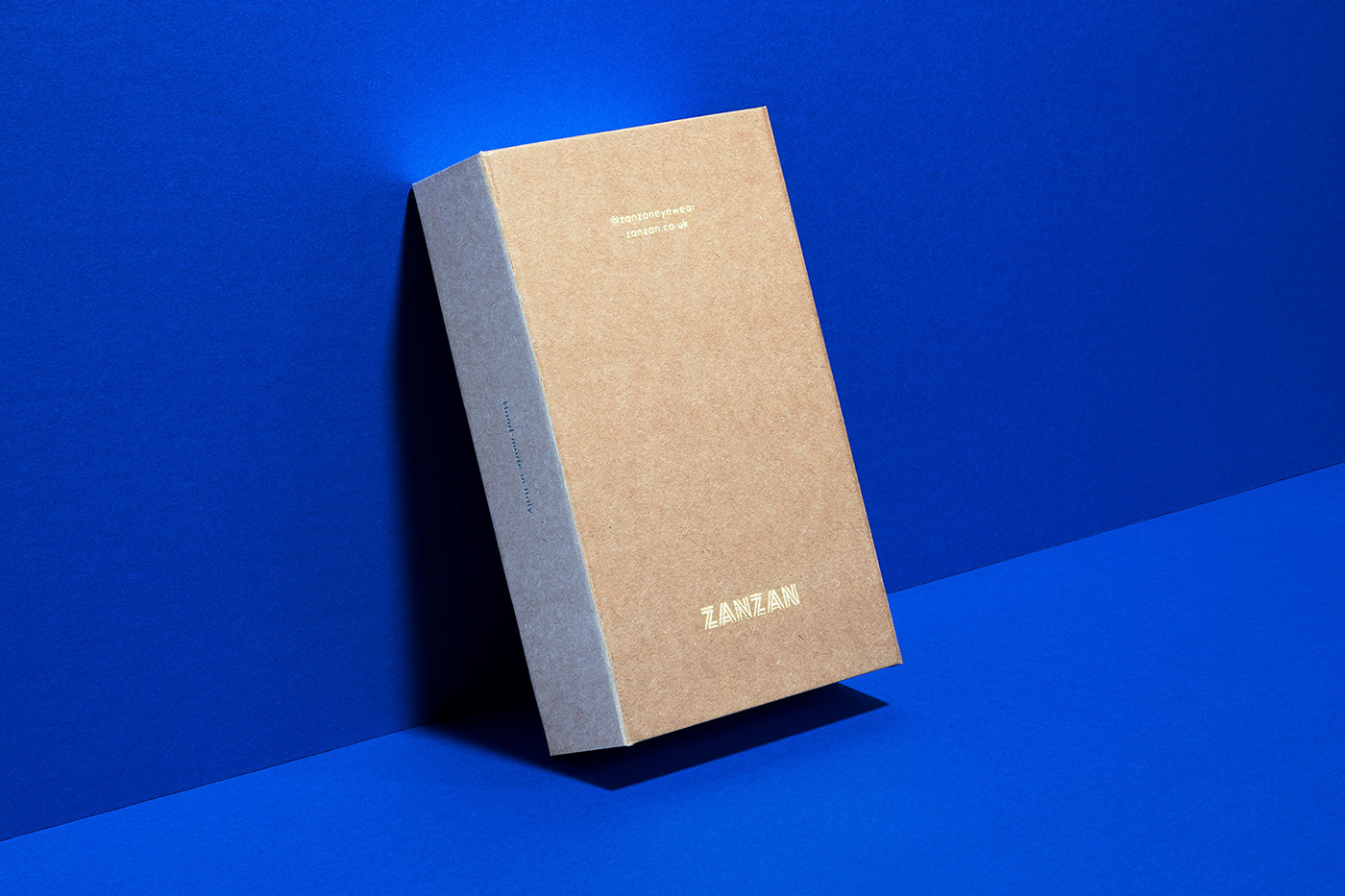
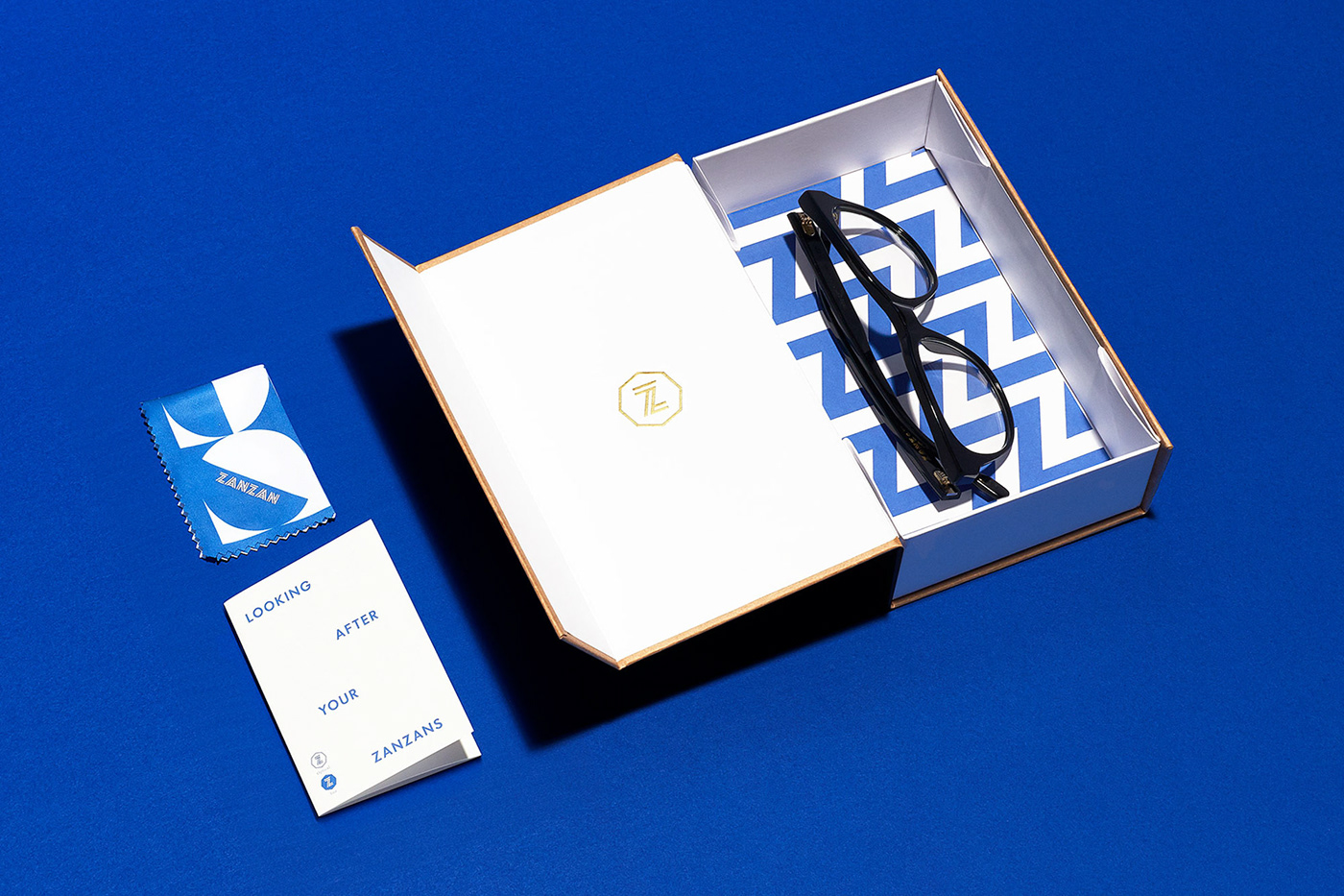
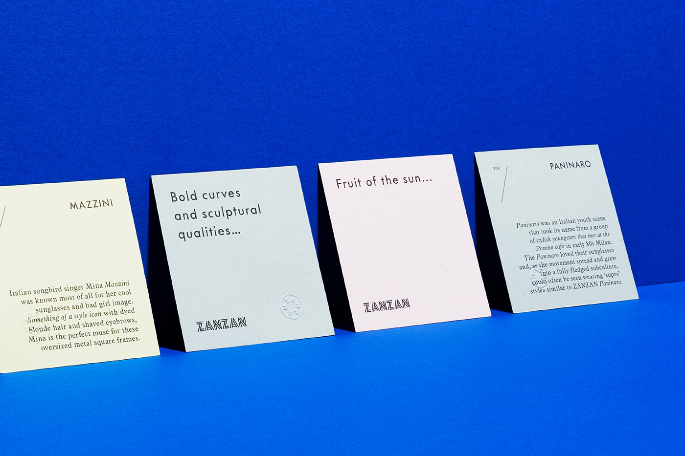
Working with creative partners who understand the importance of quality brings the Zanzan brand to life. Beautiful portraiture by James Nelson and Progress Packaging’s attention to detail elevates all aspects of the ZANZAN packaging. Use of G.F Smith Colorplan for product documentation and storytelling provides a tactile extension of colour through the brands collateral.


