
NPWF Rebrand
The National Partnership for Women & Families fights for equality, reproductive rights, health care, fair pay, and paid leave. They are at the front lines, pushing for policy changes with lawmakers in Washington D.C.
CHALLENGE
NPWF is one of the most influential women’s organizations in the country but their visual identity did not reflect this. The organization’s full name, National Partnership for Women & Families, is hard to remember and doesn’t quite roll off the tongue. Through my research on branding in the non-profit sector, I found that visual identity is moving beyond just a tool for fundraising and focusing more on social impact and organizational cohesion.
SOLUTION
The new logo incorporates distinctive shapes to make a lasting imprint on memory. Reducing the logo to its acronym allows for easier recognition while the lower-case letters keep the brand approachable. NPWF’s refreshed red and blue color palette is a contemporary take on patriotic colors. The primary font, League Spartan, is a modern, geometric sans-serif that creates bold and unapologetic headlines. The secondary font, Libre Baskerville, is elegant, optimized for body copy, and contrasts well against League Spartan. NWPF’s new look is fresh, credible, bold, and reflects their power and wide-reach used to foster change and bring policy action.
LOGO DEVELOPMENT


BRAND GUIDELINES - LOGO VARIATION

LOGO RATIONALE
The check-mark communicates NPWF’s focus on legislative action to bring change. The brackets signify a commitment to the security and stability of our nation's women and families while upper right bracket is omitted to symbolize the breaking of boundaries/ceilings.
BRAND GUIDELINES - FONT


BRAND GUIDELINES - voice

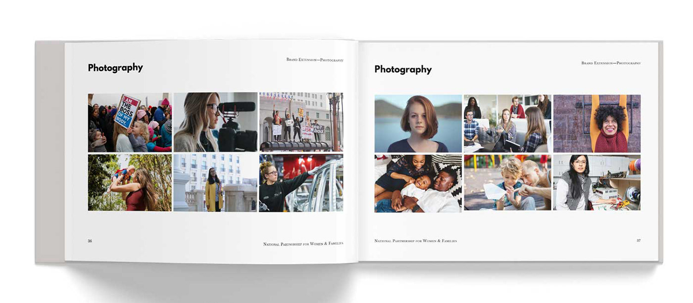
BRAND GUIDELINES - photography
GALA DINNER - ATTENDEE BADGE

BRAND GUIDELINES - SOCIAL MEDIA

