| About
„Weź się zbierz” (pol. "Let's get together" ) is a NPO created by a group of young people living in the city of Gdańsk in northern Poland. Initially it was simply an informal gathering of people willing to make some positive change within their community and invite others to do so. In time it has grown into new initiatives focused on specific areas. The current structure is:

Weź się zbierz: ( pl. Let's get it together ) core of the organization, created to activsize citizens for common goals meant to "change the world" one step at the time. The initiatives are small, but the big goal is to create self-sufficient and involved civil society through "pebble effect"
Weź to omów: (pl. Let's talk this over ) the initiative bent on promoting new quality of a dialogue between citizens, concerning pressing matters using moderated discussions and safe space for expressing opinions.
Weź to podnieś: (pl. Let's pick it up ) the initiative promoting cleaning public areas and forests by mixing the ecological happening with a family picnic and a friendly atmosphere.
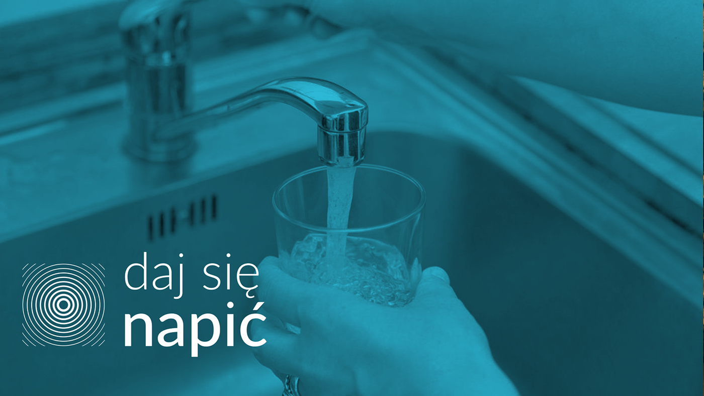
Daj się napić: (pl. Let me drink )the two-way initiative. First is promoting tap water in Tricity as a fully fit for drinking without additional filtering. Second part is inviting pubs and restaurants to serve its guests tap water as a free service, when requested. The quality of Tricity's tap water has been fully confirmed by official health department.
| The narrative
Creating visual identity for the whole organization required making four projects which would work both as a separate entities and elements of a bigger whole. In the end, the idea behind the project had to be universal and simple enough, so that the four initiatives ( and the future ones ) could be easily represented using similar graphic style.
Weż sie zbierz is heavily based upon the ideals of the civic society and citizens initiative and aims to be the spark to ignite such actions, creating what is known as a domino effect or better yet - ripple effect, where small actions might have enormous consequences. Just like a small pebble thrown into water creates great ripples, Wez sie zbierz wants their ideas to send shockwaves throughout society.
Hence the wave - most universal way of spreading and transporting energy in nature was chosen as a core idea for this project. Everything from sound to wifi is a wave.

| The concept
Now, that the narrative behind the project has been established, it was time for the practical concept to be established as well.
With the need of simplicity and universality in mind, two most basic geometrical figures have been chosen - circle and square.
From symbolical point of view, these two figures combine nature - represented by ever so common circle, and society - represented by square, whose square angles are purely human inventions.
Practically speaking, the use of only two symbols allows for all four sigils to be more similar with further sigils created in foreseeable future.

| Logos, sigils and colours
And so, the four signs has been created, each representing its own initiative and its distinctive features, yet remaining holistic in style.
Each has been given primary and secondary version.
The colours have been chosen carefully, corresponding with initiative and using psychology of the colours to emphasize the message behind the initiatives.
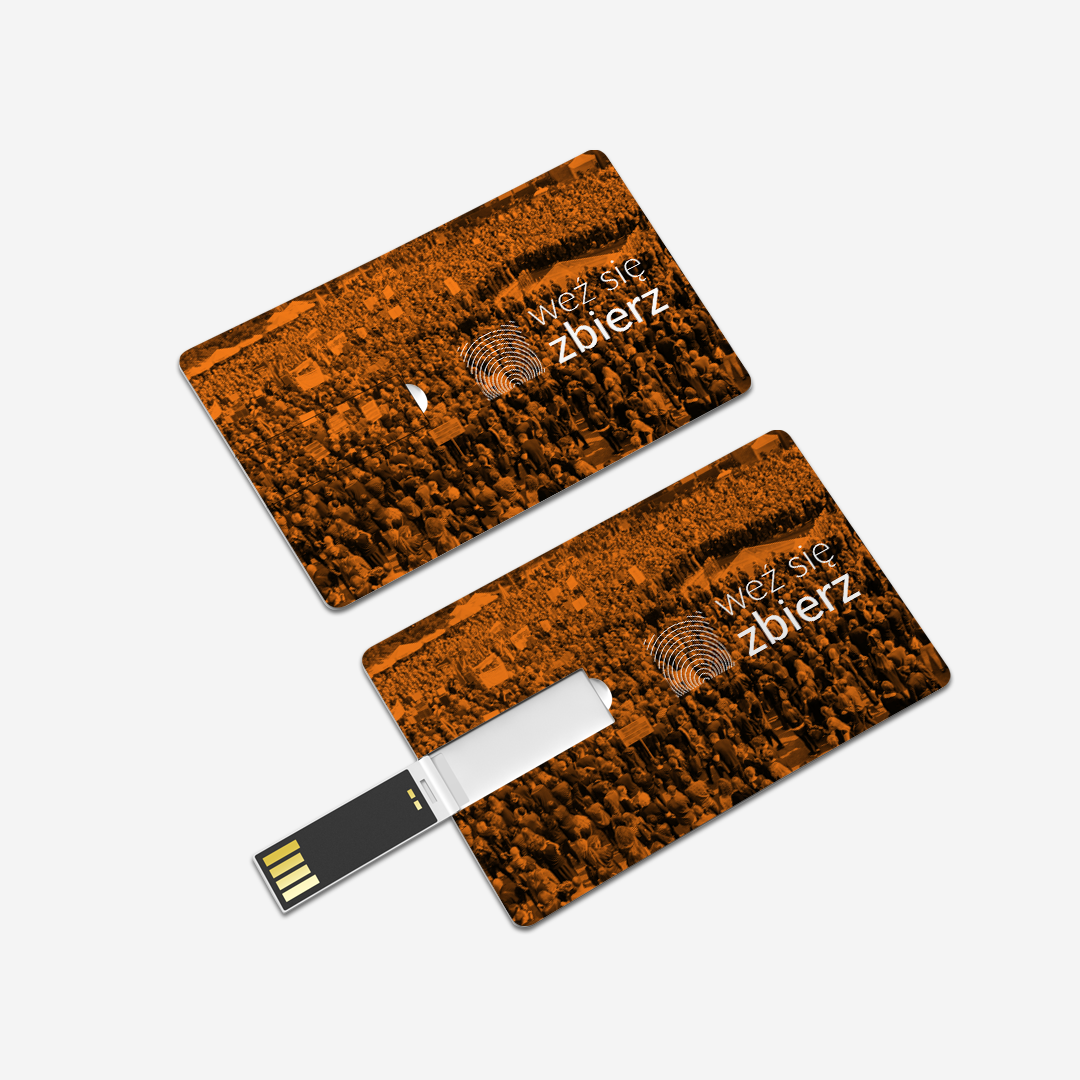
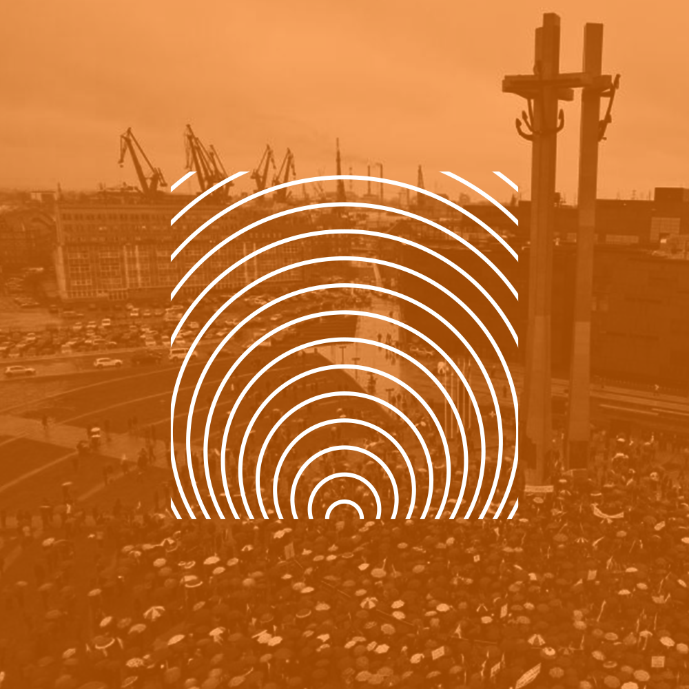
Weź się zbierz logo was based on the concept of isolines - graphical representation of concentration of features and an expanding shockwave.
The chosen colour is orange, which represents energy, life and ambition - all the features that the organization wishes to harness to a good cause.


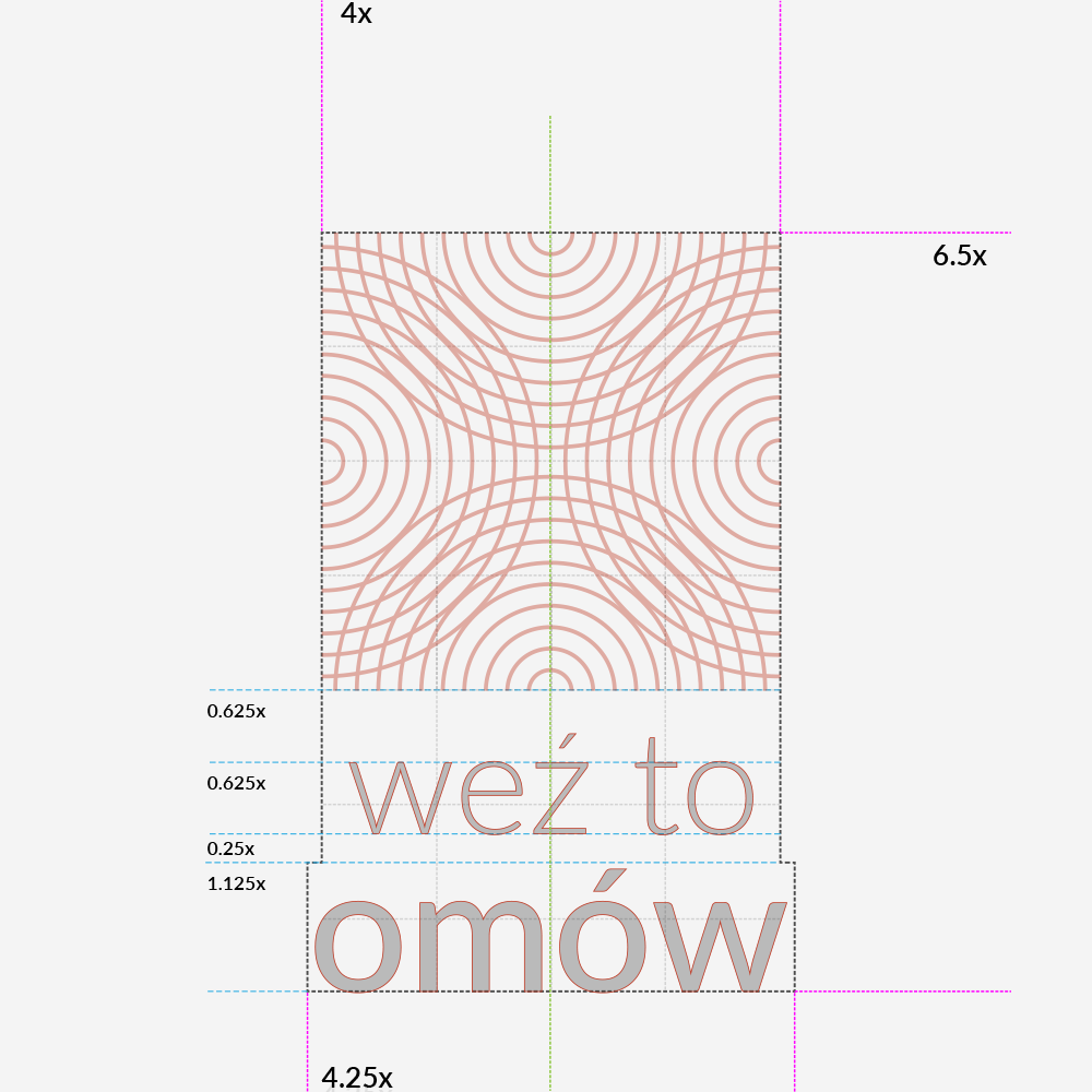
Weź to omów logo was based on the graphical representation of sound waves coming from four sources, in this case participants of the discussion.
The chosen colour is earthy brown, which represents neutrality, strength and solid base - all the features that the reasonable discussion should uphold in order to be constructive and reasonable.


Weź to podnieś logo was based on the tree jars - graphical representation of time hidden within the trees in form of ( time ) waves. Besides, it's the forest that the initiative is set upon cleaning from human wastes.
The chosen colour is green, which represents nature, wildlife and freshness - all the features that one should fine in every forest instead of heaps of garbage.


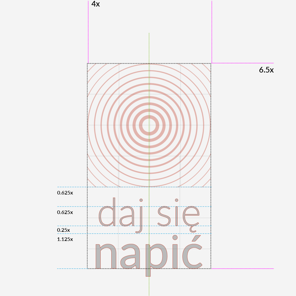
Daj się napić logo was based on ripples on the water - graphical representation of force spreading on the surface. Hopefully waves of free, clean tap water will be distributed to people in pubs and bars.
The chosen colour is blue, which represents water, wisdom and cleanliness - all the features that summarize the tap water in the tricity area.


| Visual language
Both above and below we can see possible applications for the logo and visual brand identity. Four logos have primary, secondary, minimalistic and super minimalistic version to be used in a proper situation.
The patterns created with the usage of the logo and logo's colours are meant to serve as a key visual on promotional materials.
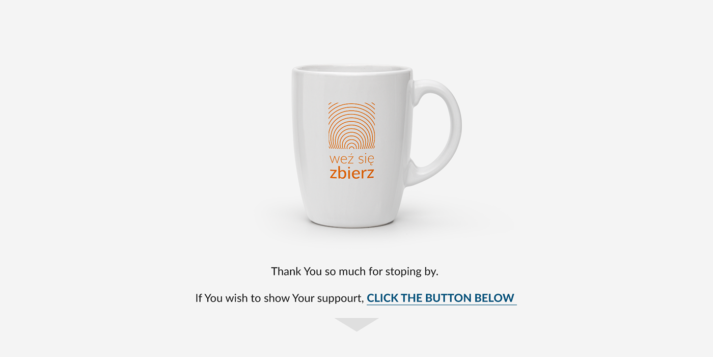
Each of the initiative has a need for different gadgets and marketing materials according to the agenda.
Examples below.