The Liberation Brewery, in one form or another, has been a traditional ingredient of Channel Islands’ life for well over a century and its award winning beers brim over with genuine local flavour.
The brewery’s current audience of ‘older, mainstream pub drinkers’ (Dean, 2017)will soon get too old and begin to die out so it is crucial that they begin to gain a following from a younger audience. However, this must be done in a way that doesn’t upset of confuse their current customers.
More and more craft breweries are beginning to pop in the Channel Islands so it is important for Liberation Brewery to stay innovative and continue to dominate their market.
The challenge was to consider how Liberation Brewery can attract a younger, more ‘hip’ audience whilst continuing to cater for their current market of older, mainstream pub drinkers.

‘Celebrate the diversity of Island life’
The channel islands are well known for their beautiful beaches, historic sites, strong financial industries, Potatoes and cows milk. However, in recent years, they have become a hub for young people bringing in fresh ideas through world class bars and restaurants, buzzing night-life, ‘hip’ new shops and quirky, boutique music festivals.
Therefore, the idea behind the label being split into two with ‘Ale’ upside down, is to represent the many contrasts within the islands and the diversity of them and they all come and work together to create an amazing place to live.
It allows for a ‘contrasting’ system that can be implemented through out the visual identity, especially when it comes to imagery that can be used for posters and other assets.
The red and blue colour scheme represents the colours of liberation day.
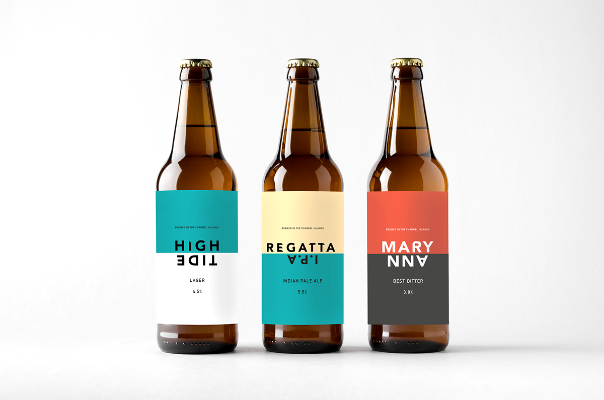
I have kept some of the original names of beers by liberation Ale, however, I have changed some names to make them more relevant to the target audience.
High tide lager
Aimed at a younger audience and it is inspired by the beach parties that occur down St. Ouens bay in Sunday evenings, when the waves roll up against the sea wall at high tide.
The regatta I.P.A
Aimed at a slightly wider audience, and is inspired by the many yacht regatta’s that are held throughout the islands during the summer months.
Mary Ann
The longest standing beer in the Brewery’s range. It is inspired by the original beer that was brewed at their brewery on Ann Street. The colour scheme is inspired by the earlier Mary Ann labels back in the early 1900s.


Imagery used in mocked up posters are taken my Jersey photographer, Matt Porteous
Ambassadors
Influential people on the islands would become faces of the brand and be included in the contrasting posters. These could be anyone from local entrepreneurs to top athletes on the island or even just locals who truly live live by the spirit of the islands.


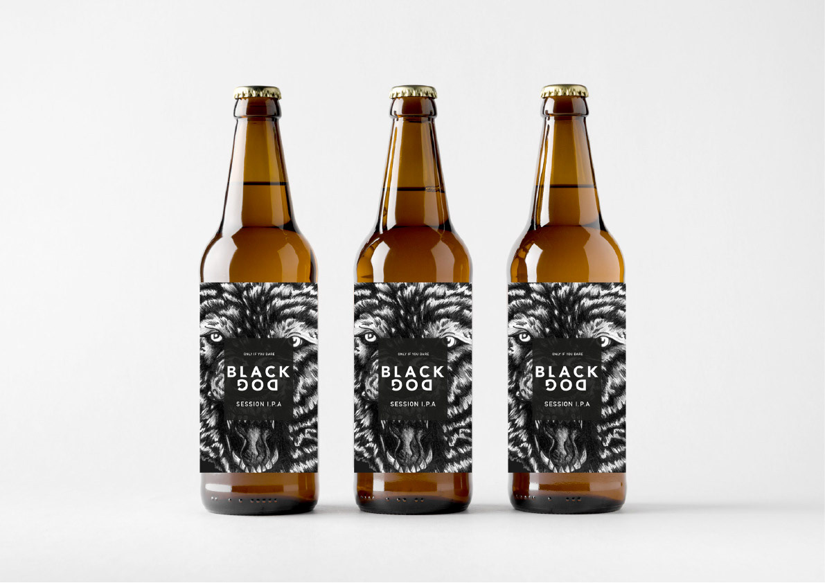
Limited Edition Range
Drawing back on my ‘myths and legends’ concept, I decided to limited edition range of craft beers that would be aimed at the younger, more curious beer drinker that would be released monthly
On the back of the label would be the story behind the inspiration for each beer. In this case, it would be about the black dog of Bouley bay. A smugglers tail about a mythical creature that would hunt on the cliff path’s of Jersey’s north coast.
Each bottle label would include an illustration to go with each story, done by a local artist. In this case, I collaborated with Jersey illustrator and good friend of mine, Travis Cracknell.
I have also included a mock up of limited edition T Shirts that would be bought as part of the launch of the new range.