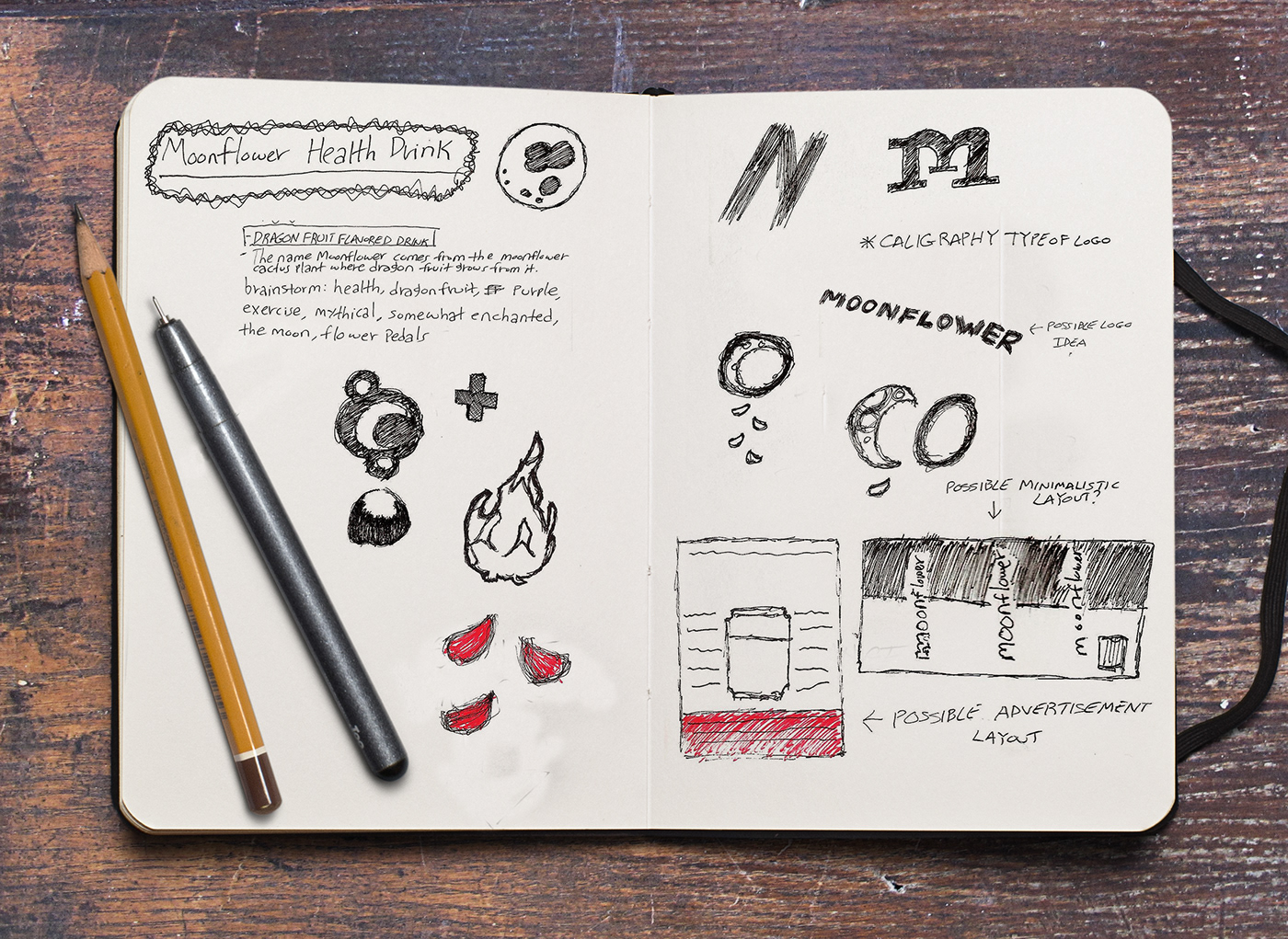
This health drink label was created for The All-American Dragon Fruit Co. with a product that wanted to capitalize on the health drink market with their own dragon fruit flavored health drink. Many ideas were considered such as making the logo mythical or mystical given with the word dragon or making a calligraphy type of logo.
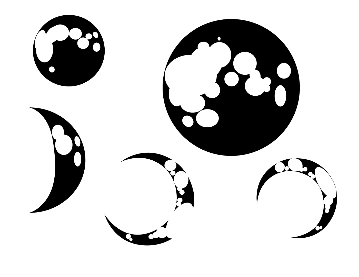
These are vector roughs of the many different moons that were considered before the decision to use a crescent moon for the final logo. A whole moon was first attempted with different circle placements. Some of the crescent moons that were attempted had different circle placements at first.
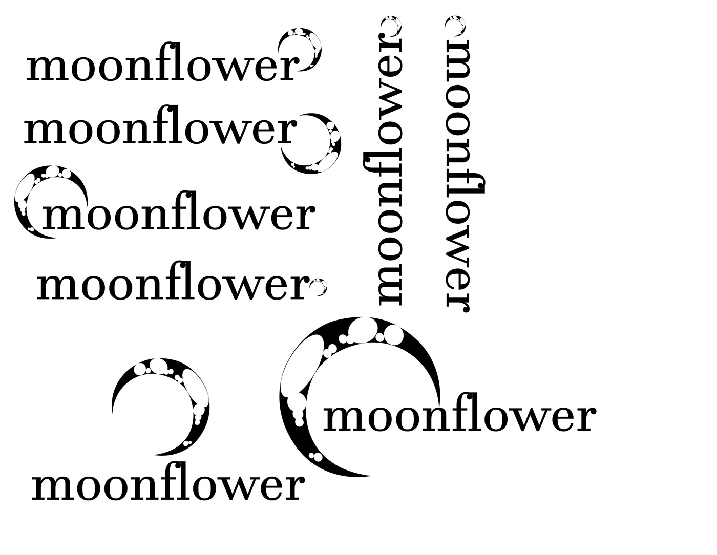
These are the many different variations of the moonflower logo. There was a lot of placement experimentation done to get the best looking logo for what would end up on the final label.
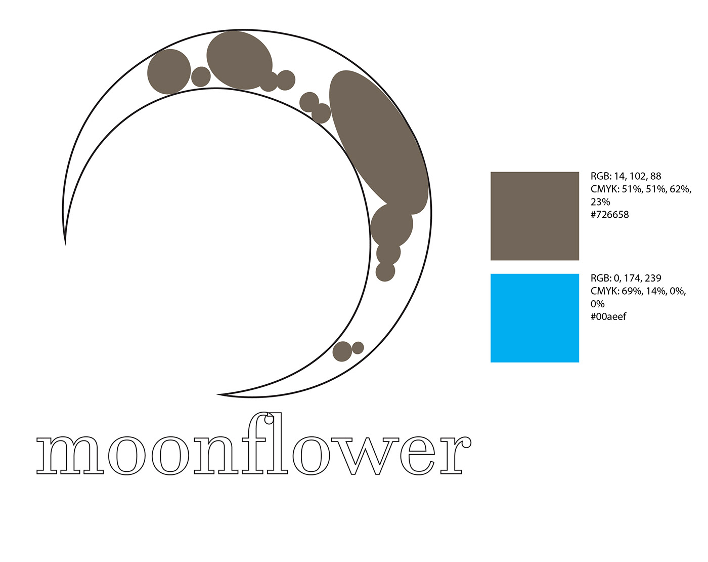
The choices of color were kept at a minimum to give the whole soda label a minimalism kind of look. The sky blue color was chosen to give it a calm feeling to people who drink the health refreshment. The grey color was chosen to match with the original look of the moon.
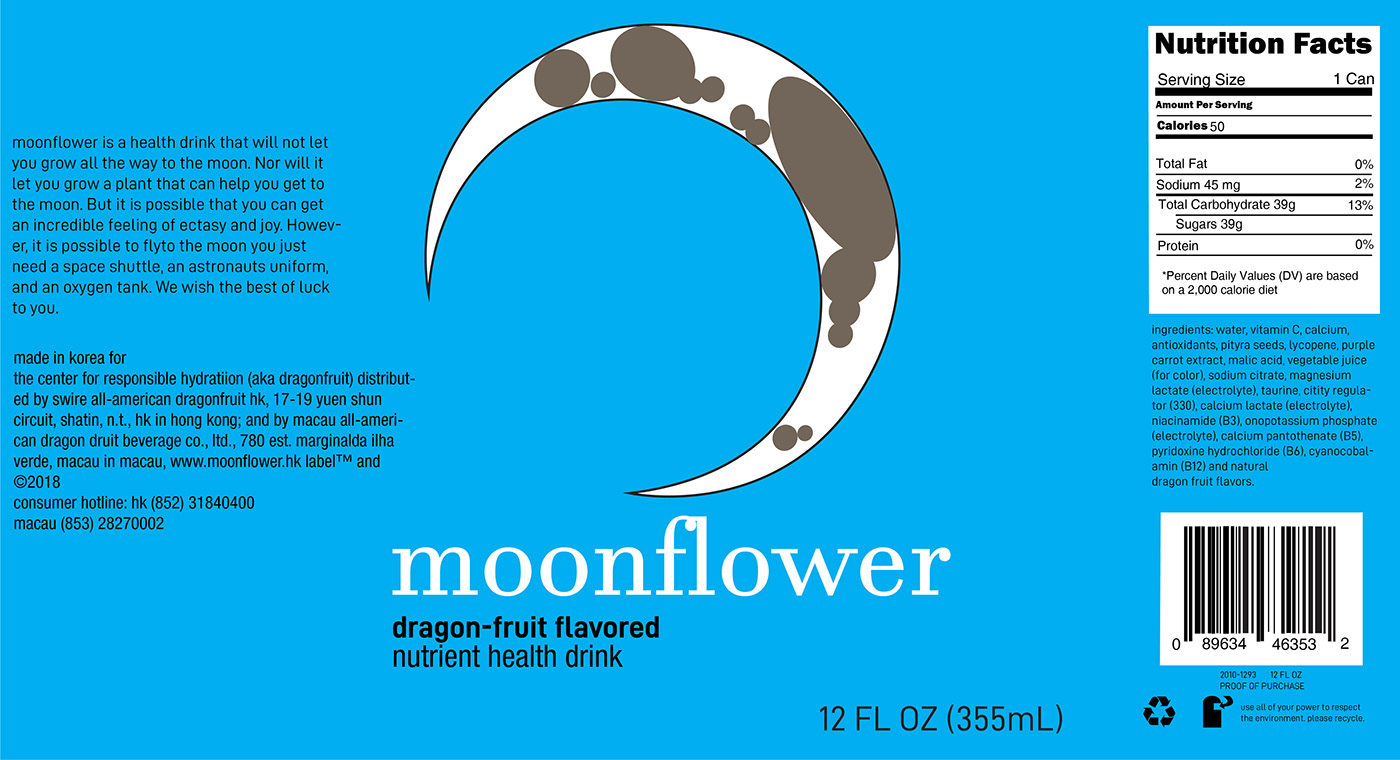
The "moonflower" label as shown above.
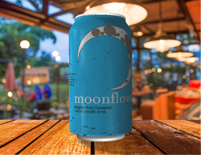
Above here is a demonstration of an application where the "moonflower" drink label was applied to a soda can with a restaurant type of background. A texture of water droplets was added to the soda can to make it look like the soda had condensation.