The following design was created for Northwest Arkansas Community College (NWACC). The logo mark and identity were for the department of Student Services within the community college. Shown below are the steps that were taken to achieve a final design.

The first step I took was researching the department and all of the services they provide as well as researching a solid mission statement and getting and idea of what the department and its members stood for. Shown above are some pages from my sketchbook of the process of brainstorming for this project. As shown on the top left page, I began with brainstorming a list of symbols or keywords that I could use for inspiration, based on what came to mind when thinking about or researching Student Services.
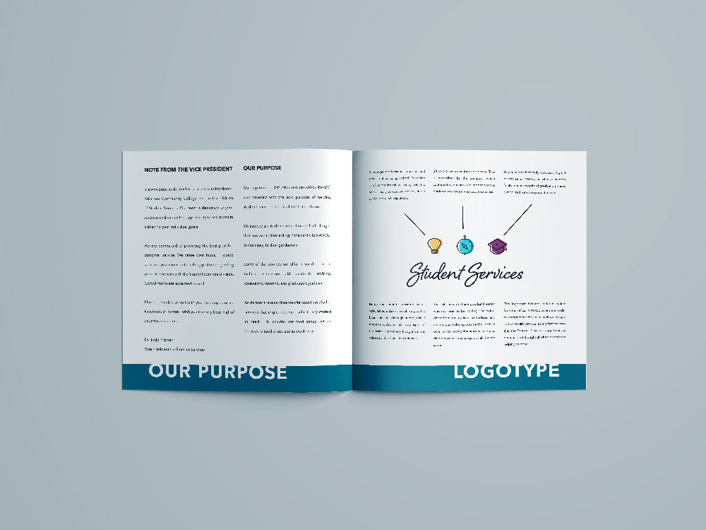
Next, I sketched a few ideas of what I wanted the overall logo to look like. I decided that the logo should be made of three separate symbols that could be used individually or together to make the full logo. Then, I began to sketch some quick Ideas for logo marks and possible symbols. There were three symbols that kept coming to mind for me and so I put them in a design (seen on the bottom of the righthand page). I also made notes for each pice of symbolism that would go into this particular design.

After brainstorming some symbols, I designed a couple of symbols for words that kept coming to mind: guidance, knowledge, and success. I came up with these six roughs.

I finally decided that these three symbols best represented the guidance, knowledge, and success. I designed a unified version of the three symbols simple and with thicker strokes because that felt professional yet lighthearted and inviting. Later, I added colors to the icons, which are offset from the outlines symbolizes and encourages “coloring outside the lines”, in other words, saying that students can take different paths to success, not all are the same.

Next, I added a script font for the department name.
“Student Services” is in a script font to show that the Student Services department is personal and thoughtful when it comes to helping students

I then designed various appropriate placement uses for the logo mark to allow freedom when choosing a specific look for various applications.

As mentioned before, the colors used in the logo mark are from the official NWACC color scheme and the same goes for the fonts used to compliment the design. Any other color from the same official color scheme would be appropriate to use as a compliment with this design as well.
“Ultra Light” may be used in any instances for text with a minimal message, whereas “Regular” may be used for general type. “Demi Bold” is to be used for main headers, in white, over bold color blocks. “Bold” may be used in sub-headers or for emphasis.

Here I included some examples of applications of the logo to stationery.
Below, I have included some examples of the style guide as well as a complete version.