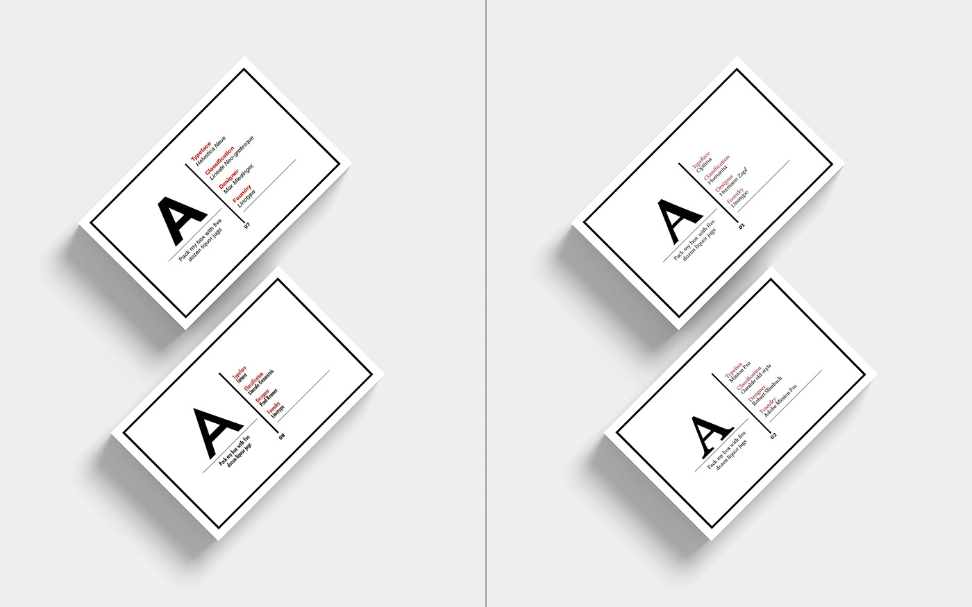
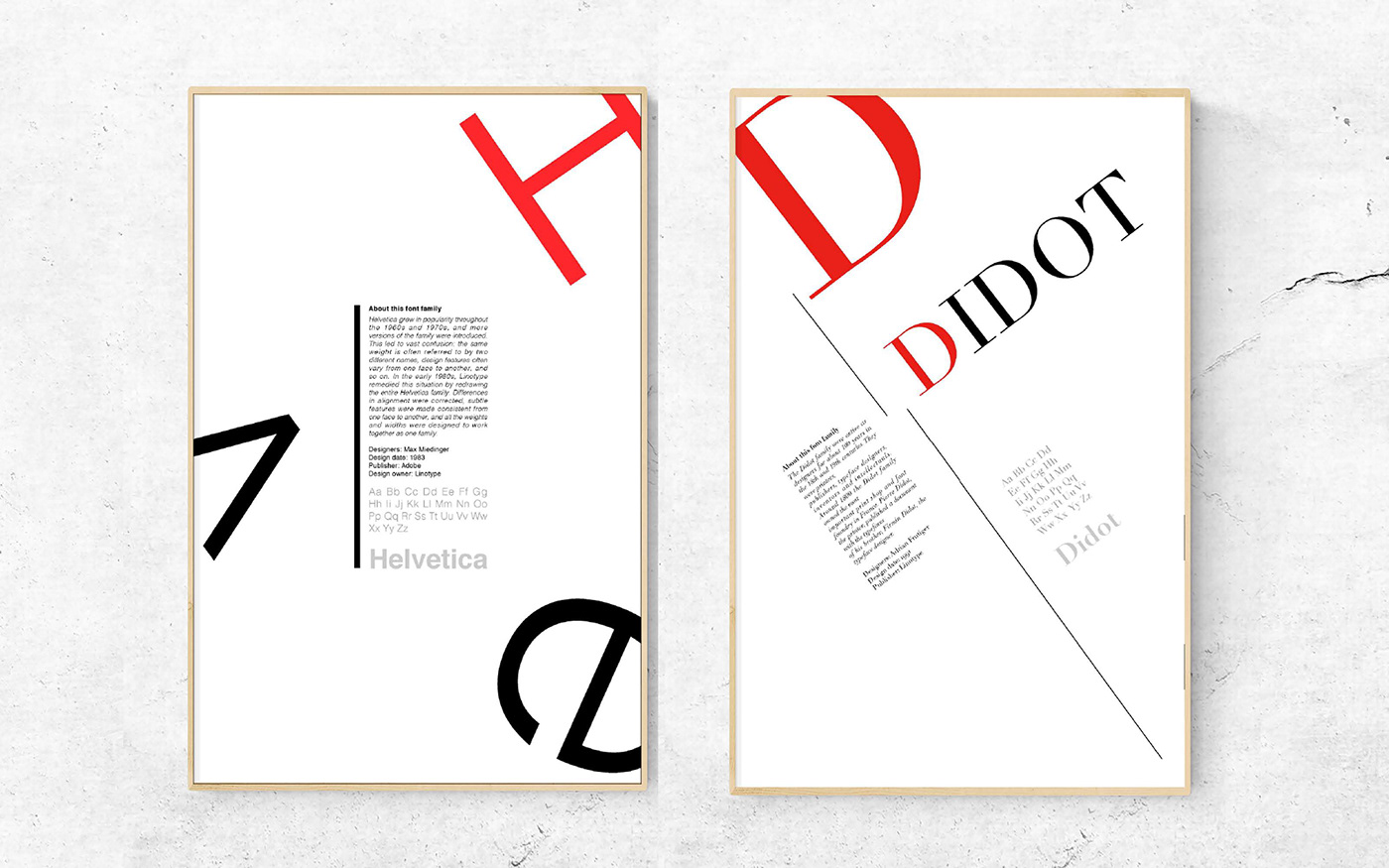
The main content of this course is all about the exploration of typeface. The Exploration’s intention (The intention of the exploration) is to learn the meaning of typographic form and choose typefaces appropriately for the poster & card design.
I chose red and black as the primary colors in this project because red can brighten the entire visual system as a clue which can go through the entire design. According to the different characteristics of each typeface, I created these font cards and posters based on their unique shape and temperament for each typeface.