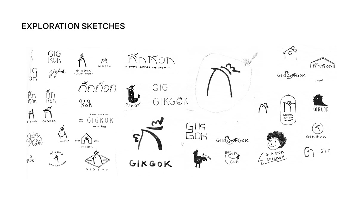
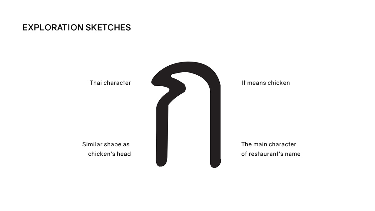
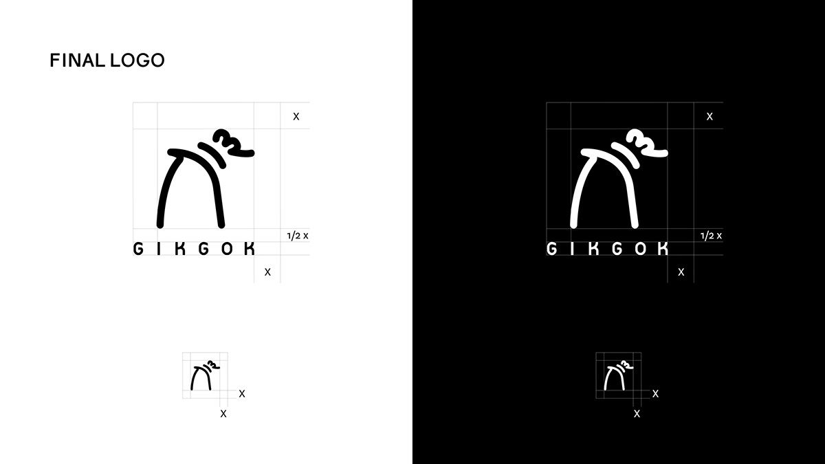
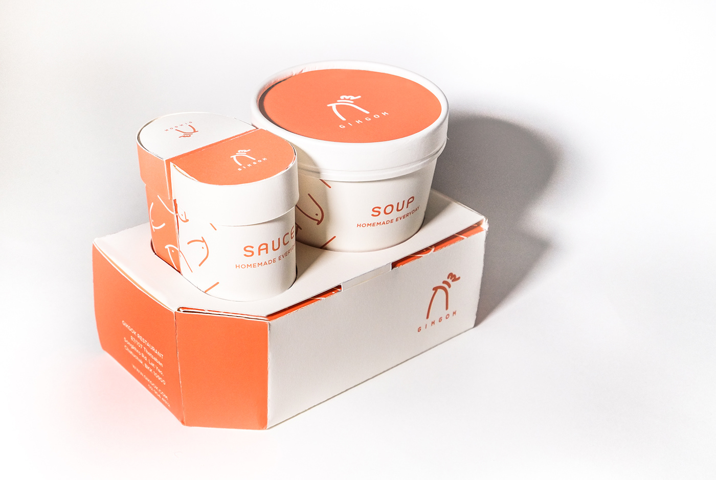
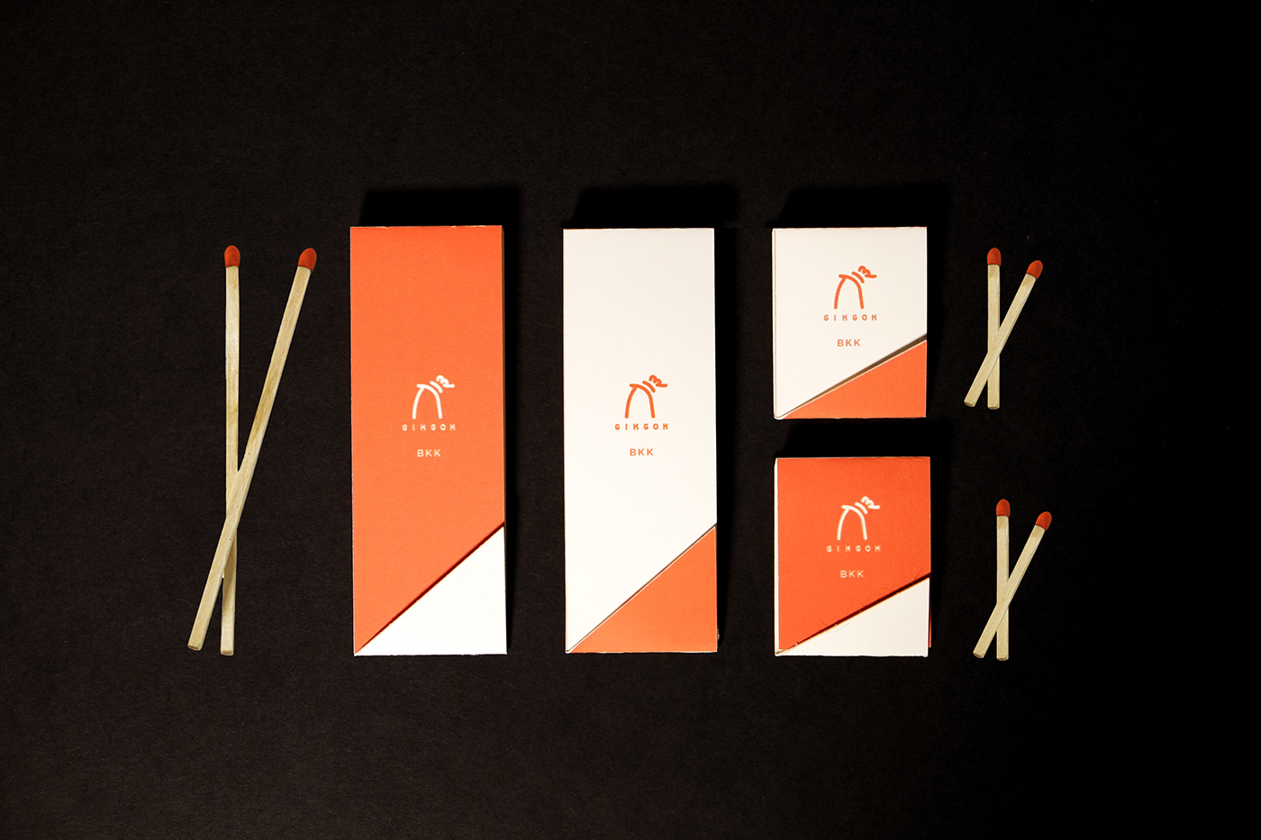
GIKGOK is a unique family owned Thai restaurant offering a homemade chicken menu. The restaurant offers quality everyday ECO friendly meals with personal friendly service. First of it’s kind aiming to inspire other small restaurant in Thailand. As for the branding, we play with Thai alphabet "ก" which is the main character of restaurant's name in the Thai language. Besides, this character represents chicken that is why we use this character as a symbol of the restaurant.
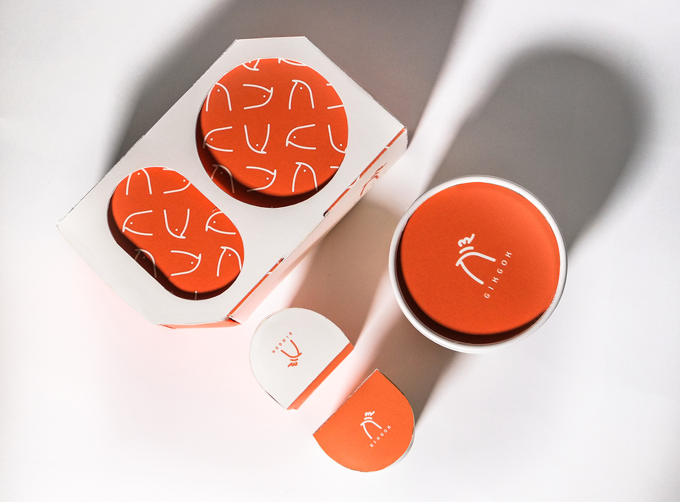
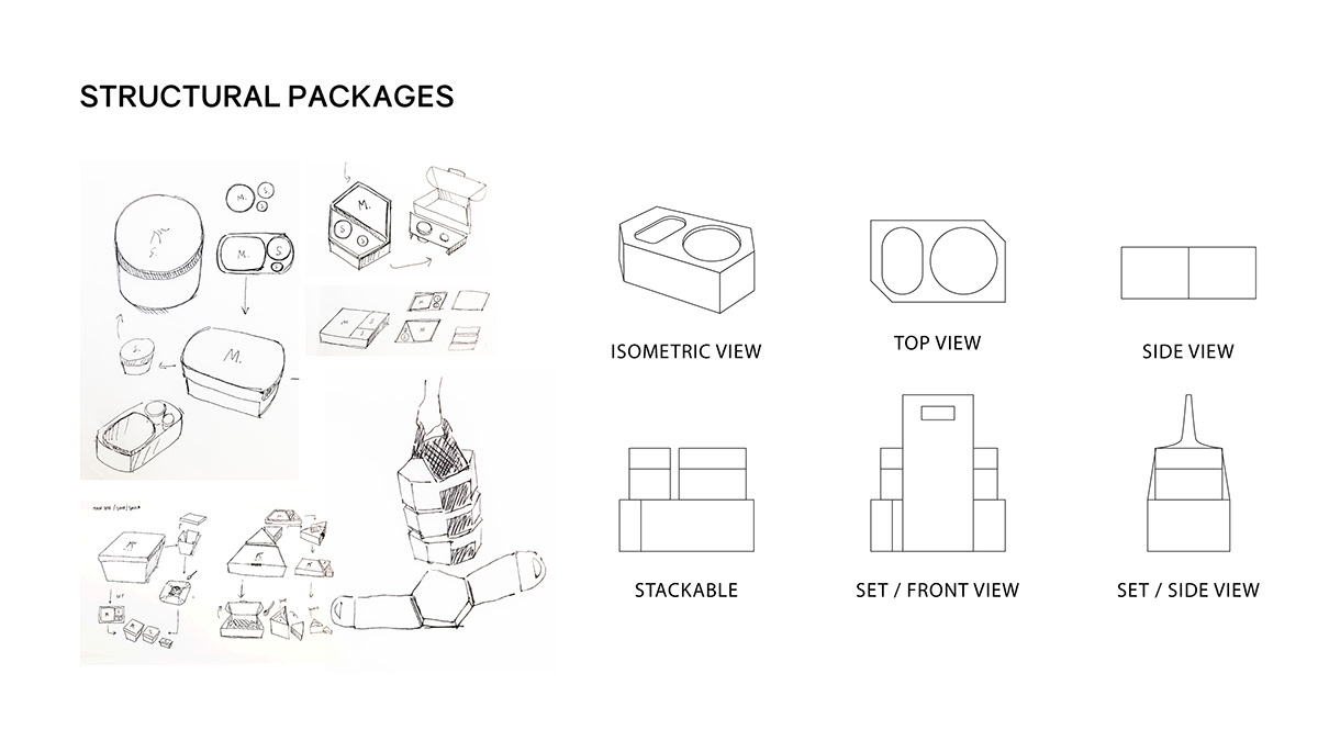
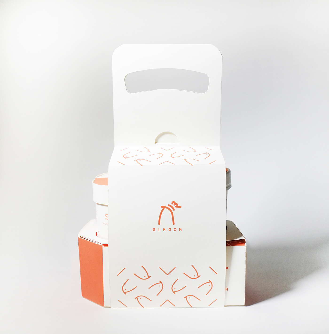
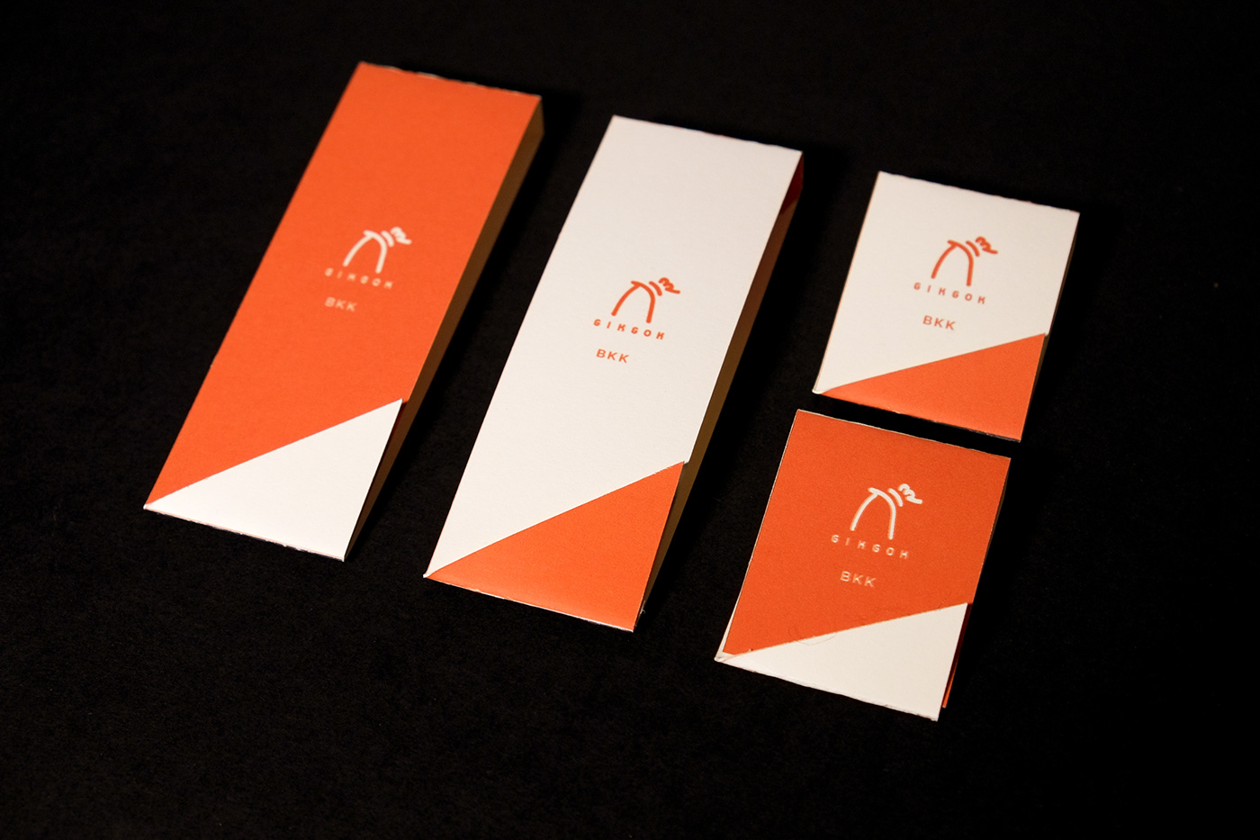
All the packagings utilize paper as a primary material because I want to encourage and spread out a sustainable concept to Thai society. Instead of using a plastic bag, we provide an alternative. By using a paper handle that is recyclable, we also help to reduce the amount of plastic waste in Thailand. We care, and we share our thoughts with customers.


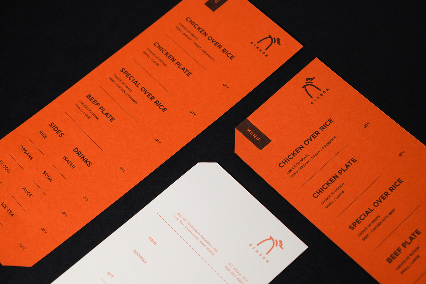
Menu
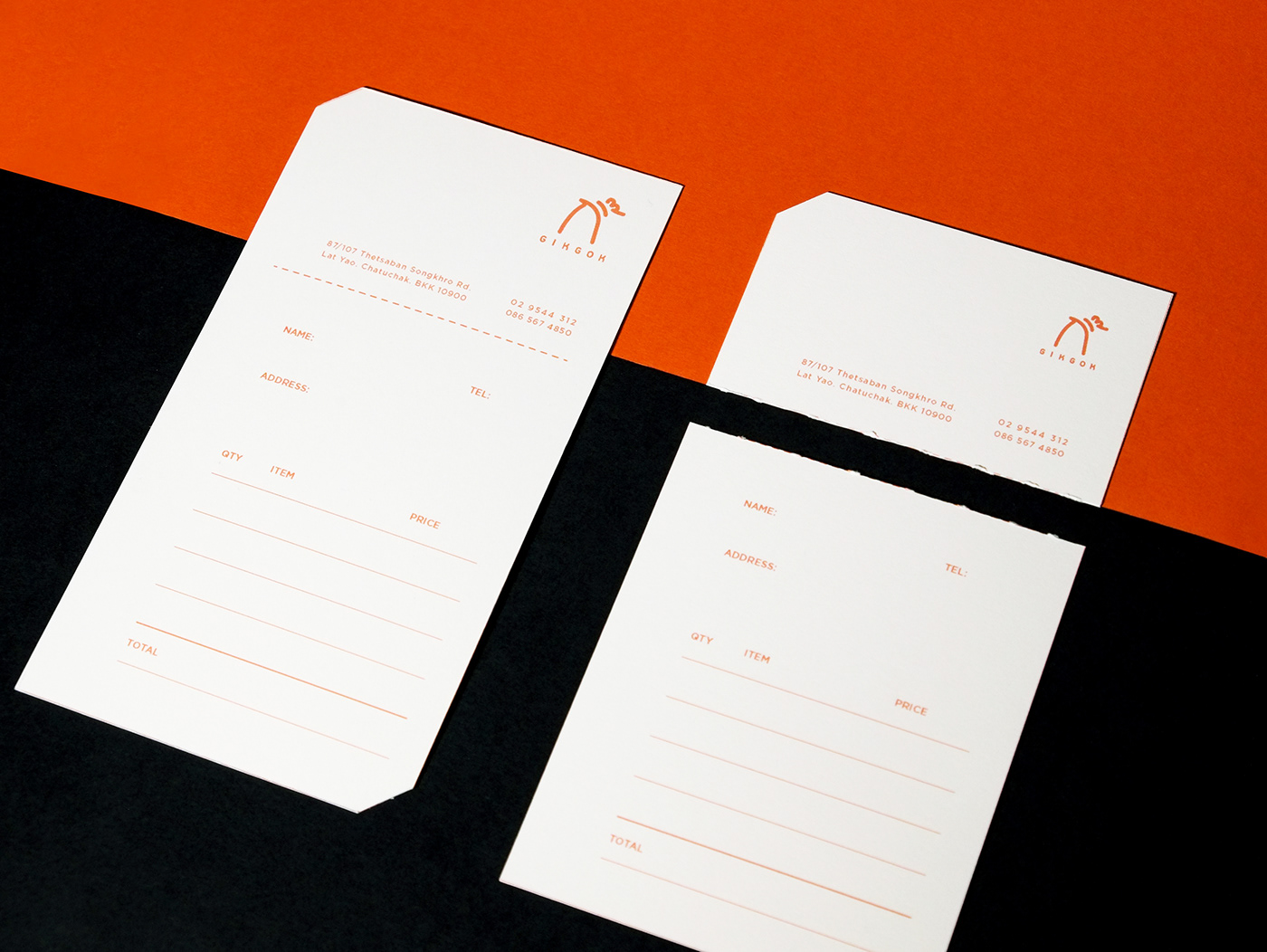
Receipt
We add a little gimmick by combining name card and receipt so that we reduce the amount of paper and link to save energy and materials. When the customers get the receipt, they can rip off the top part and keep it as the restaurant's business card.
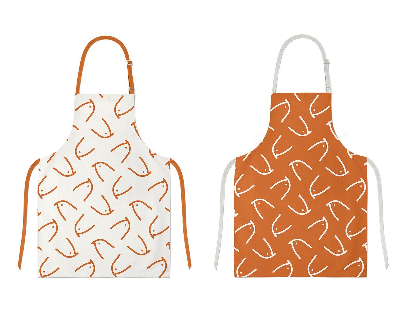
Uniforms
Interior 2D sketches

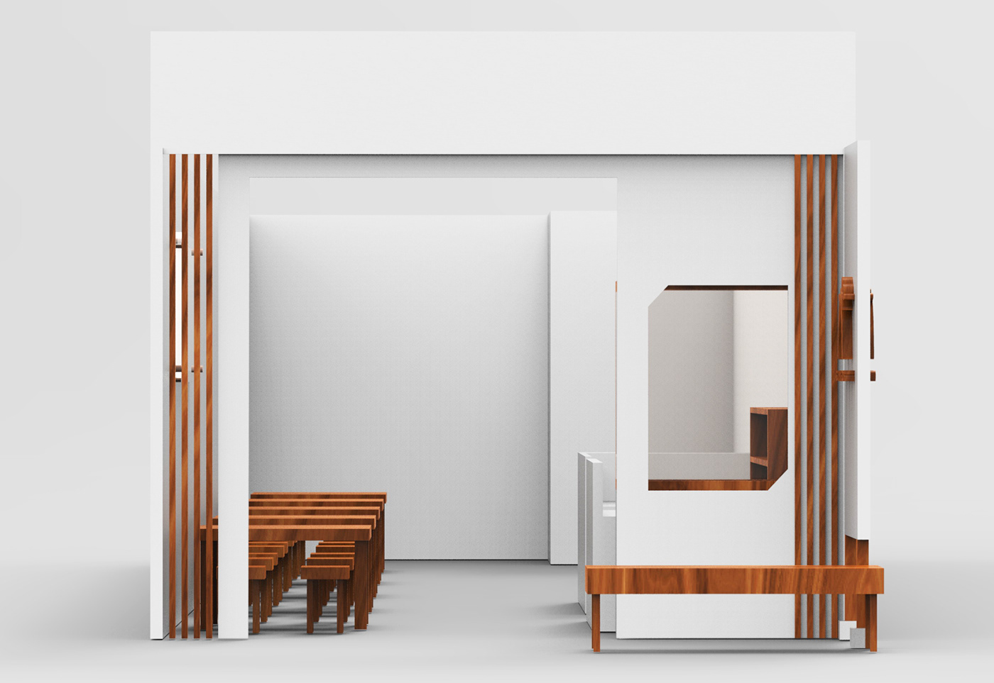
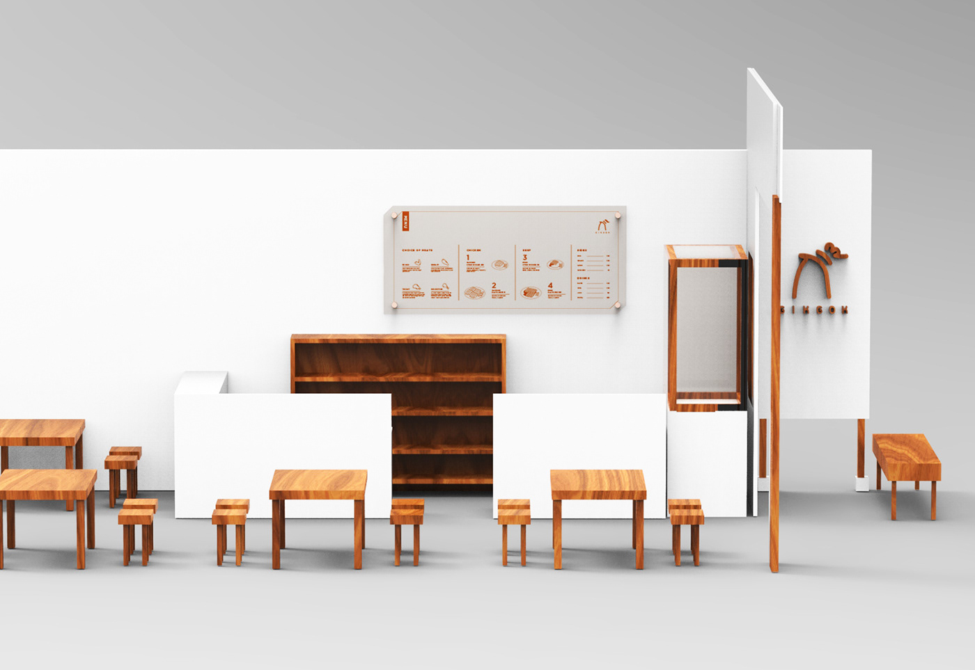
Interior 3D sketches