


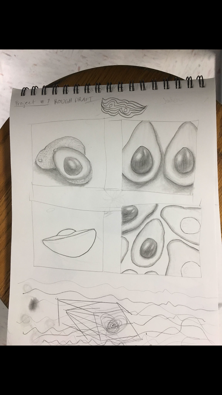
This is my final blog write up. I think I’ve done very well this year in art and I think my skills have improve much more thanks to my Studio Art teacher, Mrs. Thompson. I did my first project on a plant. I chose to do the avocado because I love everything about avacados. This is a drawing of a placement of acacados set next to each other with the seed out because the avocado had been cut in half.
The master artist I picked is Andrew Wyeth. I picked him because his art is similar to my art in the way he does realistic and representational drawings. He used value and shading to create a true life drawing. A contemporary artist I chose is Sid Weaver. I chose him for the same reasons as I chose the master artist. I would’ve done a lot better with this project if I would’ve finished it. I think if I made it a lot larger it would look more realistic and the contrast would stand out a lot. I would’ve done a background also for this priece. I think I did well on the shading of this piece and how that technique made it look like a real life avocado. In the future I want to paint a realistic avocado and make its color very vibrant and realistic.
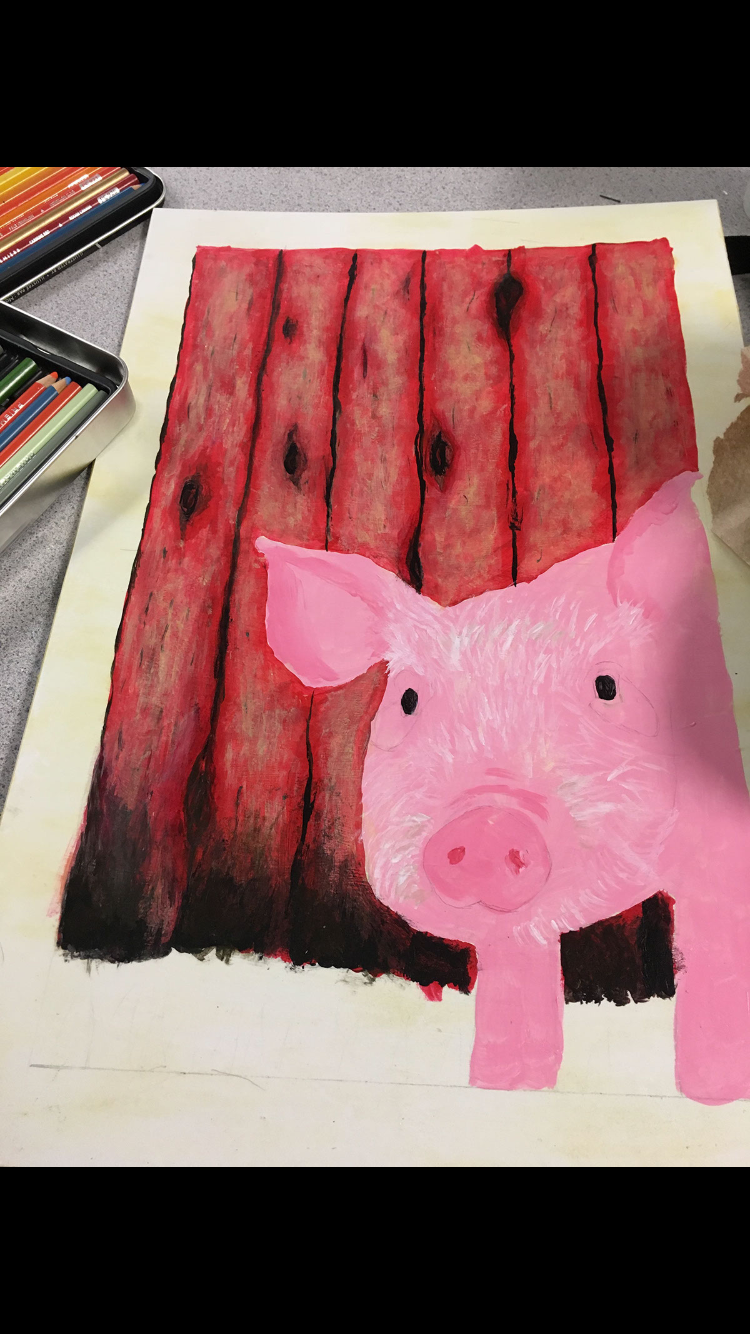
For this project I did a monochromatic theme. My idea was to create a painting of a pig infront of a red door and using the color red as the main color. This is a painting of a realistic pig poking its head out infront of a red barn door. The textures are the most important part of this piece to achieve that realistic look as a goal.
A master artist I have chosen is John Singer Sargent. I chose him because his work has a tone of texture and almost a 3-D look to it as he painted a dog. I also enjoy the fact that his painting is of an animal because I love doing artwork of the realistic look of an animal.
A contemporary artist I chose is Ester Curini. I love Ester Curini’s art because she does amazing animal portraits. She also creates realistic looks with texture in fur and other things. If I were to do this project again I would finish the texture of the pig and I would create more value and shading in the pig. I think I did really well with the red barn door behind the pig and how realistic that looked in the end.
For the super intendants project I decided to paint a picture of a bee. The paint is of a bee approaching a bright pink flower in front of a blue background that fades out into yellow honeycombs. It has a realistic affect with some abstract ideas in it with the honeycombs. The perspective is looking directly at a bee scene through a honey comb. The placement of the bee is of the bee hovering and approaching the flowers to pollinate them.
A master artist that has inspired my piece is Van Gogh. His master art is very different compared to my art but also similar. They are similar because of how he uses his brush and his technique to creat texture. In his painting of the man self portrait he uses many small brush strokes that create and interesting texture. In my piece I also did many small brush stroke to creat a realistic texture. A contemporary artist that I was inspired by is Carolee Clark. Carolee Clarks painting of a realistic animal with abstract feature relates to my art in the abstract patterns. She included many shapes inside the shape of the rabbit in her painting and I created honeycomb shapes in the top and the bottom of my painting. Our pieces are also similar in the use of bright colors. I think I was very successful in this piece in how I accomplish a realistic look including some abstract details. I used free form shapes by using the hexagon shapes to create a honeycomb. I used ovals and circle like shapes to create the body form of the bee. To create more realism I included highlights like on the bees legs and eye to create a look of light reflecting. I included space behind the bee to show a bright clear blue sky. The negative and positive spaces in the honeycomb really helped make a 3D affect. If I were to re create this project I would do a different perspective so the bee ist in the basic center of the art piece. I would also create more realistic looking flowers.
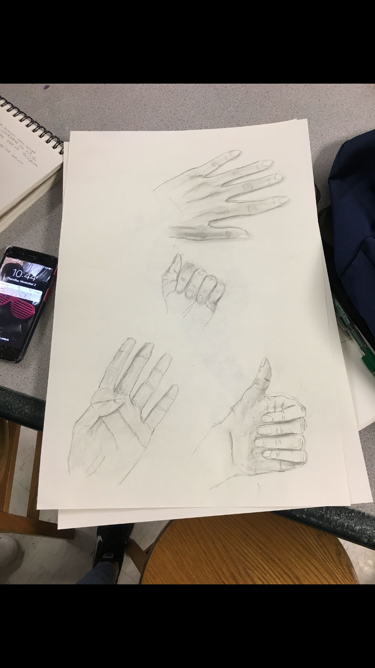
For my unit three project I decided to do a study of the hands. I used graphite to create this project and drew 4 hands. I chose the placement of the hands randomly. The first hand is positioned as a hand holding up 4 fingers and the thumb relaxed, curled into the palm of the hand. The second hand I drew is a smaller hand with all of the finger curled into the palm. The third hand I drew is of a hand doing a thumbs up position. The fourth hand I drew is of the back of a hand laid out. I tried to really focus on the lines and shadowing of the hands to make them look realistic as possible. The hands are randomly placed and non are overlapping. I used my own perspective of my hands. One master artist that inspired this piece was Albrecht Durer. His hand study was very intricate with many details. I tried to incorporate contrast similar to how he did in his hand study. A contemporary artist that inspired this piece was Lintsi on devientart. This artist creat simple by realistic drawing of differently positioned hands. I like how this artist incorporated many different forms or hands. If I were to recreate this hand study I would include much more contrast to creat more dramatic shadowing and detail. I would also like to incorporate maybe accessories like clothing or jewelery to create an interesting look like Durer did.
My 5th project is the layered paper project.
For this project I decided I wanted it to look simple and 3-D. I made a swamp scene with an alligator swimming in water, a dragon fly flying above, and grass and a lily pad growing near-by. One master artist that inspired me during this project was Monet. Monet did a piece called water lilies. What inspired me about this price was the beautiful colors and the water lilies themselves. I knew I wanted to include a water lilie in my cut paper project but I didn’t know what color and shape it should be so I used Monet’s piece as a reference. One contemporary artist that inspired my cut paper was Barbara Steinacker. She did a painting of a scene of a pond or river with grass land aligning it and thriving trees and plants. I used this piece as a reference to layout. I wanted to do a swamp with many grassy land nearby and Steinackers painting gave me good ideas on the layout of the setting. If I were to do this project again I would add a lot more plants and even though I wanted it simple I would add more detail. I would make the composition a little more uniquely placed also. Overall I think this piece came out okay. This was my first time exploring the medium of cut paper and I think I would like to do more projects like this but more interesting. I did enjoy the colors I used in this piece. It’s style is like a cartoon and the colors really compliment each other. The blue in the water is the main focal point because it is the brightest color in the piece. This project was enjoyable and I would do something like this again.
For this project I created an acrylic painting of a snowy, mountainous landscape. I made it in black and white and added hints of green into the tree. I was inspired to do this piece around Christmas time because I am from Montana. I also tried to include repetition in the mountains behind the tree. On this price I really focused on perspective with the foreground, background, and middle ground. I tried my best to make the proportions right and to make them look realistic. A contemporary artist that I used for my reference photo was Kevin Hill. His work is very beautiful and he has a lot of landscape pieces with mountains and snow. I think it was difficult to catch all the shadows in the mountains but his painting helped me see where realistic shading goes. I was also inspired by his color scheme. He used mostly black, white, and gray. A master artist that I used as a reference was Laura MacCarthy. Her style is detailed yet simple. I thought the shading in her trees looked really nice and how she made the shadows cast away from the light. Overall, I think I did well on this piece and I will do more landscape paintings in the future because I really enjoyed this project. If I were to do this piece again I would give more detail and contrast in the mountains and maybe some more texture.
My next project is my concentration piece. I decided to use acrylic as my medium and Create a realistic, but beautiful piece. The master artist I am referencing is named Karl Bang. His style is very realistic using many details and colors. These are the elements I am expressing in my peacock painting. My concentration is on colors and patterns in nature. I think Karl Bang has an amazing painting especially with colors of a woman and a peacock. He includes some blossoming flowers in his painting reflecting beauty in nature. I am also trying to express the same style of realism. As I’m progressing through my peacock painting I am using many reference photos. The first photo I have is a painting of a bird by a contemporary artist. Terry Smith created a very realistic painting of a bird parched on a tree branch. My goal is to make my art look very realistic and that is why I am using this artist to reference for my painting. He uses a lot of detail and color to create this look. Overall this piece was successful, but VERY time consuming.
