Client: WIZ
Year: 2017
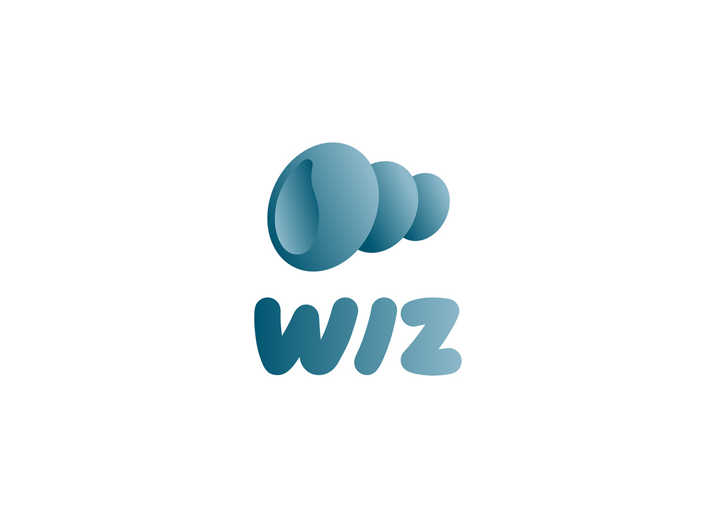
Wiz
Naming - Branding
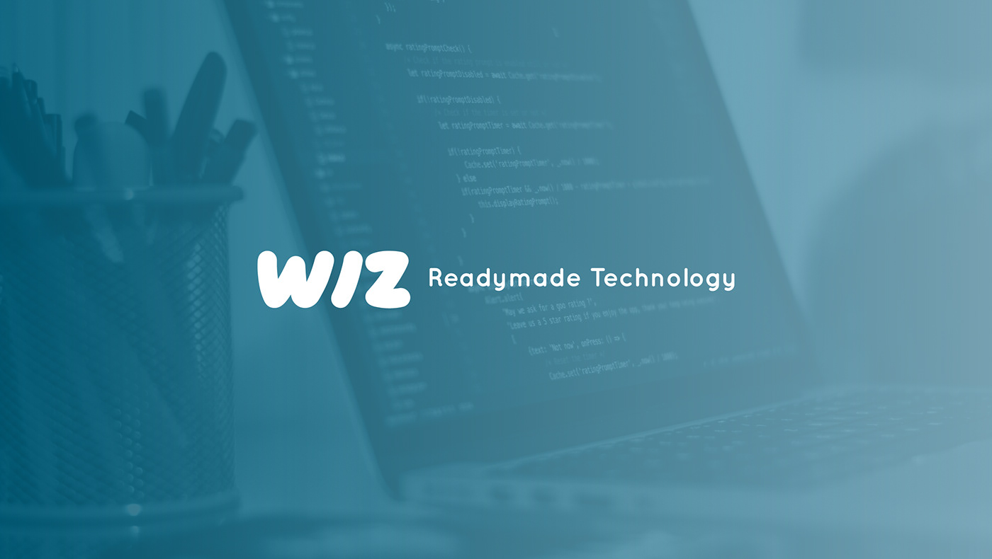
Readymade Technology
(Español)
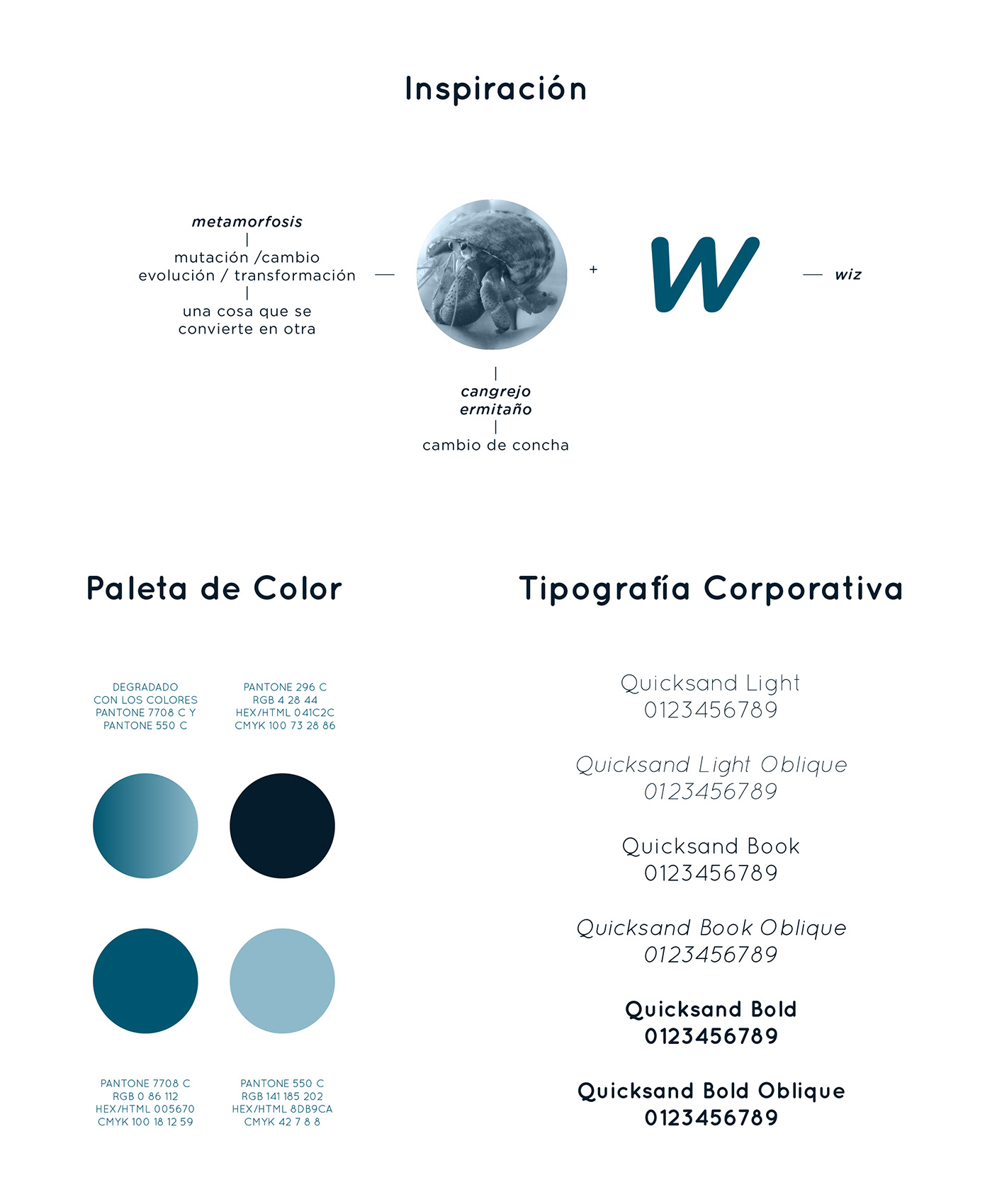
WIZ es una empresa enfocada en el sector tecnológico, ofrecen la creación de software a la medida de cualquier cliente y a un costo accesible. En SWITCH Marketing realizamos la identidad de marca en base a los conceptos de modernidad, calidad, eficacia e inteligencia. La inspiración para el diseño fue el concepto de metamorfosis, cuyos sinónimos o palabras clave son: mutación, cambio, evolución, transformación. Estos atributos guardan una estrecha relación con el tipo de servicios que ofrece la empresa ya que realizan proyectos que puedan ser adaptados para otras empresas.
Siguiendo la línea conceptual se llegó al cangrejo ermitaño, es un animal que además de sufrir de metamorfosis en sus primeras etapas de vida conforme va creciendo migra de concha en concha para protegerse.
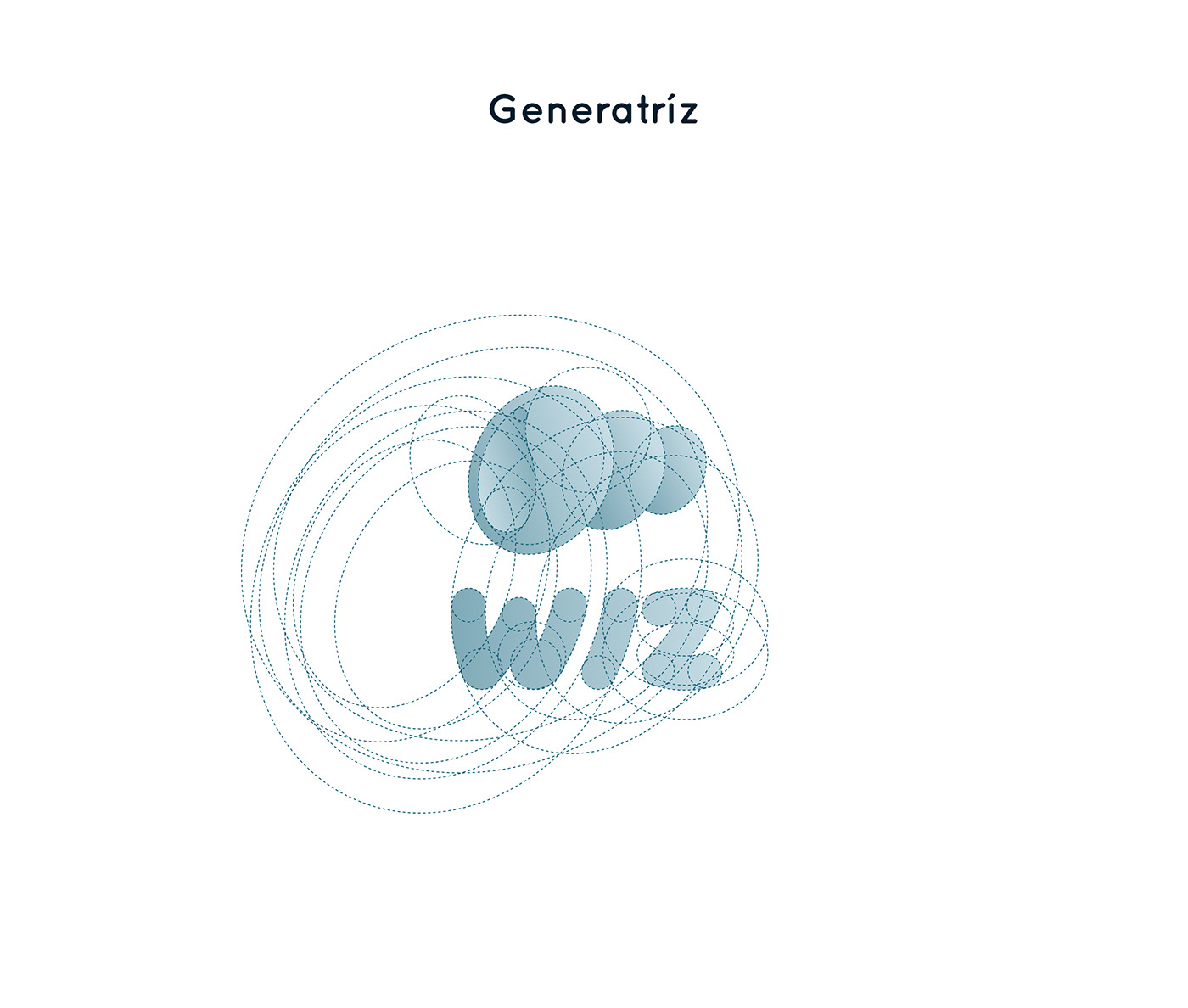
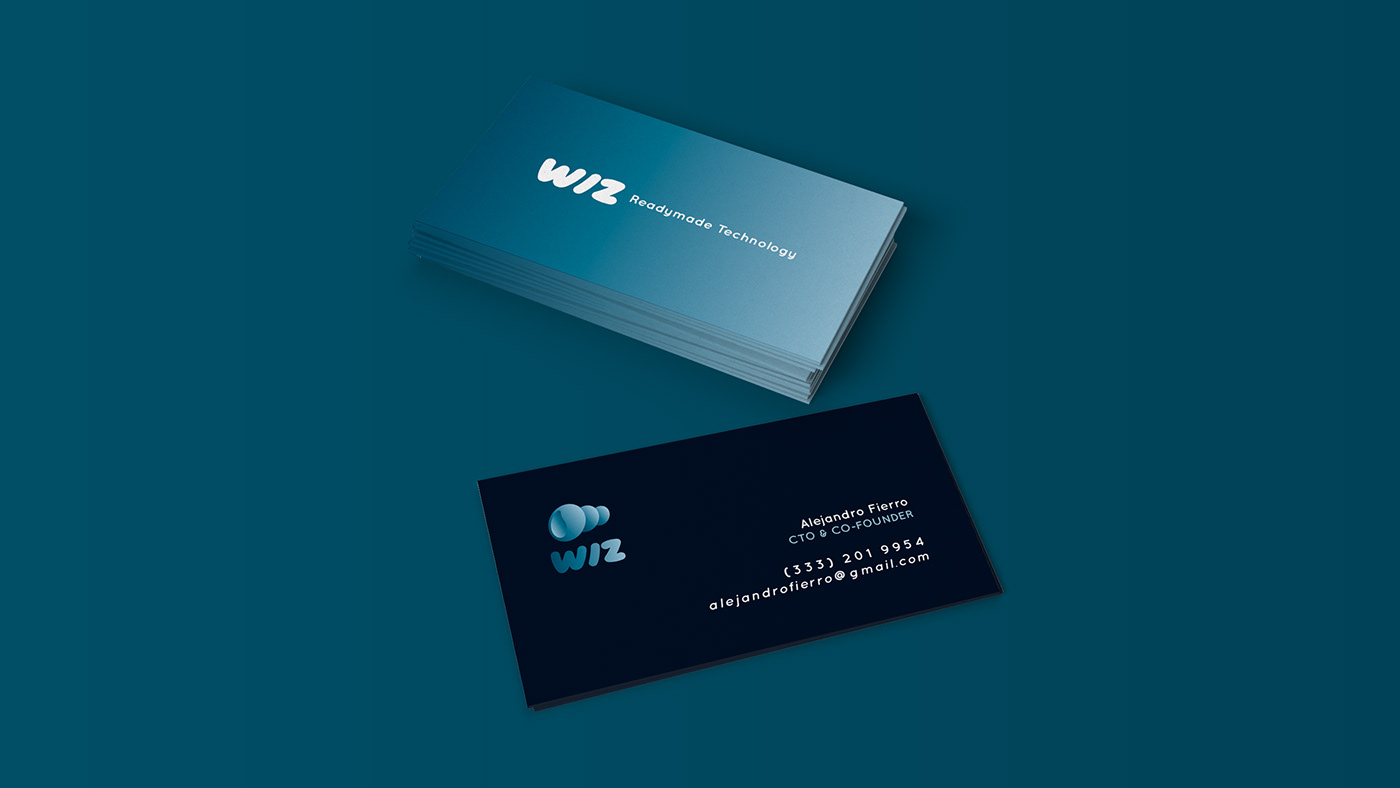
La concha fue abstraída hasta llegar a combinarse con la w de wiz creando el icono gráfico de la marca. La tipografía es orgánica, una mezcla entre una tipografía de fantasía y una sans serif itálica, logrando representar los conceptos de amigable, creatividad y eficacia.
Los colores del imagotipo fueron seleccionados en una gama cromática azul desaturado que significan los siguientes conceptos: responsabilidad, confianza, intelecto, solidez, conocimiento, sofisticación y poder.
(English)
WIZ is a company focused on the technological sector, offering the creation of software tailored to any customer and at an affordable cost. At SWITCH Marketing we carry out this brand identity based on the concepts of modernity, quality, efficiency and intelligence. The inspiration for the design was the concept and core idea of a metamorphosis, whose synonyms or key words are: mutation, change, evolution, transformation. These attributes are closely related to the type of services offered by the company as they carry out pre-made programming projects that can be adapted for any other company.
Following the conceptual line we took as an inspiration the essence and characteristics of the hermit crab. Since it is an animal that besides suffering from metamorphosis in its first stages of life as it grows, it migrates from shell to shell, he adapts and customises any given object in order to protect himself and survive.
The shell was abstracted until it was combined with wiz w creating the graphic icon of the brand. The typography is organic, a mixture between fantasy typography and italic sans serif, managing to represent the concepts of friendliness, creativity and efficiency.
The colors of the imagotype were selected in a desaturated blue color range that means the following concepts: responsibility, confidence, intellect, solidity, knowledge, sophistication and power, helping developing the image WIZ wanted to project.
Credits
Design: Vale Petit
Switch Marketing 2017