
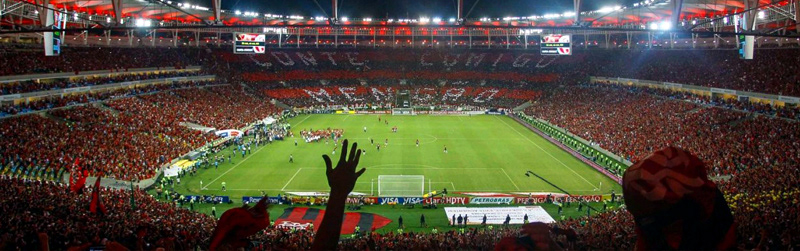
Flamengo is the most popular football team in Brazil, and one of the most traditional multi-sports Club of the continent. Flamengo's crowd is, probably, the world's biggest: a legion of almost 40 million fanatics spread around the country, which makes it known as red-black 'Nation'. Its home: Maracanã; its moto: win, win, win. In the much disputed Brazilian major league, Flamengo holds 10 important National trophies, having conquered Libertadores da América Cup two times and Toyota Intercontinental Cup in 1981, over Liverpool.
The following project does not constitute a strategic repositioning, although it symbolizes a change in attitude towards the use of the Flamengo brand. A professional management must take care of every aspect responsible for maintaining and expressing the greatness of one of the biggest soccer teams in Brazil – and a new stage in the visual communication of the club starts here.
In each detail, Flamengo must express and confirm its greatness, importance and strength as a dominant brand in the sports field. After all... this is Flamengo.

The redesign project for the visual identity of Clube de Regatas do Flamengo started in early 2017, when I asked my former student and designer at the club, Eduardo Franco, to send me any official Flamengo graphic standards manual – used and distributed to suppliers, partners and departments of the club itself.
I had suspected since the creation of the current visual standard (circa 1980), the main symbols of Flamengo's visual identity (monogram, crests, colors, logos, etc.) were altered and eroded in their various versions (analog and digital), usually created, modified or customized by sports apparel manufacturer. Analyzing ancient products, documents and jerseys, it was possible to confirm this accidental derivation process, as well as to notice an expressive lack of standard in the use of the main symbols of the club's visual identity.

CRF monogram application history on Flamengo's jerseys, from 1980 until present.
Analyzing the digital files of the CRF monogram (one of the most important symbols of the club's visual identity), we perceive problems of technical nature, both in typographic aspects and in vector refinement. In addition, the material submitted was outdated, with a number of inconsistencies, problems and lack of content. This circumstance served not only to point the need for a redesign process, but also an urgent review and standardization of the use of these elements in the institutional and commercial domains of the club.

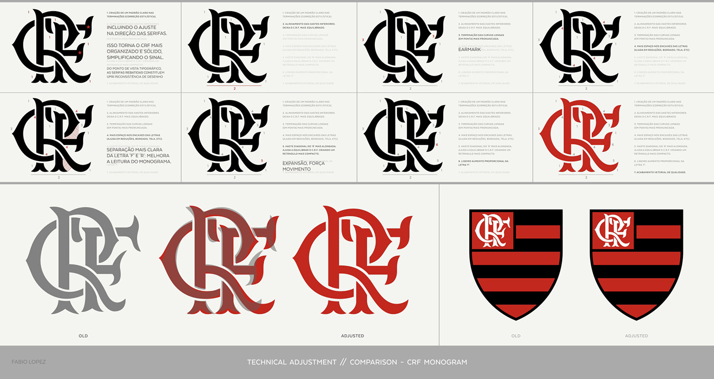
The first part of the project constituted a phase of adjustment in the main symbols of Flamengo visual identity. This process began with a detailed analysis of the CRF monogram, due to its importance in the club's visual identity.
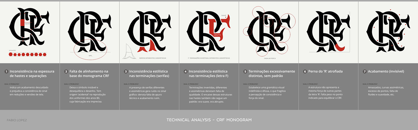
As mentioned above, technical and stylistic problems were a clear opportunity for improvement and renewal. Among them, the lack of standard in similar structures (serifs, strokes, terminals and separations), drawing issues, alignment and low quality vector refinement can be highlighted.
In order to preserve the visual essence of the monogram, the subsequent action was aimed at adjusting the typographical inconsistencies found, keeping the structure and proportions almost unchanged.
The second stage of this step was to analyze the Flamengo land sports crest, where the CRF monogram is applied. Looking closely at this symbol, I found a small issues that could be corrected (in the official files used by the club). The crest has a black outline, which, when encountering the first horizontal band of the same color, ends up making it thicker than the others.
After correcting this detail, I slightly thickened the outline in order to give a little more strength to this element, responsible for protecting and highlighting the crest from backgrounds in which it is applied. In addition to this intentional adjust, as the final ratio of the crest is affected by the thickness of the outline, the crest eventually became slightly narrower (or taller). The final result is a more upright and strong emblem, which is symbolically positive in the sporting scenario.

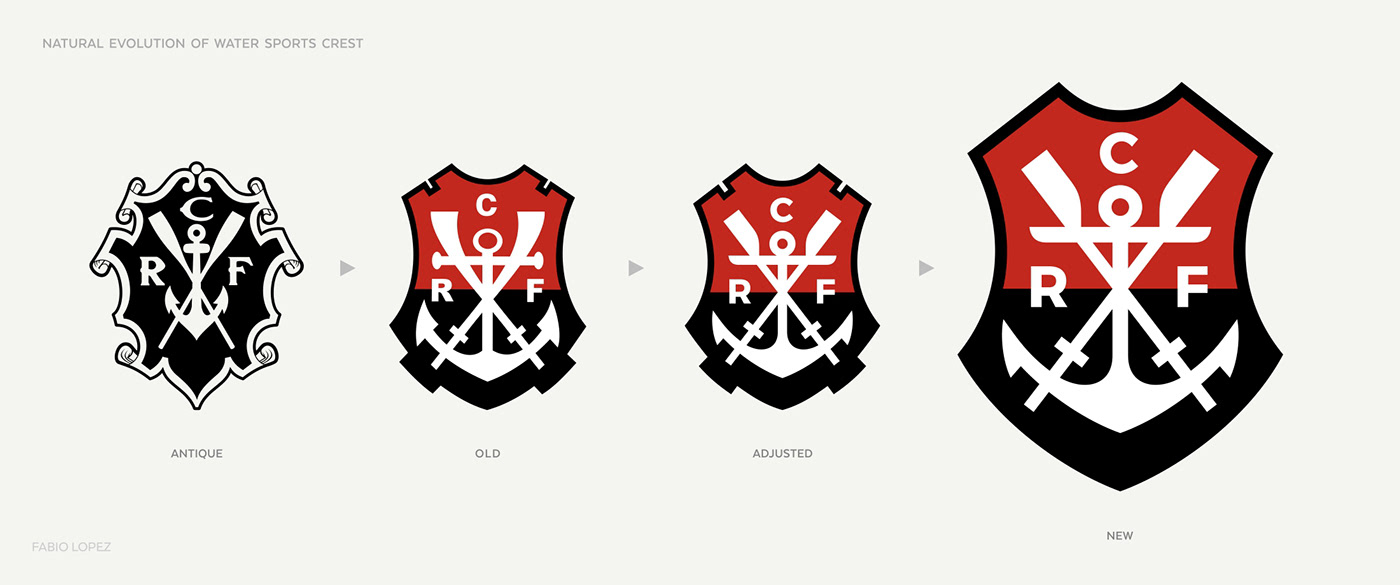
In order to close this stage of adjustment, it was necessary to analyze the water sports crest, one of the most traditional elements associated with the origins of the Clube de Regatas do Flamengo.
I began this process by isolating the constituent elements of the crest, in order to analyze their particular characteristics and identify the possible improvements – as well as some stylistic updates, since this symbol carries figurative images in its contents. This procedure helped me to find a small problem in the shape of the crest (asymmetry), and to show the lack of standard in the weight and the size of the letters 'CRF' of the core. In addition, I realized that it was possible to simplify and update the design of the anchor and the crossed oars.

The crest had its surroundings redesigned, including a small increase in the recesses found at the top of the shape. We changed the letters 'CRF' to a more readable and contemporary typeface, fixing the typographic inconsistency pointed out earlier. The anchor was slightly simplified, eliminating details that did not contribute to the recognition and legibility of the symbol, and the oars were redesigned to look more like the equipment used today. The exact point where they intersect became the red and black color divider, which also helps to visually organize the symbol.
In addition to these adjustments, the black line of outline of this crest began to have the same thickness found in the outline of the land sports crest, giving a greater visual parity to both.

Although the initial aim at this stage was only adjust the main symbols of the visual identity of Clube de Regatas do Flamengo, the exercise performed on the water sports crest ended up being an invitation to take a step forward. How far could we advance without mischaracterizing this symbols, combining aesthetic evolution with respect to the club traditions? And it was just looking at the origins of Flamengo that we found a way.

Created at its foundation in 1895, the first identification symbol of the Clube de Regatas Flamengo is the emblem that originated the water sports shield. Observing both side by side, we perceive not only the aesthetic evolution of its internal elements, but also a significant process of simplification of the external form of the crest. While the founding emblem resembles a kind of parchment or diploma, the following version virtually removes this ancient reference, retaining only a few indents and protusions in keeping with the interior drawing.
The natural sequence of this process of simplification would be, therefore, the removal of these details from the surroundings, in tune with the contemporary character of the adjustments made at the core. This procedure of simplification is quite common in the historical evolution of brands, coats of arms, shields and emblems in general, and gave interesting result to the element: a modernized crest, that wasn't simply adjusted.
According to the manner the land sports crest is described in the club's statute, the only possibility of alteration/modernization in this element rests on the CRF monogram – which, incidentally, has occurred other times in the history of Flamengo.
So I wondered how it would be possible to modernize the CRF, and stepped out of the computer to get faster more expressive sketches. The exercise was done over soft prints of the adjusted structure, which still assured me a strong relationship with the current monogram – after all, the intention was to evolve, not to modify. At the end of this process, a drawing with more modern and dynamic characteristics was digitalized, refined and became the final form of the monogram.

Comparing the modernized monogram with the current and adjusted versions, we can see that the CRF is, visually speaking, more balanced and stronger, presenting greater weight in several points of the drawing, without loss of legibility.
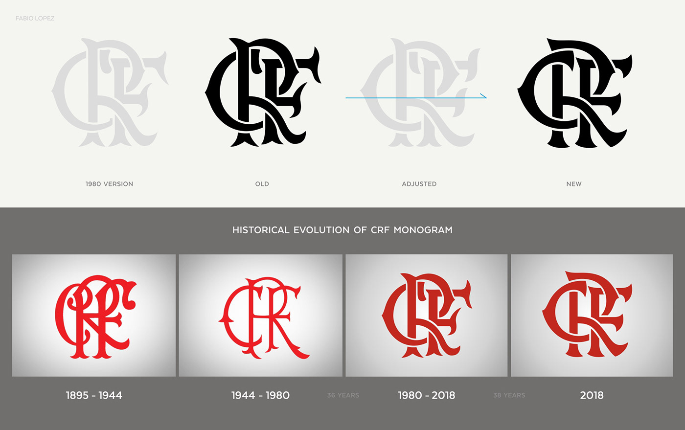
The Flamengo monogram featured fishtail Victorian-inspired serifs: a reference to the classic English style of the 19th century commonly found on old soccer club crests. This terminals was replaced by serifs of a more particular and dynamic nature, with sharp and incisive curves and tips that refer to the very shape of the Flamengo crests.
The letter C fragment isolated in the middle of the monogram was eliminated, with the creation of another fitting solution. Its termination at this point became one of the strongest visual ear mark of the modernized monogram: a kind of tusk or claw perfectly adjusted to the inner curve of the letter R. The leg of the letter R has also gained a sense in its final part, and the 'thorns' of the curved parts of C and R were modified to suggest arrows, with continuous and circular motion.

The obvious graphic similarity between terminals, curves and serifs makes the monogram more organized, concise and balanced. Everything in the new CRF reflects strength and movement, with a contemporary look and technical refinement. Despite this, the proportions of the previous monogram were respected, as well as its characteristic interlaced structure.

Regarding the land sports crest, both the statutory issue and the intention of not to significantly change this symbol of the club, the modernization of its elements was only the insertion of the new monogram, in addition to the previously presented adjustments that gave it more strength and boldness.


To complement the set and to consolidate the process of renewal of the visual identity of the Clube de Regatas do Flamengo, we also decided to renew the typographic expression of the club, creating a logotypes system aligned with the project concept. Despite the fact that this logotypes does not have the same permanent and special character as the modernized symbols, we believe that it is an important tool in the effort to reorganize Flamengo's visual communication.
The new typographic signatures adopt guidelines similar to those the club had already been working on, although presenting themselves in a stronger and more contemporary style, with small yet relevant details in their design. It is a solid and extremely clear typographic profile, integrating a versatile set of signatures and variations for everyday applications of Flamengo communication. For the whole typographic hierarchy the same principles was adopted, including a third typeface for web use.

All of the choosen typefaces are software libre, freeing the club from any licensing costs and facilitating the legal and correct use of digital typography – both internally and from partners and suppliers.

The result of this process is a renewed visual identity, which at no time distorts the personality and visual heritage of the Clube de Regatas do Flamengo. After all, our goal has always been to modernize without disrespecting our traditions.
The idea is not, evidently, to discard the red-black past, but, in time, to extend the variety of products and contents available in three possible ways:

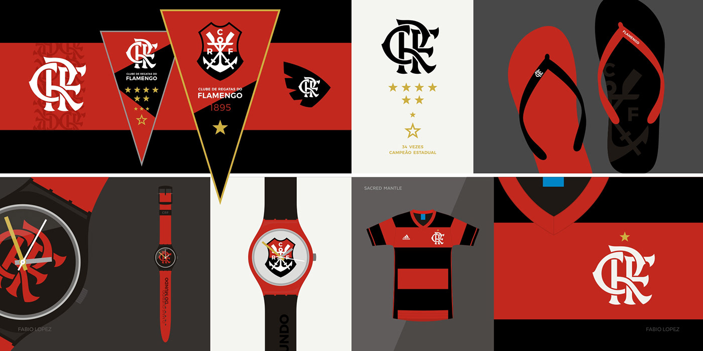
Below are some project images, color studies, hypothetical applications and/or suggestions for use. All images have a merely illustrative function and are non-existing official products or real project applications.
motion graphic created by Eduardo Franco.


A visual identity project is only complete after the creation of a graphic standards manual of the developed system. In this project, however, this item was never understood as a simple outcome, due to its importance and need for improvement in the management of Flamengo visual communication.
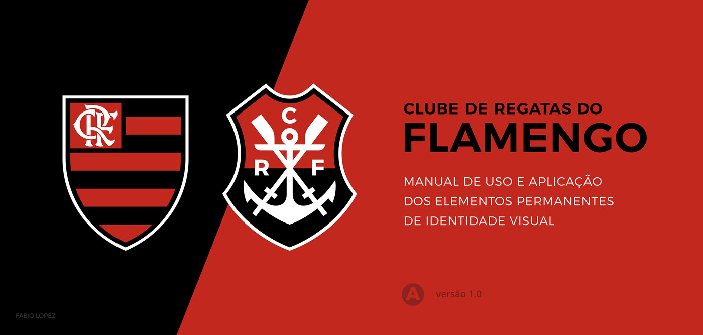
From the beginning, the creation of the manual has been one of the main goals of this project, and its content was the result of numerous deliberatios among all who have been directly involved with the project, including Flamengo employees. We set out to create a document that would adopt simple and direct recommendations, focusing only on the main elements of the CRF's visual identity – especially in this first stage of activation. Revisions and additions are provided as part of the natural existence of a large and complex project.


This document will serve to guide partners, licensees and suppliers, but also and especially to help club employees manage their own visual identity.


The project was officially revealed on April 10th 2018, in a joint operation to present the new jersey of the 2018/9 season, besides activation in social media networks and update on the visual communication of the club. In a partnership with the Wix platform, Flamengo has published a hotsite containing information about the project:


Flamengo's jersey: Adidas - Home 2018 / 9.


social media graphics with updated visual (project developed by Eduardo Franco).
On April 18th 2018, the new visual identity made its first official appearance in a sporting event, in a match valid for the Copa Libertadores da America (Flamengo 1x1 Santa Fé). The striker Henrique Dourado scored Flamengo's first goal with the new CRF.


Copa Libertadores da América - Flamengo 1x1 Santa Fé - 04/18/2018 (Maracanã Stadium)

Campeonato Brasileiro - Flamengo 2x0 América-MG - 04/21/2018 (Maracanã Stadium)


Campeonato Brasileiro - Ceará 0x3 Flamengo - 04/29/2018 (Castelão Stadium)


Campeonato Brasileiro - Flamengo 2x0 Internacional - 04/29/2018 (Maracanã Stadium)


Copa Libertadores da América - Flamengo 2x0 Emelec - 17/05/2018 (Maracanã Stadium)


With Zico and Julio Cesar, wearing the new jerseys.

Most football clubs in Brazil (and worldwide) do not yet understand design as a strategic tool in their operations – and this is a bit worrisome in 2018, evidencing a huge delay in the professionalization process of the activity.
The vast majority of clubs demand timely services from creative professionals, in actions usually associated with visual communication and marketing. But I risk to say that none has a in-house design department, with professionals dedicated to rethinking the structure of the club, its practices and actions, its discourse, the management of tangible and intangible assets and the creation of new business opportunities.
I am immensely honored and delighted to be part of an effort from my heart team to recognize the importance of your visual communication as a strategic part of your business. It is not the first initiative in this direction, but judging by the focus of this project, this was an important step.
And because I like football, I would love for this initiative to go beyond the realm of passion and serve as a benchmark for the evolution of the sport as a whole – including in this process the valorization of the designer acting.
And there does not matter your team, we're in this together. ;-)


A number of people were very important to the realization of this project, and I would like to say thank you so much. First of all to my former student and friend Eduardo Franco, who certainly can include this project in his portfolio for his untiring participation in all stages of the work, from development to presentation.
To Daniel Neves, for the valuable and crucial consulting about the club history, and for the many heated discussions to define 'what Flamengo is'. To my friends Lauro Machado and Jamil Li Causi, for the ever constructive contributions, amongst criticisms and advice.
To the friends from Clube de Regatas do Flamengo, especially Fred Tannure, Ricardo Taves and Márcio Macculloch. To Antônio Tabet, for promoting this opportunity and conducting the project with great respect to my professional performance. To the president of Flamengo and other directors (and staff) of the club, for embracing the challenge of making CRF a reference in transparency, management and professionalism.
To my wife, Ellen Gonzalez, a SPFC fan, who hears me talking about Flamengo incessantly and now also under professional pretext. And to all my flamenguistas friends who have been around on this journey, or with whom one day I have shared a bar table, a hug and a shout of champion. SRN!
Dedicated to my uncle Vicente, who made my father flamenguista, therefore contributing to a better lineage of the family.

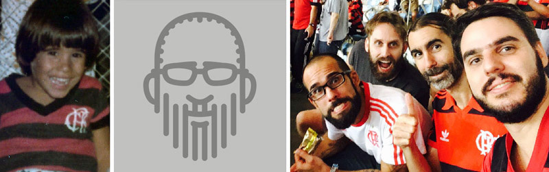
Fabio Lopez is a Brazilian graphic designer with bachelor and master degrees at ESDI /UERJ and teacher in PUC-Rio. Fabio understands design as a powerful tool for cultural production and political discussion, and works as an independent professional in typography, visual identity, fashion and illustration projects. He is the creator of the mini Rio project, a homage and extensive exercise in visual representation that has resulted in more than 200 pictograms and patterns about his city. He is the author of the projects War in Rio, Bando Imobiliário Carioca and Batalha na Vala - a triad of board game parodies which adress the issue of urban violence in Rio de Janeiro. He was responsible for the Olympic and Paralympic Rio 2016 brands logotype, and the visual identity of the Carioca's Center for Design - CCD, a development agency linked to Rio's City Hall. In 2017 he created the Emblem of Brazilian Cultural Heritage in a contest organized by IPHAN, and developed the redesign project of the visual identity of the Clube de Regatas do Flamengo, his team at heart. Currently he is a member of the board of the Latin American Biennial of Typography Tipos Latinos, after being juror and coordinator. He researches philatelic design and has developed some postage stamps for the Brazillian Post Office. Fabio has made typeface, poster, website, book, print, illustration and vandalism. He is a lecturer, consultant and writes strange things.


