


The "bow" logo that embodies my brand and identity as a creative worker, in addition to subtly portraying the letter M, stems from the fact that I wear a hair bow almost every single day. Varying colors, varying sizes, it doesn't matter; I just make a point to never wear the same one two days in a row.
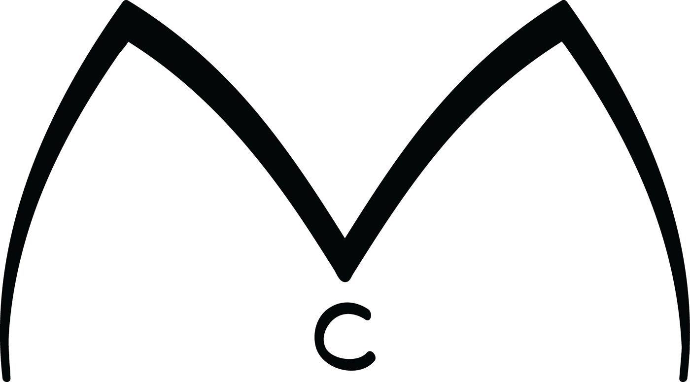
This was the very first prototype idea I had for this logo, years before I'd need to develop a professional logo in my design courses at Anderson University. The M and C make up my first two initials (I didn't want to incorporate my last name because it would eventually change if and when I got married later on). I'd doodle it on my notebooks and occasionally use it as a "signature".
Of course, when presenting it to my peers for the first time... it wasn't nearly as good as I first thought it was. Thus the revision process began.


I tried countless different shapes and styles to portray both the "hair bow" look and the letter M. Uniform line weight and simplicity became the end-goal, as well as readability at a small size. Can you find which one ended up making the final cut?


From there, the final specimen was chosen, and the final steps were taken to determine logo treatment, as well as brand typing and coloring.
Clean, sharp, and just a little bit of flair. That's me, all right!


