


A Rebranding For
Luxe Spa Ottawa
1366 Clyde Ave
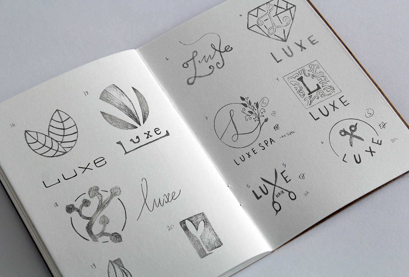
About the Rebranding
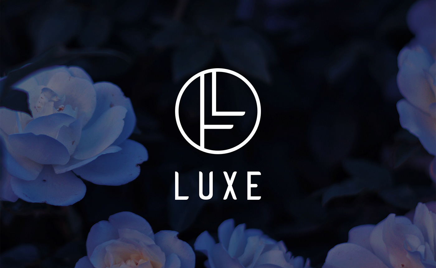
The goal of this logo redesign was to portray Luxe’s quality in services, and renown artistry to Ottawa and its surrounding cities. This newly created logo was carefully curated to bring a sense of modernism, which was highly influenced by the Art Deco style. This logo is timeless, adaptable, and straightforward.
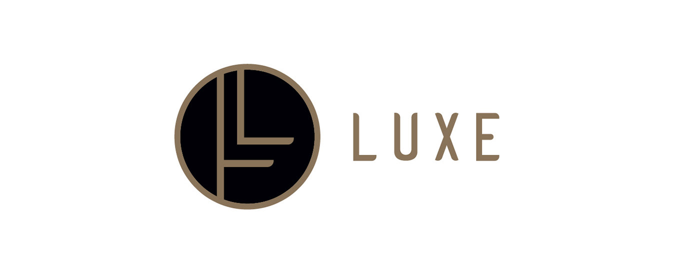
To portray the essence of elegance—which plays a crucial part in Luxe’s current presence—the logo was designed in solid, clean lines. It primarily consists of breathable space, contemporary bezels, and a classic colour palette. Gold, which is appropriately associated with luxury, pairs beautifully with the rich black at its centre. To evoke the senses of sophistication, formality, and class, a deep black was selected to create balance. All of these elements combined, the logo successfully emanates to Luxe’s clientele the feeling of grandness, lavishness, and openness.
Such qualities are valuable, and it is necessary to illustrate them to the public. By choosing this logo, Luxe’s brand will benefit from standing out from its competitors. Luxe may expand, or choose to branch off into any specific field from the beauty industry, and it will always harmonize with Luxe’s demographic. It is a unique and highly recognizable logo for a remarkable company.
Applications


+ A Custom, One-of-a-Kind Wordmark
Website Homepage


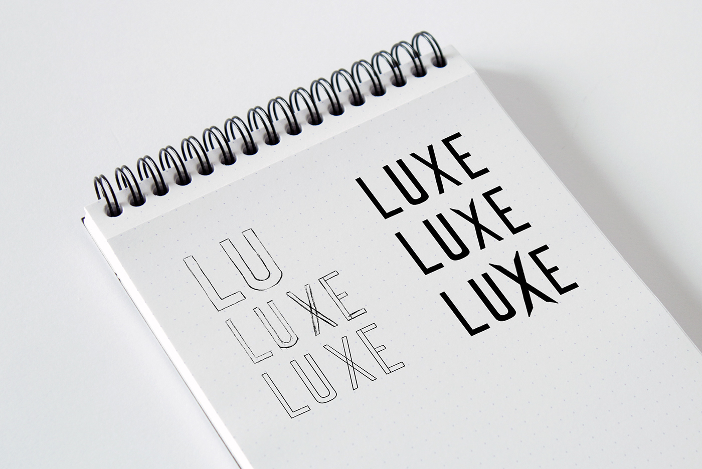
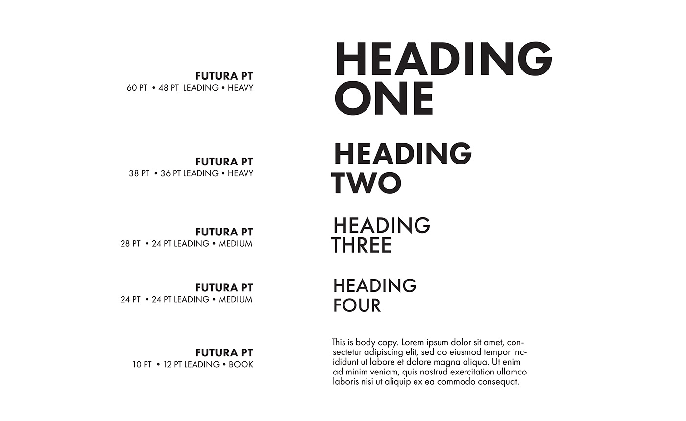
Typography
Colours
Primary
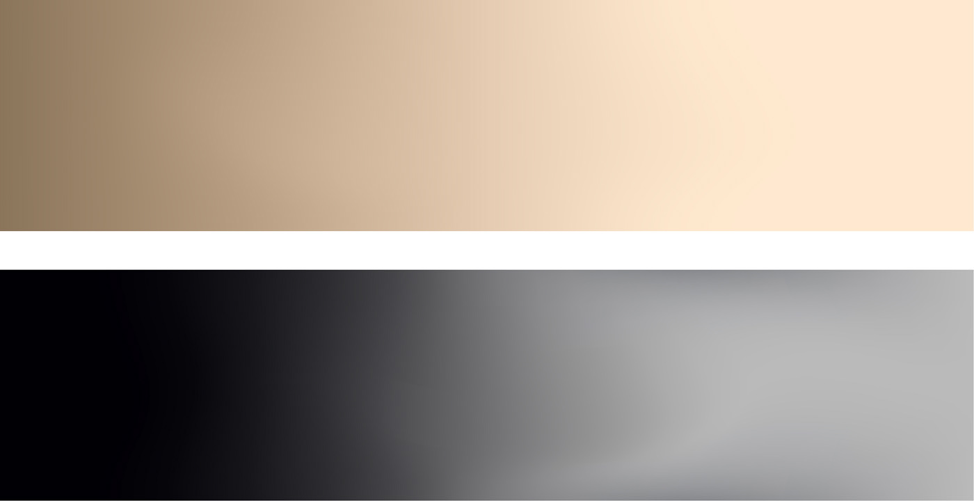
Secondary

Branding Guide
Highlights


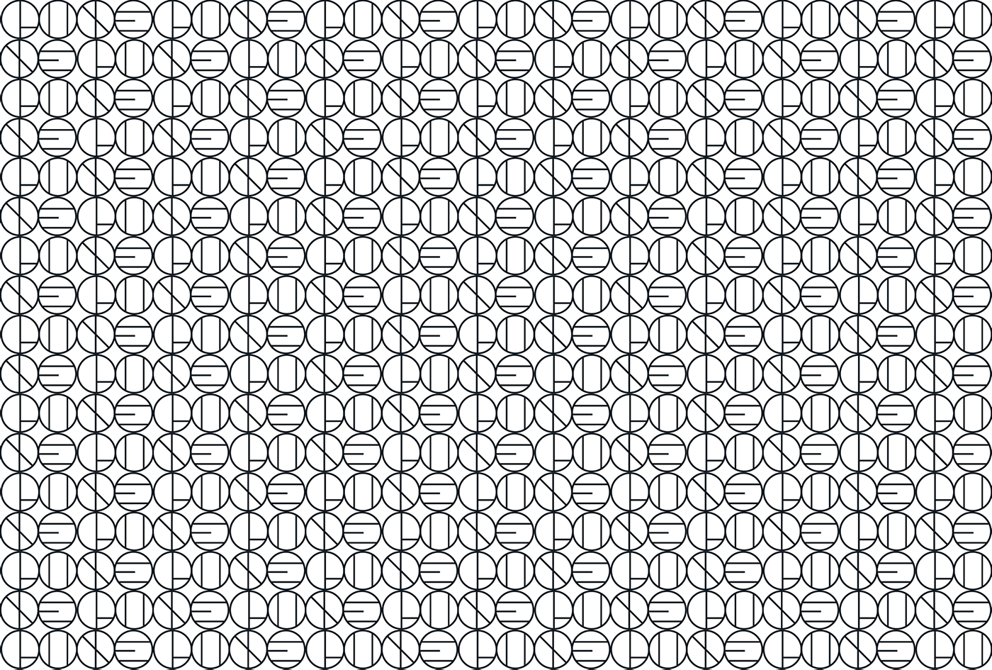
Pattern
Last but not least, here is a funky, memorable pattern that spells out "LUXE" inspired by the Art Deco style.
This pattern was intended to be used on accent walls, tissues, towels... Anywhere the salon needs a fun accent, this pattern would be appropriate.
Thank you for viewing!
Support a designer, please appreciate 👍


