

Daily Ui 010 - Social Sharing: I made the social sharing high contrast and dropped that contrast when it converts to a close button so the visual emphasis can shift to the social icons.

Daily UI 009 - Music player: I was going for something colorful and basic (meaning not feature heavy). I envisioned this being the interface for a tablet or desktop app and the mobile version would probably just have the white and no carousel.

Daily UI 008 - 404 Page: This is a 404 for a horror website. The go back link in inconspicuously dark red at the bottom of the screen. After the user clicks the more noticeable red button above it for the scare "go back" turns white so the user can better see it. Of course, if the user doesn't learn their lesson they'll keep getting the clown until they do. :-)

Daily UI 007 - Settings: I saw a meme once that was basically about how we can never have all the time, energy, and money we want. So I thought that would be an interesting idea to explore for this challenge.

Daily UI 006 - User Profile: I spent more time than I care to admit on this piece. I wanted to keep the layout itself fairly simple, and to keep it from being boring I tried making it colorful and applying little things like a drop shadow on certain elements to give it a glowing look rather than a lifted up feel.
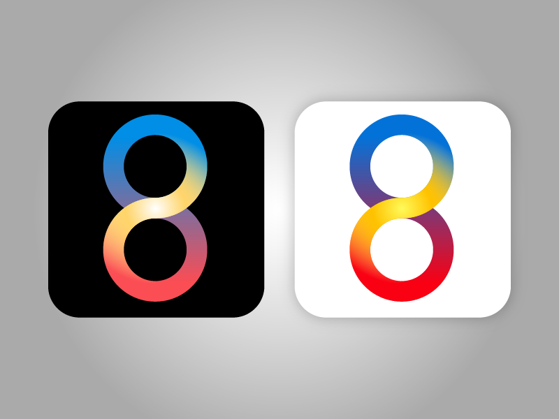
Daily UI 005 - App Icon: The hypothetical app for this is a dating app called Soul M8. The idea is that people who register answer 8 questions and compatibility with potential partners is figured out based on the answer to those 8 questions. Other ideas included grouping people (by 8) based on their compatibility...etc...
The icon is an 8 and the infinity symbol. The parts represent perfect circles (a symbol of how love in a marriage/partnership is never to have an end, which is what rings represent as well). The blue represents loyalty, and the red is love. Red is also on the bottom to represent that love is the base of such relationships. The yellow radiating from the center is meant to represents gold (usually used to make rings), so symoblically represents value and preciousness. It's also meant to convey warmth.
There are two versions depending on a white or dark background meant to ensure enough contrast to be seen on a smartphone.

Daily UI 004 - Calculator: A calculator that figures out how many fucks are given. Enter the age, position the slider over to heart of ice or snowflake. Hit equals.

Daily UI 003 - Landing Page: Due to limitations this isn't animating the way I wanted it (I had more shots included, and the transitions weren't so fast), but this gets the idea.

Daily UI 002 - A credit card form: Took some shortcuts in the process using autofill. The two things I really wanted to communicate were the CC type highlight/confirmation and how the complete order button "jumps" as a CTA after everything is complete. If I had more time I would've spent it refining the cart side a little more.

Daily UI 001 - A login form: Played with the concept of lock and key.


