Background
Hailing from Central Florida, FELICITY is a pop-punk band drawing comparisons to acts like A Day to Remember, State Champs, and Neck Deep. Known for their high energy shows and electric stage presence, FELICITY has been taking the pop-punk genre by storm, playing gigs like WARPED Tour, Florida Music Fest, and Fort Rock.

Challenge
As an up-and-coming pop-punk band, FELICITY needed a full brand experience that would match the precision and professionalism of their on-stage performances. Our challenge was to create an entire brand ecosystem that communicated FELICITY’s energy, while setting them apart from the sea of other pop-punk bands in the space.

Insights
After performing a competitive audit of other pop-punk bands in the industry, we noticed a prevalent theme of purposefully unpolished branding and presentation. Distressed type, grungy logos, and over-sprayed graphics are the clear cut trends used by the majority of FELICITY’s contemporaries. Knowing this, we strove to set FELICITY apart from their competitors, designing a branding system that is sharp and decisive, while still being unapologetically badass.


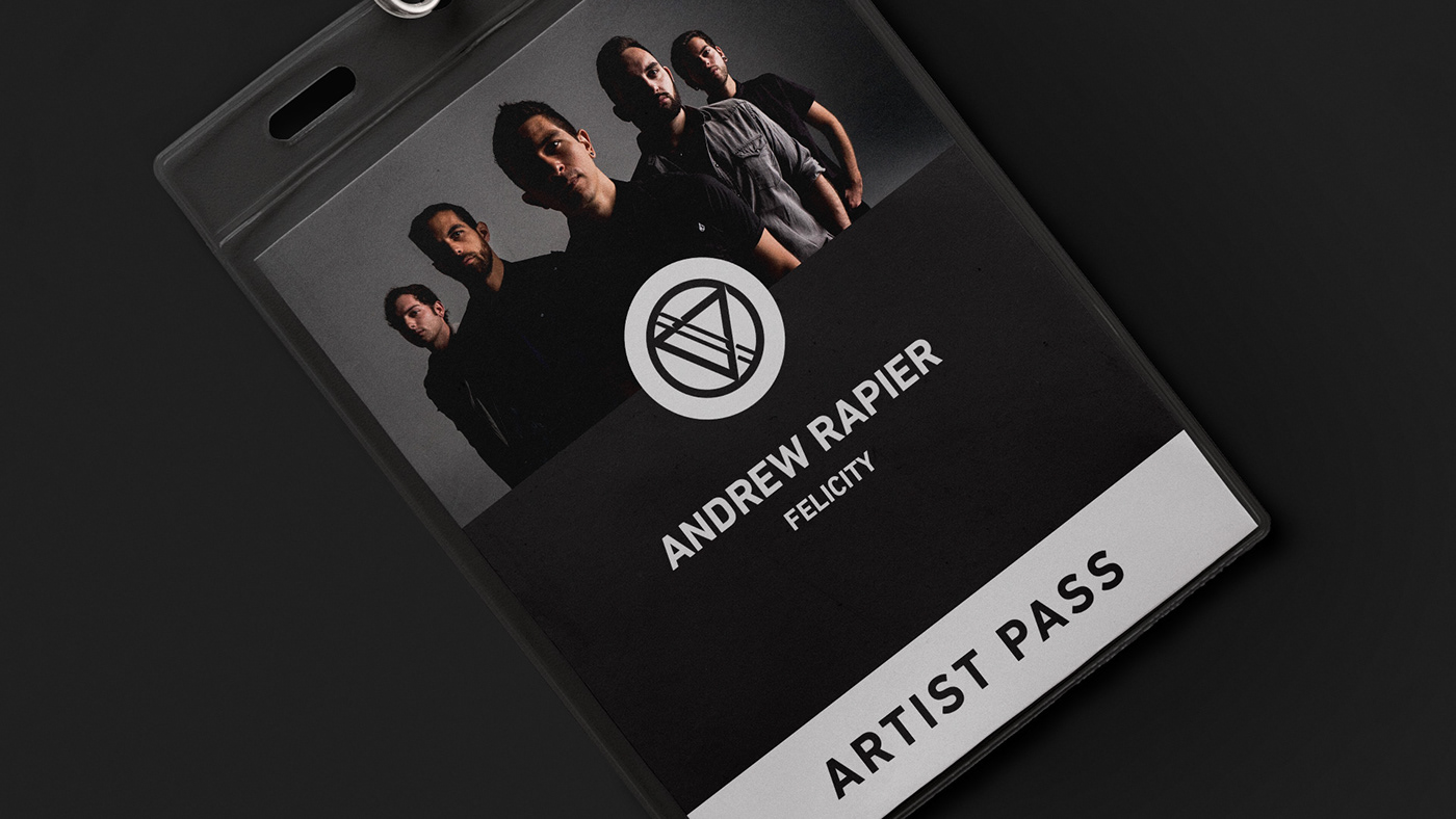
Solution
Working directly with members of the band, we were able to establish the messaging and image that FELICITY wanted to communicate to fans. Dark, muted colors are utilized as an homage to the band’s hard rock influences. Sharp edges can be seen throughout the brand’s aesthetic, connecting the visuals to the sharp precision of the band’s performances. But one thing we couldn’t leave out is the element of fun, of the unexpected, which is evidenced by surprises like the 3D glasses that we included with the band’s ‘Brace Yourself!’ EP.