


About:
PubGuru is a SaaS web app platform for publisher ad operations. It is used by ad optimization teams and revenue executives to monitor and optimize their programmatic ad inventory.
This is a concept redesign of their home dashboard created to improve their user experience and usability. I decided to approach the project by focusing on creating a interface based on Nielsen Heuristics and Donald Norman's principles of good design, such as creating a good concept model, visibility of system status, consistency and standards, Recognition and minimalist design.
What you're going to see now is the result of this process.
Before:

After reading the Briefing and analysing the screen they sent me I spotted the main problem which is: the information architecture does not display the main information from the dashboard in a fast, easy to see and clear way. From this point I started working on creating a UI to make the information visualization easier for the the user to understand and to make it easily recognizable with highlighted information not displayed as a sheet.
Creating the concept model:

The previous model had the information displayed as a sheet that looked a lot like the excel sheets these platforms usually provide. The problem with this model is that it's dense and often not as easy to visualize as it should be when someone is using a system to look at revenue numbers and access status.
To solve this problem i decided to create a card-based model in which different cards containing related information are displayed separately, besides having it all in a single spreadsheet. It makes the information easy to visualize and to analyse creating unity in the system and avoiding mistake that might happen due to information organization problems.
The result:
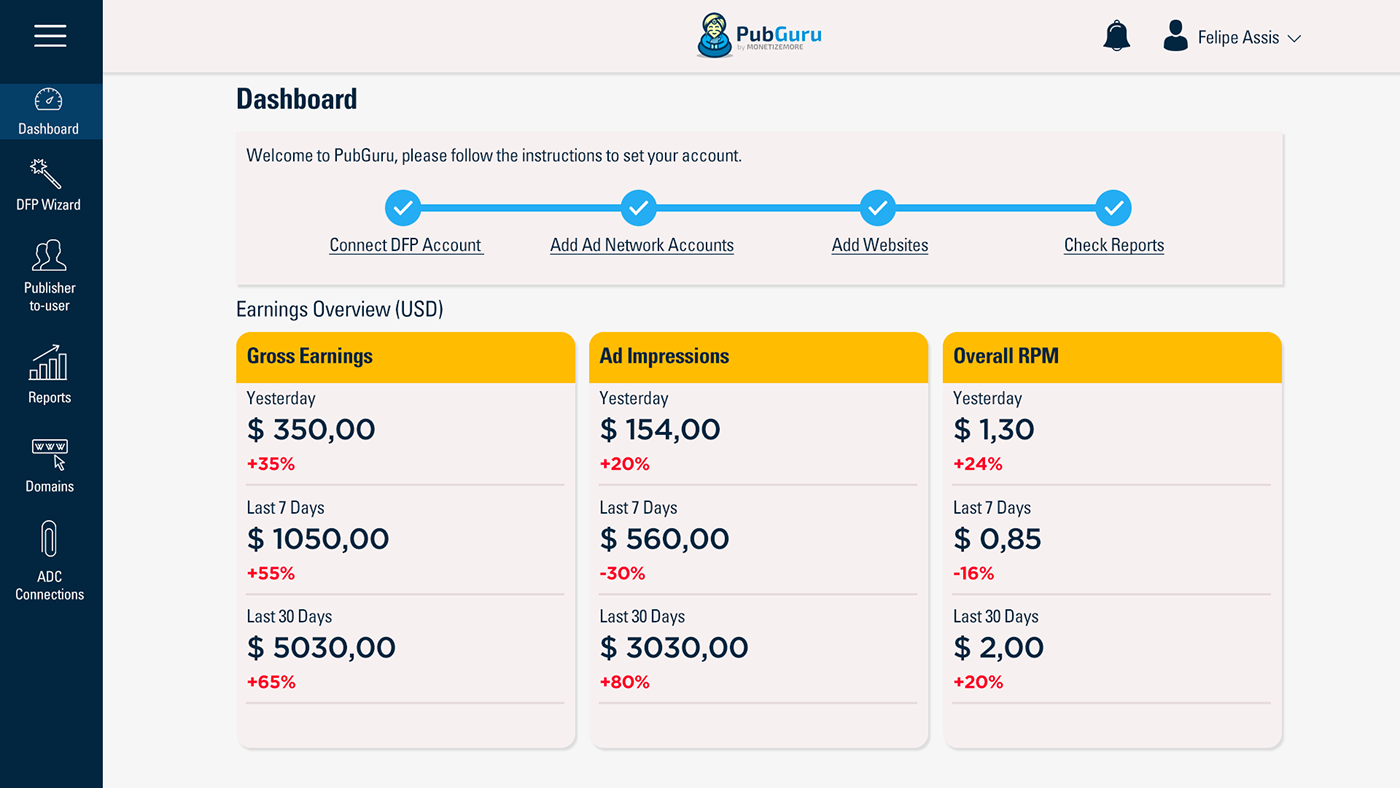
I aimed to create an interface that is good, clean and easy to navigate through. Besides creating the dashboard I have also made some modifications on the header and the menu to give it better information architecture and to make it responsive friendly.

After the onboard the dashboard focus on displaying the main information so the user can easily assimilate it. The card-based model helps a lot because we can relate it to our world memory and understand where each information belongs to. The changes on information hierarchy such as font size, colors and organization also make the interface mush more welcoming.

Thanks For Watching!


