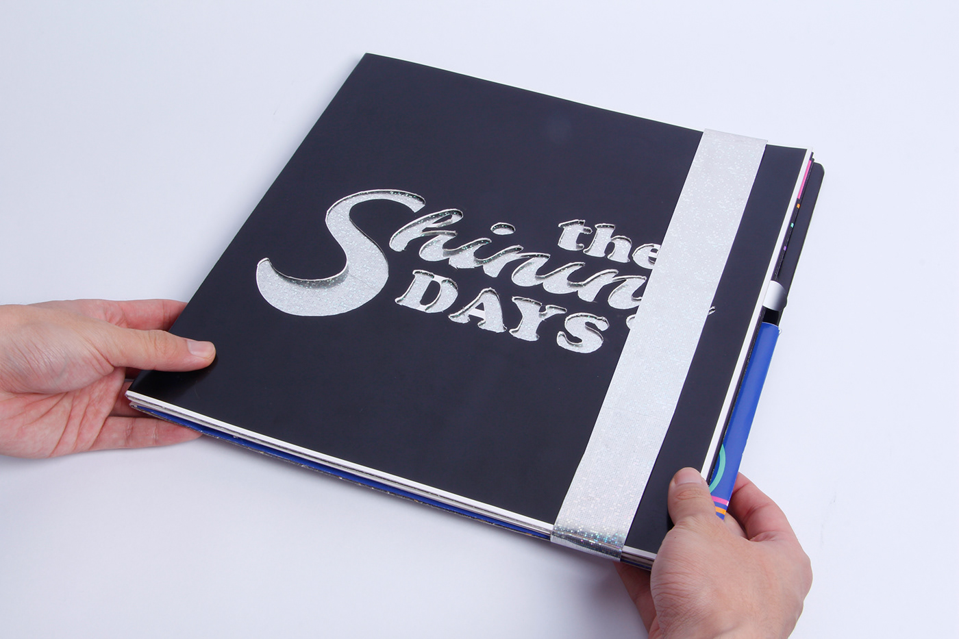
THE SHINING DAYS

OBJECTIVE
Choose a musical style and create a vinyl packaging for the record. Limitations:
• Use only typography to compose the art;
• Have a package with a differentiated design.
• Use only typography to compose the art;
• Have a package with a differentiated design.

Outer wall of the package

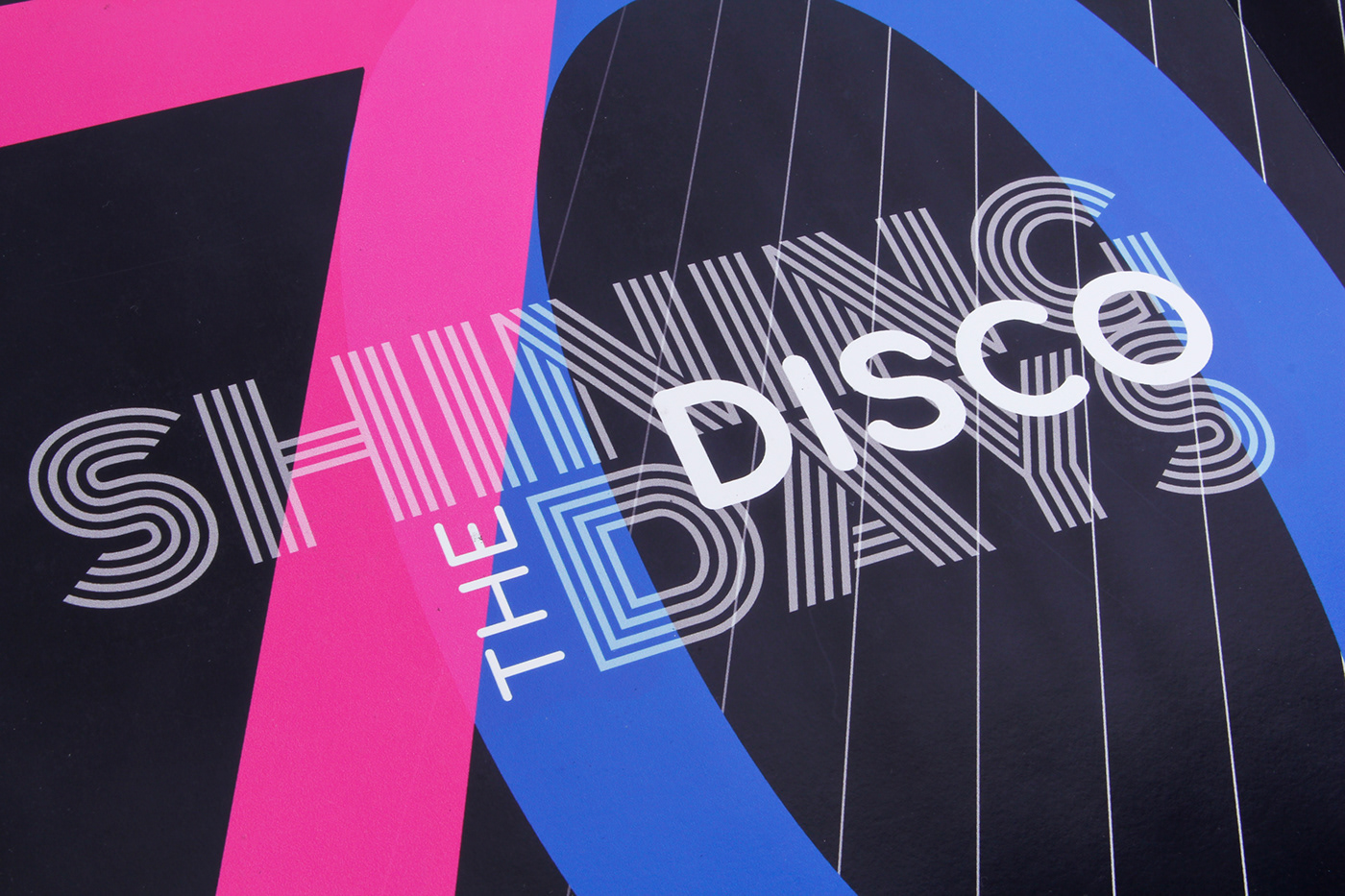
Inner wall of the package
Nas faces internas, temos uma composição de linhas coloridas em um fundo preto. Um elemento gráfico inspirado nos feixes de luzes, refletidos do globo de espelhos, que iluminavam as discotecas.

Bolsa para o Vinil
The typographies used were those present in the visual identity of the clubs of the 70s. The layout of the title "The Shining Days" was done in a dynamic and lively way, to portray the lively atmosphere of these environments and the music that played there.