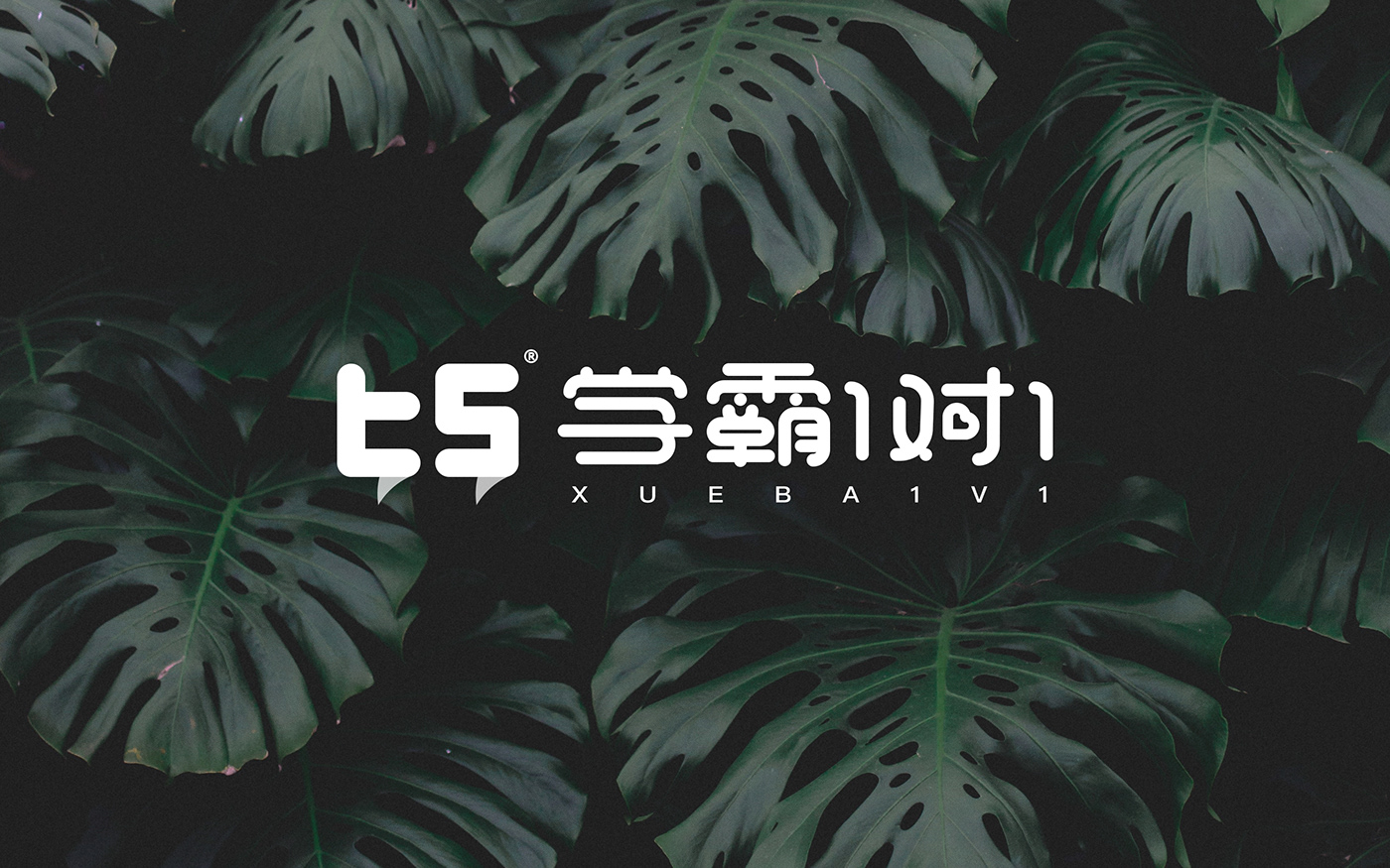
Learn to fight for one-on-one, online education, born for tutoring students, committed to become an online high-end training institution that uses role models to change the fate of students.
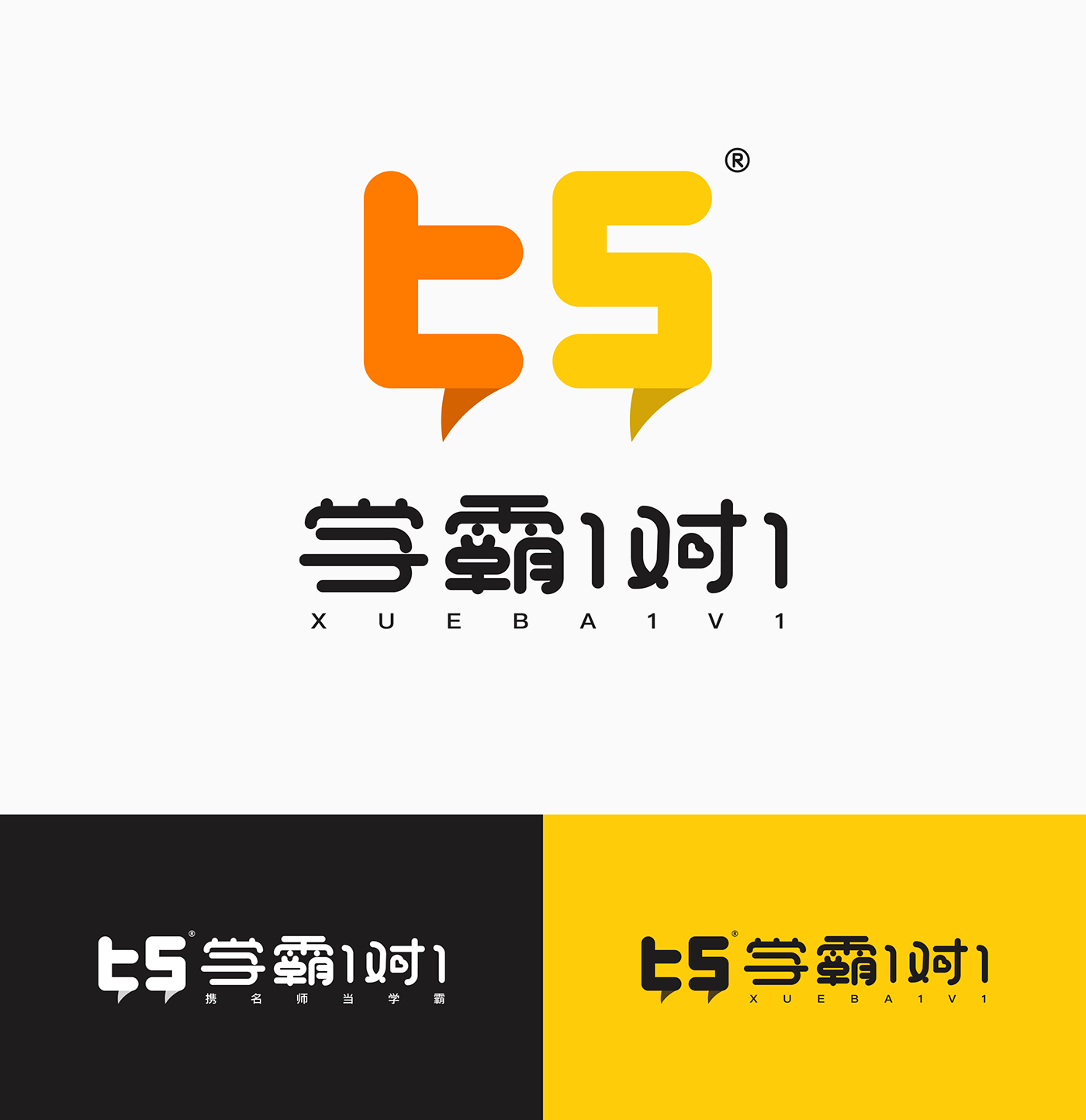
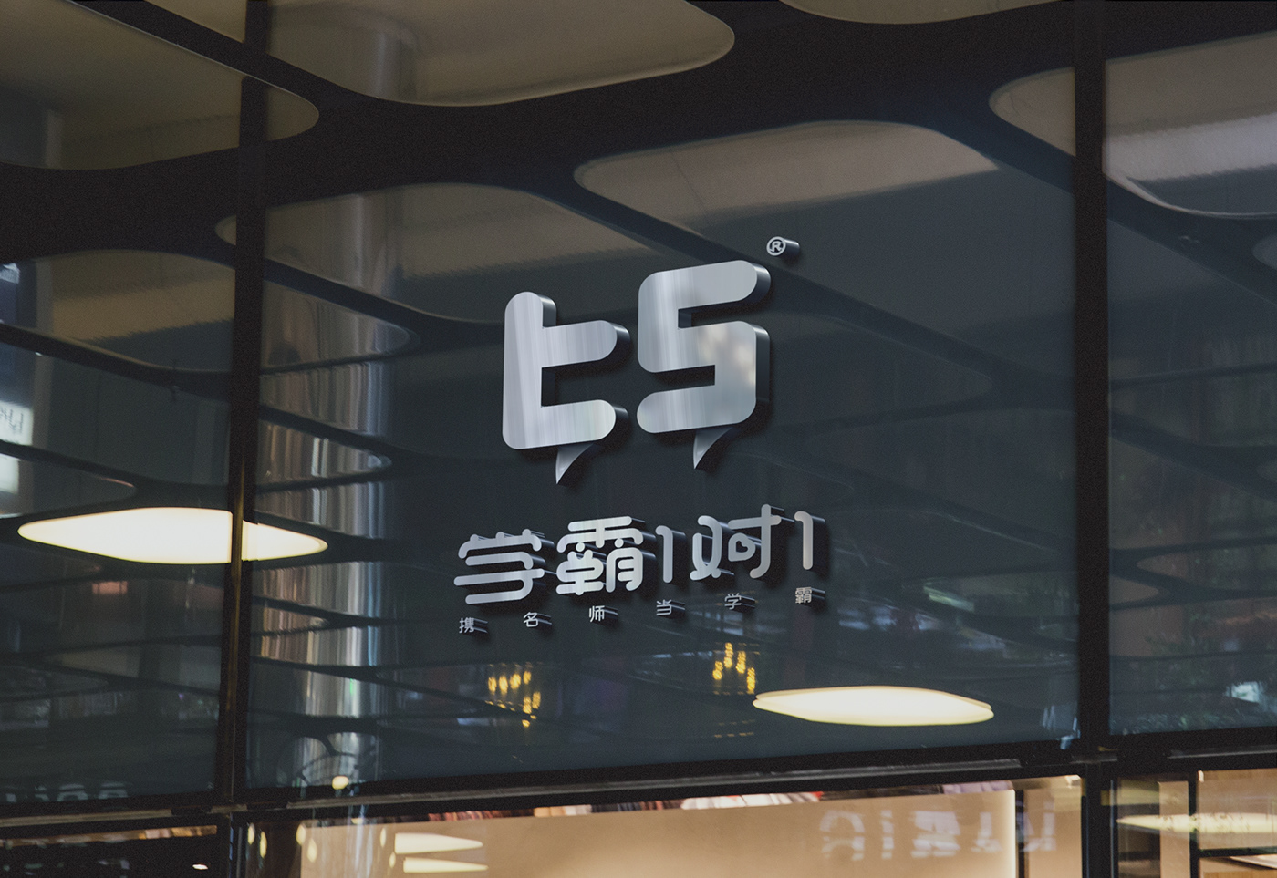
Brand refinement keyword "1 to 1", 1 to 1 is the teacher VS student, the brand uses the graphical logo English tS, t (teacher) on behalf of the teacher or school tyrants teacher, S (student) on behalf of the student, graphic logo and font are There is no lining rounded form layer, in order to allow users to feel good, soft, agile and full of tension. The service communicates with children of different grades every day to help them solve difficult problems. The bubble chat form in the graphic logo is more appropriate for the brand's meaning, brand recognition degree, and the interestingness of the finishing touches.

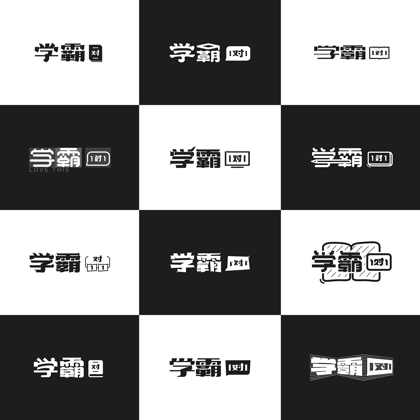
Font meaning:
From left to right, the formation of the font is from bold, regular script, official script, and round body.
01: regular script character, stiff, nostalgic, full of tension;
02: official script, the water droplets are soft, round and comfortable;
03: bold, square, formal, rigorous, professional;
04: round body word, uniform round line soft feeling, Q has the love to close the user's heart distance;
05: Bold type, add element to make the font lively, the sharp Angle part foil the atmosphere of the cow atmosphere;
06: round body word, break the convention, pen and eraser connect to make you somewhat comfortable;
07: black body type, no lining change with lining, bold assignment makes you feel different hard and rigorous;
08: black character, break the routine, when free and irregular, but study endlessly;
09: round body word, circle with Jane, join some wired books to have more appropriate topic;
10: the bold type, with a few lively embellishment, let the vision not the same;
11: bold type, try 10 different ways to arrive at the result;
12: black character, Internet expression form, to be an excellent student is the board of tintin.
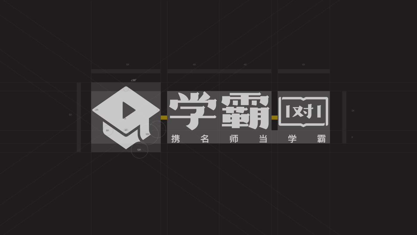
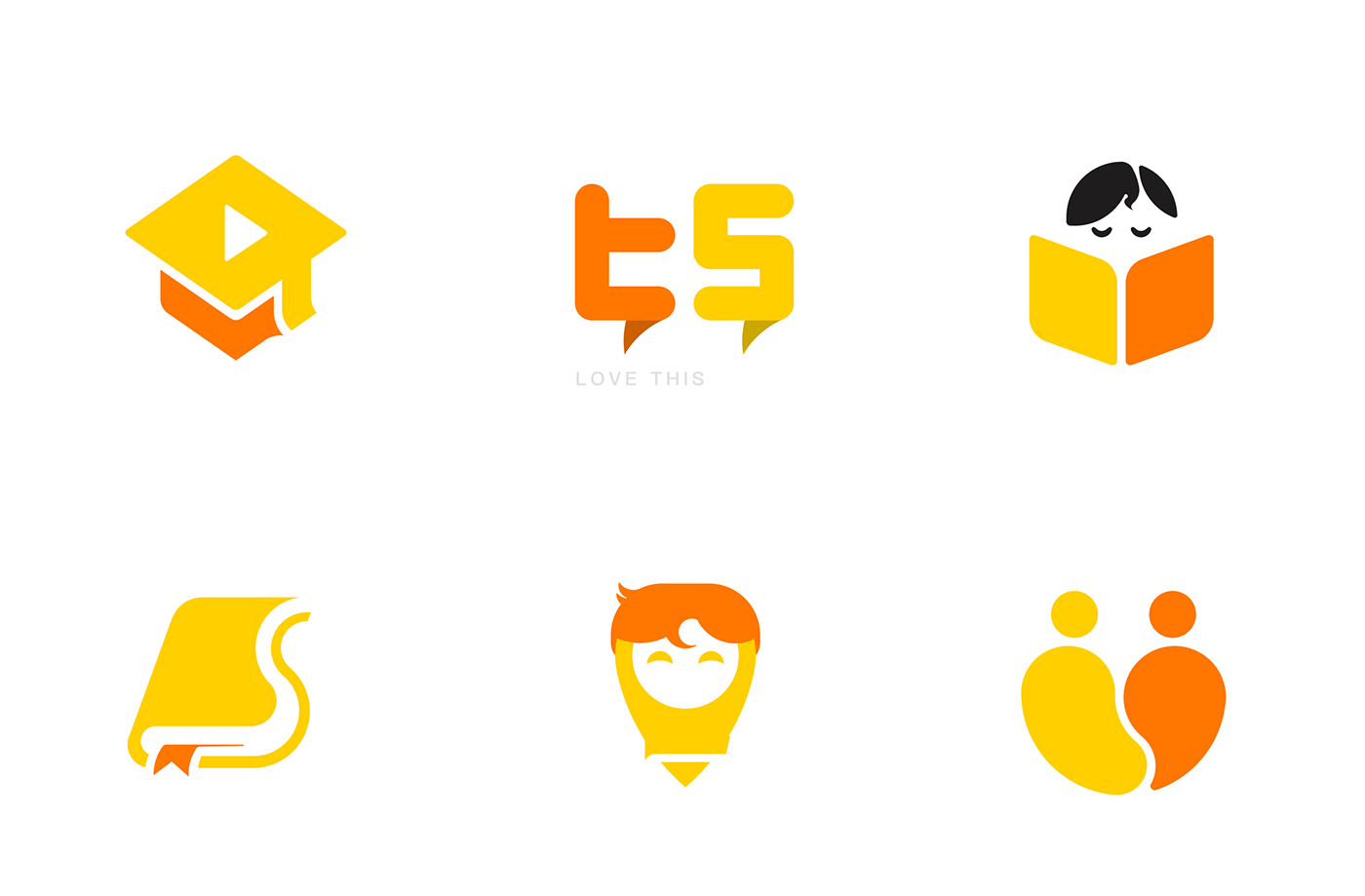
Logo meaning:
From left to right, the logo is designed around education, 1, and Internet.
01: combination design, bachelor cap + video class + chat form, from excellent students as the starting point, we are "1 to 1" online education;
02: English letter design, teacher + student + chat form. The expression technique is modern and concise;
03: character reading design, our mascot is superman image, already "superman" as the entry point, little superman is reading. The moral is good;
04: a book design, the book is closely related to education, and the "S" is used to open the book to distinguish the special features of our logo (superman, excellent students, second).
05: a pen design, followed by superman's signature head, fusion design a lovely pen.
06: two people design, from "1 to 1" point of entry design, 2 people embrace, become a heart, is also our brand want to reflect the love.