
Problems:
My biggest issue with designing my magazine was finding high enough resolution pictures. I also had a hard time figuring out the best design to go with to top my competition: "Women’s World Celebrate" and "Cake Decorating Heaven"
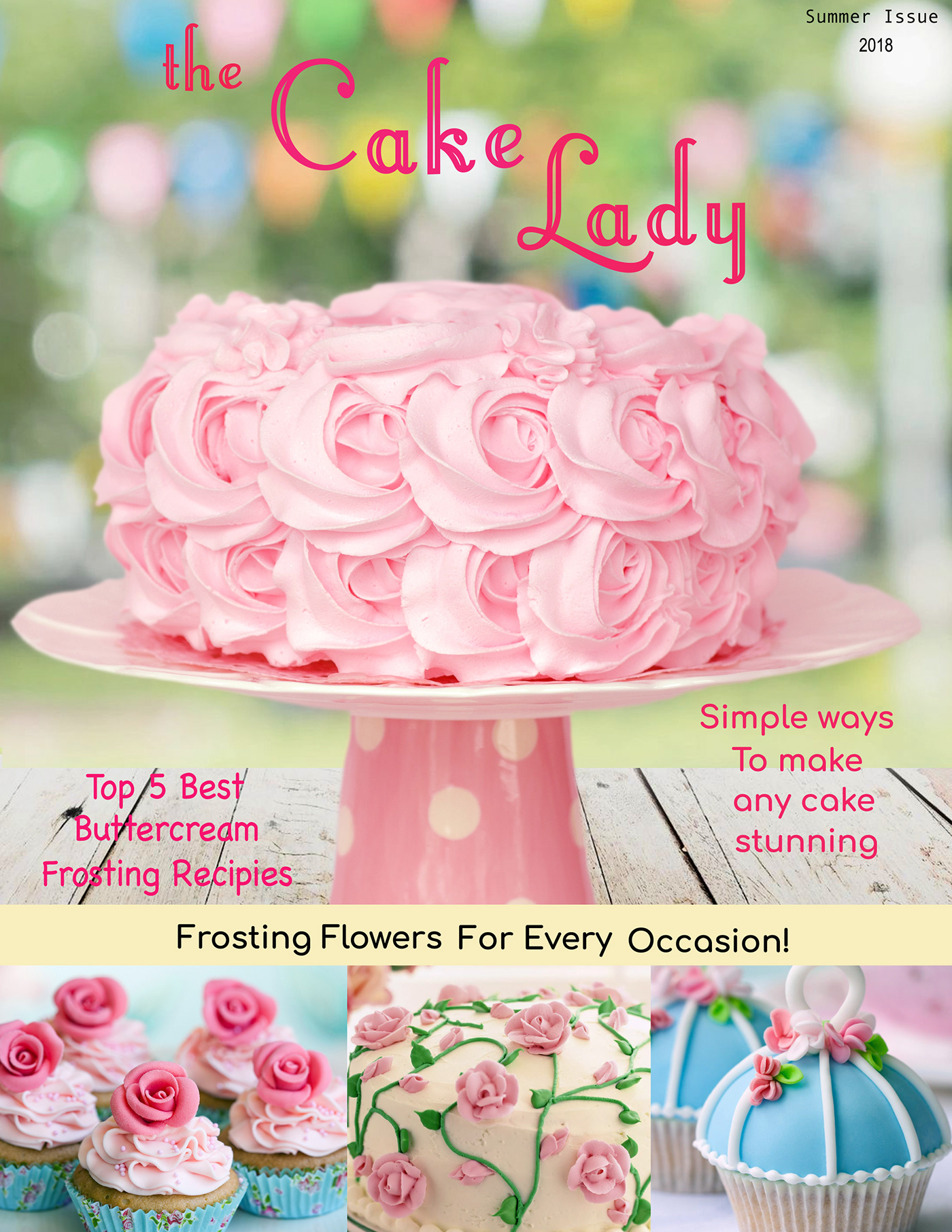
Solutions:
I used the ppi checker in Adobe Illustrator to check the resolution of all of my photos. For my competition I decided to try to stand out from my competitors. Cake Decorating Heaven. Both magazines have a very cute and cartoonish look to them. Women’s World Celebrate accomplishes this with bright colors and a focus on some of the cutesier projects they have inside. Cake Decorating Heaven does much the same thing except with more dulled down colors to try to appear more sophisticated. Almost all cake decorating magazines are targeted at women, which makes sense “about 71% of the cooking magazine audience is female” (http://www.finecookingmediakit.com/pdf/media_kit_fc.pdf). The two magazines above are certainly targeted at a middle-aged audience with an “average age of 42”, (http://www.foodheavenmag.com/wp-content/uploads/2012/05/Food-Heaven-Media-Kit-2017.pdf ) My magazine has a bit less of a cute look as an attempt to look more sophisticated, but still uses the bright girly colors that appeal to most women.
Results:
My peers say my magazine makes them hungry which it should since it's a cake decorating magazine. They also seem to like the color scheme used for the magazine as well as the projects shown.

