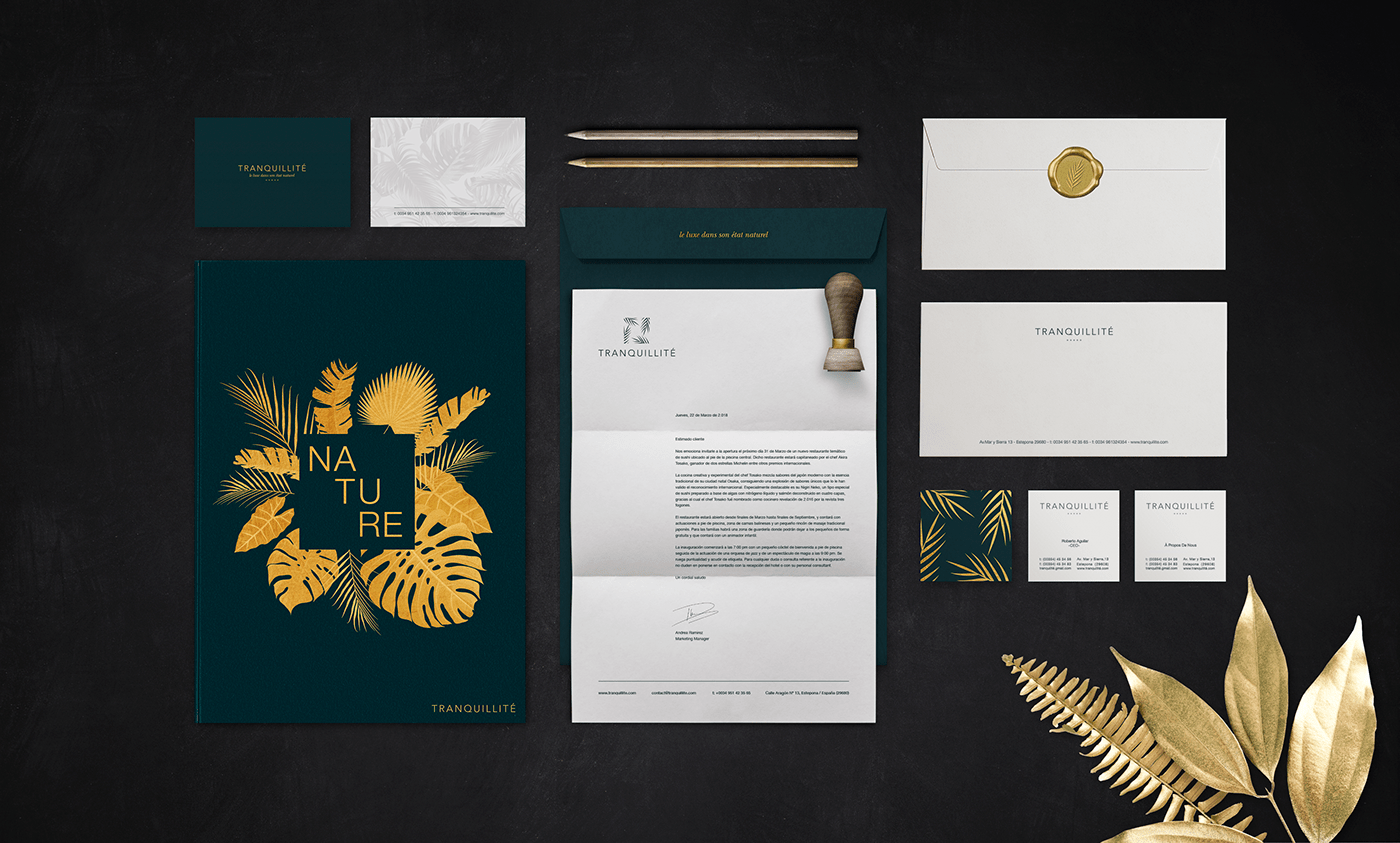
Tranquillité Visual Identity
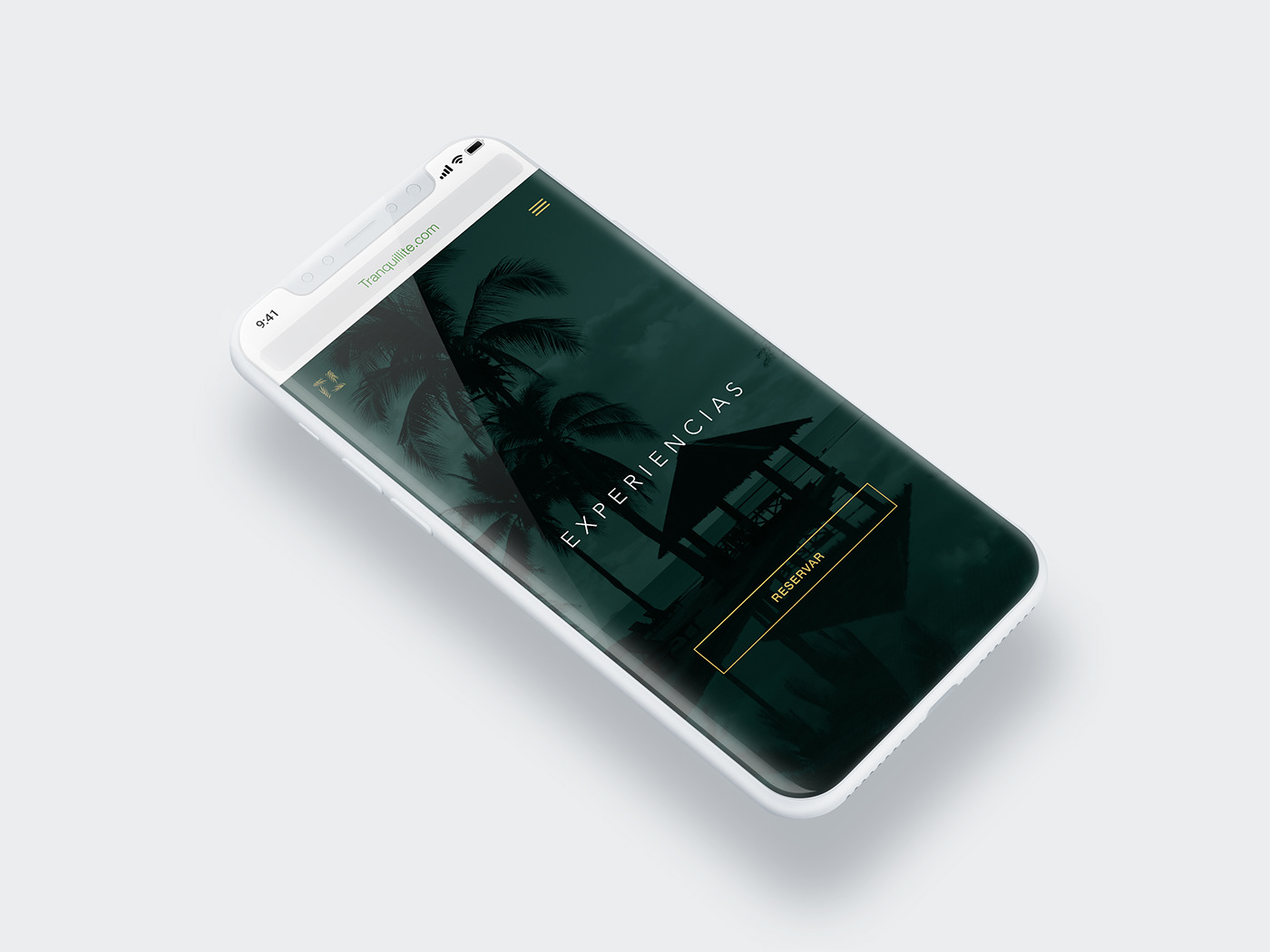
The main aim is the "Tranquillité" Hotel corporate identity creation, a luxury hotel in a magnificent environment, where nature and modern design merge to create a five-star experience, aimed at lovers of nature, luxury, and tranquility. The brand "Tranquillité" borns from the meeting point of two opposing realities, on the one hand, the architecture that is characterized by the sobriety and the statics of its forms; and at the other extreme, living nature based on dynamic forms.
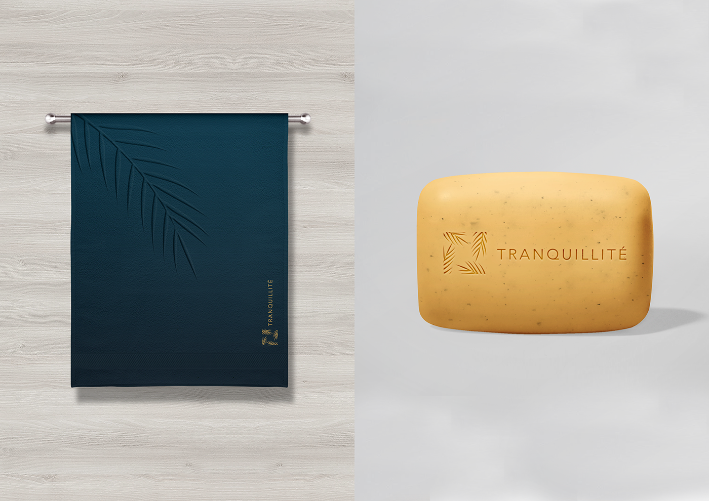
In summary, the main objective of the brand is to transmit the fusion between the minimalist, geometric and modern hotel architecture with nature, where the organic, curves and chaotic shapes reign. As a result of this combination, a balanced design is obtained, in which, even when their characteristics are totally opposite, a mutual respect between geometry and nature is achieved, giving rise to an elegant, clean and modern brand.
The logo arises from the sum of two essential elements. First of all, the square represents the geometric and modern hotel architecture, since it is the predominant form in its entire structure. On the other hand, the palm tree leaves represent the coastal areas nature, understanding the term nature as sun, sea and, vegetation. Since the hotel pretends to merge with nature, the imagery reflects this concept in such a way that the organic forms are integrated into the geometry achieving balance.