
We were approached to give a pub and retro-bar space in Bangalore city called BOLD - a 10,000 sq ft party place,
located in Marathahalli, Bangalore; its brand identity. We had to develop brand identity, interior and exterior design,
taking into consideration how the idea of ‘BOLD’ sets the tone of voice for the whole personality of the brand.
All the designs and communication encompasses vibrant colours, daring typography
and brave tones. We have injected the brand's personality across all the brand collaterals'


The logo uses geometric shapes, with sharp edges to provide an edgy bold look and feel incorporating fresh, bright and young colours.


We designed their paper cups with quirky copy interlaced with vibrant colours and offbeat design elements and shapes.
These cups were designed to be personalised.
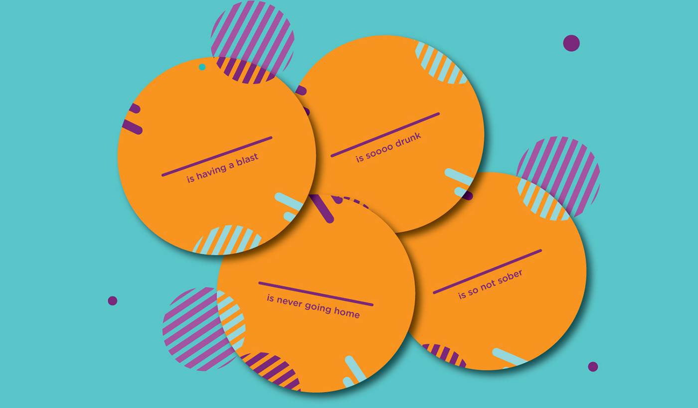
Designed coasters with witty copy and a principal colour.
These were also designed as a perfect prop for a photo-op for the customers to click pictures with.

Carry bags were designed with the same geometric shapes, primary colours and some witty copy.


Taking the geometric shapes forward; the menus were designed using geometrical shapes to represent the food and beverages as well.
For example, circles were used to represent soup; triangle shapes for bread etc…


We explore the relationship between colour and typography and how they interact with each other, as well as:
How shapes can impact the look and feel of a design.
All the colours, elements and shapes used aim to spread the feeling being bold, young and fun.