KOK KOK MEE | 叩叩面
“叩叩面”(KOK KOK MEE) is a combination of “叩叩”(kok kok) and “面”(mee). “叩叩” in Chinese, sound of “kok kok”, as a signal to inform the customer of business arrive by using bamboo stick to create sound. “Mee” means noodle in Malaysia. “叩叩面” KOK KOK MEE is a family-based business. It is a traditional stall that selling noddles and homemade Yong Tau Foo in Port Klang, Malaysia.
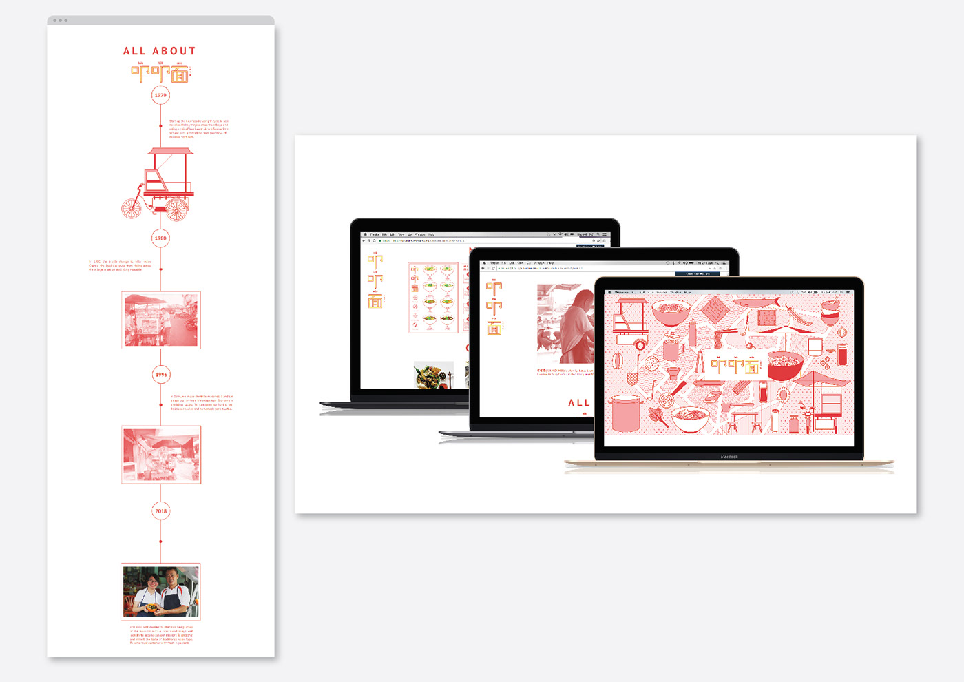
It has over 40 years’s history. Founder, Hei Foo started the business in year 1970. He passed over the business to his son, Hei Kim Tong and the stall operate until now.
Years passed, the business needed to have a brand visual identity and image to present the brand. Re-branding helps the brand to expand the business into a larger market and attract new potential customers.

_
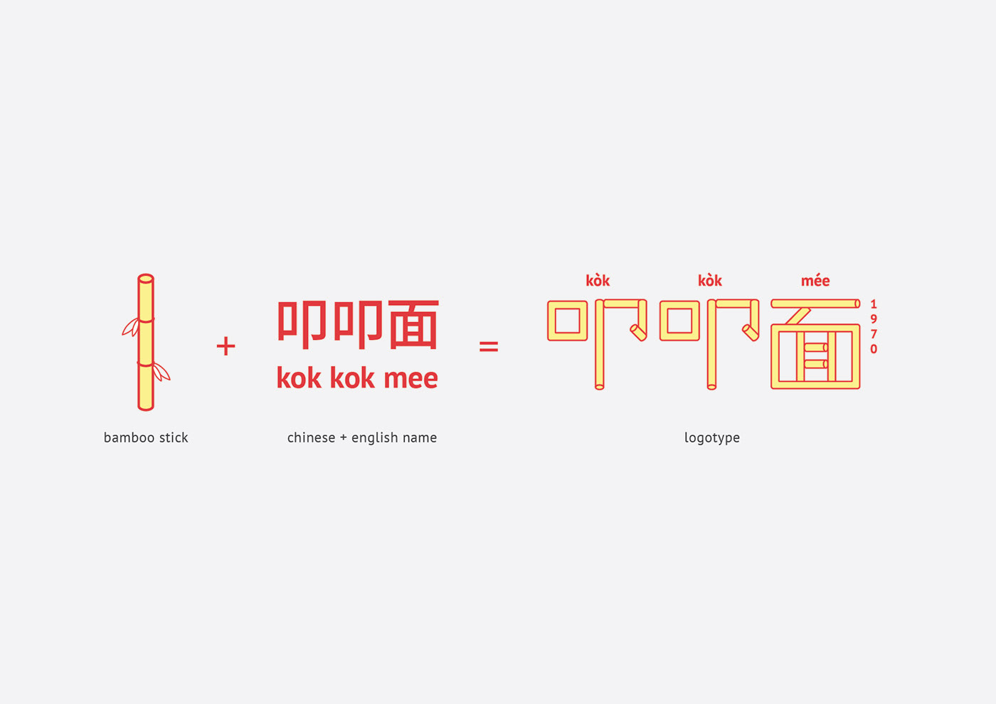
The logo is a compound logo suggests its dual-language text in Chinese and English. Logotype of “叩叩面”is a modern modern Chinese logotype that based on bamboo. The logotype is simple and clean to let audience easy to read.
As the business is for Chinese and non-Chinese, “叩叩面”(KOK KOK MEE) has stated in the logo and applied Chinese Pinyin tones to let audience pronounce the business in a correct way.
1970, the year the business begin has been stated with intention of giving consumer a reliable and rich history brand impression.


