
This rebranding assignment focused on understanding the reasons why a company may want to rebrand along with creating a new positioning statement and identity. For the rebranding of the Barnes and Noble logo I wanted to go back to the more classical feel of their older logo. What separates Barnes and Noble from buying cheap books on Amazon is the experience inside the store. In the redesign of the logo I wanted to emphasize the human to human interaction you get in the store by making the ampersand sign a person reading a book.
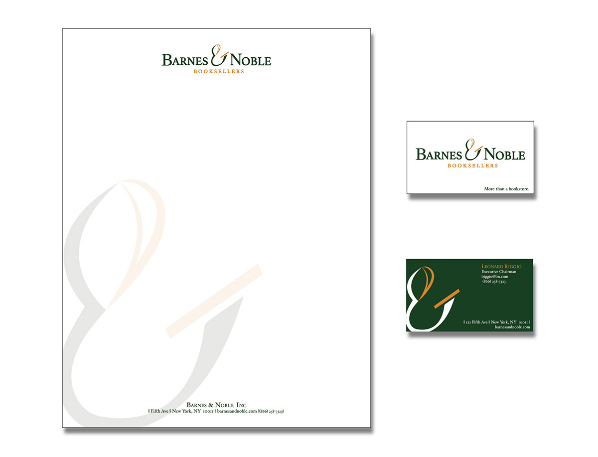
Letterhead and a business card were made and I wanted to focus on highlighting the ampersand.


This brochure outlines the new direction for the company which focuses on the in store experience, making the store a destination, and creating a community. The goal is to link the digital and physical, bringing Barnes and Noble into the technological age while keeping its strong roots in their retail stores. In stores and online there needs to be a more interactive, individualized experience, connecting shoppers with their local Barnes & Noble. This will create a sense of community within the stores and online.