

This is an example of branding by Harvest, a creative agency based in Ehime, Japan. Harvest links up creators and clients tightly to bring out the maximum value of brands and products. By proposing solutions that have been polished through the power of design to companies, the value of brands and products in the global market will be differentiated and established.
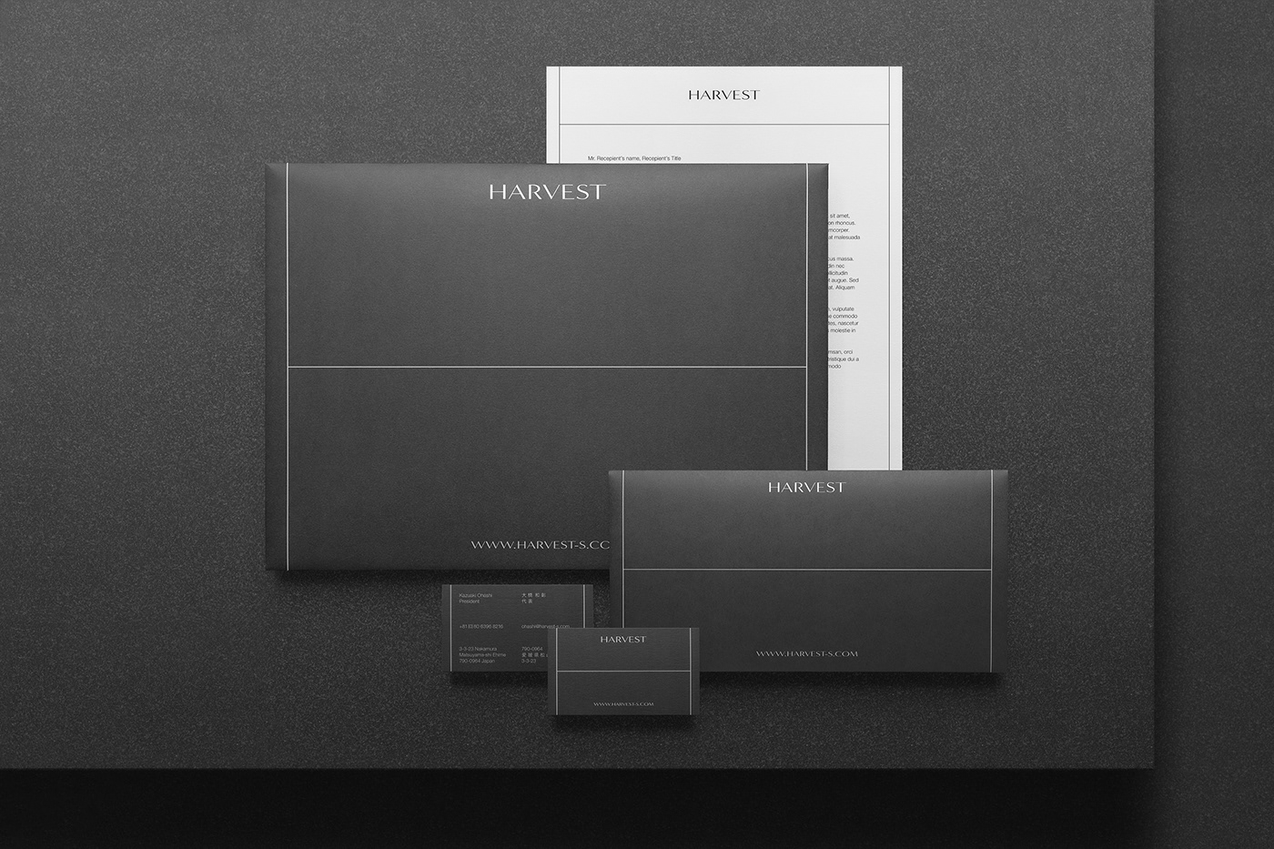
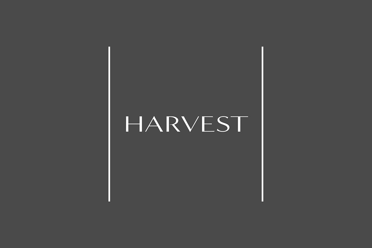
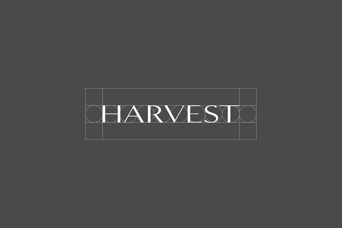
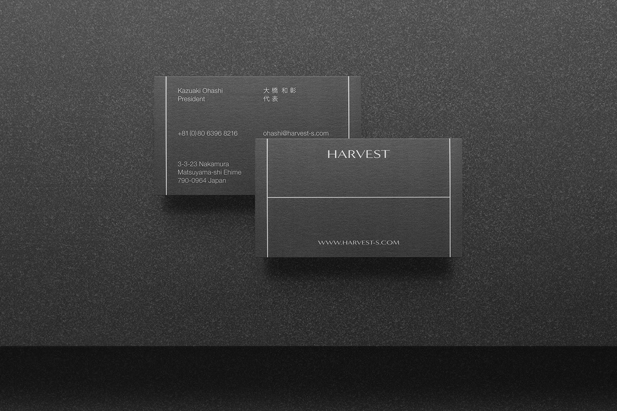
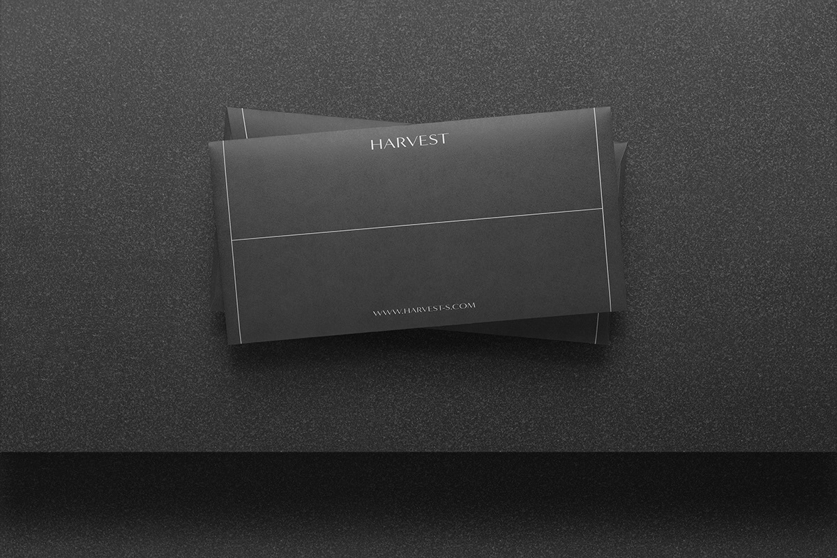
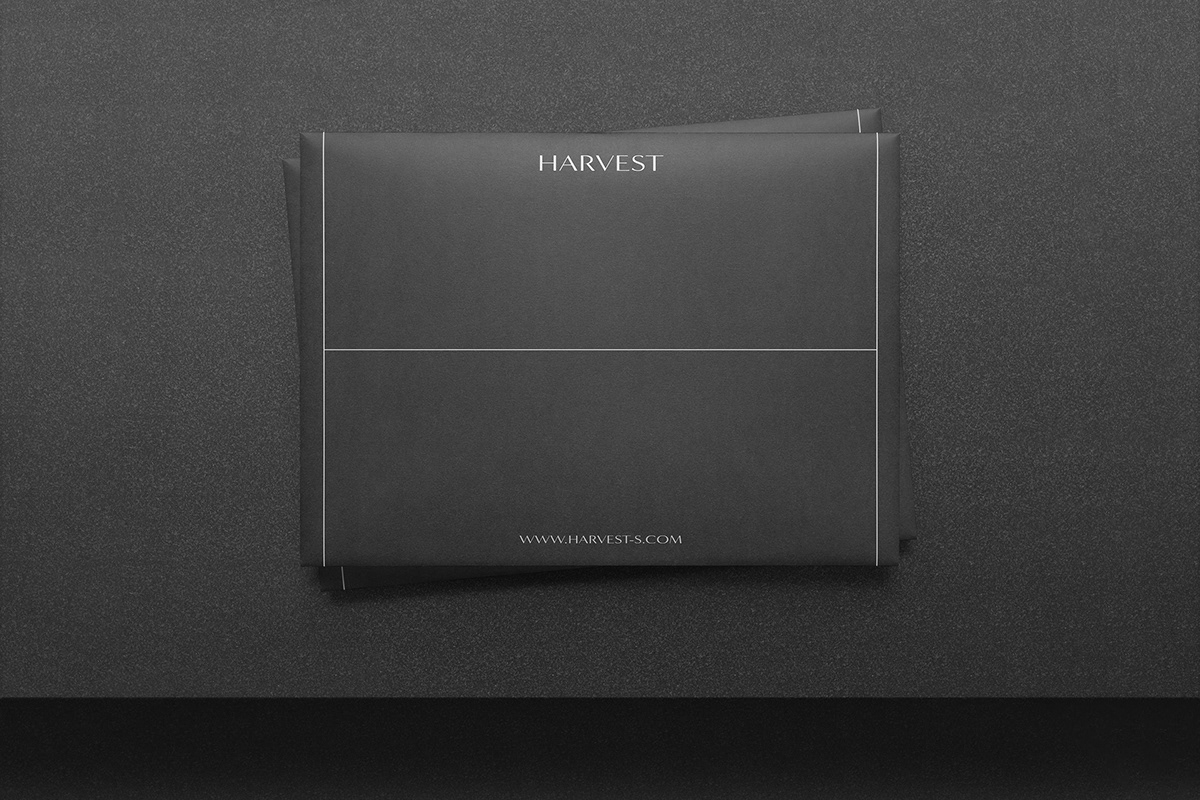
We carried out the development of an identity that is fitting of this enterprise, which proposes state-of-the-art, polished designs. The graphic element that looks like a stretched out big letter "H" situated in each item makes the viewer think of the close link between creators and clients. And the polished symbolic logotype was created and positioned to give off the impression of the two sides coming together and closing up the space between them.
Also, Harvest was named with the vision of "realizing clients' desires". To create a color palette that would be fitting for the corporate name, "white to black" were made to represent "fresh to matured", and charcoal gray, which is positioned in the harvest, was used to balance everything out.
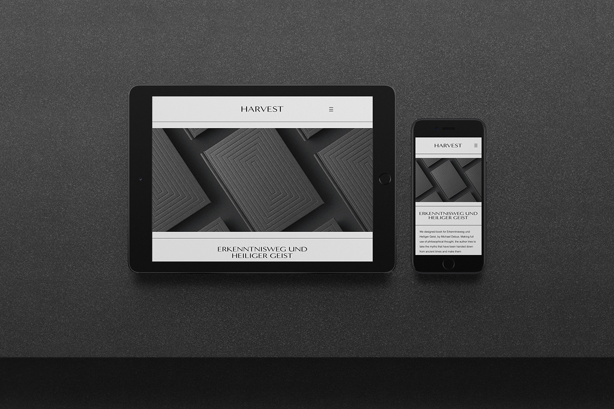
The end result is a modern corporate identity that exhibits the harmony of various elements such as refinement, uniformity, minimalism, and beauty.
愛媛県に拠点を置くクリエイティヴエージェンシー、Harvestのブランディング事例である。Harvestはクリエイターとクライアントを密に連携させることで、ブランドや製品の価値を最大限引き出す。デザインの力によって洗練されたソリューションを社会に提案することで、グローバル市場に対してブランドや製品の価値を差別化し、確立する。
時代をリードする洗練されたソリューションを提案するこの企業に相応しいアイデンティティの開発を行った。各アイテムに配された大文字の「H」を引き伸ばした様に見えるグラフィックは、クリエイターとクライアントの密な連携を連想させる。そして洗練されたシンボリックなロゴタイプが両者の間を取り纏める印象を配置的に形成した。
またHarvest(収穫)は「クライアントの想いを形にする」というスローガンのもと命名した。コーポレートネームに相応しいカラーパレットを制定するため、「白—黒」を、「芽生え—成熟」とし、収穫に位置するチャコールグレーによって全体を整えた。
全体として、洗練さ、統一性、ミニマルさ、そして美しさ、様々な要素が調和する現代的なコーポレートアイデンティティとなった。


Thanks.
Follow us: Instagram
www.yutatakahashi.jp
Follow us: Instagram
www.yutatakahashi.jp


