GREEN TOUCH | Tea Packaging
Green Touch, a company demonstrates itself as a strong, sharp, unique brand.
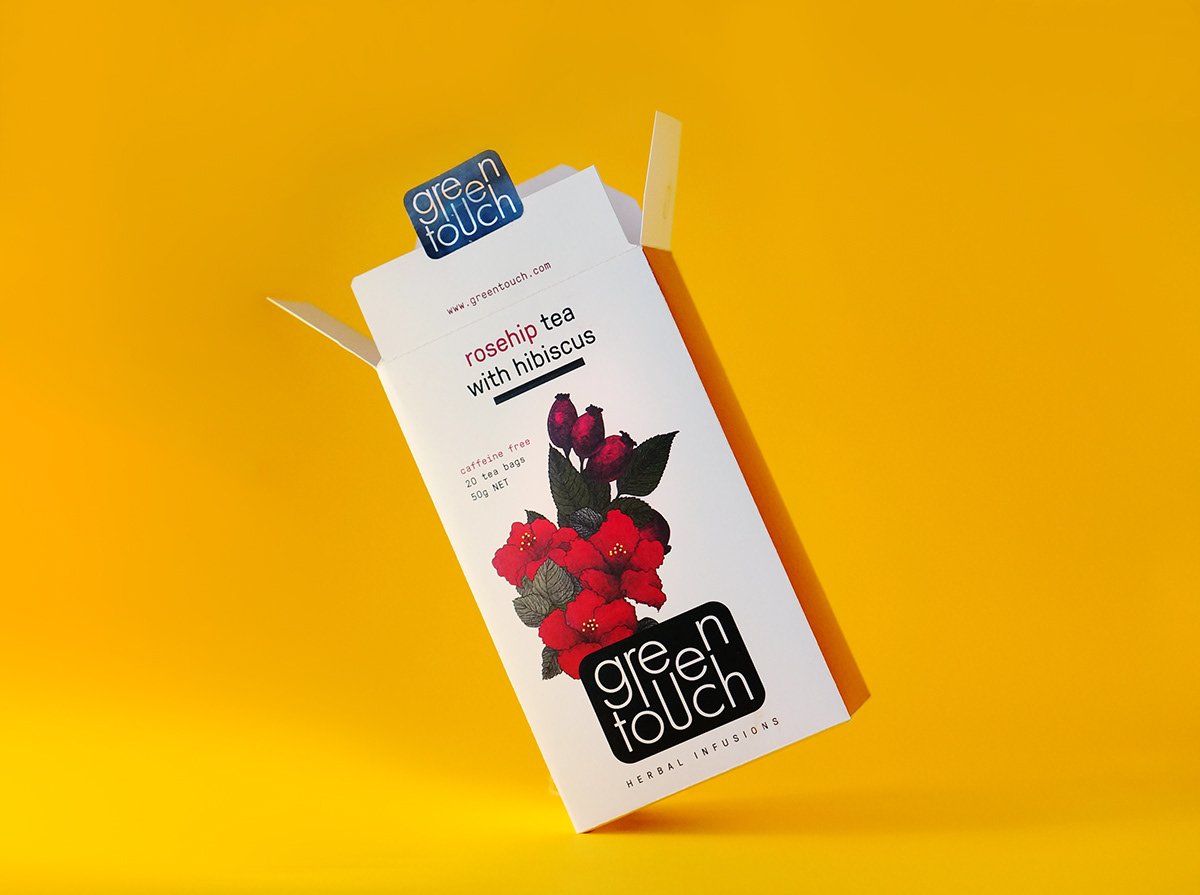
As the company presents a pleasant rosehip tea with hibiscus flavour, it delivers the brand image on the packaging design to the audience at the same time. Inspired by the colour of the product's ingredients, red is the key element of the packaging.
While the illustration of flowers with a giant logo underneath sitting on the front of the packaging, it represents an image of flowers in a flowerpot.
Not only delivering a style of bold and sharp, the tea packaging has given a human touch with a hand-drawing illustration of rosehip and hibiscus on the front. On the other side of the packaging as an information panel shows what can a customer expects from the brand and the product. A logo sticker on the top panel of the packaging is a proof for a customer as a new and fresh product that hasn't open yet.
For the inside of the packaging, there are 20 tea bags seating on a red tray with the logo on the side. Once the customer pulls out a tea tag from a tea bag, the tea bag will be ready to be brewed with hot water.