Aroma Island
…。 。 . 。 … 。
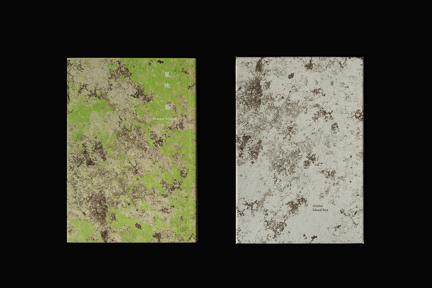
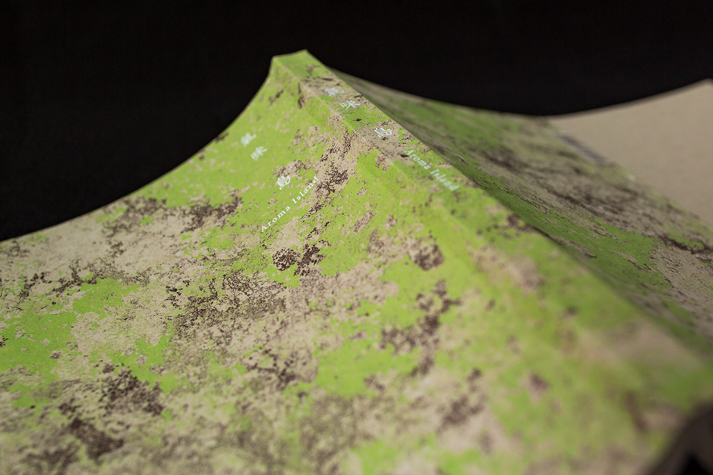
In order to recall people’s memory of Taiwan, we interpret the smell on the idea called “the fragrance of the land after the rain”. The texture of the grass is present with the paper and the print on the cover of the book. The paper box under the book represents the soil. Readers can feel and associate the moisture of Taiwan with the tracing paper as the outer packing. Moreover, an essential oil producers is invited to modify a limited essential oil for this book, using the design of top note,
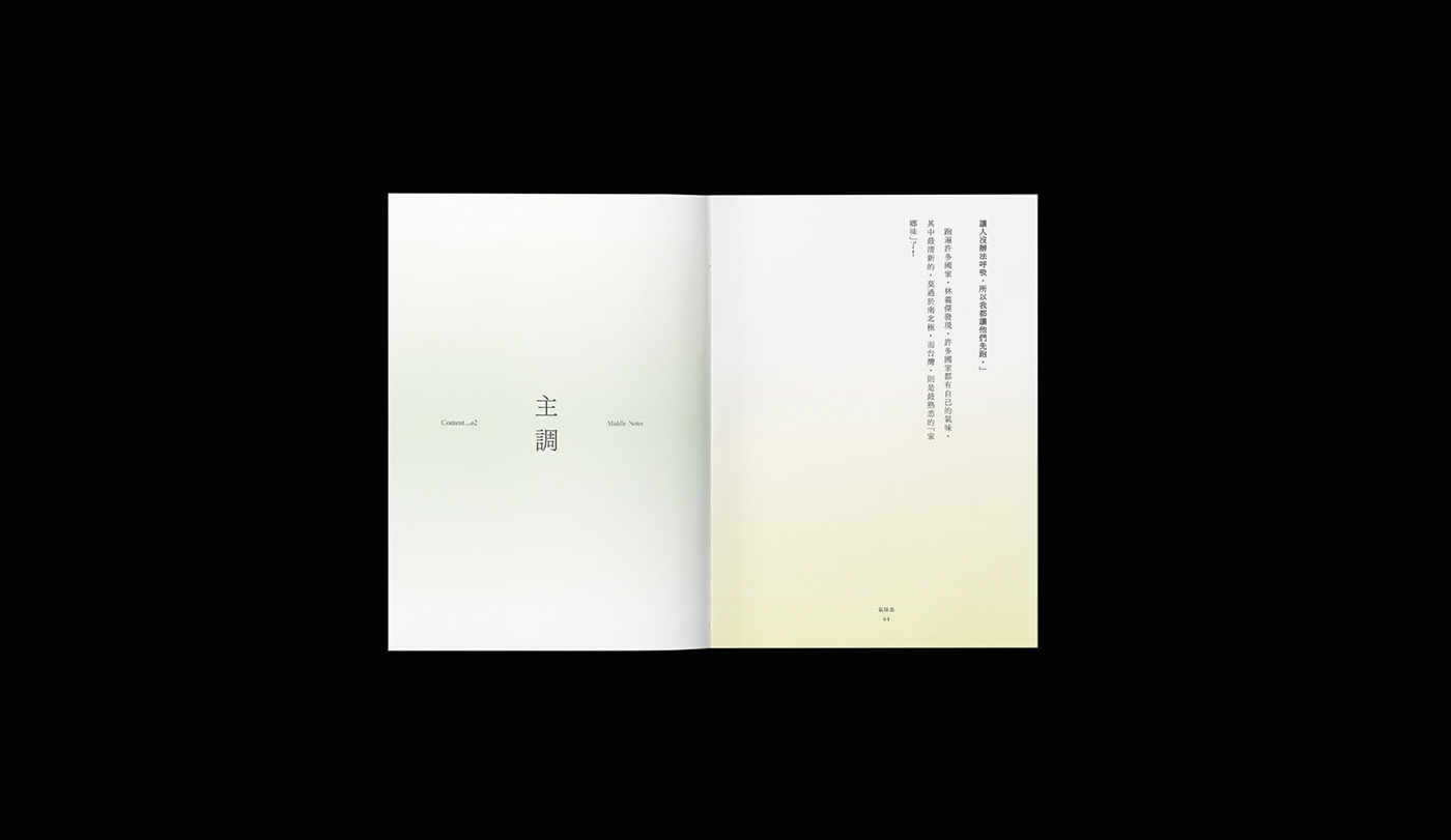
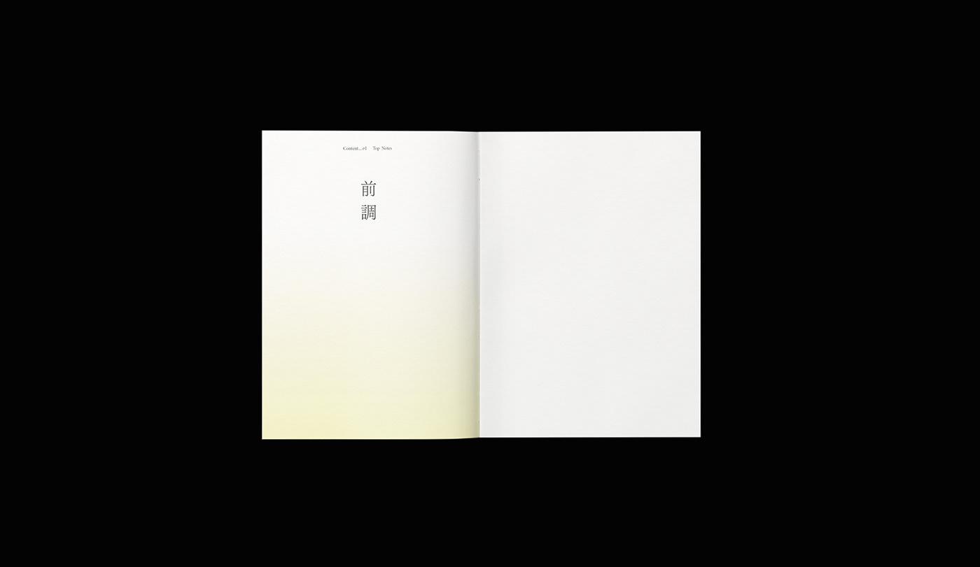
middle note and base note to elaborate the three chapters of this book. The yellow color is the first chapter as the top note with a full pocket of sunshine. The chapter two comes with color of lawn green to reveal the lively middle note. The following chapter three, with the brown color, radiates the steady and soil-like base note.
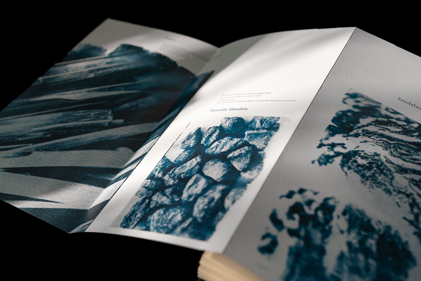
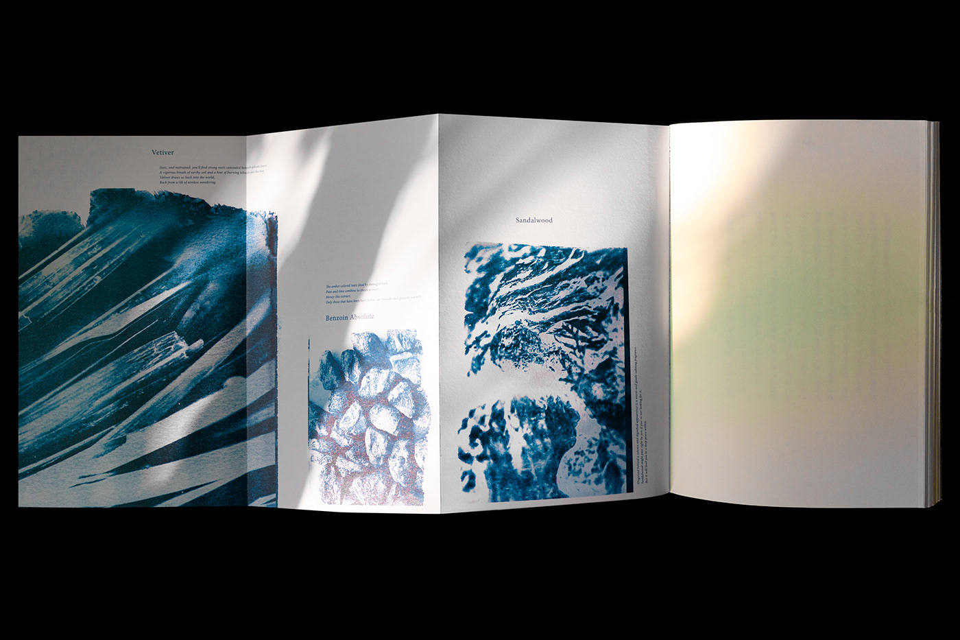
Both the colors and the words on the layout will sink slowly while the fragrance presenting. Meanwhile, with the technique of sun printing, the ingredients of the essential oil are unfold on the spreads in three chapters. Readers’ senses are open and led to experience the fragrance, soil, moss, thin fog and sunshine while reading through this book.
AD. Mistroom / D. Peng Yu Jui, Huang Jui i
Cyanotype. Li Zong Yu
Cyanotype. Li Zong Yu