It’s 2017. There’s a divide in the Sydney food scene between those who sip and savour, and those who drink and devour.
How do you realign the culinary
yin and yang?
yin and yang?
Both halves of the story.
Rey’s Place is the first Filipino fine dining restaurant in Sydney. But that’s only half the story. The sublime, refined, piano-black top half. Then there’s the ridiculously cool, stripped-back bottom half of the story. The late-night drinking, shot-smashing basement bar below.
Located in an unassuming terrace house, with little floor space, we knew that Rey’s Place needed to keep both levels full to keep the doors open. That meant telling both halves of story to reach both sides of the culinary divide.
One identity, two personalities.
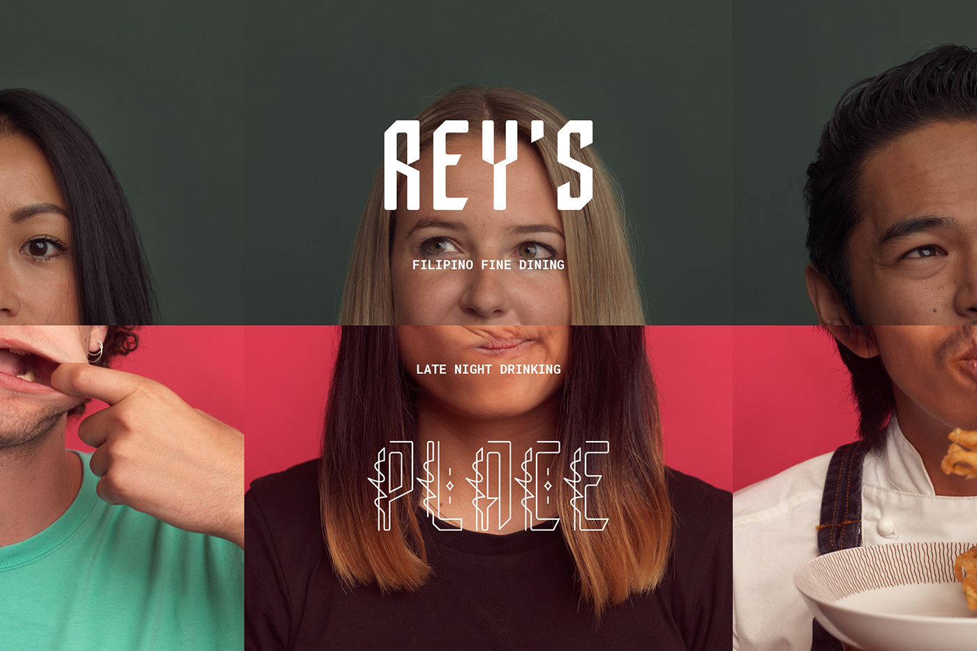
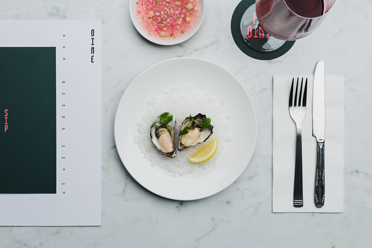
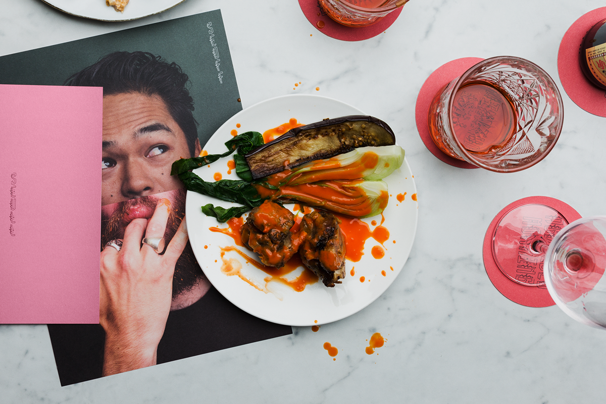
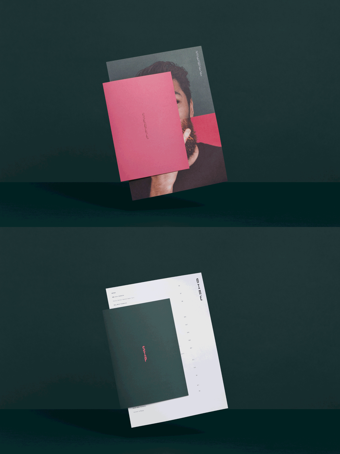
We created a split-personality visual identity where the eyes say it all and mouth is too full to talk. Two photo shoots were needed to pull it off. One softly lit photo shoot for fine dining upstairs, another high-contrasting for downstairs. The images were then painstakingly remixed with different pairings for an overall unified effect.

Two sides to everything.
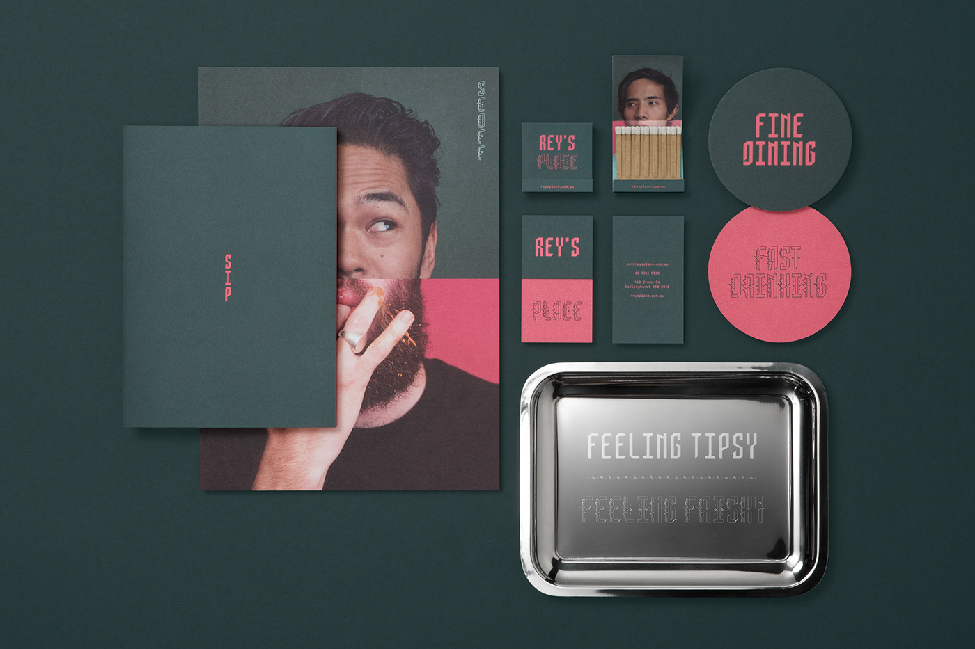
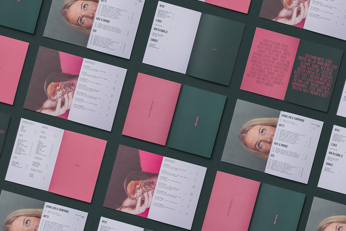
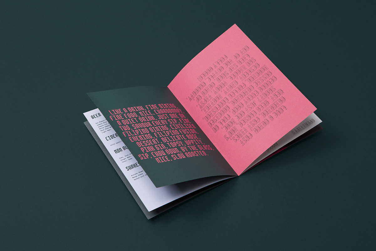
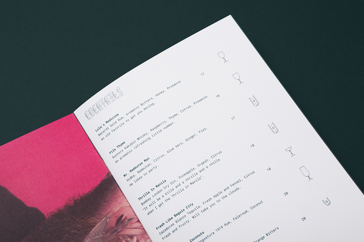
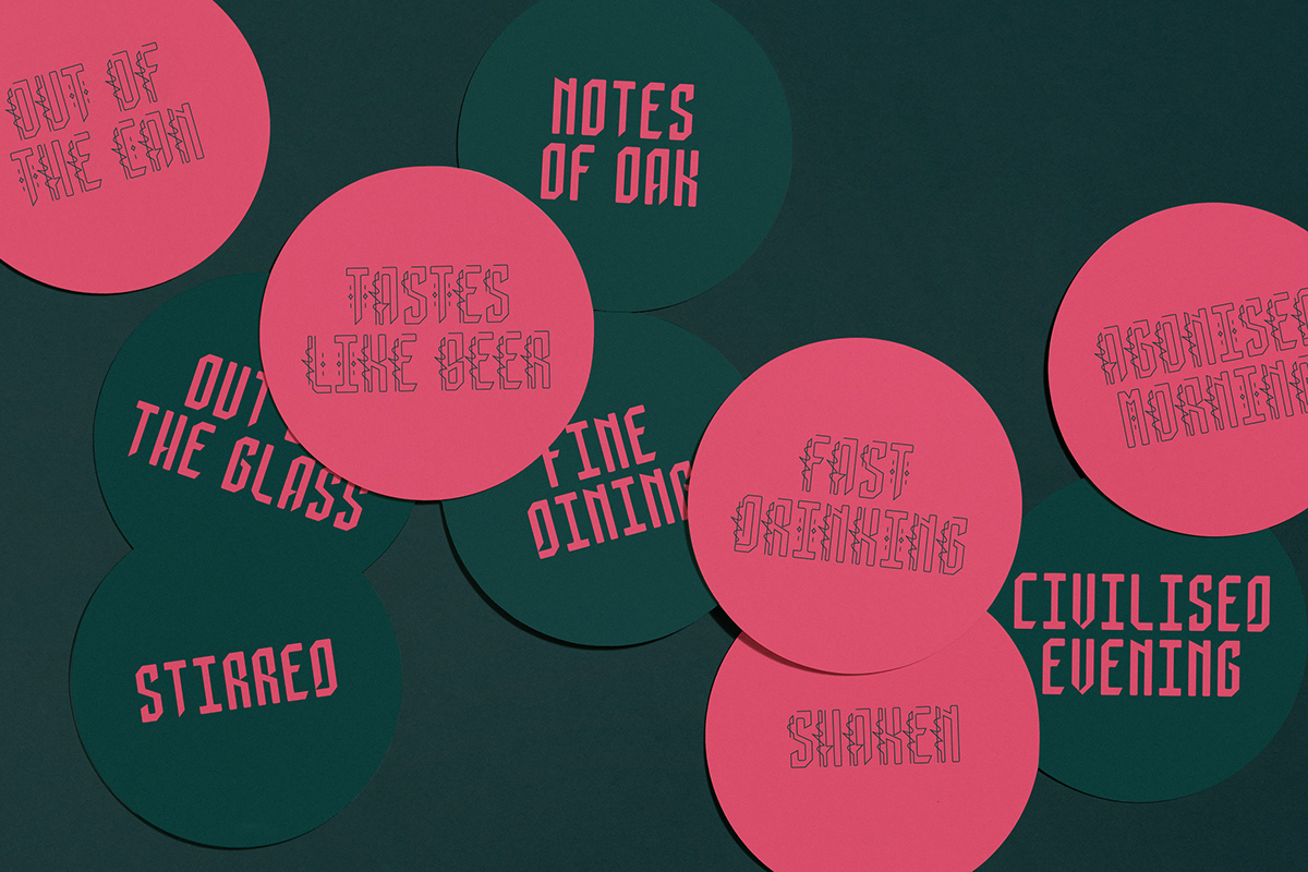
We then took the two-part story concept across all manner of collateral in contrasting pick and green. Menus, coasters, posters, even glasses, became different media to build an in-house advertising campaign. All served with some well-chosen words, and a selection of fine lines, for added flavour.
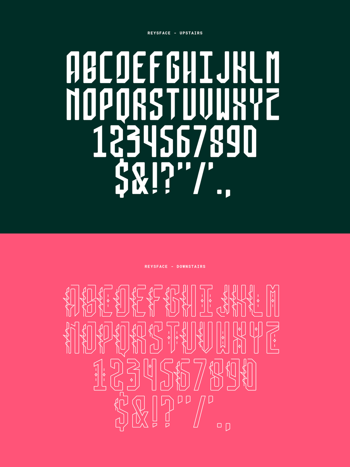
One type, two faces.
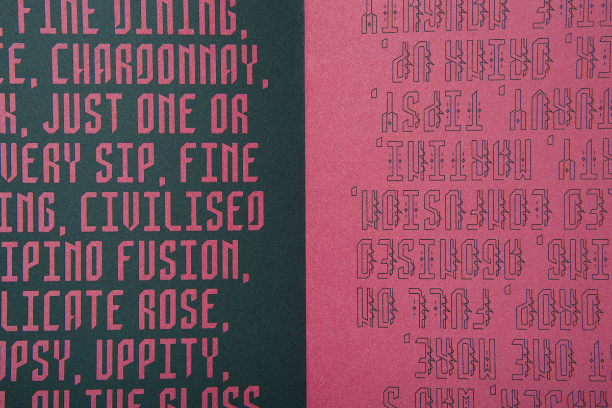
Inspired by traditional Filipino calligraphy, we built a bespoke typeface – ReysFace. One version with sharp edges and hard cuts for a more refined feel upstairs. Another with fine, winding lines for a slightly wayward vibe downstairs.

