


The Next-Generation News Application:
Stories in Context
Stories in Context
By Stefani Urmas
Specialized Journalism Master's Thesis Project
USC Annenberg, School for Communication and Journalism, Los Angeles 2018
Contact: urmas@usc.edu
1.0 Project Idea
The 200-year-old news industry really knows the art of traditional reporting and storytelling. However, presenting those stories on digital platforms is another thing. The digital revolution and the rise of gigantic tech companies have forced the news industry to reinvent its business during the past decade. Nevertheless, the way news stories are delivered and presented on online news sites and mobile apps has remained surprisingly undeveloped. Unfortunately, for many legacy media companies the digital transition has simply meant transferring the old newspaper product to digital platforms.
Traditional story production, design, and distribution of journalism no longer fit with the preferences for consumption of media. Readers’ mobile moments are short and fragmentary: People are multitasking and being frequently interrupted. Regardless, news products and articles are mostly designed for focused readers, not for hasty skimmers who enter the sites via social media links.
In many legacy media companies, news production models, story formats and news platforms are outdated and news aggregators and social media platforms outperform the legacy media news services in terms of usability, personalization, and engagement.
The purpose of this project is to learn news consumers’ needs and habits, study existing news apps in the English-speaking market, and generate new ideas on how to build a next-generation multimedia news application that provides readers with a personal, engaging, efficient, and contextualized news reading experience.
My vision is to challenge social media platforms, which increasing number of people are using as their primary news source, with an ambitious news application that helps legacy media companies engage with their audiences on mobile devices. Strengthening loyalty, customer satisfaction, and trust will ultimately heal the broken news ecosystem that is one of the main reasons for the financial struggles of news media.
1.1 Goals
Purpose of the thesis project
• To design a prototype of a hooking and habit-forming news platform and prove that the concept would solve the target audience’s pain points regarding lack of focus, control, and context.
• To create design deliverables (site maps, user journeys and use cases, wireframes, visual design guidelines, mockups, a prototype, and user test reports) required for an actual app developing project.
Quantitative objectives
• To find new audiences and increase app downloads, registrations, and number of active users.
• To increase customer satisfaction, loyalty, and time spent on the app per session.
• To improve story-to-story recirculation and to reduce bounce rates (e.g., to make users continue reading articles after entering the site from social media).
Long-term goals
• To gain trust and interest in legacy media outlets’ quality online journalism.
• To help repair the broken news ecosystem and strengthen democracies.
In my opinion, only a profitable press can be truly free, brave, and independent. Therefore, the decline of news industry is one of the biggest threats to journalism and to the development of free democracies. I believe that helping legacy media companies invent the magic ingredient for finding and engaging their audiences on mobile is an important way to heal the broken news ecosystem. There is evidence that people are willing to pay for quality online news and support journalists’ work if the content is compelling and the product is clear and easy to use and delivered in convenient, customizable, and clean format.
1.2 Design Process
In my thesis project, I followed the product development methodology introduced by UX strategist Jaime Levy. In addition, I applied the central principles of the “Lean Startup” methodology to digital product development pioneered by Eric Ries.

First, I started from the customer discovery: Finding and evaluating customer problems regarding online news consumption and validating the problem hypothesis. Second, I conducted comprehensive market research and analysis to explore the marketplace and find the most exciting products to benchmark and emulate. Third, I innovated solution models that would solve users' problems and create value for the readers. Finally, I produced design deliverables to set up a prototype and started testing my concepts with users in a build–measure–learn feedback loop.
2.0 Persona Hypothesis
Hypothesis: What kind of people might use the app and how do their needs and behaviors vary?
Tech savvy students: Lean more toward videos and visuals, find stories from social media, and want to get their news for free.
Upwardly mobile professionals: Commuters, busy readers, want to get smart fast, interested in the society, ready, and willing to pay for digital news services.
Retired persons: Have a lot of time to read; addicted to news; have a hard time with tech; and prefer print or newspaper replicas.
What ranges of behaviors and types of environments need to be explored?
• How often do they consume news on their smartphones? When and where?
• How do they find news? What apps do they use? Why?
• What kind of problems do they face? Do they suffer from information overflow? Are they having a hard time getting the big picture of a news day?
• How willing are they to personalize / customize their applications?
• When would they listen to a news piece instead of reading it?
2.1 User Interviews
I conducted six one-on-one interviews in Los Angeles and Santa Monica in January 2018 plus seven interviews in March and April 2018. I met students, working professionals, and retired persons and I framed the user pain points into the three categories:
Lack of time and focus
People suffer from information overflow. Readers feel that they don’t have enough time to digest all the news stories they would like to. Articles take too long to read, and there is lots of repetitive and overlapping information in them. Readers need help focusing. They need relevant information in a more efficient format.
“I want that the most important and interesting stories will find me.” – Tiina, 36
“I’m always trying to estimate how long does it take to read the story. I don’t like to stop reading a piece before finishing it.” – Laura, 34
Lack of control
Online news is fragmented, and stories seem to pop up in random order. News outlets, websites, and applications feel chaotic. Generally, readers have a hard time getting the big picture about the news of a given day.
Moreover, news sites tend to be disorganized and noisy, full of disturbing pop-up advertisements despite the fact that consumers are increasingly frustrated with ads that disrupt their reading, interrupt content and slow browsing down.
People get satisfaction from accomplishing things, striking completed tasks off their to-do list. Keeping news short and concise will provide hasty readers with satisfaction more likely than large packages. For example, a continuous news feed or an unfinished (too long) story are unaccomplished missions.
“I’d like to read digital news in convenient, customizable, and clean format.” – Bradley, 29
“I have external feeling. There is so much going on and I am missing things all the time.” – Laura, 34
Lack of context
Nowadays, most readers enter news sites through shared articles, push notifications, Google search results or other links and therefore, they are missing the context and editorial emphasis that is traditionally indicated on front pages. In addition, online news lacks conventional visual cues – such as sizing and positioning – that indicate newsworthiness. Readers can easily mix up different news genres and even news articles, advertorials (ads in story format) and fake news stories.
Facebook and other social media feeds have become the new front pages of legacy media. Social media feeds are not designed for conveying journalistic emphasis and curation and therefore people are missing the journalistic context of the stories.
“I have a hard time interpreting what’s important and what’s not. Is this the main piece or just a side story? What has happened before? Should I invest my time on this?” – Karina, 26
2.2 Validated personas


3.0 Competitive Research and Analysis
I used and analyzed 10 legacy media outlets’ news applications and 8 news aggregators’ applications and listed the pros and cons plus the key features of each product.
3.1 News outlets
The New York Times
Elegant and comprehensive platform for the New York Times content. Stunning visuals and engaging multimedia storytelling.
Pros: Advanced story formats, elegant appearance, morning and evening briefings, podcasts.
Cons: Exhaustive, thoroughly long stories, old-fashioned sections, constricted personalization options.
The Washington Post
The Washington Post has separate apps for featured stories, daily news and newspaper replicas. The WP app is a modern and engaging product, whereas the WP Classic is an old school news application for daily news stories.
Pros: A section for AR stories, engaging story feed on the featured app.
Cons: Too many navigation bars, no personalization possibility, poor information architecture, stories have dead ends (lacking related articles), traditional look and feel.
The Los Angeles Times
The app is more of a framework for the web content of the Times than a native mobile application. Therefore, the experience is a bit clumsy and not easy to read.
Pros: Packaging and taking advantage of engaging theme contents (e.g. Jonathan Gold’s 101 Best Restaurants).
Cons: Disturbing, relentless ads. Too many navigation bars.
The Guardian
A comprehensive news app that provides lots of features and an up-to-date feel.
Pros: Customizable home screen, follow-the-author function, morning briefings, live stories, one button navigation, unique look & feel.
Cons: Exhaustive, traditional sections, busy appearance.
BBC News
A robust news application for versatile BBC contents: articles, photo galleries, video and radio pieces etc.
Pros: Highly customizable feeds, My News feed based on preferences and behavior, lots of video content. Abundant selection of further reading (related stories and topics).
Cons: Official and sterile appearance feels a bit outdated, lacking advanced story formats, maybe too robust of an app for non-news-geeks.
BuzzFeed
A laid-back news application for young(ish) audiences.
Pros: Clear contrast between news and long reads, engaging video channels and interactives (quizzes), tagged/labelled story types, quickly catch up -briefing at the top of the news feed, brief set of topics.
Cons: Navigation is not intuitive, messy articles, noisy user interface, obtrusive ads.
USA Today
Traditional news app with decent personalization features.
Pros: Rich notifications include an article preview, neat photo galleries, Apple Watch integration, customizable news feed widgets, ad-free reading mode, clean look.
Cons: Messy related article selection. Lacking multimedia storytelling and rich story formats.
Mic
Lifestyle news magazine application for young audiences.
Pros: Personal and cool appearance, curated channels on popular phenomenon. The app learns the user’s preferences and automatically gets more personalized.
Cons: Old stories, not very up-to-date, unintuitive navigation.
Axios
Modern news site focusing on brief storytelling and an efficient reading experience.
Pros: Simple structure, brief stories, structured texts / summaries, fresh and clean look and feel.
Cons: Lacking advanced story formats and coherent story chains.
Vox News
News and opinion website that focuses on explanatory journalism: Reporting on the backgrounds of big news topics.
Pros: Clear focus, story streams and curated story packages, podcasts.
Cons: Monotonous news feeds, the layout is a bit boring.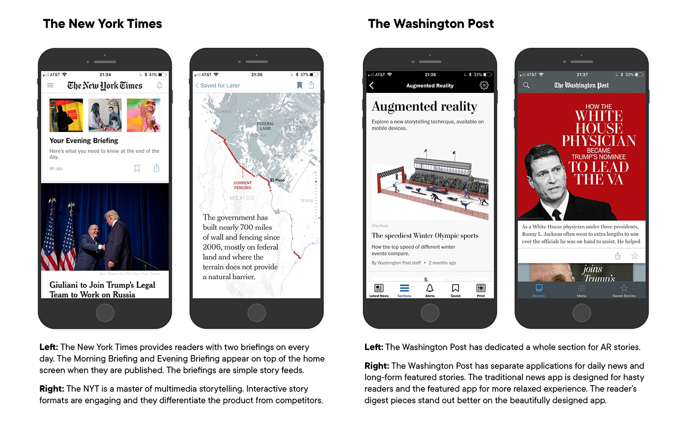


3.2 News aggregators
Refinery29 This AM
Super simple morning briefing app from Refinery 29.
Pros: Only one function: Tapping through the eight curated headlines/cards. Modern appearance.
Cons: Maybe too simple, no engaging images.
News 360
Highly customizable news aggregator with variety of sources.
Pros: A flexible and smart personalization system that learns the user’s interests.
Cons: Unintuitive navigation, clumsy user interface and cheap look & feel.
Google News
Google’s news app that aggregates coverage from 75,000 publications.
Pros: Short story intros on the news feed, simple user interface, location-based news filtering, bookmarking interests.
Cons: Sterile and boring, corporate look. Lacking personality and engagement.
Apple News
Sophisticated news aggregator app loaded with variety of features.
Pros: Great user interface, customizable My news feed / home screen, reaction buttons.
Cons: Busy, lack of videos and other multimedia elements.
Yahoo Newsroom.
Fresh and modern news platform including commenting and other social features.
Pros: Modern look & feel, engaging animations and daily video series, good use of Snap story format, good selection of topics.
Cons: Lots of carousels, complicated/unintuitive user interface.
Flipboard
One of the best-known news aggregator pioneers, it offers highly customizable platform for a personalized news-reading experience.
Pros: Fully customizable, intelligent platform, personal and modern look and feel, full-screen layout, following topics, engaging animations, reaction buttons.
Cons: Personalization is laborious, story promos redirect readers to third party sites.
Aol.
A robust app that combines aggregated news feeds, videos and an email service.
Pros: Convenient horizontal swipe navigation between sections, weather forecasts.
Cons: Confusing experience, too many features on one app.
Compass News
Curates the most important stories from globally respected publishers.
Pros: Need to know headlines (briefings), time-saving article summaries, “Story so far” context cards, no ads, read time feature.
Cons: The stories open in a web browser! So, readers need to toggle between the Compass News app and the web browser app — an unbearable feature.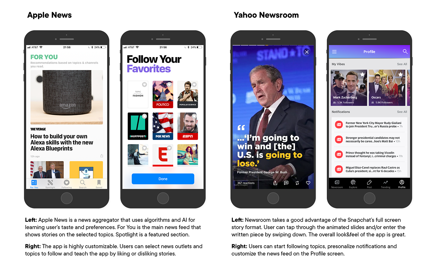

3.3 Features Comparison
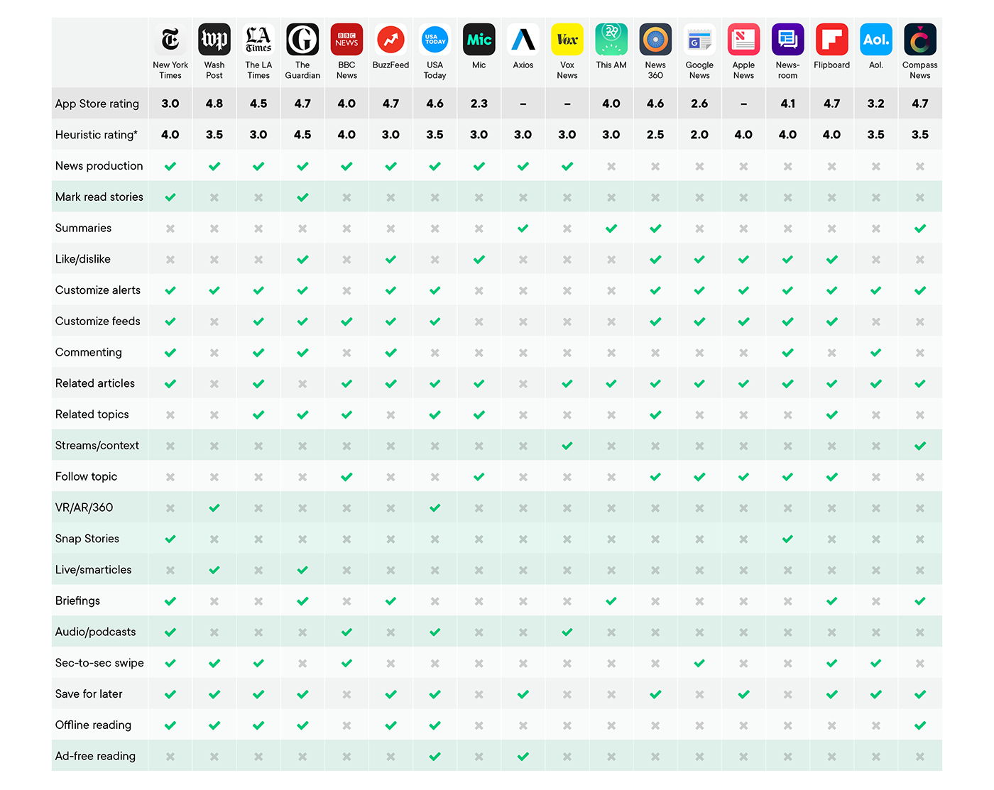
* The heuristic evaluation (scale from 1 to 5) is based on my personal user experience. I’ve used the products for several months and tried to focus purely on usability, functionalities, look, and feel of the products – not on journalistic content.
3.4 Competitor Analysis Brief
Legacy media news outlets lack many of the cool features that news aggregators possess. In many cases, news aggregators and social media platforms outperform the legacy media news services in terms of usability, personalization and engagement. Legacy media outlet feeds feel monotonous, dull, and heavy because storytelling formats (texts and still images), information architectures (traditional sections), publishing strategies (everything to everybody), and functionalities are based on the old media companies’ structures and production models.
Opportunity: Legacy media outlets are great content producers and there is a huge demand for reliable, transparent, and unbiased reporting[1]. Consequently, there is evidence that people are willing to pay for quality online news and support journalists’ work if the content is compelling and the product is clear and easy to use and delivered in convenient, customizable, and clean format.
Recommendation: Legacy media outlets should not exhaust their readers with all the stories they publish. Instead, they should take advantage of data analysis and artificial intelligence (AI) to learn from the readers’ preferences and get the news feed smarter and more tailored to readers’ unique tastes. News outlets should also focus on concise, to-the-point storytelling and provide summaries and briefings for hasty readers – plus an option to listen to the news.
4.0 Value Innovation
To mitigate my target audience’s pain points, I will design a news application that provides users with a 1) personal, 2) engaging, 3) efficient and 4) contextualized news reading experience.
4.1 Personal News
News outlets tend to throw all the stories on readers’ news feeds regardless of whether they resonate with them or not (one size fits all model). According to my research, news feeds should be tailored and filtered so that the news coverage and topics would feel more interesting and engaging. Personalization is popular among news aggregators but for some reason most news outlets seem to believe that they know what users want better than the users themselves.
My news app will learn users' interests based on the topics and issues they follow and like (or dislike). It then finds the best stories for them.
Key features / users can...
• Follow curated topics, personalize feeds and make their favorite topics stand out.
• Follow developing news events (Live stories) and get notifications on updates.
• Like and dislike stories and “teach” the AI to give them better story recommendations.
• Customize push notifications and newsletter subscriptions.
• Save stories for later.
In order to make this happen, news organizations need to...
• Redesign information architecture and enhance the use of meta data for curating intelligent story streams and news packages.
• Take advantage of artificial intelligence and machine learning to better understand user's individual taste and preferences.
• Replace traditional, static news sections with dynamic story containers (topics) that adapt to trends and current news events.4.2 Engaging News
News outlets publish mostly static, text-based articles. To engage audiences on mobile devices, publishers need to utilize interactive elements, motion graphics and videos in storytelling. Multimedia stories should stand out and not get lost in monotonous news feeds.
Key features / users can...
• Experience news in delightful snap story formats (optimized for vertical mobile screens).
• Enjoy intuitive, functional and clear design and a superb reading experience.
• Enjoy long-form journalism and great feature pieces on the Featured section.
• Listen to the stories if they can’t read at the moment (e.g. while driving a car).
In order to make this happen, news organizations need to...
• Experiment new story formats that utilize advanced multimedia storytelling techniques.
• Systematically produce engaging story types on their own platforms (not only on social media sites).
• Focus on contents and experiences that customers consider interesting and valuable.
Invest in world-class UX and UI design, accessibility and get rid of all elements that disturb reading experience (flashing ads, pop-ups, etc.). 4.3 Efficient News
Users need to be able to find the most interesting stories easily and digest them quickly. I want to improve the skimming experience and increase the contrast between brief news stories and long feature pieces. In addition, I will take advantage of artificial intelligence to get rid of repetition on evolving news stories.
Key features / users can...
• Read bullet-pointed summaries of stories and get essential information quickly.
• Stay efficiently updated on evolving news topics by following intelligent live stories.
• Receive personalized news briefings (AM and PM) and stay informed conveniently.
• Get most of the stories in a concise and visual format and/or in audio format.
In order to make this happen, news organizations need to...
• Learn new kind of live reporting style in order to break stories in small pieces and publish intelligent, evolving news stories.
• Construct the stories so that the readers, who jump to the story several hours after the news even has started, can receive the key information to understand the story.
• Start producing optimized news briefings taking advantage of machine learning.
• Deeply understand that people take in information much faster in visual format than in text paragraphs. And sometimes users' eyes are busy but ears available.
4.4 Contextualized News
Users need to be able to easily evaluate news value and the scale of the story. In addition, readers should have an easy access to the whole story stream to see the context of the article and to better understand how the history of a story unfolded.
Key features / users can...
• Explore curated story streams and see stories in a broader context (visualized timeline that reveals the big picture).
• Get clear visual clues that indicate the newsworthiness, genre and scale of the story.
• Get an easy access to relevant related articles: backgrounds, analysis, opinions etc. (360 approach).
In order to make this happen, news organizations need to...
• Invest in clear information architecture and systematic news packaging, and curation instead of just publishing spot stories and letting simple algorithms add some (often random) related stories on the bottom of the story page.
• Aggregate news contents into coherent theme entities and story streams / clusters.
• Develop a design system that intuitively indicates the story type, genre, size, length, reading time, scale etc.
4.5 Context Scenario and User Stories


5.0 Information Architecture

Information Architecture: All stories, Topics, Story Steams, Stories. Meta data stored on every story is the core of the application’s information architecture. Intelligent use of meta information allows smart packaging and organizing content into coherent topic feeds and story streams.

Information Architecture: Stories and story containers. News organizations could create new products and services by taking advantage of well-organized meta data. Coherent story streams and themed news packages would provide the readers with great value revealing the big picture and making sense of the world.
5.1 Site Map

Site map and the primary user flow (marked with blue color).
6.0 Wireframes
Use Case: User enters the application by clicking the app icon on a mobile device and 1) browses the My News feed, 2) finds a compelling story and opens it, 3) skims through a few different stories and related stories, 4) explores the story in context on the story stream screen, 5) likes, shares and saves stories and ultimately 6) feels updated, inspired and delighted.
6.1 User Flow

6.2 Functional Specifications


7.0 Visual Design Guidelines
The visual appearance of a news app should be aligned with the values and brand attributes of the news outlet. The look and feel should be clear and reflect trustworthiness and integrity. A consistent use of typography and colors will give an impression of an upright professional.
7.1 Color Palette
In the Western culture, color blue symbolizes trust, security, stability and trustworthiness. Hence, a blue color palette is fitting for a news application. Red and pastel green accent colors provide good contrast and warmth to layouts. Fresh gray works well on backgrounds and an abundant use of clean white gives a calm, clean and fresh appearance.

7.2 Typography
I decided to pick an elegant Lyon as a serif font and geometrical TT Commons as a sans-serif font into my type kit. Modern TT Commons is used on news headlines, captions, vignettes, charts and index texts. Sophisticated Lyon is used on vignettes, feature headlines and body text. Strong weight and size contrasts communicate hierarchies and structures of content and compositions.

8.0 Prototype
I designed the wireframes and mockups using Sketch and Adobe Illustrator. I synchronized the Sketch artboards with InVision using the Craft plug-in and built a clickable prototype on the InVision web application. The workflow was easy and straightforward, but the demo lacked several UI features (e.g. animations and navigation clues) since there are many constraints in the InVision prototyping tool.
8.1 Prototype Demo Script
Home screen: User taps the story promos on the main news feed, navigates through a couple of stories and opens a Story Stream modal by tapping the timeline icon on an action bar of a story.
Story Stream: User explores content on a timeline, explores related streams and taps a headline that takes him/her to another news story of the same story stream.
Related story: User finds his/her way back to the news feed, taps the Explore link on the tab bar and ends up on the Trending Topics.
Trending Topics: User decides to follow a couple of interesting topics. After that he/she taps on a topic promo and it takes him/her to a topic feed.
Topic: User browses headlines, navigates back and forth between stories, find his/her way back to the news feed and eventually opens a Live story.
Live story: User decides to start following the story. He/she explores the article by expanding the updates and checking out the Story Stream. Eventually he/she taps back to the main news feed and decides to proceed to the morning briefing by tapping the Catch up icon on the navigation bar.
Catch up: User skims through the main headlines, taps the audio button and starts listening to the morning briefing. He/she puts the phone into his/her pocket and starts his/her commute to work while listening to the news on his/her headphones.
8.2 Mockups & Demo Screens
► Link to the InVision prototype: https://invis.io/4VGRHD8HYMQ#/289513228_News

The first part of the InVision demo will introduce the main news feed, some basic news stories and a full screen story format. Users should be able to browse the news feed and navigate back and forth between stories.

The second part of the InVision demo will introduce related articles and the Story Stream concept. Users should be able to open related articles and explore Story Streams.

The third part of the InVision demo will introduce the Topics concept. Users should be able to start following topics and explore stories on topic feeds.

The fourth part of the InVision demo will introduce Live stories. Users should be able to understand the concept and read and start following live stories.

The fifth and last part of the InVision demo will introduce news briefings. Users should be able to navigate through the deck and stories.
9.0 User Tests
I conducted seven user tests using the Validately online software. The testers needed to complete five tasks and answer several follow up questions about their experience and usability. Sessions were screened with audio recordings.
9.1. Research Plan
Goals and Assumptions
I want to find out if users will get the key concepts of my product and validate my value proposition: 1) Story Streams / contextualized story packages, 2) Live articles / atomized smart articles and 3) Catch up / morning and afternoon briefings.
The most important things that every user must be able to accomplish on the site
• Users will be able to browse the news feed and navigate back and forth between stories.
• Users will be able to open related articles and explore Story Streams.
• Users will be able to find articles under a specific topic and start following topics.
• Users will be able to read and start following live stories.
• Users will be able to read through daily news briefings.
Primary persona
• Employed, age 25–40, resides in Los Angeles Metropolitan Area.
• Tech savvy, use their mobile devices daily for consuming news, and willing to pay for digital news services.
Recruiting plan
I conducted the user tests at the University of Southern California's campus and at coffee shops in Downtown Santa Monica and Downtown Los Angeles. Most of the test takers used my laptop because I wanted to make sure that there won’t be any technical constraints. I provided the users with Starbucks coffee shop gift cards as a compensation for their help.
Screener questions
• What is your age and where do you live? (must be 25–40 and live in L.A.)
• How often do you read news online? (must read at least once a week)
• What do you do for a living? (must be employed)
Establishing questions
• Where and when do you usually read news on your mobile phone?
• What existing news apps or products do you currently use?
• How did you come to choose those apps or products?
• What kind of difficulties do you face when reading news on your mobile phone?
Use Cases and Task Scenarios
Completing the tasks and answering the questions will take approximately 20 minutes.
Task 1. You are having a break at work and you want to know what’s in the news. Explore the top stories on the news feed and open at least three stories and skim them through.
Task 2. Imagine you’re feeling baffled about the ongoing trade war between U.S. and Russia. Skim through the news story about the sanctions against Russia and open the Story Stream to see the context of the story. Open a related article.
Task 3. Open a tab that allows you to explore the trending topics, explore the trending topics feed and start following the US Gun Control topic. Browse the US Gun Control news feed and open any story.
Task 4. Imagine you’re passionate about the gun control debate and want to know everything about it. Explore the updates on the live story on the March for Our Lives and expand some of the updates. start following Live story.
Task 5. You have a brief moment to get news updates in the morning. Open the daily news briefing and browse it through .
► A link to the user tests highlights reel video: https://youtu.be/VBuxxpRubeE


9.2 Results and Findings: Task 1 – News Feed
Feedback: Exploring news feed and navigating between stories
• I like the short, snappy way the “updates” section is laid out.
• Everything looks absolutely beautiful!
• I didn’t understand how to close the articles that I had opened (hard to find back button).
• I would’ve preferred the back button to be at the top of the screen.
• I would like to open up multiple stories simultaneously.
• I didn’t notice the icon that indicated that the homeless story was a slideshow.
• It took a bit to figure out my options and how to navigate.
Action: Moving the back button to the top left corner or making it more prominent.

9.3 Results and Findings: Task 2 – Story Streams
Feedback: Exploring Story Streams and opening related articles
• I like that you can get to the related info in multiple ways.
• I wish I would have noticed the zigzag icon sooner. That’s one of the best features.
• There’s just a little confusion with similar font sizes. At first, I clicked on the bulleted summaries at the top thinking those were links to related stories (since they were bold).
• I’m used to having a “back” button that easily takes me back to where I came from. I didn’t find such a button.
• I was just a little unsure of your app’s jargon.
Action: Story Stream was the most popular feature in the demo. Therefore, I decided to improve the concept by making it more intuitive and prominent.

9.4 Results and Findings: Task 3 – Topics
Feedback: Exploring Trending Topics feed and following topics
• It was intuitive to use the “Explore” icon and also the hamburger menu is an intuitive pulldown. It felt natural to click on it when I was asked to look for something.
• I wanted it to just follow or unfollow without having something pop up.
• The word “explore” is not compelling enough. I would rather choose “Top” or “Trending”, or “Most popular”.
• Couldn’t find the “trending topics” because it was under a star with the word “explore” not “trending topics”.
Action: I clarified the concept of Topics and improved the navigation.

9.5 Results and Findings: Task 4 – Live Stories
Feedback: Exploring and following Live stories
• I like the summary and the updates, it is easy to figure out how it works.
• I was not sure if by following the story I will be following the updates. I liked the concept.
• I got confused about what was an update and what was not.
• Following the live updates didn’t seem intuitive because they weren’t blinking, like it’s happening now. If it had come directly from twitter, I would not have known that it’s a live.
• I didn’t quite understand what the difference between the Updates and the articles with thumbnail photos underneath them was. And also, what was being updated?
• It took time to realize that the live article I needed to click on was right in front of me.
Action: I redesigned the Live article making it more distinct and making clear what to click and how to navigate.

9.6 Results and Findings: Task 5 – News Briefings
Feedback: Browsing through the Morning briefing and opening stories
• It reminds me of Snapchat or Instagram stories so the clicking and reading felt natural.
• I didn’t know to swipe between headlines.
• Swiping horizontally would be more obvious for me.
• I want to save the stories for later. There was no way to do it.
• I didn’t know how to keep going through my briefing. I only saw the first article.
• I found the briefing under “Catch up” because I guessed, not because I was intuitively guided to it. Once I found it, I wasn’t sure how to get to the actual briefings. And then once on the briefings, I had a hard time figuring out how to get to the next.
Action: I improved the navigation and added cues where to proceed. Furthermore, I added the Save for later buttons on each screen.

9.7 Results and Findings: Follow up Questions
What were the top two things you like about this experience?
• The timeline and the Story Stream are great ways to contextualize information.
• The daily briefing and the Story Stream.
• I liked how simple the design was: I could read and see everything clearly and it was a very friendly user experience. I also liked the Story Stream.
• The top 10 short stories to swipe through. And the concept of the live stories.
• I liked following a story to get updates. Not too many options to choose from.
• Group of information (story streams, morning briefings).
• The app is beautiful and captivating. The Daily Feed is a great idea.
What were the top two things you did not like about this experience?
• Hard to get back to the previous screen.
• The Live story needs color coding to stand out. All the names should match up.
• The Story Stream should better stand out. I had issues with understanding the Updates on the topics I was following.
• No way to open multiple tabs or save the stories for later (on the News Briefing screens).
• I was not too comfortable using an app that can trace my interests.
• Font sizing and weight left me confused as to what was a story link and just a bullet point. Navigating to the various new features was unclear.
• It was hard to navigate and find some things. Some things just didn’t feel intuitive.

10. Iteration
I decided to focus on the concepts that the users liked most (Story Streams, News Briefings and Live Stories), improve the prototype and run another round of user tests.
10.1 Concepts
Story Streams: Users found the concept pretty intuitive and clear. However, for some test takers the visual presentation was pretty vague – even though they saw the legend. I also had a hard time demonstrating the idea of a zoomable “story universe” on the InVision prototype. Therefore, I decided to start building an interactive demo using the Justinmind prototyping software.
News Briefings: Although the users liked the concept of News Briefings a lot, the navigation was unintuitive, and the audio functions were difficult to grasp. Some of the users suggested that the Briefings section should be in a more conspicuous location.
Live Stories: Likewise, the concept of Live Stories was hard to demonstrate on the InVision prototype. Therefore, I decided to use the Justinmind prototyping tool to better demonstrate the dynamic nature of live stories in the future.
10.2 Prototype
Icons and labels: Some of the page titles, navigation bar labels and links needed clarification. For example, the users felt that “Explore” and “Catch Up” on the navigation bar were a bit ambiguous. Users also had difficulties to understand how the Follow button works on the topic listing screen. Moreover, I realized that the alerts and instructions would need some rephrasing. Also, I needed to make the tab bar icons stand out better.
Navigation: Users had a hard time navigating between stories. Clumsy InVision prototyping environment caused some of the problems, but the user test revealed that navigating deeper into the story line and coming back was especially difficult. Therefore, I improved the navigation system and designed a Story Switcher function to help keeping track of the browsing history.
Typography: I adjusted font sizes and typographic contrasts to make the hierarchies more intuitive. In addition, I improved legibility of stories, as well as the story promotions.
Redesigned prototype screens:

Left: I redesigned the navigation bar, changing some icons and label names and moving the Briefings button to the center. I also made the Live story promo stand out more. Right: I changed the color of the expand button, moved the show all button to the end of the topic block and added an option to remove topics from the 'My News' feed.

Left: I redesigned the Story Stream icon and re-organized the action bar. Right: I added a 'More actions' icon and a versatile action menu, which includes a listening feature and a 'Copy link' option. Lastly, I added convenient sharing options.

Left: I designed an alternative, horizontal version of the Story Stream screen. I wanted to add photos to make the feed more compelling. Right: I added a slight gradient color to the Related Streams feed.

Left: I changed the text of the Follow button and replaced a star icon with a plus icon. Right: I also replaced the star icons with plus icons on the small topic promos.

Left: I redesigned the front screen of the Live story to better indicate the breaking news nature of the story and to be more consistent with the story promo. Right: I changed the titles and labels to be more consistent. I also added an audio player to the prototype to better demonstrate the listening feature.

Left: I changed the font of the story summary to TT Commons Regular. I also added a save for later button and an arrow icon to indicate swiping direction. Right: I added a delightful illustration to the last screen of the briefing.
10.3 Revised Research Plan
I clarified the phrasing of my questions and tried to be consistent on terms and labels. I want to avoid a scenario in which the users will only be seeking keywords from my user interface and mechanically tapping through the tasks. Therefore, as Steve Krug suggested in his famous book Don't Make me Think, I added one task to the beginning that asks users to freely explore the app for three minutes and find as many new screens as possible. During the task, users would get a sense of the contents and functionalities. Additionally, following task instructions became easier to understand.
Revised Use Cases and Task Scenarios
Task 1. Spend 3–5 minutes exploring the app and getting familiar with the content and user interface. Try to access as many screens as possible.
Task 2. Imagine you’re feeling baffled about the ongoing trade war between U.S. and Russia. Find stories about the topic and try to get information about backgrounds and what has happened so far in the story line.
Task 3. Try to find a feed that lists trending story topics. Start following the US Gun Control topic and try to find stories related to the theme.
Task 4. Imagine you’re passionate about the gun control debate and want to know
everything about it. Find a Live story on March for Our Lives demonstrations, explore the updates and related articles and start following the story.
Task 5. You have a brief moment to get news updates in the morning. Find a daily news briefing and skim it through.
11. Conclusion and Next Steps
I managed to validate the provisional personas, customer problem hypothesis and the value proposition. I also succeeded in designing a prototype that mostly pleased the testers. The concepts of Story Streams, audible News Briefings and smart Live Stories are the most potent, and unique ideas in my experiment. Therefore, I should narrow down the project and only focus on these features when building a minimum viable product (MVP).

The current phase of the project and a plan for the future. I will finish the next round of user tests, pitch the product idea to potential investors, raise funds for product development, hire a team and start building the MVP in a build–measure–learn feedback loop.
Building an actual minimum viable product requires a team of coders, designers and information architects. Therefore, I will start pitching the product idea to potential investors and news organizations.


