
Pro-Expats is a mobile prototype I created during my UX Immersion course at CareerFoundry.
It was my first project with hi-fi wireframes and the other deliverables include: Competitive Anaylsis, Buisness Requirements Document, User Stories, User Interview Report, Affinity Map, User Personas, User Journey Maps, Task Anaylses, User Flows, Mobile-First Design Plan, Competitor Content Audit, Sitemap, Card Sort, Desktop Wireframes, Lo-fi, Hi-fi, and clickable Prototypes, User Test Plan, Script & Report, A/B Testing, basic HTML Document, Style Guide & Pattern Library, and Video Presentation of app qalk-through.
Why Pro-Expats?
Have you ever taken a vacation to a foreign country? You probably asked friends who had already been there for advice, or at least bought a tourist guide book. You wanted to learn from the experience of others!
But what if you were moving to a foreign country permanently; becoming and expat. How much more important would it be for you to connect with those who have already been through the experience? Pro-Expats could facilitate that connection; those who have newly immigrated with the seasoned pro's.
User-Centered Design
Competitive Analysis
Before you make any important decision in life you do research, and UX is no different. I performed the analysis on two apps: Liana and Quora; in order to get a better idea of what was out there and in what ways my prototype could meet a missing need.
See the Competitive Analysis here.
Buisness Requirements & User Stories
After you do thorough research it will be combined with requirements from executives, investors, and company stakeholders. This may not strictly be the job of a UX designer alone but is an essential step in the process of designing a buisness viable app.
Obviously there were no stakeholders to interview in this case, but the functional requirements agreed upon in this document are what I needed to write User Stories.
These stories add a human voice to the formal buisness requirements and are an important step in the development of a Persona.
User Interviews & Analysis
Now that I have User Stories its time to start thinking about what types of people might use this app and start interviewing them. Being an American expat who lives in Spain I already know who these people are and reached out to my own personal network to interview 3 people with relevant experience.
See the script, answers, and full analysis here.
Below you will see pictures of my research area and an affinity map. As the sole researcher and designer of this project I personally felt this particular step was unnecessary. I make the affinity map in my head as I do the interviews, take the notes, and do the analysis. However, if you are forming part of a team this step becomes essential.


User Personas
The creation of a persona is proof that we really have the user at the center of our design. I want to give my research a face, make them relatable, and invite them into each and every design decision. Without a persona its easy for me to stray into designer-centered design.


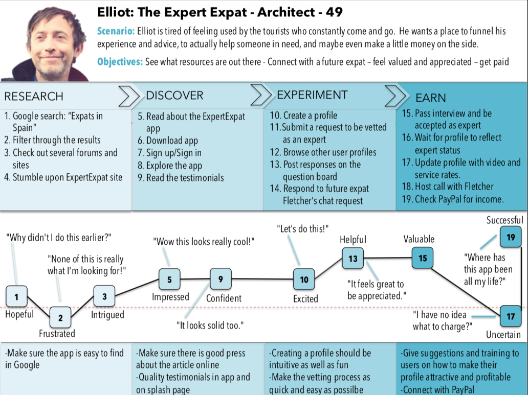
User Journey Maps
Good stories are powerful because they produce empathy, they can pull the outsider...inside. Have you ever cried at a movie? Have you ever hated the bad guy? Did you ever get goose-bumps in an inspiring moment?
User Journeys are stories and we use them to create empathy because it helps make our personas real. If there are key members of our team outside this can be one of the tools to invite them in.


User Flows
Having these flows continues to help me design through the eyes of my user. While I may be tempted to get carried away by the glitz and glammor of every page and its UI elements, the flows keep me task-oriented, just like Fletcher is.
Here a little bit of structure is a needed step on the way to full info architecture. Below you have an example and you can see all 3 User Flows.


Content Audit
If the resources are available I will research at every stage throught the UXD process. That being said, a content audit is one of the last pieces of research before I shift focus towards designing the prototype. Together with the user flows the audit will guide my information archictecture.
I found an excellent competitor called internations.org which claims to be the largest expat community in the world. See my Content Audit.
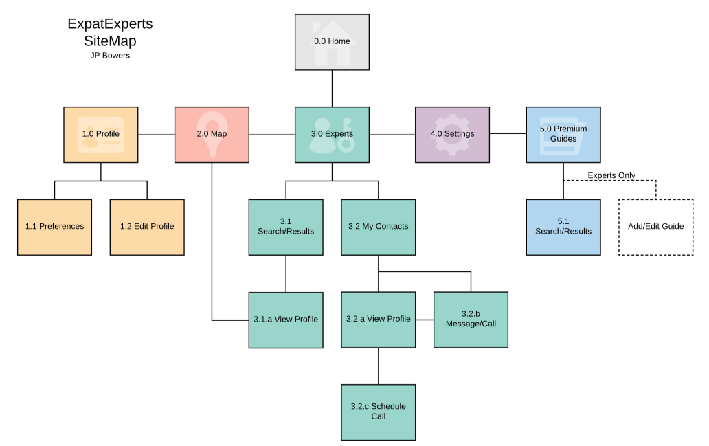
Information Architecture: Sitemap
Guided by the user flows and using the content audit I can put together an initial sitemap.
On a small side note you will notice that the name of the app used to be "EpatExperts". This turned out to be a bit of a tongue twister for my users and was later changed to "Pro-Expats".
Card Sort and Sitemap Iteration
Even though we have shifted our focus to design now, that doesn't mean we are finished doing research. After an initial sitemap is constructed, its time to use a card sort to better inform the structure of our app.
Take a look at the Card Sort Analysis which led to the following Sitemap iteration.

Lo-Fi Wireframes
I have to admit that going from information architecture to visual design is a big jump for me. I've never been an artist! That being said, I always did well in Pictionary despite my lack of drawing skills! I realized that as long as my partner got the idea, it didn't matter how bad it was. It was about learning to communicate despite my limits.
I approach sketching the same way. Although the perfectionist in me hates rough sketches and bad handwriting I know its an essential first step to put your ideas on paper.
In the following image you will see how I transformed some initial sketches using Balsamiq, followed by the other Lo-fi frames.


Usability Tests
I love people and find it incredibly fascinating to watch them interact with and dissect your design, even if that means turning it to dust before your very eyes. It's all about observing, learning, and later improving.
When constraints allow I prefer to do interviews and user testing in person but for this course I've done most of them remotely.

After my first round of user testing with 6 participants, I had plenty of things to adapt or change completely in my design. I recorded my tests and from those took extensive notes. I converted those notes into the following affinity map to help me analyze the results.


Once I had the affinity map I was then able to prioritize and organize the errors I found while testing. I placed them in the following Rainbow Spreadsheet:


As a result of my user testing I had to make some major changes to my design. Take a look at the changes I made here on the home screen:


Let me highlight just one change here for you. The screen on the left has "ExpatExperts", "My Contacts", "My Guides", and "New Experts", confusing huh?
This nomenclature was very confusing to my testers and so I simpliflied not just the lingo but the app features as well. The screen on the right puts the focus on the "Expat" and hopefully does away with the confusion.
You will also notice that I added color and I began to study Google's Material Design Guidelines to help me with the general layout of the application.
This includes learning how to use a grid, designing tool bars, using heirarchy, and handy bottom navigation.
You can see the entire Usability Test Report and A/B Preference Testing that was carried out here.
Hi-Fi Wireframes


Accessability was another issue I had yet to really tackle. I went through every mock up and adjusted text, buttons, and color contrast ratio's until it met the WCAG requirements for AA.
I tried not to borrow much from designs I saw on the web. But as I iterated further I needed new ideas. The changes in the following screen design came from inspiring UI patterns online:


I collapsed information boxes to reduce cognitive load. I then had room to add an attractive and contextual image. I used a skrim to keep the text readable and in focus. I improved the color scheme and I began using android system icons.
Here are the final mockups:


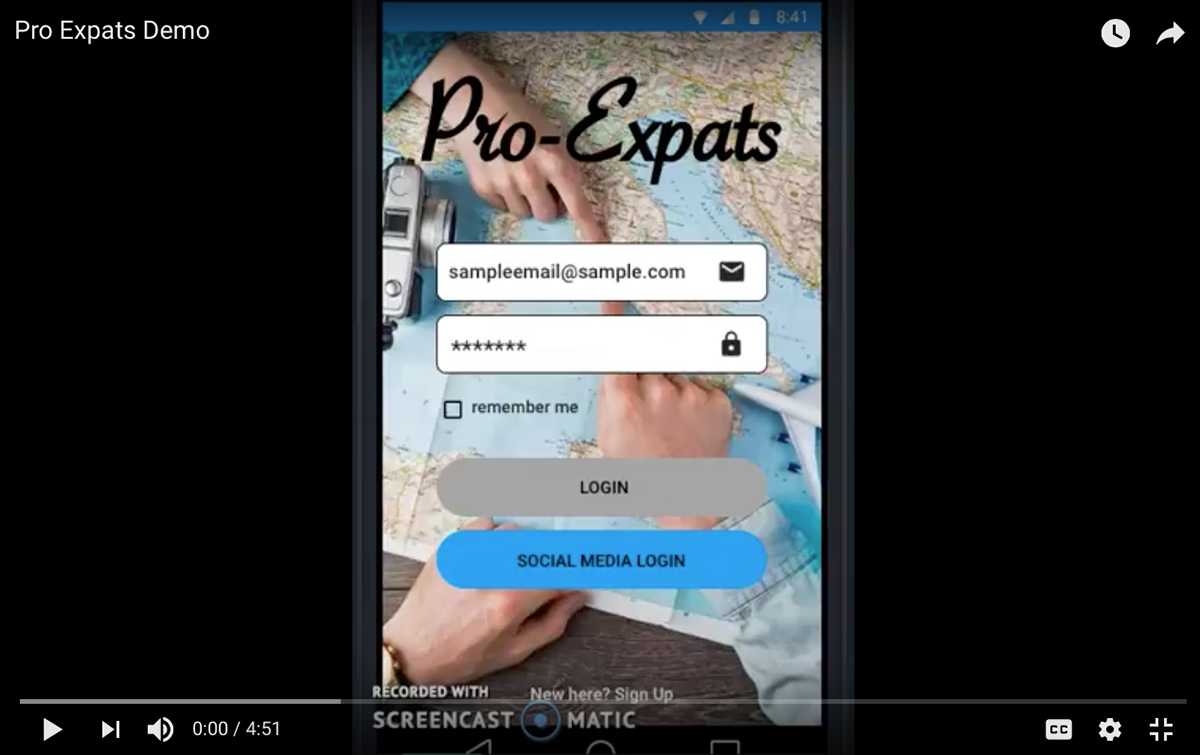
Last but not least you can see a demo of the final clickable prototype in this 5 minute App Walk-Through
Conclusion
As far as my personal process goes it's still very much in development. Being that this project formed part of a course I didn't have as much freedom as I might have on a personal project.
A lot of work went into this project. I learned which part of the UXD process I really bring strength to and which parts I would be more than happy to allow my teammates to bring their strenghts to. I would love to focus on UX Research moving forward!
Thank you!
