


Client | Mirror
Role | UI/UX Designer
Duration | SIX Weeks
______________________________________________________________________________________________________________________
Mirror is a global clothing chain with over 400 retail stores in 32 countries and was established in the year 1994. They are very successful offline and are well known for their good quality clothing and economic pricing. Their main ideal is to make any type of clothing accessible to everyone. They believe clothing doesn’t have to be expensive and last forever, that we should be able to change styles as we need and please.
Problem Statement
A few years ago they decided to not invest in digital because they preferred keeping their service in person. Today, due to digital shift in consumer behaviour, prolonged requests from customers for online access and the need to clear warehouse inventory to cut costs, Mirror decided to extend their services digitally by making their products available online.
Project Goal
‣ To design a responsive e-commerce website for Mirror, in order for users to browse and purchase with ease.
‣ Design a new logo that positions Mirror as a neutral, modern and a fresh clothing store.
Stage 1 | Research
A research plan was formulated to determine the demographics of potential consumers - their needs, expectations and what drives their motivation; analyse the scope of current Indian apparel industry; assess competitors market positioning and analyse their website functionalities / features; identify pain points of consumers and what difficulties they face when shopping for clothes online. An empathy research was conducted over a duration of 6 days using the following proposed methodologies - secondary research, competitive analysis, contextual inquiry and customer survey. Overall findings from research helped establish,
Pain Points Consumer Needs Possible Solutions

Stage 2 | Define
Synthesising User Research
From the research findings, participants inputs from contextual inquiry, research data were analysed to identify similarities/patterns in user behaviour and preference.
A persona was built that resonates with their goals, needs and frustrations. A back-story for the persona was created to resemble interviewees lifestyle. Following which an empathy map was developed using patterns observed from inputs provided by participants from contextual inquiry. Two of the most observed pain points from the research data were chosen as underlying problem to create a scenario for storyboard. It was observed that a lot of participants were hesitant to buy clothes online, afraid of getting a size too small or too big. The story depicts a situation where the persona ‘Samantha’ would face a similar problem and how using Mirror would help her overcome her presumptions about online shopping.


From left to right - Persona Development, Empathy Map
Establishing Project Goals
Using overall research findings i.e. goals and pain points of both business and users were defined to establish project goals. Additionally technical considerations were also included to help achieve realistic outcomes.

Product Roadmap
A feature roadmap was developed using inputs from interview, survey and secondary research. Must have MVP features requested by participants as essential to an e-commerce website were given high priority. Typical features in a clothing website was added along the way which would help users in their buying process.
A competitor feature matrix analysis was done alongside direct and indirect brand competitors.
It helped to analyse the cost and value of implementing features and services to find which will be profitable and easy to execute with the most gains; identify which features are available/not available in competitors website.
Information Architecture
Before beginning to categorise sections of the website, a card sorting study was conducted to understand how users perceive product categories. A set of 30 clothing items along with a product picture and description were provided to participants. This helped to create the foundation of developing a sitemap. Task flow represents how a user would use the website to purchase a product. The user flow map depicts two different tasks and the user flow for each of the tasks - using Try & Buy feature and purchasing a product.


From left to right - Sitemap, Task Flow, User Flow
Stage 3 | Design
Wireframes
Before beginning to design wireframe, various sketches were made to build variations on the homepage to establish a basic structure with the use of sitemap. A low fidelity wireframe was designed using Sketch for important pages. Subsequently pages were later developed to complete task flow for buying a product and using the Try & Buy feature.

Brand Identity
Designing the logo involved sketching various ideas derived using word map technique. After several round of iteration, a logo was chosen. The letter ‘M’ is used as a base in the creation; mirrored opposite to each other creating an effect of rectangular mirrors reflecting one another. Keeping in mind, that the brand should cater to all people of varying styles, the mirror is a reflection of each individual’s personality and taste. The use of colour red is known to evoke strong emotions. The use of color red can be profitable as it stimulates a sense of urgency to shop and also create a delightful experience. Varying shades of blues and greys are used to neutralise the palette.
Primary Logo Small Size Variant Mobile Icon

UI Kit
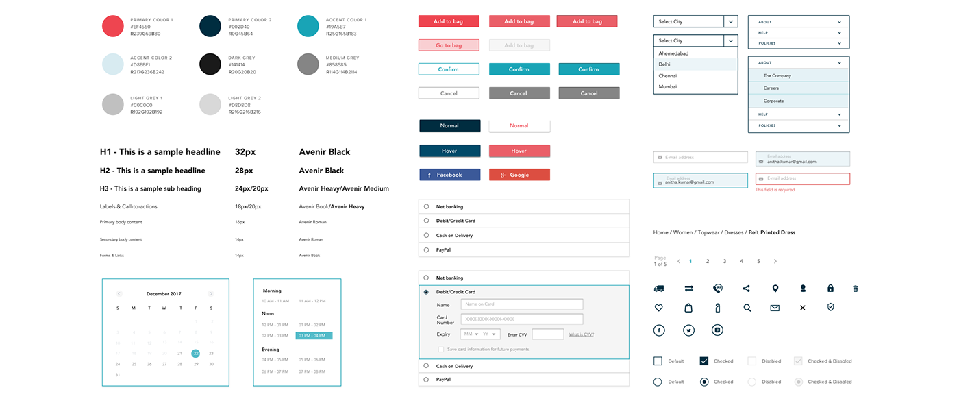
Responsive wireframes were designed and was further polished using UI Kit to create a mid fidelity prototype.

Stage 4 | Prototype
Prototyping with Invision
An interactive high fidelity prototype of Mirror desktop website was created using Invision. The prototype functionality is limited to two major task flows.
a. Finding a product and adding to cart, through checkout to payment and confirmation.
b. Finding a product and scheduling visit to store using ‘Try & Buy’ feature.
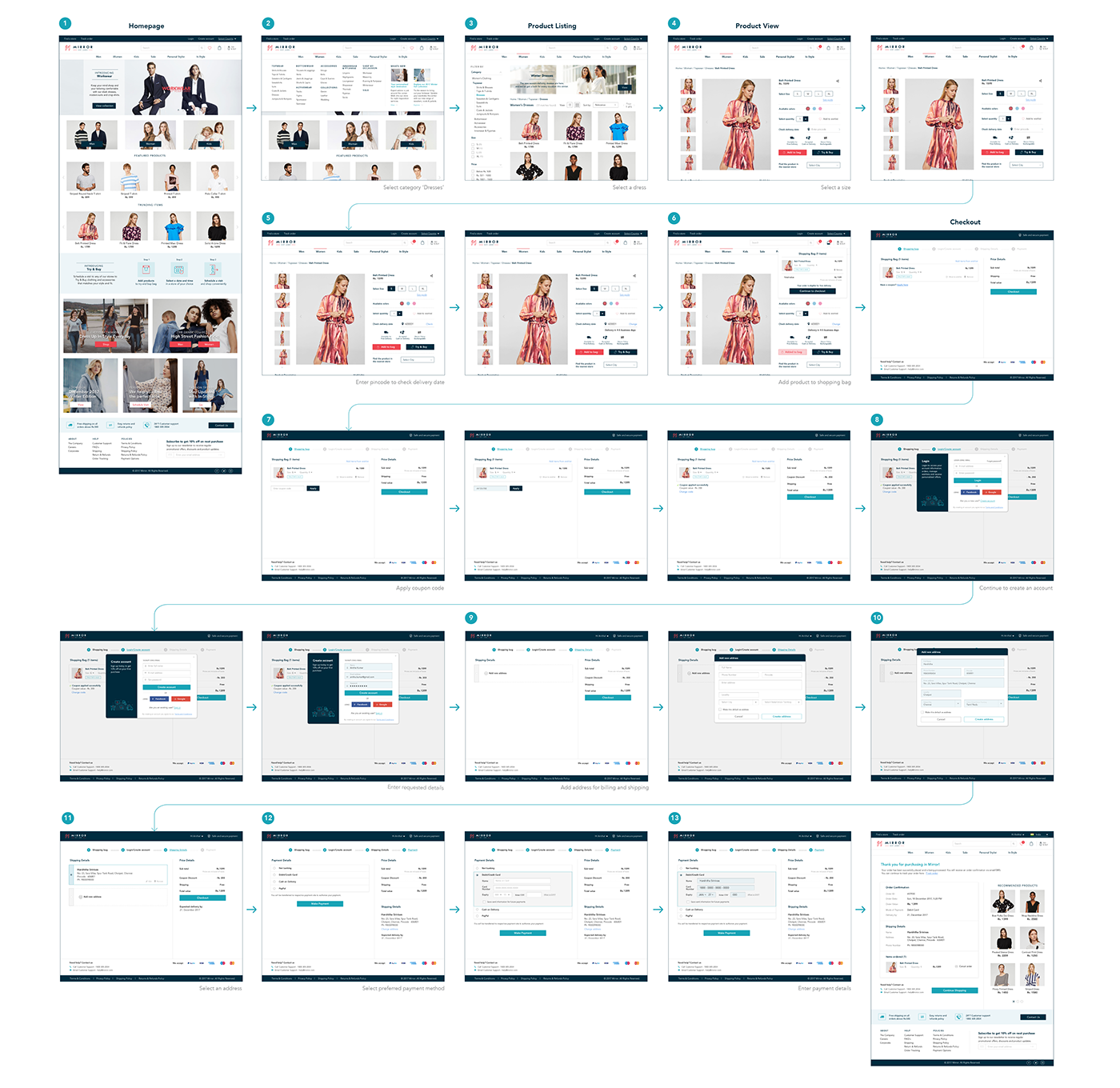
Above image - Product buying process

Above image - Scheduling a visit to the store for a pickup via Try & Buy method
Stage 5 | Test
To determine the level of efficiency of design and usability within the user interface of the interactive prototype, multiple moderated and unmoderated usability testings were conducted. The test plan was devised were to understand user preference, memory and identify potential navigation issues within the task flow. From the usability test findings, an affinity map was created based on error patterns observed.
The affinity map is segregated into groups of findings in navigation & usability; content and call to action, suggestions from participants and recommended course of action. The issues identified were addressed based on priority and subsequent changes were made to the interactive prototype.
Next Steps
Based on patterns that emerged from usability test, a lot of potential user suggestions can be taken into account to initiate research for validating user preferences across brand archetypes. After establishing valid reasoning for implementing new features, the same can be updated in the prototype to run a usability test.The process can be repeated to include various novel features in the site such as designing and developing 'Lookbook' and 'Personal Stylist' sections.


