ВЕРНИКА. ДИЗАЙН ЛОГОТИПА
Верни свое здоровье!
Клиника здоровья «Верника» предлагает существенно отличающийся от традиционной медицины подход к здоровью и лечению. Биорезонансная терапия — уникальный по своей эффективности вид лечения. Он основан на том, что все органы и ткани живого организма являются естественным источником сверхслабых колебаний, и коррекция собственных электромагнитных колебаний систем и органов позволяет восстанавливать физиологическое равновесие в организме.
Vernika. Design of the logo
Return your health!
The health clinic "Vernika" offers an approach to health and treatment that differs from traditional medicine. Bioresonance therapy is a unique type of treatment. This Therapy is based on the fact that all organs and tissues of an organism are a natural source of superweak oscillations. Correction of the electromagnetic oscillations of systems and organs allows restoring the physiological balance in the body.

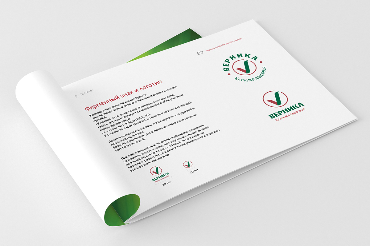
В названии клиники читается призыв к действию. В основе знака буква V, первая в латинской версии названия, а также она несет в себе позитивный смысл: «victory» — победа. А еще это галочка, которой можно смело отметить решенный вопрос.
Одна из версий компоновки знака и логотипа — круг, напоминающий печать на медицинском бланке.
The name of the clinic is a call to action. At the heart of the sign is the letter V, the first in the Latin version of the name. It also carries a positive meaning - "victory". And the tick in the middle of the sign reminds you about resolved issue.
One of the versions of the logo is a circle resembling a seal on a medical form.