1. Understand the Problem
The purpose of a book cover is to sell a book, so having an interesting enough cover so they pick it up and look at the back cover, than at that point the consumer will decide if they want the book or not.
I think this is a good book cover because it caught my eye, and is something I would probably read based on its cover. It's also interesting, and has a great graphic too.
A good book cover generates sales, and a bad one doesn't. A good cover has to grab a reader by relaying information. It must communicate information quickly too like the genre of the book, who the books being directed towards, and must grabs people on the first look, or they'll pass it by and look at another book instead. A good book cover must also be unique, and stand apart from other books in its category.
A bad book cover would be the opposite of what a good one would be. A cheesy, generic, boring, or a book cover that looks the same as other in the genre of book.
Sources:
http://businessofillustration.com/makes-good-book-cover/
https://goinswriter.com/book-cover-design/
Book Summary:
"Wringer," written by Jerry Spinelli, is a book about a kid who doesn't like an event in a festival where pigeons are released and shot. Mostly because he was peer pressured by other young kids to wring the necks of injured pigeons on the field. He kinda becomes friends with these people and they want to see who can be the best wringer. In the process of becoming friends with them, he and those other people "harass" one of his long time friends before he knew these other people.
But then when a pigeon flies into his window, he names it Nipper and takes care of it for a while. He says sorry to his friend, and his friend is also against the game of shooting pigeons. So he gives the pigeon over to his friend in order to keep Nipper secret from the other group of friends who enjoy wringing pigeons. His friend thinks it's best to release the pigeon, and unknowingly to her, she releases it also so Nipper avoids capture, but she released it by some railroad tracks in an area where the pigeons were captured for the festival.
The main character is at the festival, (not to wring pigeons) and notices a pigeon circling in the air, (other pigeons were flying away so the main character knew it was Nipper) and it was then injured, and in the midst of gunfire he runs in the pick him up. He gets booed by people, but another boy asks his dad if he could keep a pigeon too.
2. Research and Investigate
Author: Jerry Spinelli
Publisher: Harper Trophy
Awards: Newbery Medal Nominee (1998), Josette Frank Award (1997)
Source: https://www.goodreads.com/book/show/278264.Wringer
Big Events: The main character Palmer goes to his first pigeon shoot and has to wring injured pigeons, and under peer pressure at a pigeon shoot for a festival. He become friends with some people who are not very nice to other people. A pigeon he ends up taking care of flies into the opening of his window. He gives his pigeon to a long time friend who also does not like the pigeon shoot. She releases the pigeon, and Palmer sees the pigeon injured from the shoot.
Sources:
http://www.bookrags.com/studyguide-wringer/#gsc.tab=0
3. Generate Possible Solutions
List of ideas:
1. The word wringer put somewhere
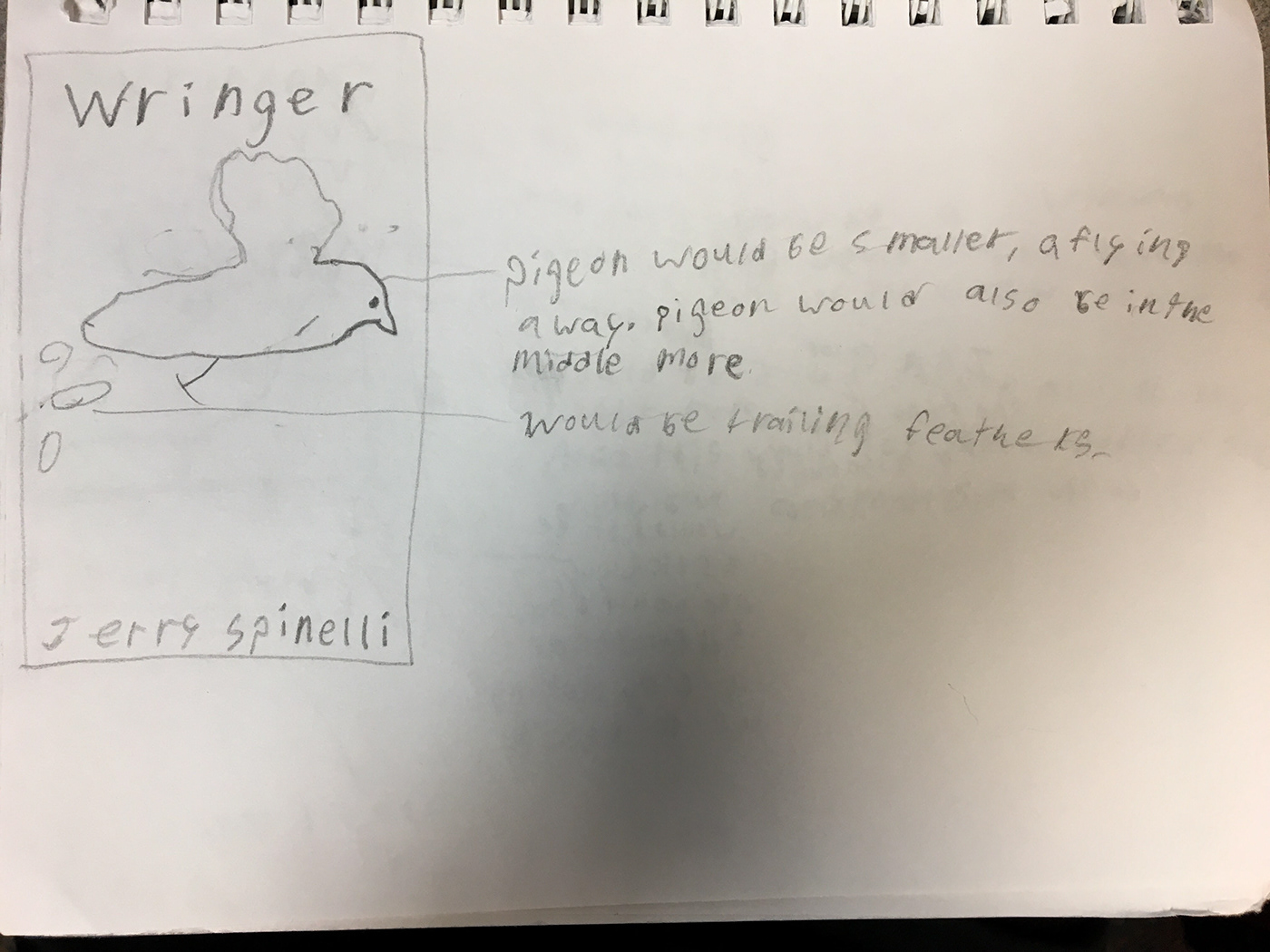
2. Using a pigeons eye (because of things described he book)
3. A pigeon on a window sill
4. A sideways view of a pigeon
5. Some sort of silhouette of a pigeon, with the eye highlighted
6. Some type of typographic design with the authors name
7. But the award stamps on it (or the most important one on the front, other on the back)
8. Authors picture on inside cover (maybe back on the back)
9. Some sort of description of the book on the back
10. A side view of a pigeon with some type of texture on it with the eye highlighted and excluded from the texture
11. Footprint of a pigeon
12. No modern fonts
13. Footprint of a pigeon, but more of just a graphic of one
14. Silhouette of a boy holding something carrying a pigeon in his hands
15. A silhouette of a boy holding his arm out with a pigeon in his hand
16. Not using mostly bright colors, since the theme of the book doesn't exactly go with that
17. A graphical design of a sideways view of a pigeon, with only main features other colors like stripes, eyes, legs, etc.
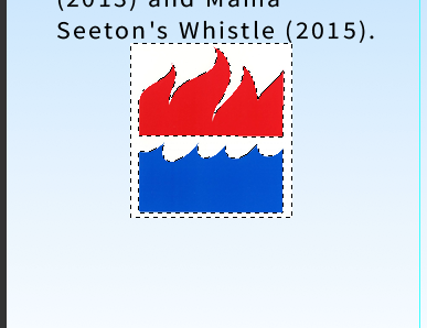
18. Red, black, and orange theme (the eye)
19. The title "Wringer" centered, middle top position
20. Standard B format size
21. A clean design
22. Very simple looking overall graphical design (implementing other graphical designs listed
23. A pigeon pecking at something on the ground
24. Pigeons flying away, or a single one
25. Pigeons flying in the distance as silhouettes, and a silhouette of a boy looking up at them
26. Trail of feathers, textured, blended, fading away, or other things that might look good
27. Using any of the ideas with a pigeon not moving, have feathers floating down on the ground, and using things from 25
Sketches:
I don't really know what font yet, and I was just going to pick the font that fits and look the best with everything, as well as their size and exact placement. Because placement for things in these sketches are kinda general. That also goes for the color schemes too, but I do still have an idea of what that will be. Also for all of the sketches, I think they would all fit what ideas I have in my head if they're graphics, or images of the things that would be on the cover.
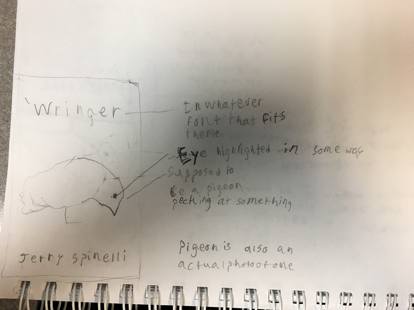
I was thinking this one would just be some pigeon pecking at the ground, and would either be a graphic of a pigeon, or an actual picture of one. The color scheme would also probably be in a darker range of colors. I was thinking the whole pigeon except its eye would be faded a bit, textured a bit, or just a graphic so the eye does what I want it to do, and also because of things that happen in the book.
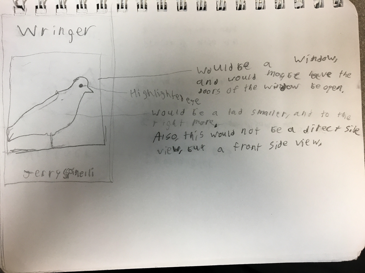
This one would be a pigeon in a window, and would either be a direct side view, or a kinda front side view, and it would be sitting in a window sill because of some things that happen in the book. I would also probably make the window bigger and have the side not visible, because I just realized how small I made the window. The window sill would be a stained wood or something too. I was I also thinking I might have sun rays too coming from the side. I would probably just have a sky in the back round, and then everywhere else it would be like a wall. The wall would probably be made of wooden panels with a piece of skinny wood trim on top of it, and would just be a plain wall from there, that I might be able to use a texture for.
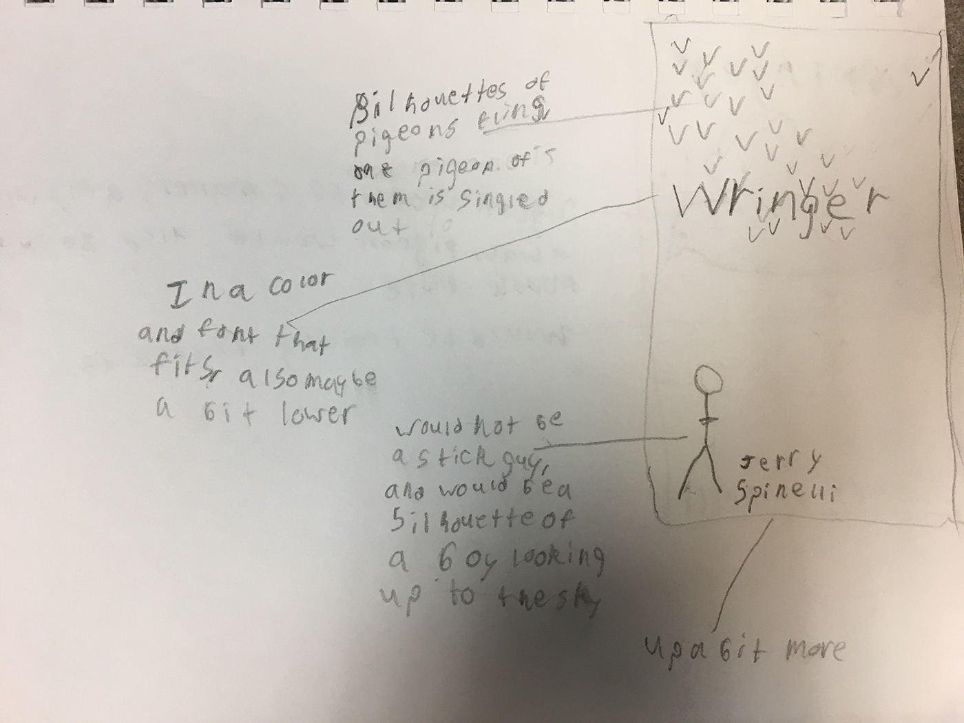
This one would be all silhouettes or simple graphics. I would have a person that looks like a boy looking up at one pigeon flying apart from another group of pigeons flying away in a big group. I was thinking I would have a color scheme of white, grays, and blacks. The font would also probably be bold, since it would be on top of, or behind the pigeons, whatever ends up looking the best and still being able to clearly read the title.
This last one would be a pigeon flying away, but flying upwards, and diagonally away. The pigeon would also would be smaller, and I would have a trail of feathers going behind it. The back round would be a deciduous temperate forest with sky, or just sky and no forest. The pigeon would be more in the middle, so I would be able to make the title lower on the cover. The authors name would also be a bit higher.
4. Select and Develop Best Solution
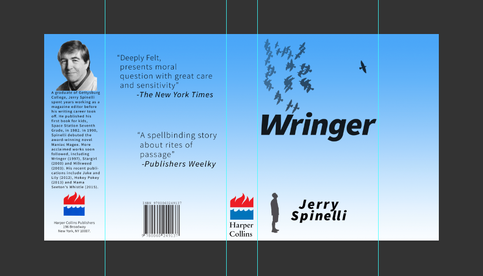
I chose the design that was the third one down, because I liked that one the most when I started making the sketches. I thought about picking the second one down too, because what I'm imagining what it might look like seems good too. Both of them also have good meaning and make a lot of sense too for things that happen in the book. But I kinda want to see if a more simple design will work ok, so I'm going this one.
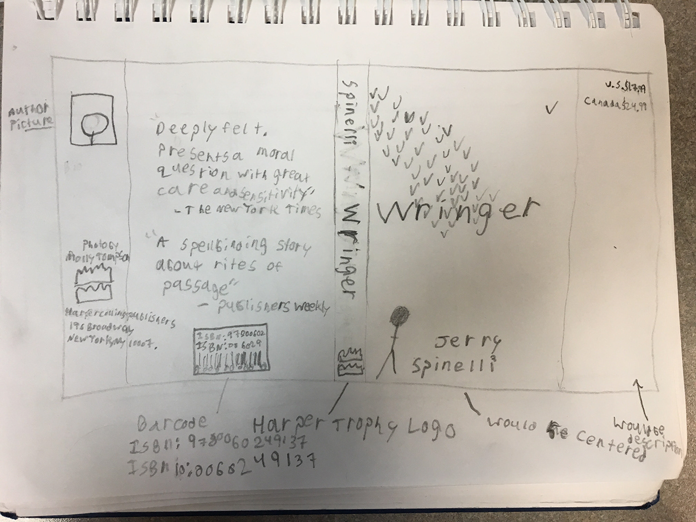
The fonts would probably be pretty simple, but they would be whatever font that looks good. The color scheme will probably be black whites, and grays, having everything white, and all objects and fonts in black or different shades of grays.
Theres also a couple of quotes on the back, and I'm going to have the description of the book in the empty area on the first inside cover.
ISBN: 9780060249137
ISBN 10: 0030249137
The book is published by Harper Trophy which is part of Harper Collins Publishers.
I also am putting the other publisher information of the back inside cover, instead of the back, because I think it makes it a bit cleaner on the back and fills space on the inside cover. Plus a lot of other books do the same thing.
Harper Collins Publishers
196 Broadway
New York, NY 10007.
The most important part of the cover is keeping the pigeons flying in the sky, and the boy looking at the one lone pigeon flying away from the other ones. I also think it's better to keep it simple with the color scheme to not make it complicated looking. The quotes could be changed to different ones, and I might add the Newberry Medal thing. The picture for the author doesn't exactly matter which picture it is of him. The place where I put the price price for the book does't matter too much, I just saw a few other books do it, and I thought it was best of the front inside cover to keep other places in the book more clean.
The pictures below are a little bit out of order
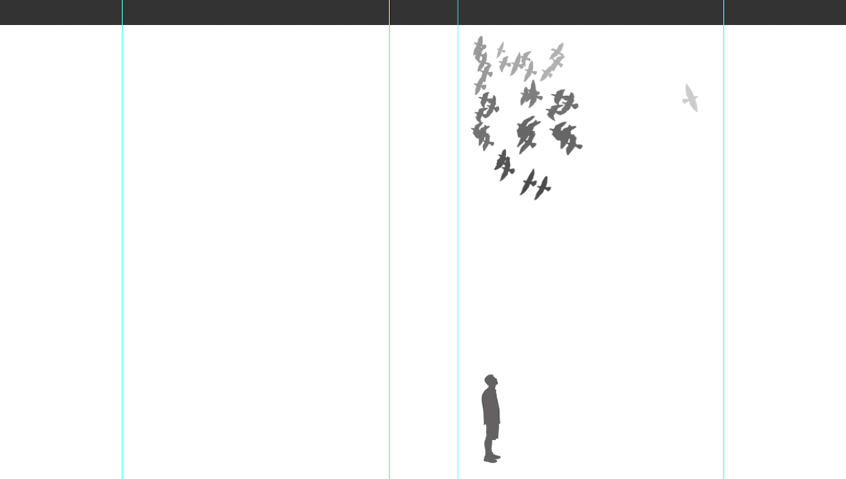
This is with a white backround and with a boy looking up at a pigeon.
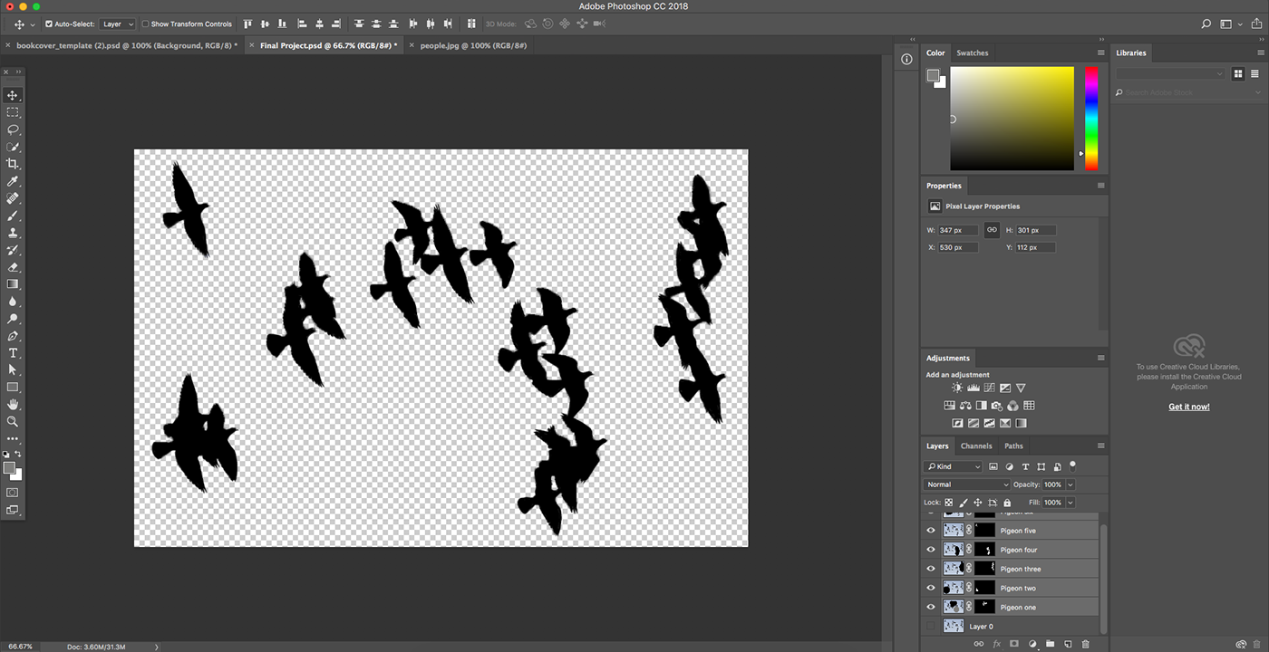
Making the cutouts I made of the pigeons into silhouettes.
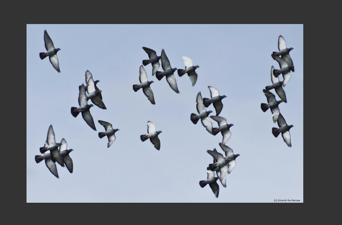
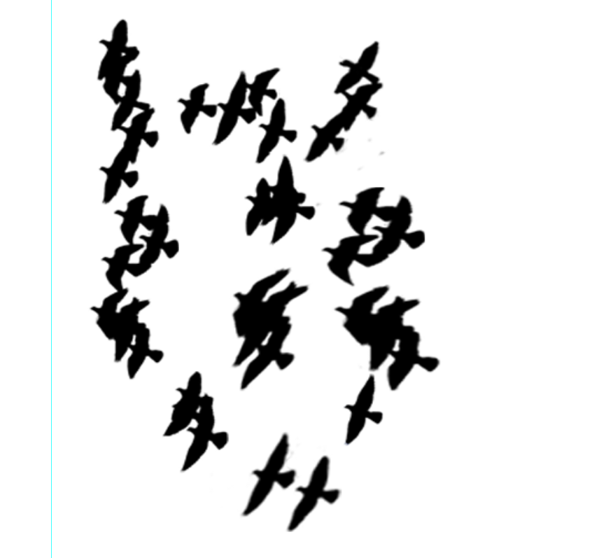
The picture of where I took the pigeons from.
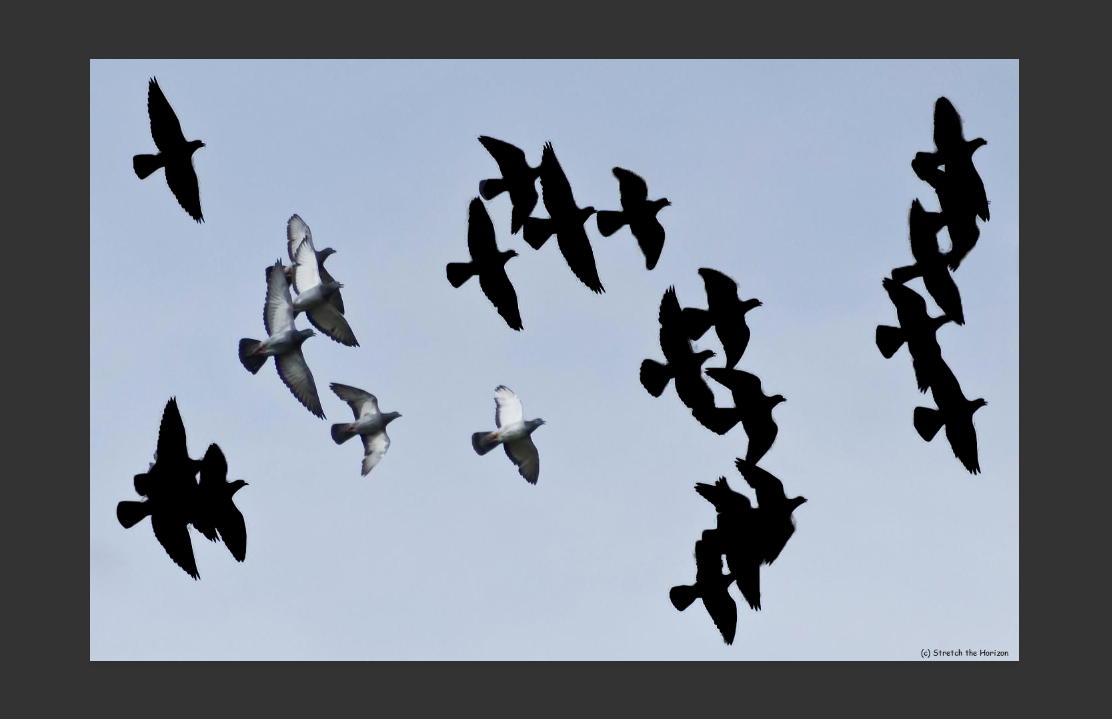
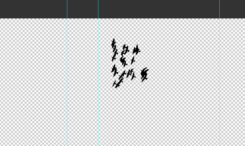
I cut some of the pigeons out.
All of the pigeons were never completely black like I wanted, so I touched them up with a black brush.
The wing on the right shows what it looked like when it wasn't completely black.
All of the pigeons cut out and put in a spot where I was planning on putting them. Some groups of the pigeons were reused so I didn't have to use pigeons from another picture, where they would be flying at a different angle, and it was also kind of hard to find a picture that fit the idea I had in my head, and on paper. All I did was distort it, change the size, and get ride of a pigeon that was in the group so it wouldn't look the same.
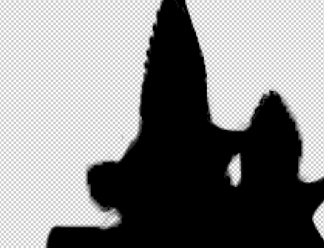
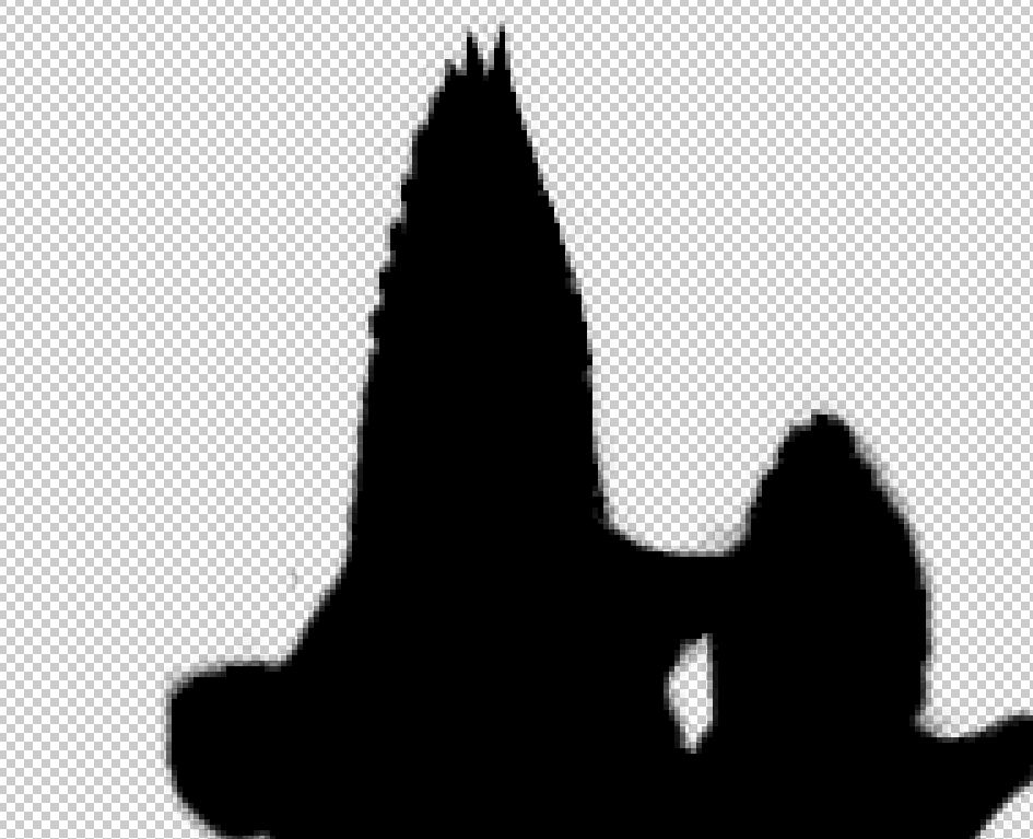
I was touching up the little black specs that are in the white space with a layer mask.
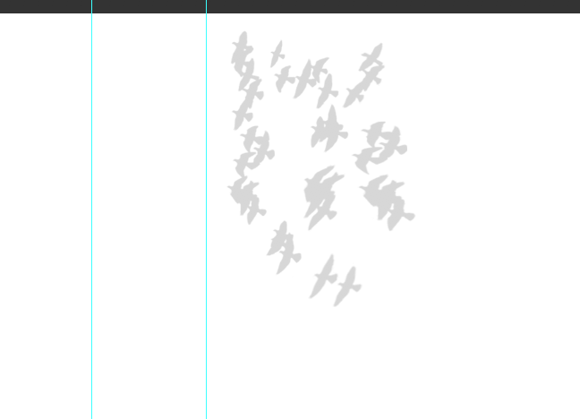
Seeing if they would look better more grey than black.
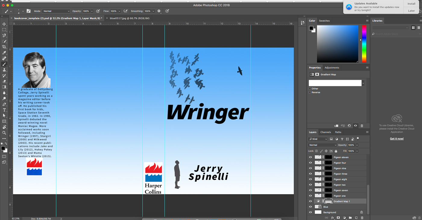
I changed the opacities of the pigeons, put in a blue rectangle, and then put a gradient filter on that. It also show the logos for the publisher, author description and picture, as well as the title and author name.
I selected the white with the magic want tool to get rid of the white.
In Illustrator making all the descriptions and stuff. I chose the base font called Source Sans Variable.
For the quotes I made to separate sections for each review quote because I couldn't get the words to line up how I wanted with the first quotation mark.
I changed the opacity of the pigeons a bit more, added the barcode with the books ISBN that I got from a ISBN maker from a website. I also put the publisher info on the inside cover to keep the back cover clean, and a lot of other book covers do that too.
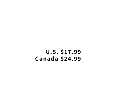
The prices for the book in Illustrator.
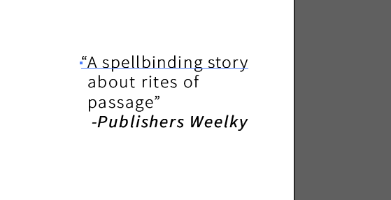
What the quotes look like put together, since I had it in two parts.

I changed the fonts for the title and the author name, I also put the description of the book on the inside cover, and I just used the description from the actual book (a bit shortened) because it's not my book, and that's what the author made for a description for it.
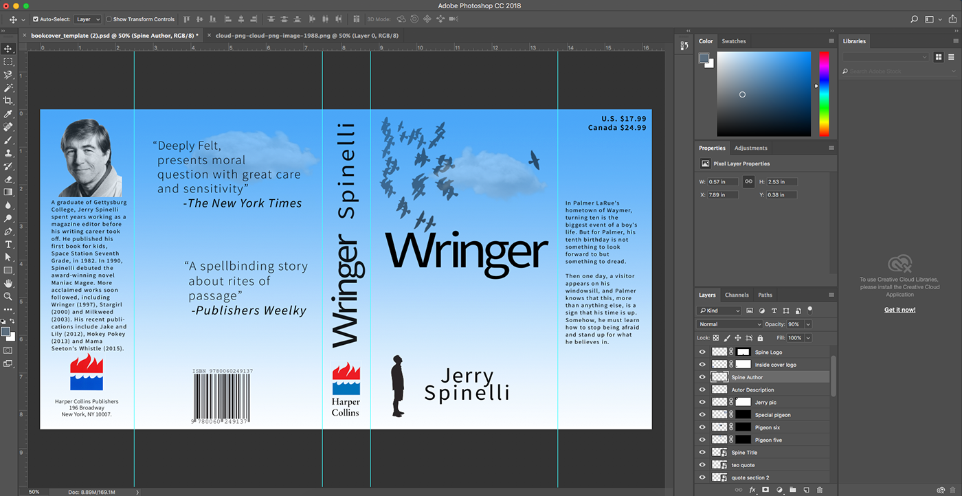
This is the final version, all I did was add the title for the spine, and move the autors name on the spine. I also changed their opacities a bit. I also added a couple of clouds to add a bit of texture. I used the same cloud and just distorted, warped, and rotated the second cloud. The bottom part still looks a bit plain, but I think its better off that way. The last part I did was just making the logo a bit smaller.
6. Test and Evaluate
I could probably adjust or add more textures maybe, and just tinkering with some other little things. I also think if the description was longer in the front inside cover, it would look a bit better.
The people I asked said it looked good, I only asked Coulson and a person next to me since the other people who used to sit on the other side of me left. I was just told to add the title to the spine, make the logo on the spine a bit smaller, and to add some textures.
Those refinements are shown in the picture above.
7. Produce
What I liked about the solution was it was different than the actual book cover, because the actual one is not as simple as mine. That book cover also has a actual picture of someone on the front cover and mine has no picture of anyone on the front cover. Next time I would probably try to think about textures a little sooner, so I could do something more unique with them. The hardest part was probably cutting out the pigeons and making that work out so it looked okay. It wasn't too hard, but every time I cut out a pigeon it had a bunch of stuff I didn't want that would stick out on the side of the pigeons. I learned more of what makes a good book cover, and a little bit more of the specific components of a book cover. As well as how little textures make a project look much better.
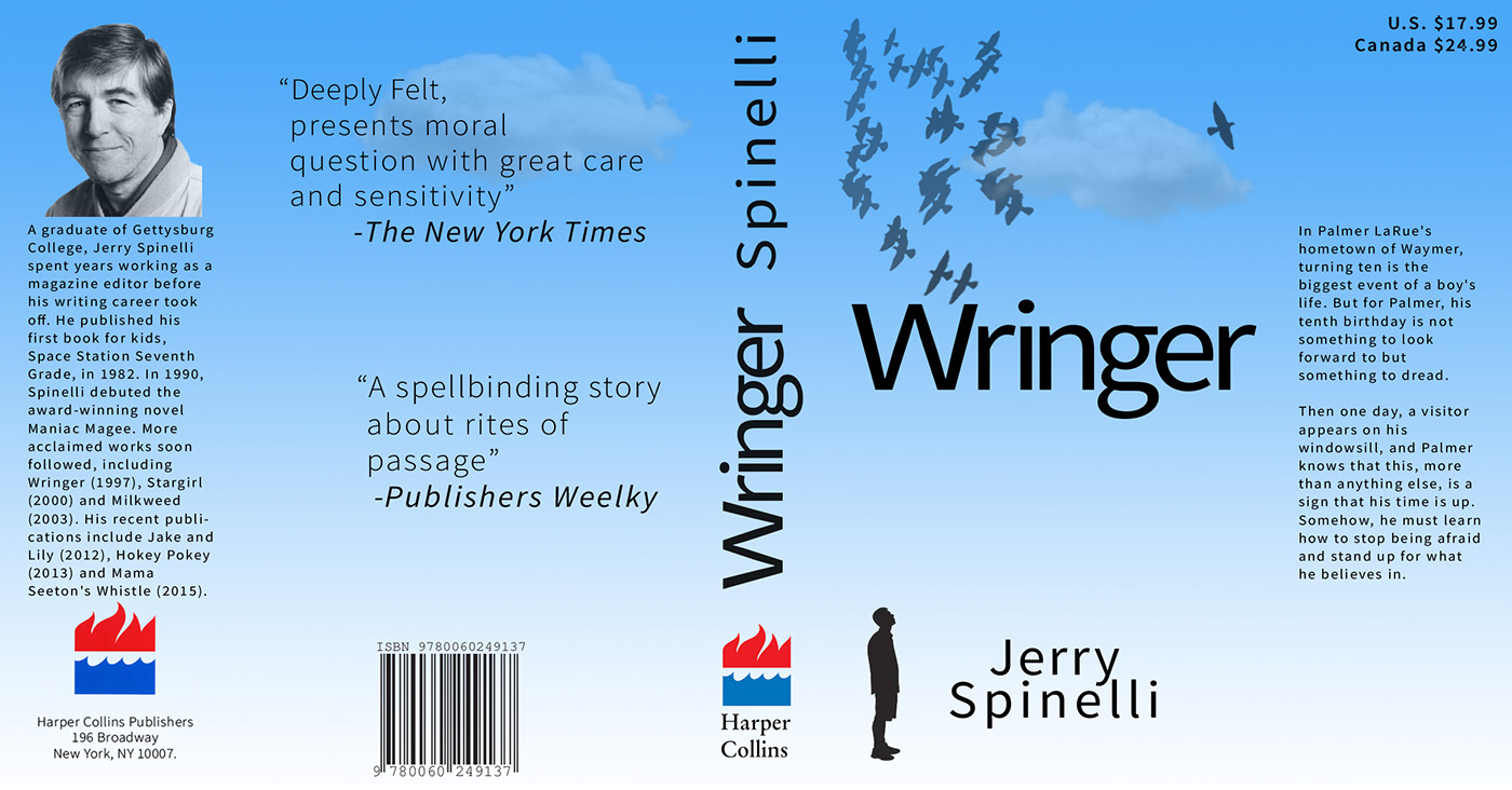
Final version of the book cover.
