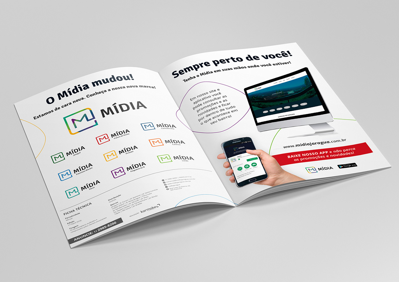
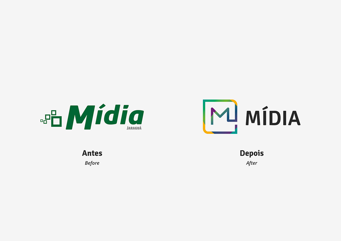
A Revista Mídia é uma revista de anúncios comerciais veiculada em um bairro da capital do estado de São Paulo, e que começará a ser distribuída também em outros bairros, e foi preciso desenvolver um novo logotipo e variações no símbolo para diferenciar cada região.
A proposta das várias cores no símbolo principal remete à variedade de locais onde a Revista será distribuída. Em cada variação o símbolo recebeu uma única cor, escolhida para representar cada região.
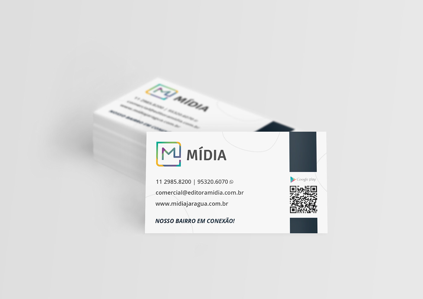
De modo geral, o símbolo deve ser compatível e legível tanto para os meios impressos como os digitais, e foi pensado cuidadosamente para ser também o ícone do aplicativo.
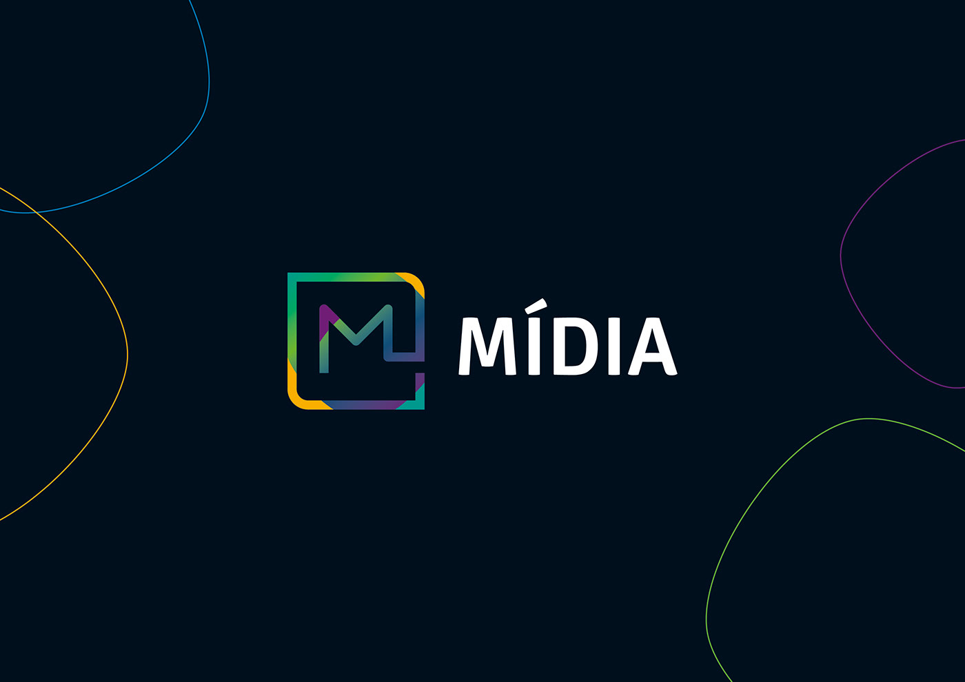
O formato quadrado do símbolo representa os anúncios que são veiculados na Revista, e a inicial 'M' ligada diretamente ao quadrado representa o vínculo com os anunciantes.
---
Revista Mídia is a magazine of commercial ads in a neighborhood in the city of São Paulo and will begin to be distributed in other neighborhoods, and it was necessary to develop a new logo and variations in the symbol to differentiate each region.
The proposal of the various colors in the main symbol refers to the variety of places where the Magazine will be distributed. In each variation, the symbol received a single color, chosen to represent each region.
In general, the symbol must be compatible and readable for both print and digital media, and it has been thought carefully to be also the icon of the application.
The square format of the symbol represents the ads that appear in the Magazine, and the initial letter "M" linked directly to the square represents the bond to the advertisers.