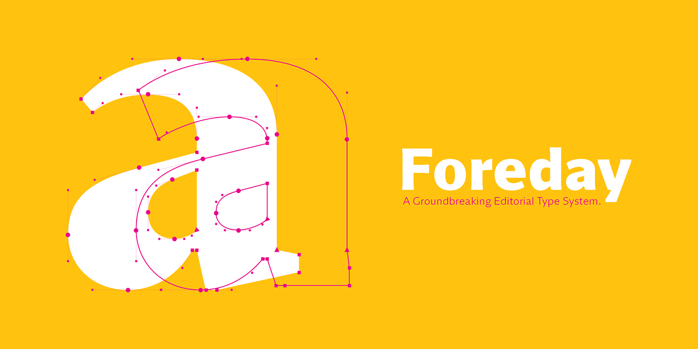
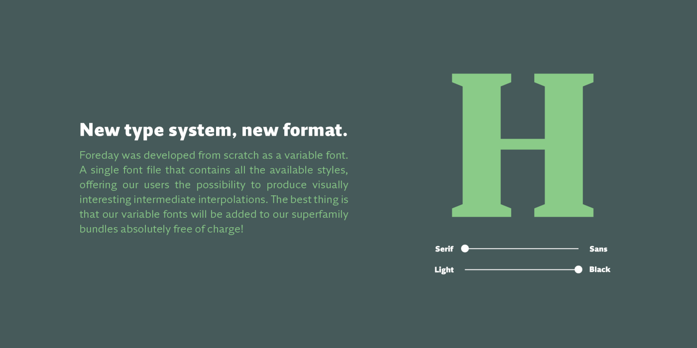
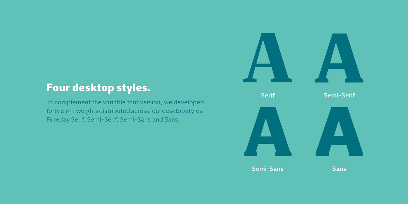


The end of the design space we used for centuries is just around the corner and, as a discipline, the survival of type design, will clearly depend on how we will face the upcoming problematics. This typeface is our first attempt to respond to the problematics of the upcoming digital publications. While in print the serifs might contribute to the legibility of typefaces, making any publications easier to read, the fact is that in screen environments the sans serif can render better and come out cleaner and thus more legible. In order to preserve the overall identity of the publication we expanded the design space, from the usual thin to thick, to serif to sans serif while confirming the consistency of the in-between typographic shapes. This way we can have a uniform typographic support for both analog and digital publications or, if digital only, from extremely big to small, pocket size displays, while covering all the digital devices responsively.
