

This project was registered in the public contest #brandOradea, organized by the Municipality of Oradea. The organizers found no winning solution out of the 180 creative proposals. Therefore, the prize was not given to anyone to any participant.

Positioning: “Oradea, the city that meets Europe”
Brand positioning is closely linked to the long-term strategic objective of Oradea. This identified the “European” position which occupied more and more space in today’s consumer mind, which must be continued and intensified. Also, this “point of focus” has been graphically translated into all the components which developed the Oradea brand.

A brand new city
A strong city brand needs a holistic approach (the whole city must be regarded as a brand) for this reason we choose to build a “master logo” (umbrella brand type) that can move and speak in favor of the city of Oradea.
The circle symbol overlaid on the letter “O” symbolizes openness, community, an element that is like a porthole with openness to the future, offering a configuration that invites the eye to travel between letters, titles, and pictures, also creating curiosity. It conveys a bold and safe attitude through a relatively “simple” symbol, but when it was activated with images and graphic elements from the history of the city, art, culture, events, etc., it manages to give you a cosmopolitan, colorful and poetic image of Oradea city.
The solution founded offers to Oradea city a modern and distinctive position, both region and internally, which aligns with the development of the community and the already outlined perception: new town.

Concept and significance
The city’s identity Oradea refers to the initial “O” of the city and is composed of several meanings:
Cosmopolit: Oradea is aligned with the shortlist of cities in Romania that have a contemporary/west form appearance and atmosphere that benefit from a unique vibe. Oradea is a city that belongs to the whole world, with an attitude that gives a positive brand identity that is no longer an option these days.
Community: Oradea is a model of both inter-ethnic place of Romanians, Hungarians, Jews, Gypsies, and Germans living here for centuries, as well as inter-denominational cohabitation. The circle represents an open individuality that is in full communion with the people it loves.
Progress: The circle symbol creates a sense of energy and past, present, as well as future aspirations of the city of Oradea. It is a dynamic city, which is constantly improving, Oradea is one of the few cities in the country with a clear and coherent vision of expanding.
Centre: The level of cultural activity and events has established Oradea as one of the most important cultural centers of this eastern territory in Europe. Among the Romanian cities, Oradea has the most beautiful historical center. Additionally, Oradea was the center of the world in the 15th century, because it was located on the 0-meridian parallel.


Slogan: Tomorrow again
The brand “Tomorrow again” is an integral part of the brand identity that represents and describes the mental representation that involves the essence of Oradea. Here are the evaluation criteria after which BroHouse believes that this slogan can have a significant impact on the citizens in Oradea:
1) Simple and credible with a focus on optimism regarding the future of the city, even though it is based on complex emotional and intellectual levels.
2) Oradea is valuated exactly what can Oradea will become. However, it’s difficult and incomprehensible for the moment, were all the achievements of last year’s results, generated offering hope for a healthy future, and a model to be followed.
3) The small daily signs of progress, even if they seem much insignificant, led to great achievements in time.
4) A person is no longer the same after he discovers something. You create the next moment.
The slogan “Tomorrow again” has the role of a manifest. Why do we say that? “We believe in this place that belongs to us all. A city that keeps our curiosity and for which we always return for more. A place that fills in the gaps in our past and makes the present take root in the future. ‘Yesterday’ is not an image of a maximum, it is not something to keep, but yesterday is an image that deserves and must be overcome. Oradea is a place for you. For me. Together for each day tomorrow.”
A slogan in English
It was created in English because intends for an international audience (Jews, Polish, Hungarians, Israels) but also because Oradea is such a model of interethnic cohabitation between Romanians, Hungarians, Jews, Gypsies and Germans living together for centuries (see: “Brasov – Be. Live it!”). Also, it offers a stronger global reputation and generates premises for increasing the international market share. Let’s not forget that level of understanding, reading and writing is an easy one.

Sector brand
In the case of products as well as in cities, functionality means an observable benefit. Once the logo has been created, the next step is to turn it into something noticeable everywhere in Oradea.
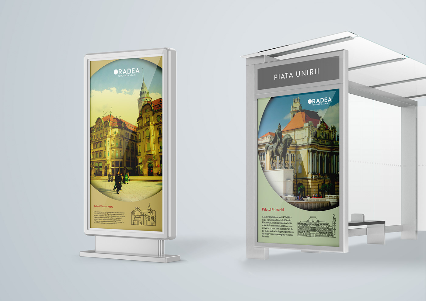
Depending on the context, the circle element in the structure of the word Oradea can have different and have representative interpretations of the city, offering a full visual language. In the application, the logo is transformed into an extended device of the type “window logo” meant to get more attention and a stronger connection with the audience.
The visual narrative is authentic, but at the same time, it is inspirational. This objective will help the citizens of Oradea to understand the role that they play in achieving the objective proposed by the city.


Art Nouveau colors
The color range is inspired by the Art Nouveau trend that successfully combines modernism with nostalgia, both interacting pleasingly. They are quite calm and weighted colors, in which pale shades of yellow-mustard, brick red, olive green and brown, offering a perfect ambiance dominated by elegance and charm.


Strategic directions
1. The new identity of Oradea goes beyond the political complexity and plan to unite a growing portfolio of initiatives, programs, services, events and activities (brands: Art Nouveau, geothermal, sports, smart city, etc.)
2. This challenge was solved by giving the city a unified, flexible and future-oriented picture. The new image confirms the evolution and change of Oradea’s reputation and allows it to connect with new opportunities.
3. The high degree of flexibility and adaptation in the identity system of the city of Oradea offers enough creative space, able to withstand in time.


Development directions
1.Photos
A limitation in the creating of this project was the family of existing photographs online, which combine different styles, approaches, and colors. The human element is missing from any photo, leaving the impression of an empty city. It is necessary to create a successful photo album that corresponds to marketing and brand objectives.
2. Signaling and urban orientation (Roads for orientation and information / Orientation for cyclists / Orientation in parks / Public vehicles etc.)
3. Online presence
4. Brand manual
The role of an identity manual is to prevent the misuse of the visual identity elements of a brand on different printed or digital materials, both in terms of size, proportions, and graphic components, as well as color.

Long-term results and other certainties
The interface of this project is just the tip of an iceberg. A successful approach to the Oradea brand must combine the consistency of the message and the cooperation of the community partners through marketing efforts.
Criticize
The best performing public administration in Romania showed us that he still knows how to disappoint and make a “Romanian bad thing”. We got upset, but now we must calm down. Many questions remain without reply, but we were able to draw some obvious conclusions:
1) The absence of the winner “is unfounded, there are good winning” working “proposals, which will enter in stage 2 for the feedback rounds and adjustments in collaboration with the APTOR organizers.
2) Design education in Romania is still in transition, and it will take some time until we get there.
3) The organizers of #brandOradea offered an indecent lack of dialogue, which means a lack of respect and transparency.
We believe in common sense, justice, and well-done things. Without going back. No need to take it from the beginning. Give everything.
Copyright © BroHouse. All rights reserved.
Trademarks and brands are the property of their respective owners.


