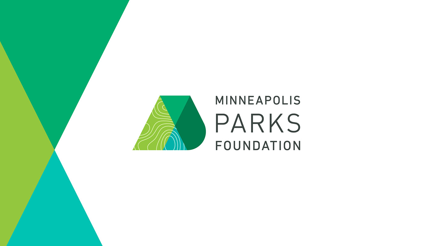
Minneapolis Parks Foundation
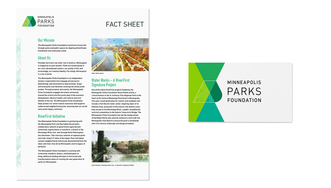
Anyone from Minneapolis knows our park system is consistently ranked among the best in the nation. The Minneapolis Parks Foundation raises funds and selects architects to push the future of public spaces. This innovative brand identity is as forward-thinking as the ambitious projects they make possible.
Created in collaboration with Fast Horse
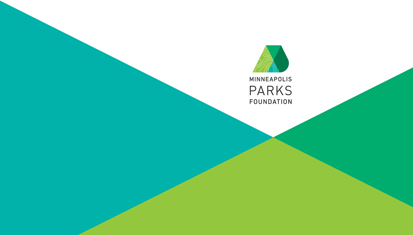
Primary Identity
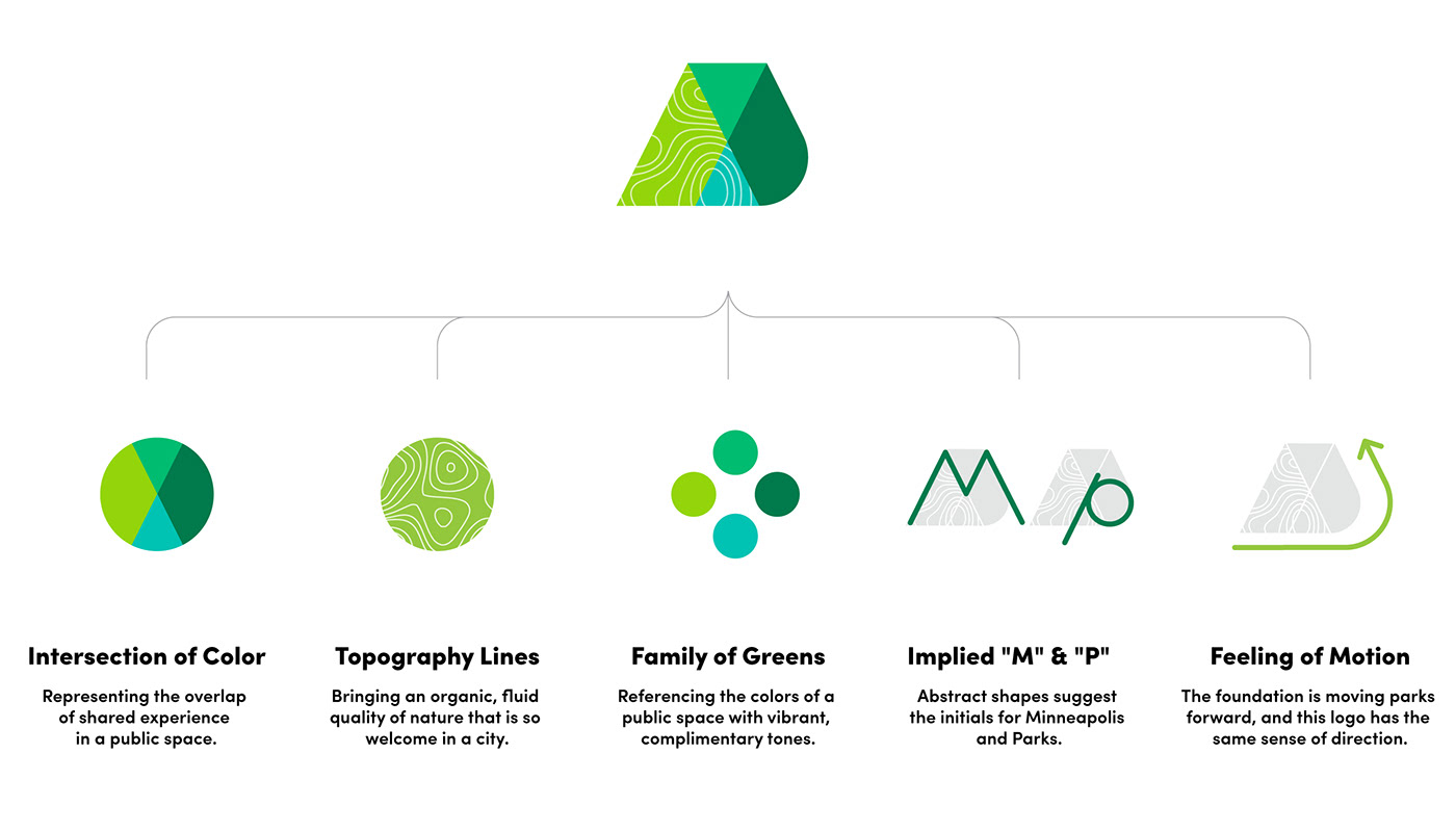
The logo blends the need for a modern, innovative brand with visual references to the public parks experience. Several factors delicately compliment each other for a compelling symbol to start a conversation about the future of Minneapolis parks.
Brand Tools
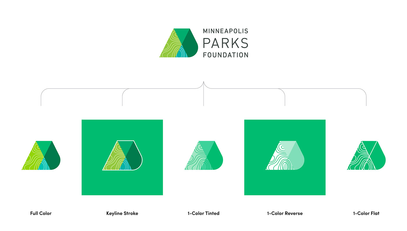
Logo Versions
In the fund-raising world, the brand must show up consistently in dozens of applications ranging from a bus billboard to social media watermark. Each of these situations has its own specific needs, so versions of the identity are made to fit perfectly in every execution.
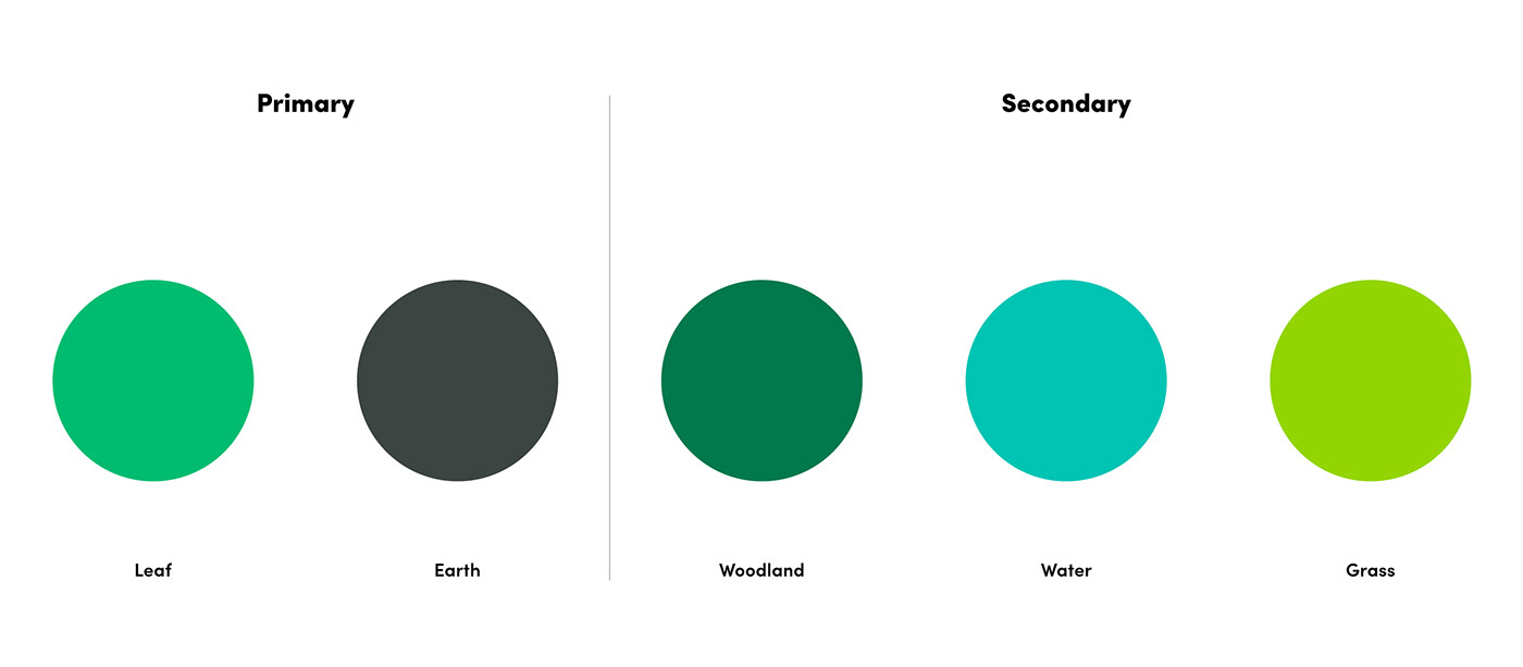
Color Palette
When considering color for a parks organization, green is an obvious choice but also cliché in the category. Public spaces are vibrant and alive, the brand should feel that way too. The solution is a broad palette of bright, tonal greens that draw inspiration from the outdoor experience.
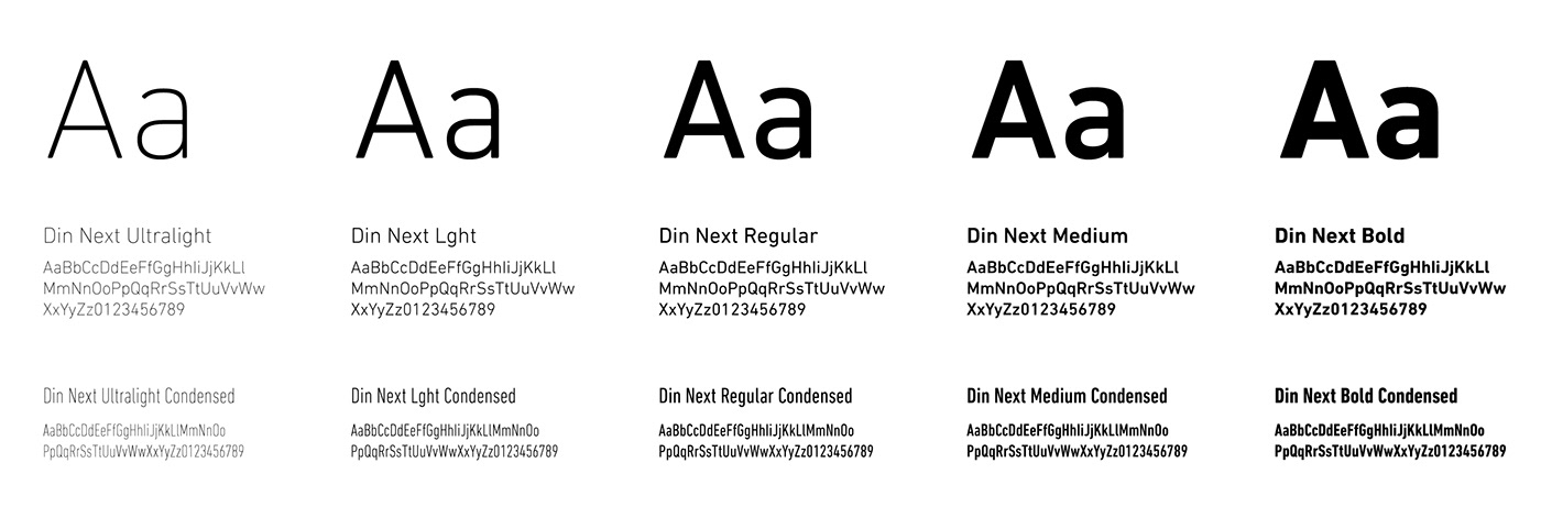
Typography
To best serve the breadth of executions, many of which are heavy in text, the brand uses one typeface with a range of weights and widths. This allows for multiple levels of hierarchy while keeping a consistent look.
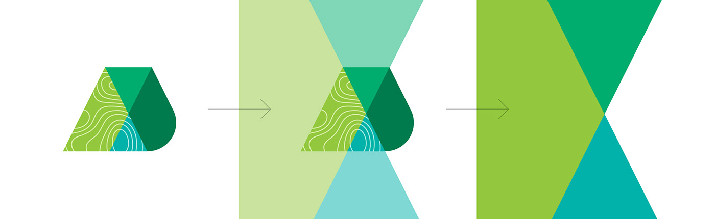
Intersection Graphic
The category is dominated by floods of green and park imagery, this brand needs a dominant graphic element that separates and connects all of its materials. The color intersection of the logo is exaggerated and scaled up, bleeding off edges to create big statements where necessary.
Map Texture
The hardworking executions of the brand, like fact sheets, brochures and emails, can be copy dense and dry. The map texture is pulled out of the logo to create accent graphics and add interest to these situations.


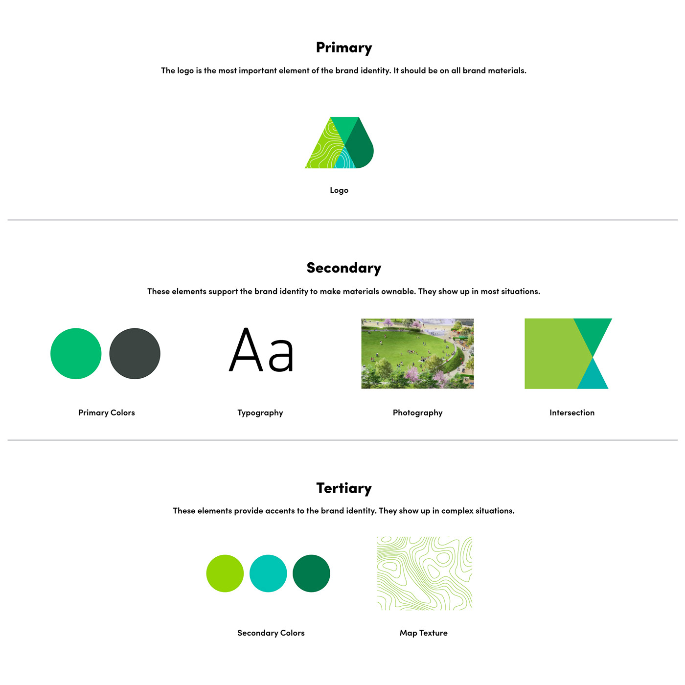
Asset Architecture
A brand identity requires a nuanced understanding of the intention behind the elements to execute well. Non-profits work with dozens of partners, often on fast timelines, and providing adequate guidance is a challenge. The brand assets are organized and explained so partners and team members alike know what parts to use when.
Activation
When handing off a new identity, it's important to show examples of how the brand could come to life. Below is a range of example showing the brand tools affecting various marketing materials.


Summary
The Minneapolis Parks Foundation has a brand identity as innovative as the projects it helps to fund. The system has enough elements to be appropriately loud or quiet, and because they come directly from the logo, marketing materials connect visually while separating from competition.