This week in the Mac Lab, I decided to make several different things in an effort to remember what I lost over Spring Break. I should start by mentioning that this week and next week Valhalla is doing CAASP testing, and thus there is a modified block schedule for this week and the next. This schedule has me spending a large amount of time in the Mac Lab, but only two days of the week.
To start, I decided to give geometric patterns a shot, and decided to work off of whatever I made. This first geometric pattern was made using the Gettysburg color theme on Adobe Color. I don't like the pattern I made, the colors look good, but I still decided to make something else out of the pattern.

Using what I had learned last week, I took out a part of the previous pattern and made it into a mosaic. For this one, I started with an 8x8 layer, then a 10x10 layer with a multiply blend mode. Next, I added a 20x20 round layer with a lighten blend mode, and finished it with a 20x20 layer with a color dodge blend mode. I like the colors of this mosaic, however I think it has too much white, which distracts from the rest of the image.
Next, I decided to take the mosaic I made and make it into a pattern. I made it into a pattern, then duplicated it, flipped it, and added a screen blend mode and some Camera Raw adjustments. I think when looking at the pattern further away, and by increasing the brightness of the other colors, this pattern came out pretty good.

Lastly, I took the original mosaic I made, then applied a Gaussian Blur to it, and some extra Camera Raw adjustments. I like the blur that all the colors come together to make, but in hindsight I think it needs more brightness.

I decided to continue my workflow from last time, and started with another geometric pattern, this one using the Vintage Ralph Lauren color theme on Adobe Color. This pattern I think looks better than my previous pattern in terms of just structure, but I still like the colors of my previous pattern more.

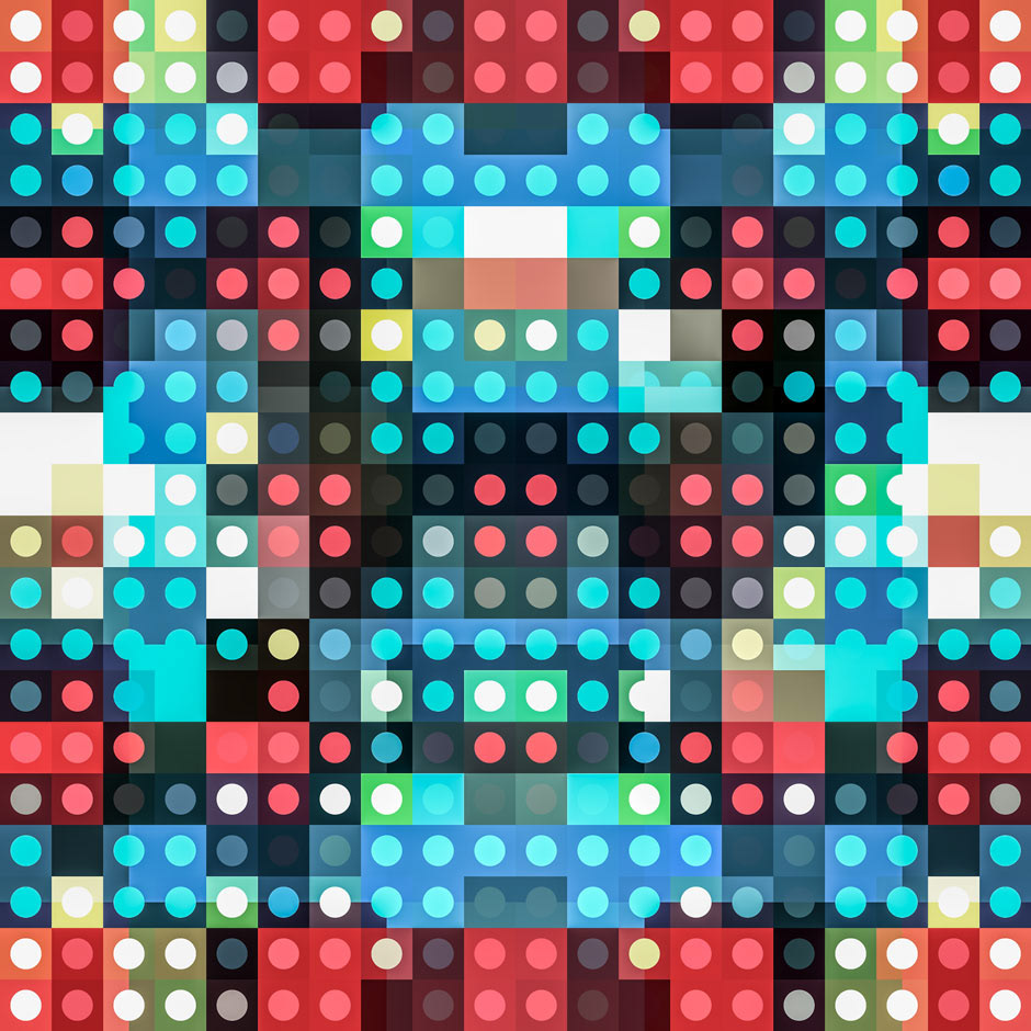
Once again, I took a part of the previous pattern and made it into a mosaic. This one I started with a 5x5 layer, then a 10x10 and 20x20 layer both with a soft light blend mode. I then finished this one with a 10x10 round layer with a linear dodge blend mode, and screen blend mode. This mosaic I think looks a lot better than the previous one I had made, and I think the colors blend together a lot better, and this mosaic is not too bright, which was another problem I found with the previous mosaic.

I then made the mosaic into a pattern in the same way I made the previous mosaic into a pattern, except this time I added a soft light blend mode. I think this pattern turned out nice, given how good I thought the original mosaic was.

For the blur of this mosaic, I decided I didn't like the color of the original blur I made, so I decided to experiment with it. I inverted the colors, and came to this result after applying a Gaussian Blur and a Camera Raw Filter. I made sure to brighten this blur unlike the previous one, which I think made it turn out a lot better.

For this last pattern, I used the Flat UI color theme on Adobe Color. I really like the way this pattern came out, mostly due to the color, but also due to the way I structured it this time. I have used this group of color themes a lot the past couple of weeks, and hopefully next week I will remember to find some new colors to work with instead of these same colors.

For the mosaic of the previous pattern, I started with a 5x5 layer, then an 8x8 round layer with a linear dodge blend mode. Next, I added a regular 8x8 layer with a soft light blend mode and a 20x20 round layer with a linear dodge blend mode. I then finished the mosaic with a regular 20x20 layer with a screen blend mode and some Camera Raw adjustments. I like the clarity this mosaic has, and the way the colors blend together. I will admit, there is still a bit too much white, but not as much as my first mosaic that it distracts from the rest of the image.

For the pattern, I followed the same procedure I did before, and added a soft light blend mode. I don't like the pattern of this mosaic as much as just the mosaic, probably because there is too much distracting white in the pattern.

Lastly, I added a Gaussian Blur to the mosaic, and was satisfied with the results. I need to get better with the brightness of these blurs, and when comparing what is seen here to with what I made in Photoshop, I can notice the drop in brightness. Besides that, I liked how this blur came out, and at the very least all the colors are somewhat balanced.

This was a great week for me, and although I had some pretty bad headaches throughout the week, I still had fun. Next week, I will either do what I did this week, and experiment with what I already know in order to make something new, or learn something new and work with that.
