A truly faithful ally for every designer looking for fresh yet familiar and reliable font choice. Geller was created as a part of graduation project in Typowa Pracownia at Academy of Fine Arts in Warsaw. It is a typeface family intended for newspaper, editorial usage. At this moment we hand you headline optical size. Text optical size is currently in development process and will be released as soon as possible.
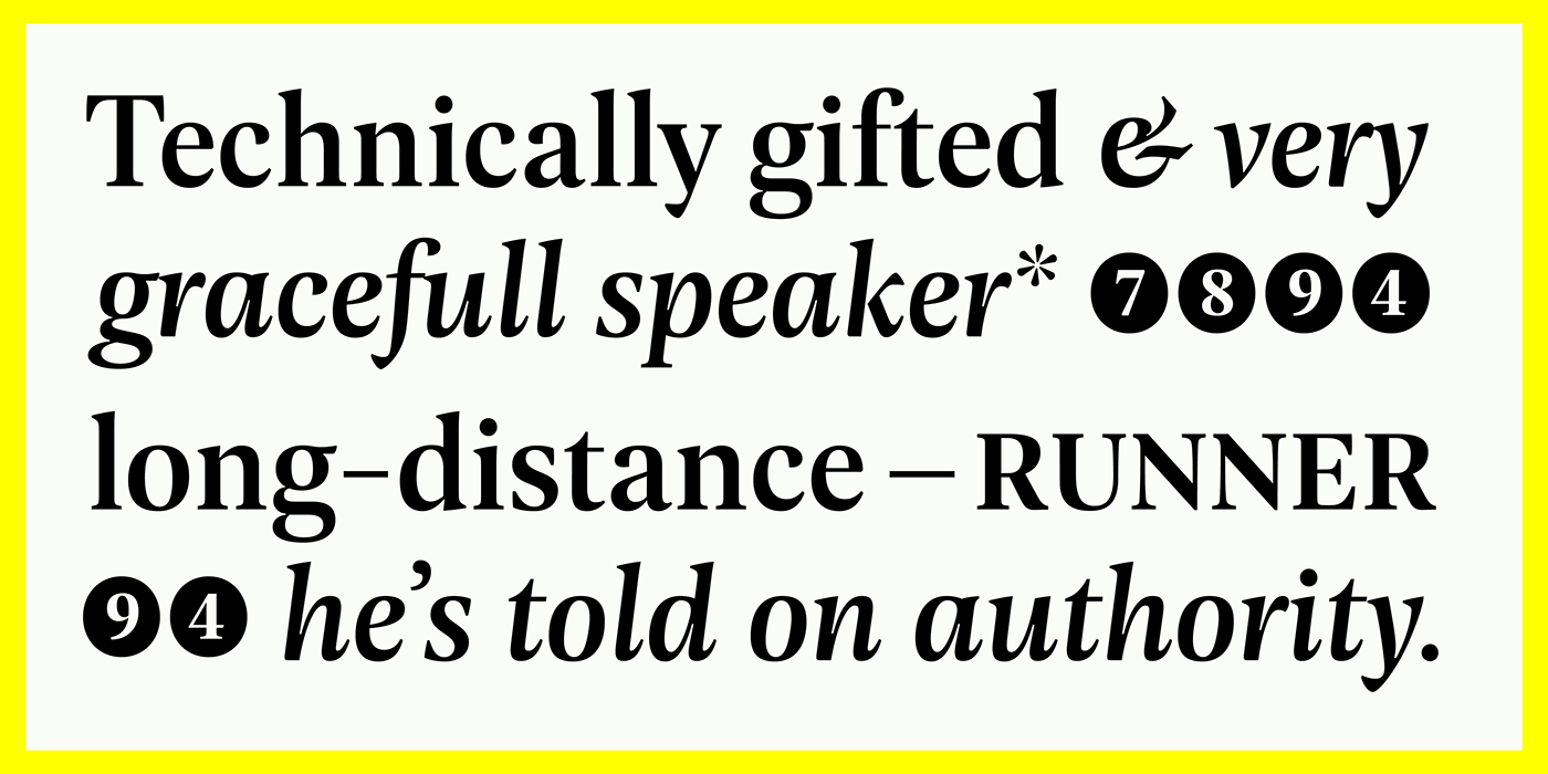
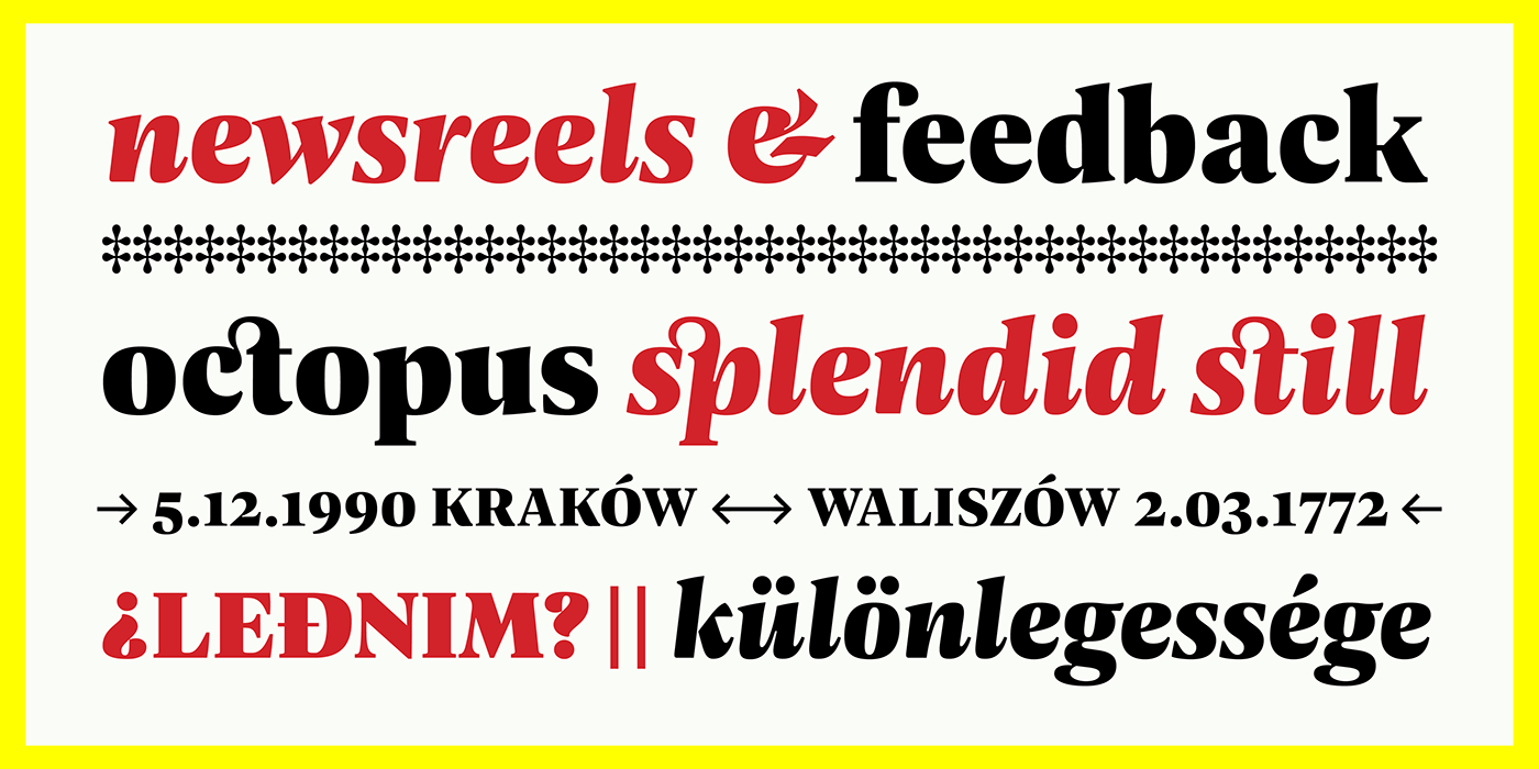
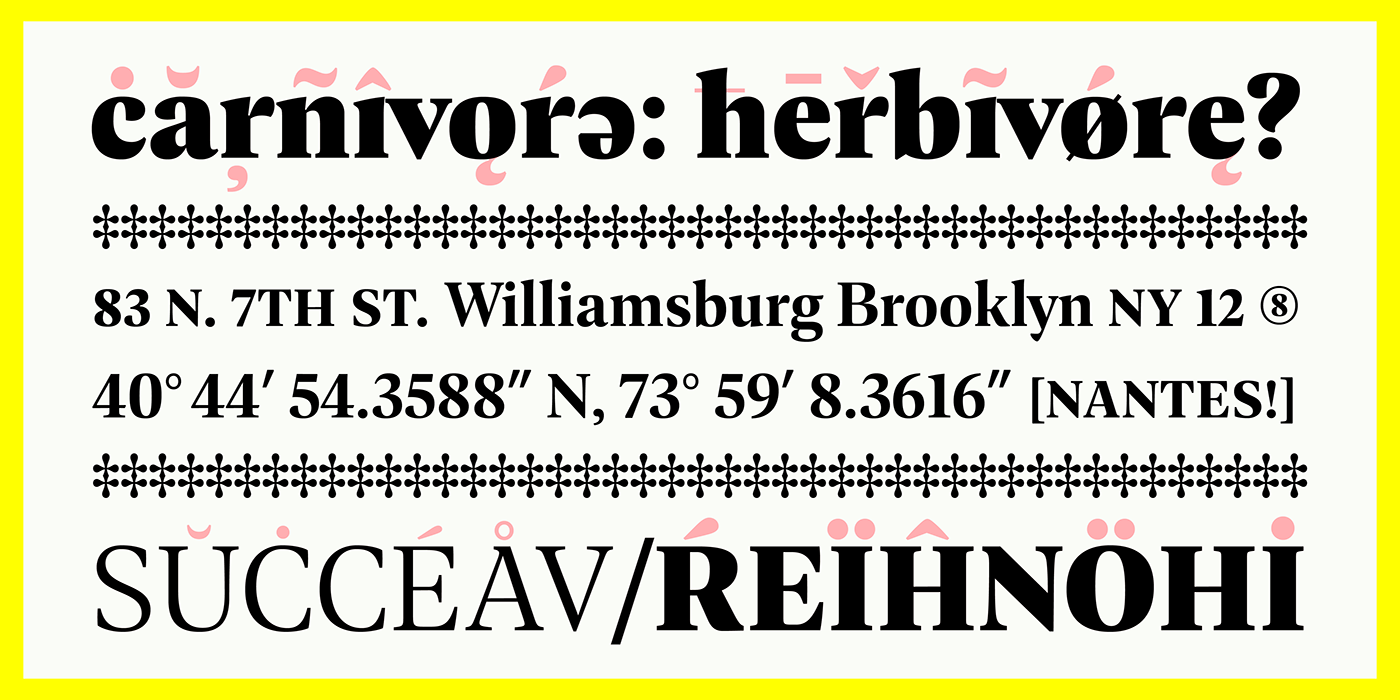
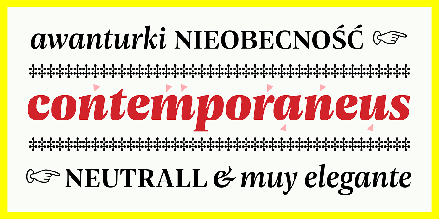
During design process the technical needs of certain typographic fractions were examined. The capital letters were designed with certain purpose: it's modern proportions (derived from Didone fonts) with optimised inner lights as well as short ascenders and descenders work very well within titles and leads. Except of wide range of opentype features, Geller contains bullets & dingbats providing many possibilities in introduction of entry points in editorial design. Compact diacritics, proportionally tall x-height, narrow letter construction – all this designed features make typesetting of narrow text columns and spreads economical. Shop and test now at: