Type Specimen Book

Outside and inside of the book cover


Table of Contents Spread

Chapter two spread

Spread in chapter three

Spread in chapter three

Spread in chapter one
Design Rationale
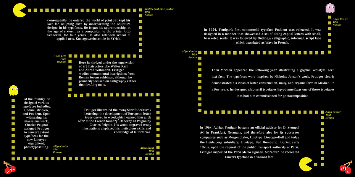
The goal for this project was to create a Type Specimen book centered around one of Adrian Frutigers' typefaces. After looking through all of Frutigers' typefaces, I narrowed it down to the Centennial Typeface. I wanted to make my book fun and interesting to look at, as well as make it personal. After researching the Centennial typeface, I discovered it was made in the 80s. I love the 80s era with music, style, and games so I wanted to make something that related to the 80s. I originally wanted to do an arcade theme, but after consideration I narrowed it down to one specific, iconic, arcade game of the 80s: Pacman!
For the design elements of the book, I wanted to incorporate, obviously, Pacman himself. But I also wanted to include more elements of the game so I incorporated the ghosts, the cherrys' as the page numbers, and the squares Pacman eats. I also incorporated the arcade machine aspects as well, such as the start and game over screen of a game and the Pacman arcade machine as well. I wanted the layouts to be unique and fun to look upon, so each spread is different since each level of Pacman is setup differently. For the color scheme, I wanted to stick to the colors of Pacman which were: yellow, black, white, red, pink, and blue.
Overall, the goal for this project was to create an fun and interesting type specimen book to convey Frutigers' typeface, Centennial, and the book totally meets that goal.