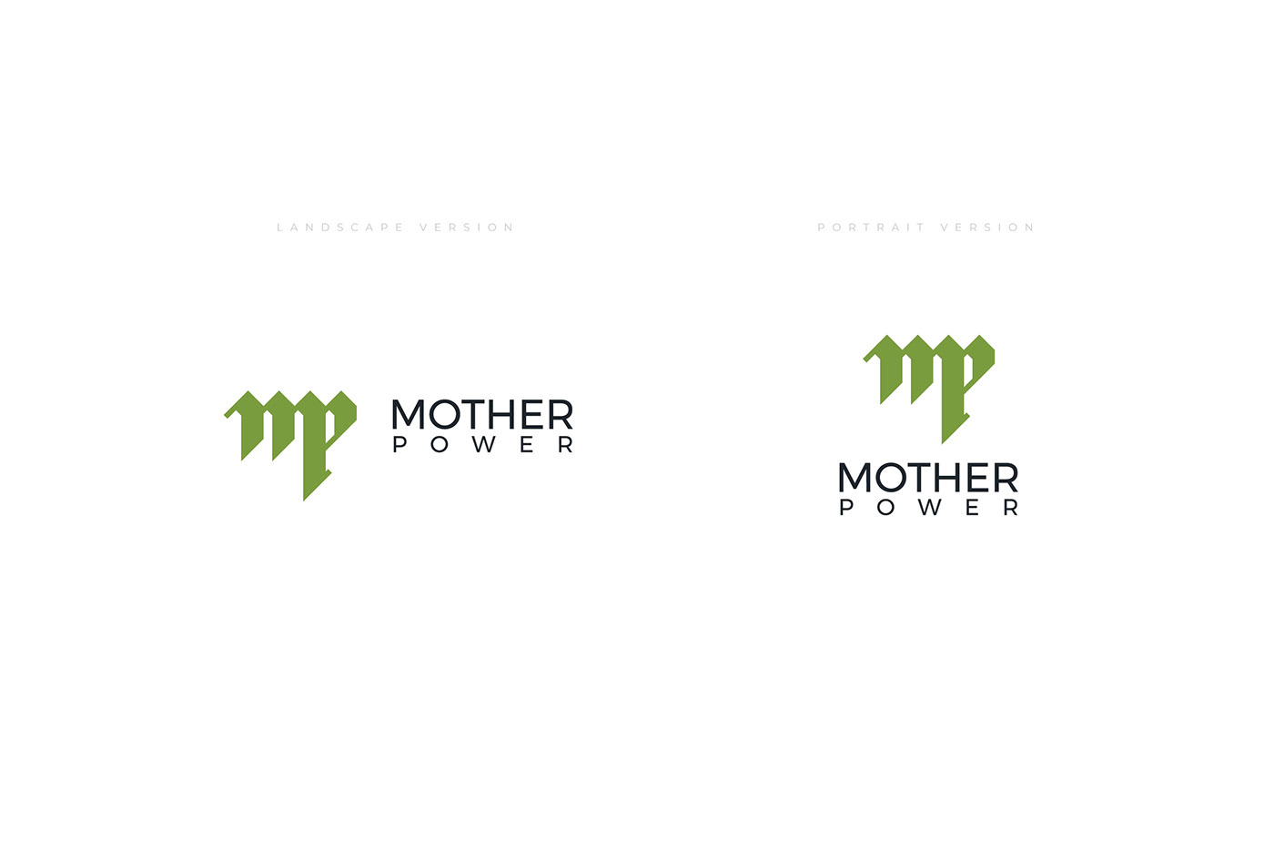
A beautiful collaboration with a wonderful client, Mother Power is a company that deals in construction materials. Their unique name sets them apart so it has been a challenge when creating this lettermark to not have them being confused for a mother & child company. The owners requested green as a must in the visual branding so I took the liberty to create perfect 45º angled letters which resemble rooftops. The client was very pleased with the result and so was I!


A visual guidelines manual was also included, to cement the foundations of the visual style to be used for this brand.


Thank you for watching!


