

Unfinished logo
| Gmina Przodkowo |
Boroughs and towns
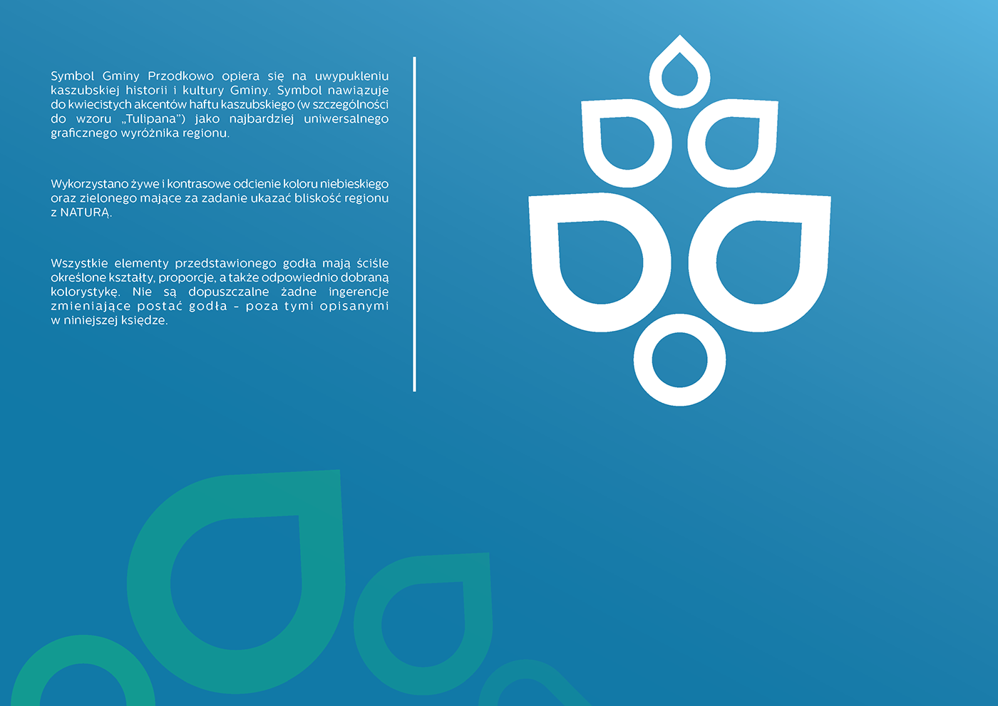
The logo design of the Przodkowo commune based on Kashubian culture and history. The logo connected to traditional floral Kashubian embroidery
(especially to model of Kashubian Tulip) as the most universal symbol of the region.
(especially to model of Kashubian Tulip) as the most universal symbol of the region.
Use bright and contrast shades of blue and green color, to get close nature effect.
All elements of presented logo've well definited shapes, propotions, and also properly selected color.
Any changes are not allowed without those, which are descibed in description below.
Any changes are not allowed without those, which are descibed in description below.

I. Main logo - vertical layout of the logo in protective field.
II. Horizontal layout of the logo in protective field.
CMYK scale is a basic color scale of the logo. In the table above are presented also numeric representation of used colors in RGB, PANTONE and Gray Scale (monochromatic version).
In the figures also are presented the smallest possible minimized vertrical and horizontal version of the logo.

III. Color variants of the logo - vertical and horizontal layout of the logo.
IV. Typography
In presented work of the logotype used free font rezland logotype font by Frasier Davidson. "A" letter also are used as a element of logo.
Centrale Sans Rounded by Veronica Stavanova are also recommended supplementary font (Rezland logotype font doesn't have polish diacric signs).
Example animation of the the logo