Osteoporosis
Typography experiment
Graphic Design MA project
Graphic Design MA project
Moholy-Nagy University of Arts and Design 2018

About the project:
- How can we implant an autonomous visual experiment into the experience of exact design methods?
- What is the relationship between design, typography and medicine?
- What are the socially useful aspects of creative font design?
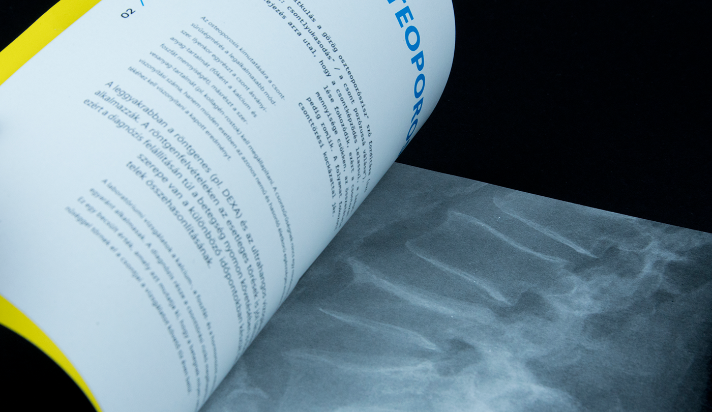
As a university project, i had a task to experiment with type, in order to draw attention to osteoporosis, one of the most common age-related illnesses.
I wanted to visualize the progress of the disorder with a clear visual way. First I conducted various, mostly photographic experiments to express the shrinking and disorting effects of this process.
- What is the relationship between design, typography and medicine?
- What are the socially useful aspects of creative font design?
As a university project, i had a task to experiment with type, in order to draw attention to osteoporosis, one of the most common age-related illnesses.
I wanted to visualize the progress of the disorder with a clear visual way. First I conducted various, mostly photographic experiments to express the shrinking and disorting effects of this process.


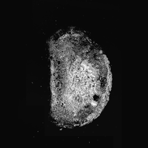
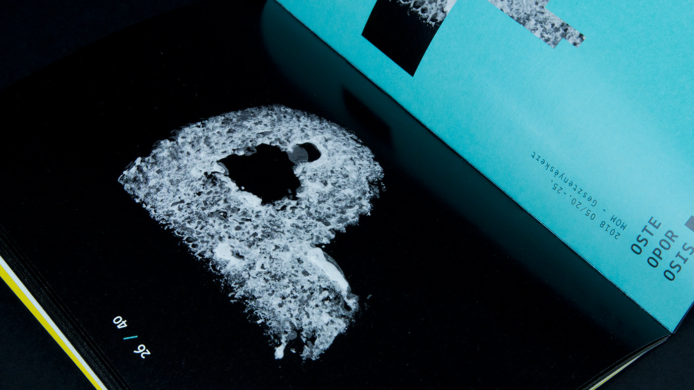
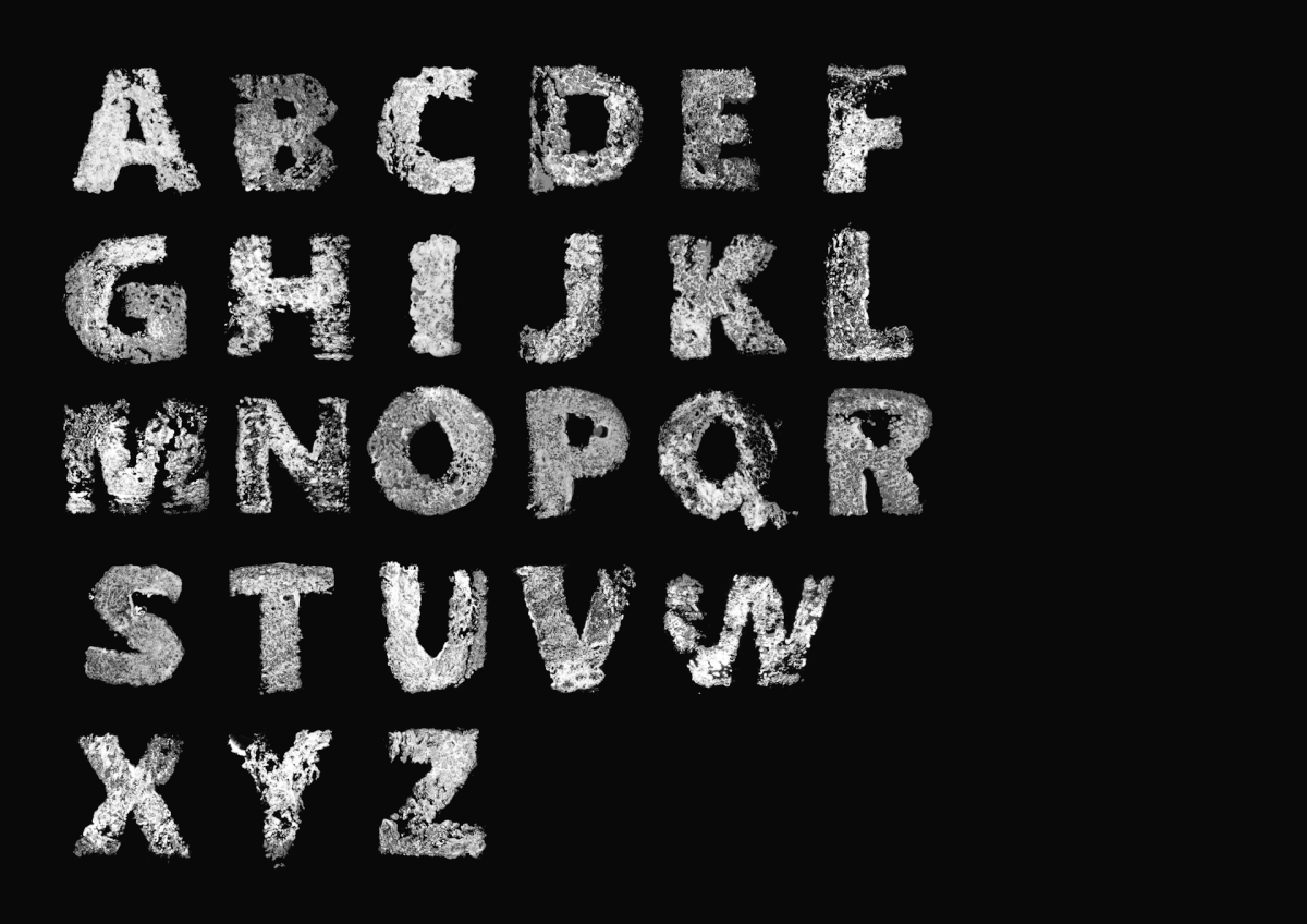
Lots of experiments later, I observed the drying process with a slice of bread. I handprinted it several times, in different stages. (4 hourly with a brown bread in a moderately warm room) I was so excited about the experiment, that I did it with various dyes and inks to a lot of different papers. After a long run I had my exact way to construct the versals of the experimental typeface, in order to use them as key elements in my project.


The type was based on Arial letters, but disorted by the structure of the bread, wich reflects extremely well to an actual bone structure. With the different captured phases put on top of eachother, I had my typeface to work with.

A the end I made several posters, leaflets and a typebook for a fictive international symposium about the current state of osteoporosis research.